

::Raises hand:: I am!bunny-gypsy wrote:I think it looks a bit better, but I'm not a 3D artist/expert. (I'm still a beginner/newbie at 3D, heh.)
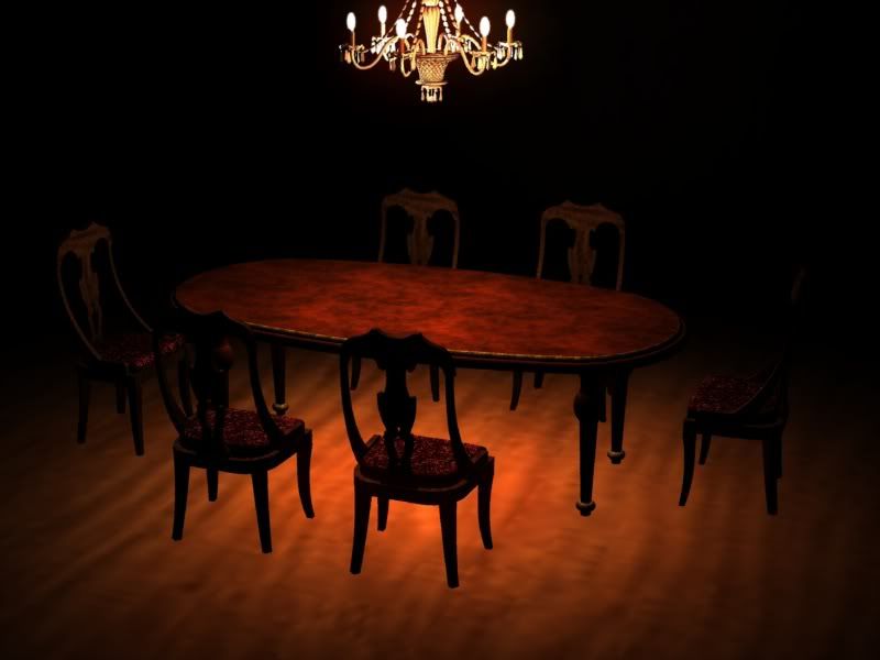

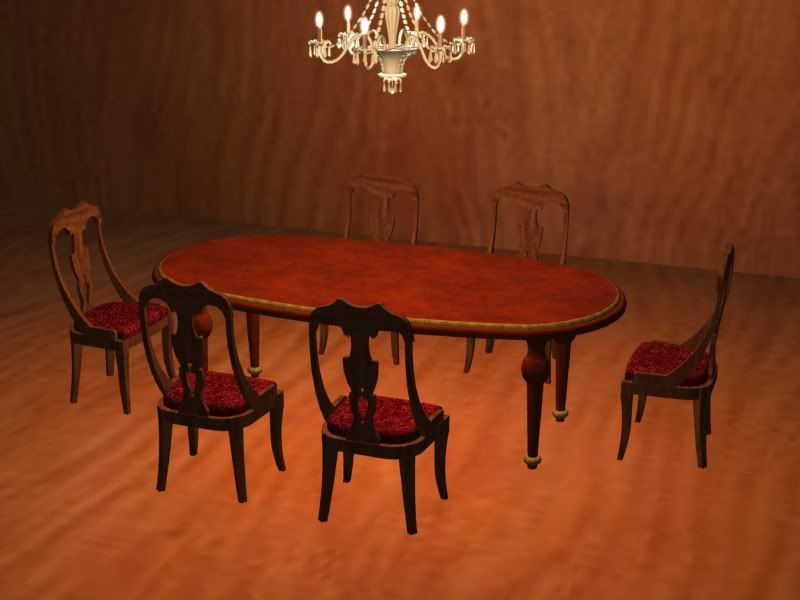
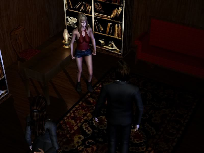
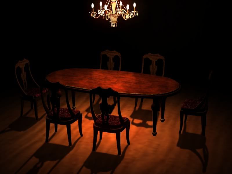
You are losing the most important focal point of your scene - the characters. Remember, if you want the focus to be on the characters, the light needs to draw the viewer's eye to them. I still don't see any shadows being cast. Look at the dining room set. Where are the shadows the chairs should be casting on the floor? The same for the characters in your first image. No model is casting shadows on other models, only self-shadowing themselves. Again, look up ray casting and shadows for iClone. Though not absolutely correct, Auro-Cyanide's corrections are in this vein and are an improvement. And yes, not all of this has to be done in the 3D application. Professionals actually render out separate passes (the color channels, the lights, the shadows, the ambient occlusion, etc.) and mix and adjust them to perfection in applications like Photoshop, thus giving them total control.ImmortalDreams wrote:Thank you Late White Rabbit for all your advice and help. I read the the tutorials and decided to work on my lighting again. I really would like to use 3D if I can, so good lighting means a lot to me.
Sorry if it still sucks
Here are the new images:


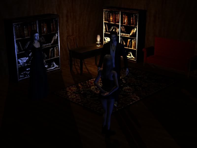
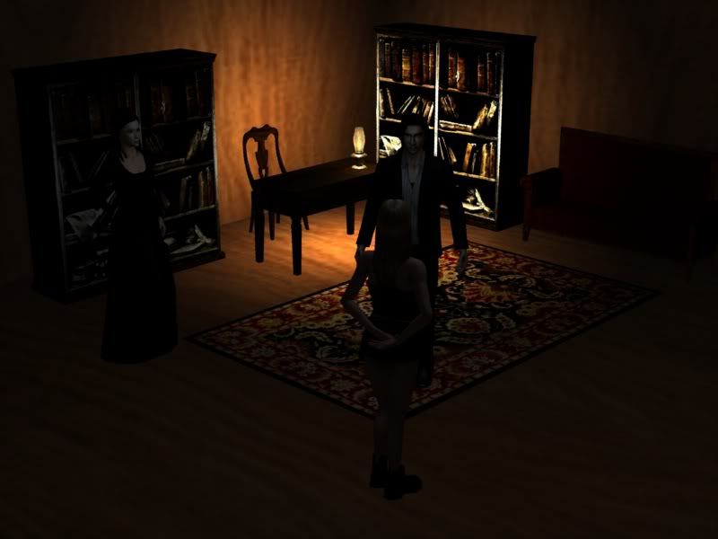
It's starting to look much better.ImmortalDreams wrote:Okay, so the lighting is still probably really bad but I worked on the orange and blue light technique and I added shadows. I want the scene to be dark and scary and I want the lamp on the desk, but that takes away from the characters.


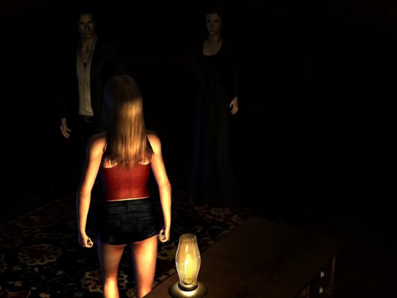
You've lost a lot of your color information now (though I can still still see a little of it), and the way you have it set up still implies that the lamp is the most important thing in the scene.ImmortalDreams wrote:I changed the angle and applied a black soft brush to the overly lit parts. Does it look better?

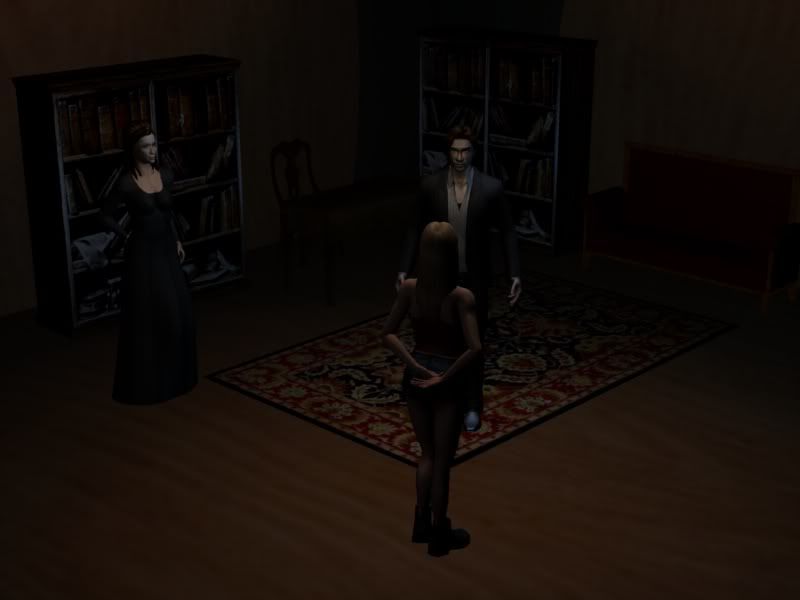
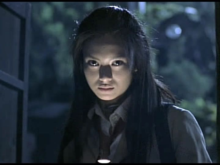
If it is from her perspective, you set up the shot like the second picture in my last shot. And you still need to SHOW the other two characters well, regardless of if they are bad or should be in shadow. You set up the lighting to make them look ominous, but still let the audience SEE them.ImmortalDreams wrote:It's supposed to be a spooky scene. The protagonist(the girl) is closest to the camera and in that angle because it seemed a bit more like you were looking through her perspective. This isn't a a friendly scene and the two other characters are in shadow to give an ominous feeling. I plan to have a future shot that shows the man(antagonist) in more detail.


Users browsing this forum: Ahrefs [Bot]