Lovely art style, hun. =)
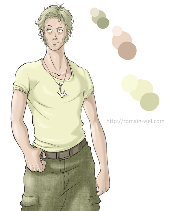
Your anatomy skills are really great!
A few tips concerning colouring:
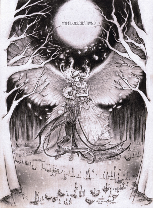
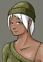
1. Cloth textures
a.) They don't really fit in as you only use them on the clothes--either throw them out completely, or use them somewhere else too (e.g. a really subtle skin texture). Using a textured brush might work better as it's looser and thus fits in better.
b.) The texture doesn't wrap around the surface which makes the jeans appear flat--if you're using Photoshop using the wrap tool could help.
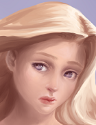
2. Skin palette
The skin appears really grey-ish. Skin is rather saturated in shadow areas, and using white to highlight is something you should stay away for a while. (Black and white both--they can make an image better, sure, but they are tricky to use, especially since they make your colours more dull by desaturating them.)
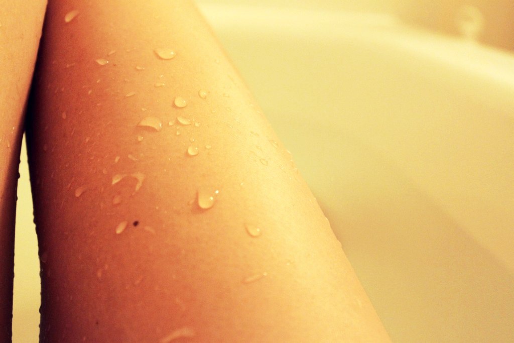
http://upload.wikimedia.org/wikipedia/c ... athing.jpg
^ Unnatural lighting and editing, sure, but you can easily spot how saturated the shadows are.
... I just colourpicked the image and noticed that you didn't use white to highlight. The palette appears so dull because you only changed the saturation and darkness of a single hue (which is exactly what happens if you shade with black and white). I won't go into detail here because you can find a lot of tutorials on deviantArt on this, but hue switching is important.
If you have a warm light source, pick your lighter colour in a warmer hue and the darker ones in a cooler hue (e.g green: highlights would be yellow-ish, shadows blue-ish). You don't have to be too extreme, just a subtle switch will make it more vibrant and lively.
I'm looking forward to see more from you--your anatomy really looks good, and your people look so characteristic, it's really nice to look at!
- En.


