Page 413 of 526
Re: Art Dumpage! Show your art ^^
Posted: Thu Jan 09, 2014 8:20 am
by MomoiroGirl
@Vintehin: Your stuff is pretty cool

Realistic drawings, that somehow still retain a bit of that cartoon-ish feel, even though they are realistic (if that made sense XD)
@Tempus: Your backgrounds are awesome @__@ They look so pro!
@DerWanderer: I feel like I've seen his face before o.o Nice job!
@Eora: I really dig the feel os this picture
Now I'm intrigued~
I made a digital version of a drawing I posted earlier, and coloured it, and for once, I'm actually pretty damn satisfied
Also, I took a pic of another drawing of my current Gaia avatar (which I might also make a digital, coloured version of)
Re: Art Dumpage! Show your art ^^
Posted: Thu Jan 09, 2014 9:49 am
by kelsaki
Just a couple of chibis of characters I've FINALLY nailed down the design of.

Everyone on here is so good!
Re: Art Dumpage! Show your art ^^
Posted: Thu Jan 09, 2014 4:00 pm
by Katon
I did a redraw thingie and thought I'd share it here. Sorry for the lazily done BG--;;
Re: Art Dumpage! Show your art ^^
Posted: Fri Jan 10, 2014 12:37 pm
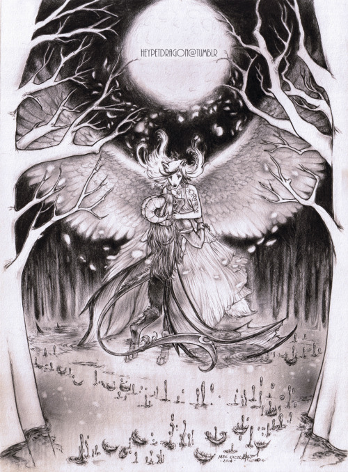
by heypetdragon
Hello,
new in the forums...let's try this.
A commission I finished recently.
Re: Art Dumpage! Show your art ^^
Posted: Fri Jan 10, 2014 12:44 pm
by Armee
@heypetdragon: Welcome to the forum! You created such a lovely piece
Re: Art Dumpage! Show your art ^^
Posted: Fri Jan 10, 2014 10:19 pm
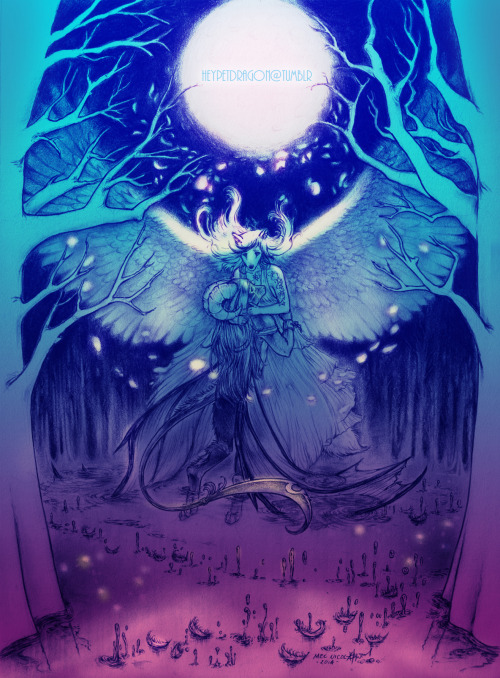
by heypetdragon
Armee wrote:@heypetdragon: Welcome to the forum! You created such a lovely piece
* u * Thank you Armee.
Lucente looks great btw!
Re: Art Dumpage! Show your art ^^
Posted: Mon Jan 13, 2014 3:24 pm
by Deshtat
Here are two paintings I realised the last few days. They still need some little improvements, but I don't really want to open Photoshop again today x)
I think I'll use them in some personnal projects.
Re: Art Dumpage! Show your art ^^
Posted: Mon Jan 13, 2014 5:07 pm
by SimonLayton
@heypetdragon: I love the details! :D
@deshtat: They look really great! I especially love the fabrics of their clothes. :3
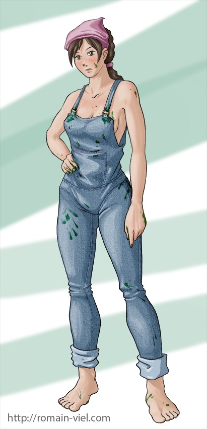
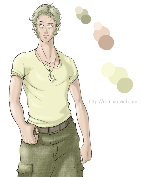
A rather quick one. This is honestly nothing impressive compare to all the art here in the forums. :P
Re: Art Dumpage! Show your art ^^
Posted: Tue Jan 14, 2014 6:16 pm
by Deshtat
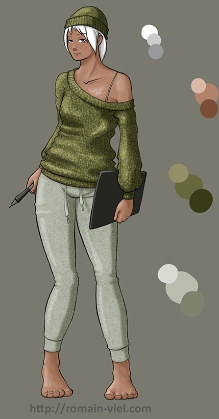
Thanks ^^ Here's a new one I made today.
Re: Art Dumpage! Show your art ^^
Posted: Tue Jan 14, 2014 9:05 pm
by Endorphin
Lovely art style, hun. =)
Your anatomy skills are really great!
A few tips concerning colouring:
1. Cloth textures
a.) They don't really fit in as you only use them on the clothes--either throw them out completely, or use them somewhere else too (e.g. a really subtle skin texture). Using a textured brush might work better as it's looser and thus fits in better.
b.) The texture doesn't wrap around the surface which makes the jeans appear flat--if you're using Photoshop using the wrap tool could help.
2. Skin palette
The skin appears really grey-ish. Skin is rather saturated in shadow areas, and using white to highlight is something you should stay away for a while. (Black and white both--they can make an image better, sure, but they are tricky to use, especially since they make your colours more dull by desaturating them.)
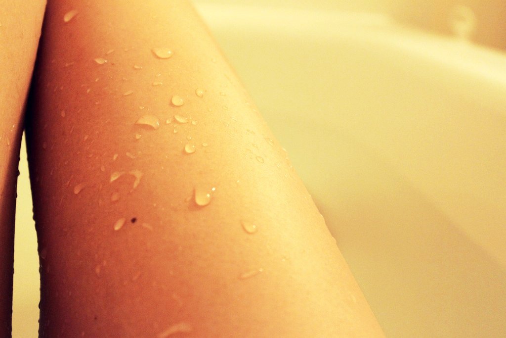
http://upload.wikimedia.org/wikipedia/c ... athing.jpg
^ Unnatural lighting and editing, sure, but you can easily spot how saturated the shadows are.
... I just colourpicked the image and noticed that you didn't use white to highlight. The palette appears so dull because you only changed the saturation and darkness of a single hue (which is exactly what happens if you shade with black and white). I won't go into detail here because you can find a lot of tutorials on deviantArt on this, but hue switching is important.
If you have a warm light source, pick your lighter colour in a warmer hue and the darker ones in a cooler hue (e.g green: highlights would be yellow-ish, shadows blue-ish). You don't have to be too extreme, just a subtle switch will make it more vibrant and lively.
I'm looking forward to see more from you--your anatomy really looks good, and your people look so characteristic, it's really nice to look at!
- En.
Re: Art Dumpage! Show your art ^^
Posted: Wed Jan 15, 2014 12:15 am
by akemicchi
*jumps in*
Just wanted to color something. I might clean this up. Anyone have any secret tips for foreshortening? ;v;
Re: Art Dumpage! Show your art ^^
Posted: Wed Jan 15, 2014 12:44 am
by LateWhiteRabbit
akemicchi wrote: Anyone have any secret tips for foreshortening? ;v;
Well, you should apply perspective to the figure, just like you would a building or an object .... however, my secret technique is redrawing it till it looks right!
Then discover half-way through coloring that it still looks kind of wonky and redrawing it again. Curse my inefficiency!
Re: Art Dumpage! Show your art ^^
Posted: Wed Jan 15, 2014 2:38 am
by Auro-Cyanide
akemicchi wrote:Anyone have any secret tips for foreshortening? ;v;
This might help you
http://www.youtube.com/watch?v=eJWLaDSNBAI
Re: Art Dumpage! Show your art ^^
Posted: Wed Jan 15, 2014 4:46 am
by noeinan
THANK YOU. Thank you so much for sharing this! I was just lurking, not expecting to find much and when I clicked that link I saw his videos and they are the best!
Re: Art Dumpage! Show your art ^^
Posted: Wed Jan 15, 2014 5:23 am
by Deshtat
Endorphin wrote:Lovely art style, hun. =)
Your anatomy skills are really great!
A few tips concerning colouring:
1. Cloth textures
a.) They don't really fit in as you only use them on the clothes--either throw them out completely, or use them somewhere else too (e.g. a really subtle skin texture). Using a textured brush might work better as it's looser and thus fits in better.
b.) The texture doesn't wrap around the surface which makes the jeans appear flat--if you're using Photoshop using the wrap tool could help.
2. Skin palette
The skin appears really grey-ish. Skin is rather saturated in shadow areas, and using white to highlight is something you should stay away for a while. (Black and white both--they can make an image better, sure, but they are tricky to use, especially since they make your colours more dull by desaturating them.)
http://upload.wikimedia.org/wikipedia/c ... athing.jpg
^ Unnatural lighting and editing, sure, but you can easily spot how saturated the shadows are.
... I just colourpicked the image and noticed that you didn't use white to highlight. The palette appears so dull because you only changed the saturation and darkness of a single hue (which is exactly what happens if you shade with black and white). I won't go into detail here because you can find a lot of tutorials on deviantArt on this, but hue switching is important.
If you have a warm light source, pick your lighter colour in a warmer hue and the darker ones in a cooler hue (e.g green: highlights would be yellow-ish, shadows blue-ish). You don't have to be too extreme, just a subtle switch will make it more vibrant and lively.
I'm looking forward to see more from you--your anatomy really looks good, and your people look so characteristic, it's really nice to look at!
- En.
Thanks a lot ^^ I think I'm gonna try this in my next works.
I'm not so happy with the texture either x) Clothes usually are my nemesis, so sometimes I try so hard to make them look okay that I forget about the skin...
Well I don't know if what I say is correct in english, but I agree with what you said ^^