OOOHHH!! Nice promo material!!
*jealous of Hijiri's skills* ;______;
Now on to that demo review I've been meaning to write!!
First Impression/Menus:
-- Your attention/disclaimer message in the beginning (after the studio splash screen) seems to be a bit too high up. Try adding more of a margin at the top so the exclamation point's circle isn't bumping up against the top edge of the window.
-- I'm going to guess that this is not the final version of the main menu layout. I love the buttons/system ready graphics, but just the image of a forest does not leave a very exciting impression of the game for me.
I would suggest putting some shadowy figures in, but that probably wouldn't look good. Hopefully I'll think of something better to suggest later OTL
-- In the "Assistance" section, the glowing white text is a bit hard to read over the white hexagons. Consider darkening the background?
-- I think there was an earlier suggestion to move the "Display Game," "After Choice," etc, setting headers to the left side of their respective boxes. I actually think that that would be helpful now that the GUI is in action. It took me a second too long to notice that the headers were aligned on the right side, which is a minor inconvenience to the player but could be mitigated. It might be a little tedious to edit (esp. if you merge your layers), but if you think it's worth the effort you may want to consider revising this positioning.
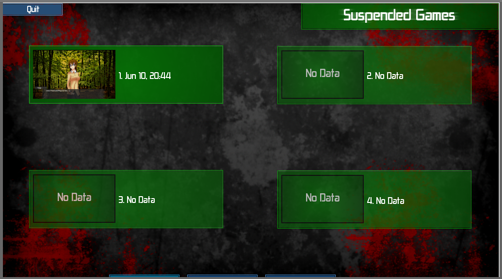
-- The grey/red background clashes in a odd way with the green boxes in the settings/load/save screens. Try
adding more contrast to the bg so there's more variation in saturation? (In that particular edit, I just changed the contrast to 18 using the Brightness/Contrast tool in gimp, avoiding all the boxes)
Death Rule:
-- I LOVE YOUR IN GAME GUI (esp. the textbox) ;______; At first I thought the way it faded at the edges was a little weird but in the end it looks really good with the overall game and serves it's purpose well.
-- It would definitely be helpful if there was some way for us to check the rules of the Game as well as everyone's Death Rules. Since there isn't a lot of stress on who has what number in the story (like the characters don't call each other by their numbers so far), then it's really hard to remember who is supposed to be killing who, etc. Though, I do like the format you presented all the information in!!
--
The Tanya/Abraham alliance was really fast and odd. Unless both of those guys are really chill by nature or both super lethal, I would find it hard to believe their scene where they're just calmly giving out their names and exchanging their player information. Of course, we've previously learned about the ability to obscure your goal, so does that mean players in the Game aren't allowed to lie about their information unless given the ability? If this is the case, it needs to be more clear.
-- When Abraham says
"You really did memorize the whole thing." Unless players without the Double Agent ability are forbidden to lie about their info, how can he just take her words at face value (unless he's feigning acceptance of her words)?
-- Is Hector's scene where he's alone in the beginning really necessary?
Since he's shown again later in Abigail's scene and his name is a "???" it's weird to look at because the player already knows who he is. I know it's shown as a "???" because technically Abigail doesn't know who he is, but the narration is in 3rd person... :/
-- I loved the Dwight/Tinasa/Tanya/Abraham scene xD OH DWIGHT. His face was great.
-- Love the final count thing going on after the day is over.
False Execution:
-- Sorry, after I read the first 2 sentences I couldn't read anymore ;_______;
I can't read on without first knowing how/why they died OTL
General Comments:
-- Please make a button to return to the main menu somewhere in the settings or load/save screens ;______; This would be helpful if you wanted to leave your game without saving and without quitting (closing the game window). I wanted badly to leave False Execution without saving or closing the window but there seemed to be no way to just navigate back to the main menu. At the very least, make some kind of back to the main menu navigation at the chapter selection screen.
-- On your main menu, you use the term "Preferences," but once you actually navigate to other menus, it magically transforms into "Settings." People will get the message, but from a player's perspective it looks inconsistent and makes me feel like you just forgot what term you used previously. I realize that "Preferences" is a longer word and looks nicer on the main menu could have been a consideration. This is just a nitpick of mine, so take it with a grain of salt.
Overall, I'm super excited for the final release now!! Great work so far and I'm looking forward to seeing more updates! *U*