Revamping character graphics for G!MB?
-
Alessio
- Miko-Class Veteran
- Posts: 576
- Joined: Fri May 07, 2004 9:40 am
- Completed: GO! Magical Boy (2006), Angelic Orbs (soundtrack)
- Projects: Cyberlin (in progress)
- Location: Finland
- Contact:
Revamping character graphics for G!MB?
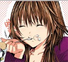
I'm planning to put out a new minor release of G!MB to fix some typos and to include the new Ren'Py logo as soon as it is ready, and was wondering if I should take the chance to re-work the character graphics' outlines in colour. Currently, all characters are outlined with black lines. I noticed most CG artists use coloured lines instead, and it does make their drawings look very smooth. Question: Would it improve anything if I included new graphics as shown below, or should I rather let it be and keep the "Art Nouveau" style? :) Thanks for your comments!
- Attachments
-
- Left: original / Right: new outlines
- G!MBcomparison.png (109.94 KiB) Viewed 1646 times
Re: Revamping character graphics for G!MB?
Well, if it's not too much trouble to change them all, myself I prefer the versions with coloured lines... I think the problem with the guy (whose name I'm afraid I've forgotten, which is terrible, I was just playing that last week...) is that coloured lines, to me, look good when they contrast against both sides of the line still; the outline for the orange on the shirt should thus be the dark brown of the shirt rather than the dark orange, or it doesn't show up against the background and looks odd.Alessio wrote:Question: Would it improve anything if I included new graphics as shown below, or should I rather let it be and keep the "Art Nouveau" style?
The hair, on the other hand, doesn't look bad to me at all.
Server error: user 'Jake' not found
-
Watercolorheart
- Eileen-Class Veteran
- Posts: 1314
- Joined: Mon Sep 19, 2005 2:15 am
- Completed: Controlled Chaos / Sum of the Parts / "that" Midna game with ZONEsama
- Projects: Sparse Series/Oddments Shop original cartoon in Pevrea; Cybernetic Duels (fighting game); Good Vibin'
- Organization: Watercolorheart Studios
- IRC Nick: BCS
- Tumblr: adminwatercolor
- Deviantart: itsmywatercolorheart
- Github: Watercolordevdev
- Skype: heartnotes
- Soundcloud: Watercollider
- itch: watercolorheart
- Location: Florida
- Contact:

-
Alessio
- Miko-Class Veteran
- Posts: 576
- Joined: Fri May 07, 2004 9:40 am
- Completed: GO! Magical Boy (2006), Angelic Orbs (soundtrack)
- Projects: Cyberlin (in progress)
- Location: Finland
- Contact:
Thanks a lot everybody for your feedback so far, I'm surprised to see how opinions differ! I want to be sure on this one, to not waste time for changes that achieve nothing. :)
Actually the lines are not drawn on the PC, they are the original inked/scanned ones. When the scan is resized to a smaller size, the lines become transparent on the outside and dark in the middle, very much like as if painted with a paintbrush tool. This transparency is kept when coloring the lines, since I only change the lines' color, not their Alpha channel values.BCS wrote:it works best with the paintbrush tool not the pen tool like what you're using.
Very good proposal, I'll make some fake screenshots for comparison when I have a few minutes. No, the backgrounds would remain as they are, I didn't find any reason so far to re-do them.mikey wrote:Maybe you could show us how it would look against the backgrounds? Will you be refiltering them as well?
-
Alessio
- Miko-Class Veteran
- Posts: 576
- Joined: Fri May 07, 2004 9:40 am
- Completed: GO! Magical Boy (2006), Angelic Orbs (soundtrack)
- Projects: Cyberlin (in progress)
- Location: Finland
- Contact:
Okay, so I've redone Matt's orange shirt and pasted my two guinea pigs onto different backgrounds. Sorry if it's a bit crammed, Aina was elbowing Matt away. ^_^;;; What do you think...? (Hm... I'm starting to believe that black outlines look really better in this case... odd.)
- Attachments
-
- fakeyard.png (386.86 KiB) Viewed 1560 times
-
- fakeclass.png (340.53 KiB) Viewed 1554 times
-
PyTom

- Ren'Py Creator
- Posts: 16096
- Joined: Mon Feb 02, 2004 10:58 am
- Completed: Moonlight Walks
- Projects: Ren'Py
- IRC Nick: renpytom
- Github: renpytom
- itch: renpytom
- Location: Kings Park, NY
- Contact:
I think I like the black borders better... It may have something to do with the relatively flat shading style.
Supporting creators since 2004
(When was the last time you backed up your game?)
"Do good work." - Virgil Ivan "Gus" Grissom(When was the last time you backed up your game?)
Software > Drama • https://www.patreon.com/renpytom
Honestly, I can't decide - both have something to them. And crucially, I don't see one concept being substantially better than the other. If I had to be shot, I'd say go with the colored borders, but if I had to re-release a game just to change that, I'd probably say that the change is just cosmetic. But if you had a major thing that you need to repair in the game and make the switch to colored outlines as a bonus to that update, I'd say it's a good idea.
-
papillon

- Arbiter of the Internets
- Posts: 4107
- Joined: Tue Aug 26, 2003 4:37 am
- Completed: lots; see website!
- Projects: something mysterious involving yuri, usually
- Organization: Hanako Games
- Tumblr: hanakogames
- Contact:
Strangely I like the colored borders much more in the outdoor shot than the indoor one. I suppose the contrast plays with my eyes differently.
I've always found that colored borders, for me, didn't work out in the end. I've never been able to make them look right and tend to give up and go back to black.
I've always found that colored borders, for me, didn't work out in the end. I've never been able to make them look right and tend to give up and go back to black.
Who is online
Users browsing this forum: No registered users