It looks fabulous. XD
I love how it turned out. I'm glad I was able to help you in some way XD
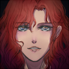
Strings of Fate (WIP) GxB. Feedback appreciated! :)
-
Snowflower

- Bishie Fangirl
- Posts: 814
- Joined: Sat Jan 01, 2011 11:24 pm
- Completed: Idol Crush
- Projects: Shugojin!, RockRobin (openmodewriter), your highness
- Soundcloud: jenna-yeon
- Location: Orange County, CA
- Contact:
Re: Strings of Fate (WIP) GxB. Need opinions on logo & menu

Completed: Idol Crush | WIP: your highness | Hiatus: Shugojin!| Follow Me on Twitter | Subscribe to YouTube
your highness @ 102k as of 2/13
-
YuukiCrossPudding
- Miko-Class Veteran
- Posts: 540
- Joined: Sun Dec 19, 2010 12:38 pm
- Completed: Gidget & The Mysterious Thievery of Hoppity Town
- Projects: Cerulean, The Photographer, Stalker&Yandere, Enamored Risks, Who Is The Red Queen?
- itch: yuukipudding
- Contact:
Re: Strings of Fate (WIP) GxB. Need opinions on logo & menu
@digirin:
you're welcome! whee, I love small wings :3
but I think I'll try to make another text box, and you see if it's better or not, is that okay?
coz' I'm eager to make one that will match the logo! <3
I'll probably change it a bit... the colors.
Yeah it is! lol xDD
the shadow make a deep impression that he's so depressed X3
-
Miss-Mae
- Regular
- Posts: 145
- Joined: Fri Feb 11, 2011 5:31 am
- Projects: Waiting on Love
- Organization: Kinki Skiddles Productions
- Location: Canada
- Contact:
Re: Strings of Fate (WIP) GxB. Need opinions on logo & menu
The logo art looks great!  <3 And the drawing you are considering for the background is really nice looking! Have you tried using it as a background in a practice Ren'py file? I'd be curious to see it with buttons on it.
Come visit me, if you like, at: http://www.miss-mae.deviantart.com / http://www.kinki-skiddles-games.deviantart.com <3 or on my NEW game making blog, which you can find here: http://kinki-skiddles.tumblr.com/ <3
-
digirin
- Regular
- Posts: 49
- Joined: Tue Jan 18, 2011 9:58 pm
- Projects: Strings of Fate
- Location: Canada
- Contact:
Re: Strings of Fate (WIP) GxB. Need opinions on logo & menu
@snowflower: thank you. your drawing helped me alot i was really lost at what i was going to do when i didn't have it.
@yuuki: i love the new textbox you sent me! hopefully we can start putting things together in the game soon.
XD i was trying to make him look mysterious, i guess i failed.
@miss-mae: thank you! hmm not yet. I don't have customized butttons yet (i want to make new ones to go with the art). I also have to resize the image D:.
I could probably whip up a screenshot of it later this week.
@yuuki:
XD i was trying to make him look mysterious, i guess i failed.
@miss-mae: thank you
I could probably whip up a screenshot of it later this week.
-
YuukiCrossPudding
- Miko-Class Veteran
- Posts: 540
- Joined: Sun Dec 19, 2010 12:38 pm
- Completed: Gidget & The Mysterious Thievery of Hoppity Town
- Projects: Cerulean, The Photographer, Stalker&Yandere, Enamored Risks, Who Is The Red Queen?
- itch: yuukipudding
- Contact:
Re: Strings of Fate (WIP) GxB. Need opinions on logo & menu
@digirin: Thank you! I'm glad you like it
lol, he's pretty mysterious coz' I don't know him, but maybe that dark shade make him look depressed for me xD
not failed, he's good. maybe he'll look better if he held his head up, and see us, not the floor in that pic, also maybe hold his glasses lie the cool one? xDD
I'm excited to see how's it's like when it's done
Re: Strings of Fate (WIP) GxB. Need opinions on logo & menu
In my opinion, I think you should have drawn him facing backwards but still showing that he's holding on to the string. Because I think showing the face defeats the purpose of saying that he's a "secret" character since we now know what he looks like. It will also make him look not depressed or something. xD
-
digirin
- Regular
- Posts: 49
- Joined: Tue Jan 18, 2011 9:58 pm
- Projects: Strings of Fate
- Location: Canada
- Contact:
Re: Strings of Fate (WIP) GxB. Need opinions on logo & menu
@yuuki and julie: thanks for the suggestions on him. The way he looks isn't decided for me yet. I may change the way he looks entirely. The more I think about it I'm unhappy about his character design and how he looks in the picture. So both will probably change before the final product of the game XD.
And for an update: I changed the school uniform. it's now new colors. Here's a WIP of how it'll look.
Also I'm coloring and shading all sprites.
Which leads me to the question of do people think me redoing Yuichi's sprite completely is a good idea?
Also please let me know which uniform you like better. The original one still in the first post, or this one?
- Attachments
-
-
Snowflower
- Bishie Fangirl
- Posts: 814
- Joined: Sat Jan 01, 2011 11:24 pm
- Completed: Idol Crush
- Projects: Shugojin!, RockRobin (openmodewriter), your highness
- Soundcloud: jenna-yeon
- Location: Orange County, CA
- Contact:
Re: Strings of Fate (WIP) GxB. Need opinions on logo & menu
I like the design of the new uniform. However, I do not think the color of the sweater is very school uniform color (?)
Maybe, changing the sweater color to the original color, keeping the crest and the line thing (change colors if necessary) and see if that goes with the uniform feel better
Maybe, changing the sweater color to the original color, keeping the crest and the line thing (change colors if necessary) and see if that goes with the uniform feel better
Completed: Idol Crush | WIP: your highness | Hiatus: Shugojin!| Follow Me on Twitter | Subscribe to YouTube
your highness @ 102k as of 2/13
-
digirin
- Regular
- Posts: 49
- Joined: Tue Jan 18, 2011 9:58 pm
- Projects: Strings of Fate
- Location: Canada
- Contact:
Re: Strings of Fate (WIP) GxB. Need opinions on logo & menu
The only other color I can think of is the maroon XD. I'm not too sure if the blue would go with the rest of the colors D:
The problem with maroon is too that it's the same color of mei's hair.
The problem with maroon is too that it's the same color of mei's hair.
-
Snowflower
- Bishie Fangirl
- Posts: 814
- Joined: Sat Jan 01, 2011 11:24 pm
- Completed: Idol Crush
- Projects: Shugojin!, RockRobin (openmodewriter), your highness
- Soundcloud: jenna-yeon
- Location: Orange County, CA
- Contact:
Re: Strings of Fate (WIP) GxB. Need opinions on logo & menu
Wait, why can't you change the sweater color to navy blue?
Completed: Idol Crush | WIP: your highness | Hiatus: Shugojin!| Follow Me on Twitter | Subscribe to YouTube
your highness @ 102k as of 2/13
-
Snowflower
- Bishie Fangirl
- Posts: 814
- Joined: Sat Jan 01, 2011 11:24 pm
- Completed: Idol Crush
- Projects: Shugojin!, RockRobin (openmodewriter), your highness
- Soundcloud: jenna-yeon
- Location: Orange County, CA
- Contact:
Re: Strings of Fate (WIP) GxB. Need opinions on logo & menu
Like you can keep the navy blue tone of the original sweater, incorporate the stripes using either a cream tone or golden color's range. & you can also keep the crest on the new sweater if you're fond of that from the newer version.
Although I like the new version, with the salmon colored tone, I'm saying this because I've never seen that color uniform. If you think about it, would a co-ed high school actually have that color for the boys?
Although I like the new version, with the salmon colored tone, I'm saying this because I've never seen that color uniform. If you think about it, would a co-ed high school actually have that color for the boys?
Completed: Idol Crush | WIP: your highness | Hiatus: Shugojin!| Follow Me on Twitter | Subscribe to YouTube
your highness @ 102k as of 2/13
-
digirin
- Regular
- Posts: 49
- Joined: Tue Jan 18, 2011 9:58 pm
- Projects: Strings of Fate
- Location: Canada
- Contact:
Re: Strings of Fate (WIP) GxB. Need opinions on logo & menu
D:! i thought the sweaters looked more orange than salmon.
I really don't want to use such a dark color for the uniform though. i did try seeing how the blue looked though.
(it's attached, I will change one of the lines to maroon on the sweater probably. I just noticed I left out the crest too.)
If anyone's willing to give input, I'm wondering which would interest you more:
1) More poses or 2) more outfits for the sprites?
I can't decide which I should focus on making more of.
- Attachments
-
- blue for the uniform? this is hiro's other hair style. it'll be mostly used when he's running track or at sports events.
-
Snowflower
- Bishie Fangirl
- Posts: 814
- Joined: Sat Jan 01, 2011 11:24 pm
- Completed: Idol Crush
- Projects: Shugojin!, RockRobin (openmodewriter), your highness
- Soundcloud: jenna-yeon
- Location: Orange County, CA
- Contact:
Re: Strings of Fate (WIP) GxB. Feedback appreciated! :)
I think the blue tones are much fitting with the boys. It's much better suited.
Completed: Idol Crush | WIP: your highness | Hiatus: Shugojin!| Follow Me on Twitter | Subscribe to YouTube
your highness @ 102k as of 2/13
-
digirin
- Regular
- Posts: 49
- Joined: Tue Jan 18, 2011 9:58 pm
- Projects: Strings of Fate
- Location: Canada
- Contact:
Re: Strings of Fate (WIP) GxB. Feedback appreciated! :)
@snowflower: yay . i thought maybe baby blue would of been still not good enough. but i think it looks good so far XD
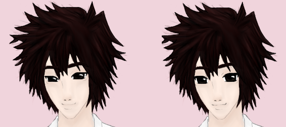
I've been changing things a bit editing all the sprites. I have an issue XD the longer I look at their faces, the more I think their eyes are too big so I tried making hiro's eyes smaller. (let me know which one you like better)
and as for other things, I've also been making progess:
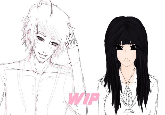
I've been changing yuichi and daichi too. Yuichi especially because I was unhappy how he looked.
hopefully all bases will be done before april, and they'll have atleast their uniforms made. now i just have to find time to finish this =D
I've been changing things a bit editing all the sprites. I have an issue XD the longer I look at their faces, the more I think their eyes are too big so I tried making hiro's eyes smaller. (let me know which one you like better)
and as for other things, I've also been making progess:
I've been changing yuichi and daichi too. Yuichi especially because I was unhappy how he looked.
hopefully all bases will be done before april, and they'll have atleast their uniforms made. now i just have to find time to finish this =D
-
Snowflower
- Bishie Fangirl
- Posts: 814
- Joined: Sat Jan 01, 2011 11:24 pm
- Completed: Idol Crush
- Projects: Shugojin!, RockRobin (openmodewriter), your highness
- Soundcloud: jenna-yeon
- Location: Orange County, CA
- Contact:
Re: Strings of Fate (WIP) GxB. Feedback appreciated! :)
For Hiro, I don't think there was anything wrong with his face. I definitely like the right drawing better. Some may disagree, but I think it's perfectly fine for guys to have big eyes, especially in the anime drawings. & it seems like his personality also fits with his drawing.
In the newer Yuichi drawing... he looks much older than his original drawing. I might have different opinion when I see the colored picture, but so far, Yuichi's new drawing is fine. I like it.
I'm assuming the girl in the WIP is Shizuka? She looks fine, but I think her hair needs more distinction with the highlighting.
Completed: Idol Crush | WIP: your highness | Hiatus: Shugojin!| Follow Me on Twitter | Subscribe to YouTube
your highness @ 102k as of 2/13
Who is online
Users browsing this forum: Google [Bot]