Well, hi, guys. I'm gonna spam this thread with my art, because I'm in need of feedback.
Estelle Uniform
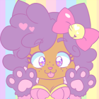
This is one of my most recent works and probably the one I'm most satisfied with (especially compared to my prior version of the same character ^^; I'm not even going to show that one.)
The Wind Of Change
This one is also done recently and is the first with a (sort of) background. Continuing to experiment, happy with the overall result, I like the hair.
Dreamer...
The last picture I did, experimented with blurring and with fainter shades. A bit more on the realistic side (at least regarding the features, I don't mean the colours. xD)
All in all, these are the digital works I feel best about.
~Do you think they're anatomically correct?
~Do the poses look natural?
~Is there any other mistake you can notice?
~As a whole, how do you like the pictures?
Thanks in advance, guys~ (:
P.S. I meant to simply attach the pictures, but they're huge!
P.P.S. You might want to check my deviantArt page for more art. (:
Veniae's artwork, critique appreciated.
-
Lotus
- Veteran
- Posts: 298
- Joined: Thu Jan 06, 2011 9:28 am
- Projects: Unnamed Slenderman VN, Secret 10560
- Location: USA
- Contact:
Re: Veniae's artwork, critique appreciated.
For the most part to me your pictures look anatomically correct and the poses are natural, though your shading is too soft. Don't be afraid to shade a little darker, it really helps pictures look 3 dimensional.
Re: Veniae's artwork, critique appreciated.
@Lotus: Oh, thanks. I'll keep that in mind - in fact I really have this tendency to reduce the opacity of the shading because I think it's too dark. xD
-
Pyonkotchi
- Veteran
- Posts: 494
- Joined: Sat Jun 19, 2010 1:19 pm
- Projects: Magical Warrior Diamond Heart, unLucky Love, Phantom Thief Asterism
- Tumblr: magicalwarriordiamondheart
- Deviantart: PastelPyon
- itch: Pyonkotchi
- Location: Illinois
- Contact:
Re: Veniae's artwork, critique appreciated.
added more shading and folding of the clothes and skin. as well as the hair a bit
the anatomy was pretty good except the foot was weird and the right art should be a bit more visible i think
i found these do be really healpful clothing tuts, by the way.
http://darlingmionette.deviantart.com/a ... -176140835
http://darlingmionette.deviantart.com/a ... -176116285
for that second pic, i think you should ad the same motion in the grass, headphone cord, and clothing as in the hair. it looks like theres a LOT of motion in the hair, but everything else is very still

Re: Veniae's artwork, critique appreciated.
You are great. Thanks so much for taking the time to edit my pic, that shading is pretty awesome. I shall use it as a reference in the future. *o* And yeah, you're right about the hand. I kinda suck at drawing them, that's why I try to avoid them. xD
And about the tuts, yeah, I know them. They're really useful (and DM is one of my favourite artists on dA)~ Thanks for sharing though~
Once again, thanks for everything! It's sooo helpful and I'll keep it in mind (:
And about the tuts, yeah, I know them. They're really useful (and DM is one of my favourite artists on dA)~ Thanks for sharing though~
Once again, thanks for everything! It's sooo helpful and I'll keep it in mind (:
Who is online
Users browsing this forum: No registered users