my drawings and stuff. critiques welcomed

Use this forum to help develop your game-making skills, and get feedback on writing, art, music, or anything else you've created that isn't attached to a game in progress.
Locked
Message
Author
User avatar
bilibala
Newbie
Posts: 17
Joined: Tue Jun 07, 2011 1:41 pm
Contact:

my drawings and stuff. critiques welcomed

#1 Post by bilibala »

I kinda pick up the hobby of drawing comics few months back but felt compelled to take a break improve my techniques (it was quite sloppy lol). Anyway here are some stuff I'm practicing with, just girl characters for now .... I'll append to this thread when I learn to do other stuff:

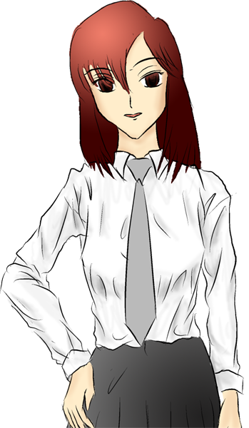
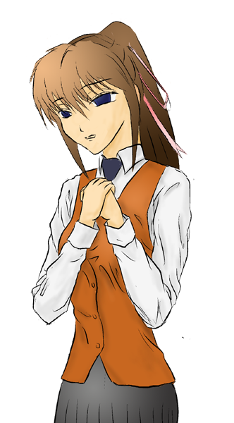
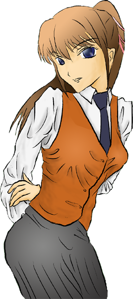
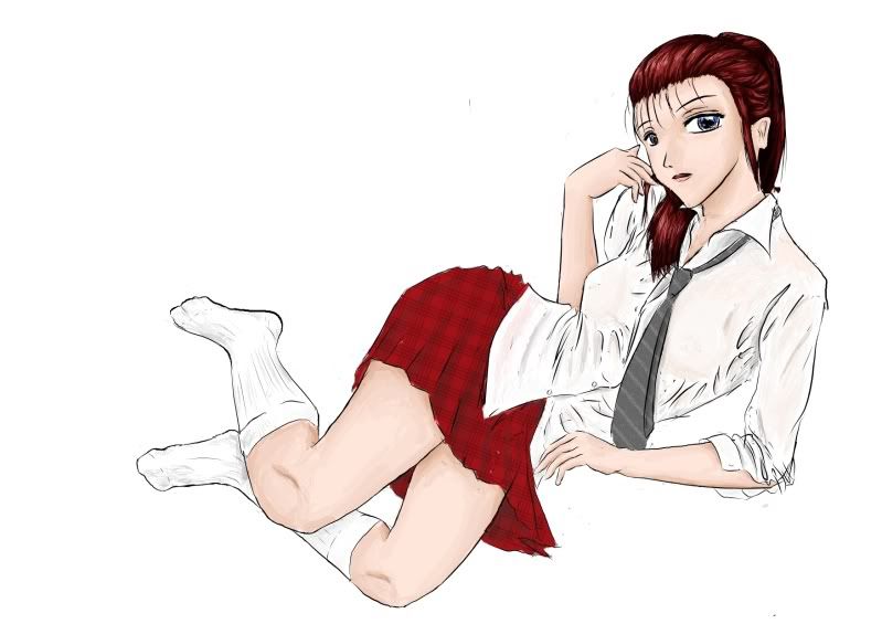
random schoo girl ... I think I broke her spine in this one lol
Image

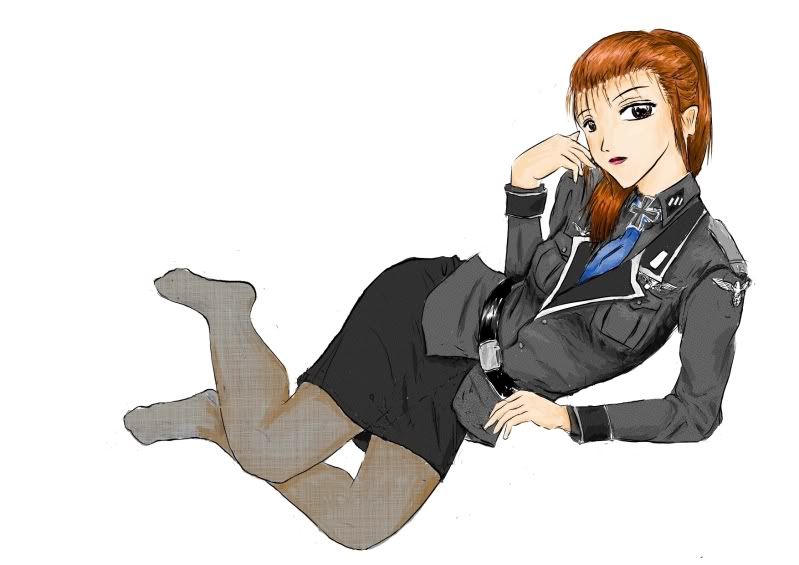
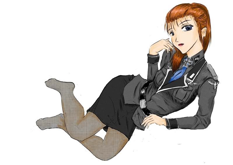
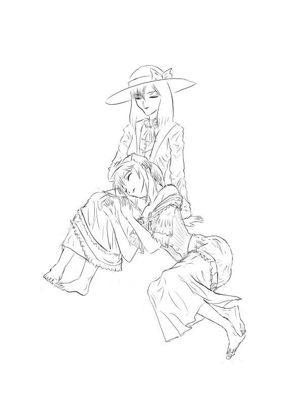
Nazi version. No shoes for her atm cause I fail to draw it right yet lol ...
Image

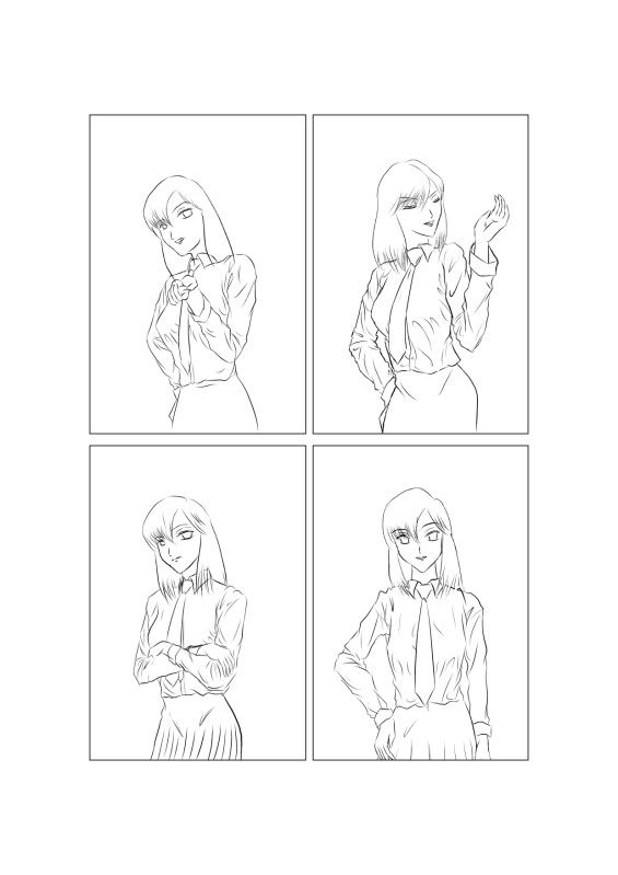
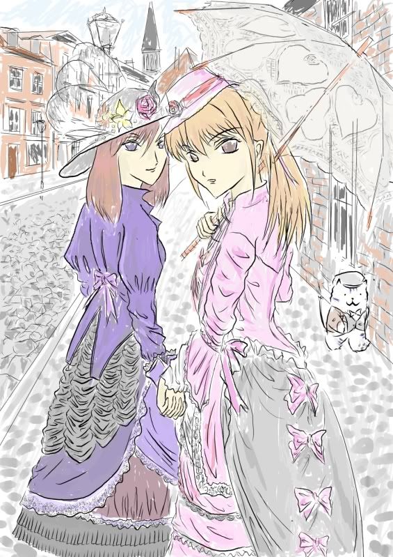
Concept art for two characters from the comic series I'm trying to do, Vivian(Left) and Sona (right). The series doesn't have a fixed settings, but more like random adventures/comedies that evolves around the same set of characters. In this case they are in victorian times Britain:
Image

Drafting for another one. Still need to round up the clothings and add some background
Image

Redoing some clipart from the comics
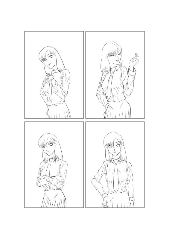
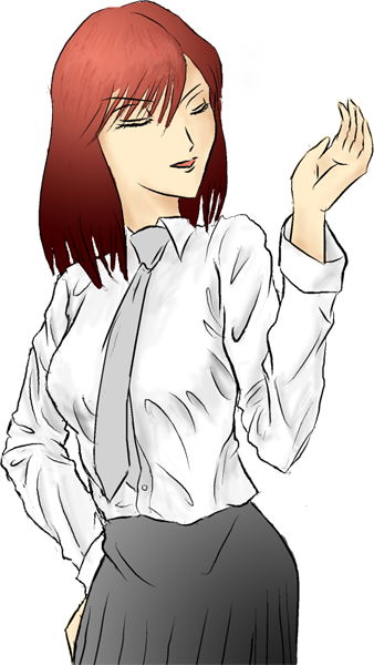
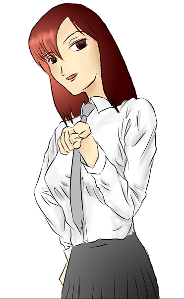
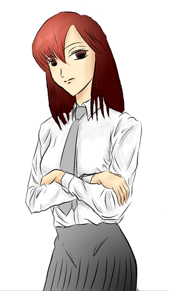
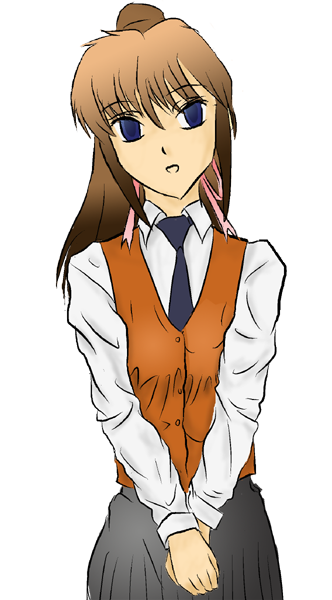
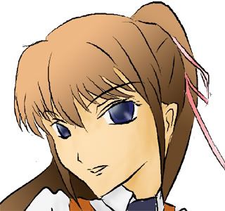
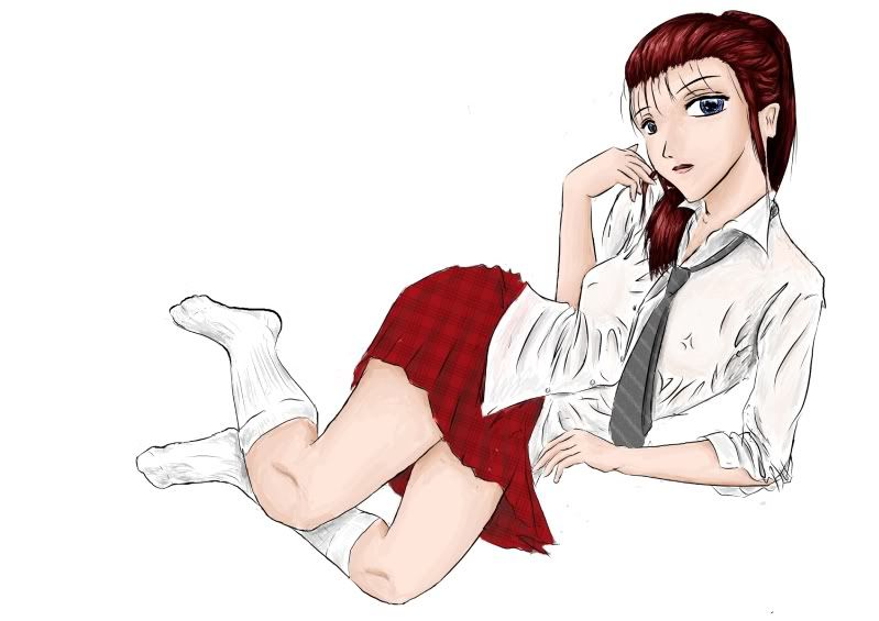
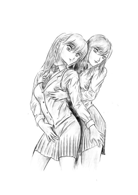
V & S were originally school girls
Image
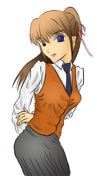
Not so happy with the fabric folds especially the waist coat.. color it some day when I figured how to fix it


I kinda like the idea of renpy (much less frames to draw vs doing comics lol and less perspective involved). Maybe I will do some of stories in renpy style some day lol. I don't know how to do coloring tho', comics are just b/w ... so maybe I need to take a course or something for that :|

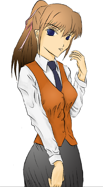
I drew and colored these in comic studio fyi.

Anyway critiques and opinions welcomed. Thanks~
Last edited by bilibala on Sat Jun 11, 2011 12:06 pm, edited 1 time in total.

User avatar
bilibala
Newbie
Posts: 17
Joined: Tue Jun 07, 2011 1:41 pm
Contact:

Re: my drawings. critiques welcomed

#2 Post by bilibala »

Hmm, kinda quiet here lol.

Anyway, tried to make some sprites for fun today:
Image


1st time using photoshop for coloring (very old version 7.0). Doesn't quite know how to do things there yet ... anyway, here is few sprites of Vivian:


Image
"Whatever."
Image
"My 7 year-old sister could have done better."
Image
"This is the most retarded thing I have seen."
Image
"Hope it will be better next time."

User avatar
bilibala
Newbie
Posts: 17
Joined: Tue Jun 07, 2011 1:41 pm
Contact:

Re: my drawings. critiques welcomed

#3 Post by bilibala »

Made a few sprites of Sona so V got someone to chat with. Got better idea in handling layering when I do color now:

General:
Image

Playful .. sort of:
Image

Dreamy:
Image

Sad panda:
Image

KimiYoriBaka
Miko-Class Veteran
Posts: 636
Joined: Thu May 14, 2009 8:15 pm
Projects: Castle of Arhannia
Contact:

Re: my drawings and stuff. critiques welcomed

#4 Post by KimiYoriBaka »

hmm, there's two things that seem off about every drawing
1. the head is rather large compared to the body
2. the eyes seem to be higher on the face than normal. either that or the hair isn't coming up very much as it leaves the skull.

other than that, I would suggest not emphasizing quite so many wrinkles. they may be there, but they don't all need to have thick lines to represent them.

Tachyglossus
Regular
Posts: 164
Joined: Wed Dec 01, 2010 7:43 pm
Projects: Sprite Art for: "Final Banquet", "365 Days"
Location: British Columbia
Contact:

Re: my drawings and stuff. critiques welcomed

#5 Post by Tachyglossus »

Not only does the random school girl have a broken spine but a birth defect! She has six fingers!

Also in general I would like to say sometimes you make the hands too small.

I second Kimi's comment about less emphasis on the wrinkles. With lineart, less is more if you are going to colour something anyway. Let the shading reflect the folds. It's a pleasant attention to detail, but it still is best not to put in that many folds in the actual lineart.

User avatar
Sapphi
Eileen-Class Veteran
Posts: 1685
Joined: Fri Jun 05, 2009 3:31 am
Completed: Boku no Taisetsu na Yumeko
Projects: Twelve, PAW ★ PRINTS
Organization: Kitsch-soft
Location: Illinois, USA
Contact:

Re: my drawings and stuff. critiques welcomed

#6 Post by Sapphi »

I think the wrinkles wouldn't look so excessive if there was more line detail in their hair... it is pretty flat and plain by comparison. I for one like the wrinkly look, but to pull it off well you do need to employ more logic about where they would actually be, and not just draw them everywhere, or it starts to seem like these girls are either competing in a wet blouse contest or just leave their uniforms crumpled up in a corner when they aren't wearing them :lol:

There's a certain playfulness about your style that I really like, and I'm jealous of you because you are much better than me with drawing hands and feet. :P I also love the idea of taking two characters and dropping them into various settings (an idea I'm toying with for two of my own after the story they initially play a role in is finished). The one real critique I want to make is that these girls aren't showing a wide range of emotion. As it stands, they kind of remind me of robots. (Part of that is probably the lack of reflection in their eyes, but I know that's a stylistic choice.) IMO one of the most fun parts about manga style is the exaggerated expressions, so don't be afraid to get a little crazy with it! ^0^
"It is [the writer's] privilege to help man endure by lifting his heart,
by reminding him of the courage and honor and hope and pride
and compassion and pity and sacrifice which have been the glory of his past."
— William Faulkner
▬▬▬▬▬▬▬▬▬▬..+X+..▬▬▬▬▬▬▬▬▬▬
Image

User avatar
kkffoo
Regular
Posts: 133
Joined: Wed Sep 22, 2010 3:17 am
Completed: Tea For Two [KN]
Location: UK
Contact:

Re: my drawings and stuff. critiques welcomed

#7 Post by kkffoo »

What I really like about your drawings is the emotion that comes through the facial expression and body language.
As for wrinkles, maybe less is more. A well placed fold, or patch of shading indicates the rest.

User avatar
bilibala
Newbie
Posts: 17
Joined: Tue Jun 07, 2011 1:41 pm
Contact:

Re: my drawings and stuff. critiques welcomed

#8 Post by bilibala »

Thanks a lot for the feedback! Made some quick fixes see if that address the problems.

Indeed I tend to lose the proportion with head. I rescale the head so the width is now around half the shoulder width. I think the hand size problem was due to the head went to big, with smaller heads now they can vaguely cover from chin eye lash/brow when they go /faceplam. See if it's better:
Image
Image
Gonna fix their fabric wrinkles later.

I don't how to resize multiple layers of a partial selection in Photoshop 7.0 yet. I tried linking the layers and/or placing them in folder set, but seems I can't edit them at once unless I merge them (Please teach me if you know how lol). I only edit one of the sprites with color:

resized head:
Image

spent some more time with the eye details:
Image
Darker pupil and less reflection (is better vs above?)
Image
Gradient on the iris was kinda weak I think.

I wish I can do more texture in the hair like those in the random school/nazi girl one, but I don't know how to get the brush work the way I want yet in PS 7.0 (like stroke-in stroke-out touch and pen pressure issues). I'll update it when I figure it out.

I'm kinda happy with eyes/nose/mouth placement atm, but indeed their hair isn't very puffy. This is what I had in mind:
Image
I'll experiment more with other hair styles and see if it's an eye or hair issue.

And yea I was really careless about the lines and left her with 6 fingers lol. Thanks for spotting that out!!
Image
Image
Shrinked her head size a bit. Her left eye was a bit off (too high), I lowered it a bit. See if it's more proportional now. Also reduced some wrinkles on the clothes in the lineart.

User avatar
OtomeWeekend
Eileen-Class Veteran
Posts: 1087
Joined: Tue Apr 19, 2011 1:29 am
Location: Somewhere seaside
Contact:

Re: my drawings and stuff. critiques welcomed

#9 Post by OtomeWeekend »

if you don't mind some extra "a bit off" I noticed....

....The position of the breasts are a bit off, its lower than the usual position(wouldn't mind if you were drawing an old lady but it seems they aren't and they are high school students). Oh, and I'm pointing out the sprites I mean. :D
"The weak can never forgive. Forgiveness is the attribute of the strong." ---Mahatma Gandhi

I no longer use this account. Please refer to my new account, enta if you want to contact me. Thank you.

Locked

Who is online

Users browsing this forum: No registered users