I want my art to improve, so any tips/suggestions will be greatly appreciated ^^
I drew these recently(the one on the bottom I drew today):
Death_HUG drawings, critque please
-
Death_HUG
- Veteran
- Posts: 246
- Joined: Sun Jun 26, 2011 6:31 pm
- Projects: A Mysterious Note
- Location: ...behind you...
- Contact:
Death_HUG drawings, critque please
- Attachments
-
-
-
-
15385bic

- Miko-Class Veteran
- Posts: 771
- Joined: Tue Jun 28, 2011 7:39 am
- Location: Australia
- Contact:
Re: Death_HUG drawings, critque please
ok critique huh?
the first pic....wat did he do to that metal bay looking thing?? its twisted like a rasberry licorice.
if he did hit something - it should be bent in one direction? like a v? (the guy himself i quite like though ^_^ <-- has that cool look)
second pic and third ..... not much i can say - they look fine to me


-
Snowflower

- Bishie Fangirl
- Posts: 814
- Joined: Sat Jan 01, 2011 11:24 pm
- Completed: Idol Crush
- Projects: Shugojin!, RockRobin (openmodewriter), your highness
- Soundcloud: jenna-yeon
- Location: Orange County, CA
- Contact:
Re: Death_HUG drawings, critque please
I think overall, your pictures are great. One of the things you should watch out for is your proportions. (like upper body to lower, make sure the body is big enough for the head)
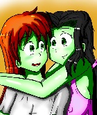
like the first picture, the legs look short in comparison to the rest of the body. the shoulders on the second picture look a little bit too narrow in whole when looking at the girl's head size. In the third picture, the guy is smaller framed than the girl, isn't it normally the other way around?
These are just my thoughts.

Completed: Idol Crush | WIP: your highness | Hiatus: Shugojin!| Follow Me on Twitter | Subscribe to YouTube
your highness @ 102k as of 2/13
Re: Death_HUG drawings, critque please
Study anatomy and structure a bit, it'll help you draw bodies better. Also try using more hues in your shading, as well as using hard brushes to define shadows better.
Re: Death_HUG drawings, critque please
First, great drawings!
The first one, looks great. (How he managed to do that to the baseball bat!?) But the legs looks a bit short.
And in the third one, the guy face looks a little small. Or maybe ... is not wide enough? Or maybe the neck is too wide.
The first one, looks great. (How he managed to do that to the baseball bat!?) But the legs looks a bit short.
And in the third one, the guy face looks a little small. Or maybe ... is not wide enough? Or maybe the neck is too wide.
-
felisselita
- Newbie
- Posts: 16
- Joined: Thu Jul 21, 2011 12:26 am
- Completed: "Starstorm", a BL visual novel game
- Tumblr: felisselita
- Deviantart: felisselita
- itch: felis-selita
- Contact:
Re: Death_HUG drawings, critque please
That's already a great drawing, I think. XD
Coloring is quite good but maybe you need some more shading. And also, maybe the lines are a bit too pale-colored, I mean they don't look so clear~ O.O
Hope that helps ^^
Coloring is quite good but maybe you need some more shading. And also, maybe the lines are a bit too pale-colored, I mean they don't look so clear~ O.O
Hope that helps ^^

Starstorm by felisselita, a BL visual novel with minigames! Get it here: https://felis-selita.itch.io/starstorm
Re: Death_HUG drawings, critque please
I think overall, your style is adorable! I just looove the big eyes and the hair <3 >.<
But, I'd have to agree with SnowFlower, rincewind and Fawn. Studying proportions would help create more exciting poses. (I myself am still learning to improve on these things.) Right now, your pictures look very flat. (I think that's the word..) If the character him/herself is in a stationary position, I find that it's always more interesting if something else is moving. For example, I usually like to make the clothes look like they're flowing in the wind or I'd draw the character doing something with it (like grabbing it, pulling it, etc.. ), or another thing you can do is add more creases to them.
Also, try flipping the picture to make sure that it looks good both ways before you start inking it, I usually find most of my mistakes by doing this.
As for coloring and lineart, you seem to have lines mastered (They're godly! *-*), and you put my hair to shame, but the coloring, is also very flat. The color palette is wonderful, but the shading is too light! Let it show! Show us how hard you worked on them! >< Try using complimentary colors (like what you did with the hair) instead of a darker shade of the color you are using. Experiment with them, you might find that the two most unlikely looking colors look amazing together. And if you're working on white, just use a light shade of a color that's already in the picture. (Ex: Red=pink) It makes the white stand out more.
..Just some suggestions.
Omo, omo, omo, aigoo.
Sorry for all of these: [!!!!]
-
Death_HUG
- Veteran
- Posts: 246
- Joined: Sun Jun 26, 2011 6:31 pm
- Projects: A Mysterious Note
- Location: ...behind you...
- Contact:
Re: Death_HUG drawings, critque please
@15385bic
Thank you ^^ I was trying to figure out how to draw a metal bat.
@Snowflower
I am not good with proportions >.>; thank you for pointing out what's wrong with my drawings ^^
@Fawn
Thank you, I'll make sure to study anatomy and use harder brushes.
@rincewind
I think I made his neck too wide >.>; and thank you.
@felisselita
Thank you, that helped. I'll try to make my shading darker.
@Version
I'm not very good at proportions, so I have to study really hard >.< thank you for your suggestions, I'll make sure to do them ^^
I drew a picture today, hopefully it's okay ^^;
- Attachments
-
-
15385bic
- Miko-Class Veteran
- Posts: 771
- Joined: Tue Jun 28, 2011 7:39 am
- Location: Australia
- Contact:
Re: Death_HUG drawings, critque please
the angel is really cute
I quite like ur colouring - soft a light
=D
I quite like ur colouring - soft a light
=D
-
Death_HUG
- Veteran
- Posts: 246
- Joined: Sun Jun 26, 2011 6:31 pm
- Projects: A Mysterious Note
- Location: ...behind you...
- Contact:
-
Zocha
- Newbie
- Posts: 8
- Joined: Wed Jan 19, 2011 11:18 pm
- Projects: Magiflyte (GxB, fantasy), Creatopia
- Location: US West Coast
- Contact:
Re: Death_HUG drawings, critque please
Your art is looking super-cute, especially your chibi characters! ^^
Most of the stuff to improve on was already mentioned by other people, so I was wondering if you use wire skeletons (I'm not quite sure what they're called -- they're those stick figure-like things) in your sketching process. If not, you should consider using them even if they seem like more work than they're worth, because they can really help with proportions and for adding volume and a sense of 3D to your art.
Most of the stuff to improve on was already mentioned by other people, so I was wondering if you use wire skeletons (I'm not quite sure what they're called -- they're those stick figure-like things) in your sketching process. If not, you should consider using them even if they seem like more work than they're worth, because they can really help with proportions and for adding volume and a sense of 3D to your art.
Re: Death_HUG drawings, critque please
Nice! The chibis are really cute!
-
Death_HUG
- Veteran
- Posts: 246
- Joined: Sun Jun 26, 2011 6:31 pm
- Projects: A Mysterious Note
- Location: ...behind you...
- Contact:
Re: Death_HUG drawings, critque please
@Zocha
Thank you. I don't use wire skeleton, I've tried it before, but the character would always come out wierd. I'll try using again ^-^
@rincewind
Thank you ^-^
I drew another picture! Inspired by Super Junior's Mr.Simple >///< Kyaa~ Eunhyuk!!
Thank you. I don't use wire skeleton, I've tried it before, but the character would always come out wierd. I'll try using again ^-^
@rincewind
Thank you ^-^
I drew another picture! Inspired by Super Junior's Mr.Simple >///< Kyaa~ Eunhyuk!!
- Attachments
-
Re: Death_HUG drawings, critque please
He keeps changing his hair color!! ><
I like how you did the lighting! And his hat looks awesome *-*
I like how you did the lighting! And his hat looks awesome *-*
Omo, omo, omo, aigoo.
Sorry for all of these: [!!!!]
-
aestate

- Regular
- Posts: 100
- Joined: Sat Apr 10, 2010 10:36 pm
- Projects: Twinkle Twinkle
- Location: Canada... eh.
- Contact:
Re: Death_HUG drawings, critque please
OMG LOL, I had a mini spaz-attack when I saw your avatar in the forums. Then I lurked and noticed your latest picture in this thread. <333
Nice job with the lighting and the colouring~although just a comment, I think his hair / body / etc. are in proportion, but his face looks a bit small in comparison. (But then again, I'm no pro!)
Also, Eunhyuk's concept for Mr Simple is so adorable! I saved like a gajillion pictures of him, hurrhurrhurr. He's not even my bias OTL.
Who is online
Users browsing this forum: No registered users