Note: Her dialog is intentionally that rigid.
UI troubleshooting
-
KomiTsuku

- Eileen-Class Veteran
- Posts: 1023
- Joined: Mon Sep 22, 2008 11:32 pm
- Completed: Dreams of the Skies, Anton's Vacation, Luka, The Halberd and The Tiger, Rising Angels, Pyrite Heart, Rising Angels: Reborn, The Halberd and The Fox, VN Tycoon, RA: Hope
- Projects: Rising Angels
- Organization: IDHAS Studios
- IRC Nick: Komi
- itch: idhas
- Location: Somewhere
- Contact:
UI troubleshooting
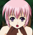
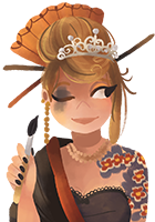
Okay, anyone who has seen my past games knows that there is generally a major issue between the quality of everything else vs the quality of the UI. The issues range from unreadable text to ugly textboxes. That's mostly because I am not an artist in the slightest. So I decided to take a moment and get some quick feedback on an upcoming kinetic novel I'm working on. If there is anything that just doesn't look right, is unreadable, or just plain ugly, let me know. Also curious if folks like the art style. It's different than the traditional cel-shaded anime I normally work with.
Note: Her dialog is intentionally that rigid.
Note: Her dialog is intentionally that rigid.
My common sense is tingling!
Woah! I actually have a website now. It never updates!
Woah! I actually have a website now. It never updates!
-
Cidz
- Veteran
- Posts: 458
- Joined: Wed Jul 27, 2011 1:50 pm
- Completed: The Forgetful Kiwi [NanoReno 2012], Papercut [NanoReno 2013]
- Projects: Words Within Our Hearts, Papercut [NanoReno 2013]
- Organization: Starlight Melodies
- Tumblr: starlightmelodies
- Deviantart: cidthekitty
- Location: California, USA
- Contact:
Re: UI troubleshooting
i think it looks fine. its simple and easy to read and the colors go well.

-
papillon
- Arbiter of the Internets
- Posts: 4107
- Joined: Tue Aug 26, 2003 4:37 am
- Completed: lots; see website!
- Projects: something mysterious involving yuri, usually
- Organization: Hanako Games
- Tumblr: hanakogames
- Contact:
Re: UI troubleshooting
It's not unreadable, but it's not pretty either, and definitely looks of a lower quality level than the rest of the art.
Of course, I'm one to talk, because I am *terrible* at UI design myself. Still, sometimes less is more. It may be better to make a simple flat roundrect (giving it space from the screen edges) rather than trying to rely on beveling to make the box look more interesting.
A lot of Japanese VNs have something as simple as that, sometimes with slight variations like a top-to-bottom gradient and a faint pattern overlay (quite often focusing in one corner).
Also, the 'Menu' up in the corner needs work. It looks like a bevel effect has been run on the text, but it didn't work evenly, so they're lumpy and puffy rather than being three-dimensional, and the sharp pixel edges on the M really stand out and look broken. This to my eye is the most important thing that needs fixing.
-
Tag-
- Miko-Class Veteran
- Posts: 508
- Joined: Tue Jul 05, 2011 7:50 am
- Projects: Circo della Sera
- Contact:
Re: UI troubleshooting
The text itself is quite clear, though the font bothers me a lot. I think it looks....unattractive, for lack of a better term, and I generally do not like large text since it often looks pixelated. The shadow in the corner also bothers me, it looks like the box is indented into the screen, and is very distracting. I concur with papillon's suggestion of giving the text box 'space' from the screen edges.
The colour scheme looks good though, and the art looks quite stunning~ I think it's the difference in quality between the art and UI that mainly bothered me.
The colour scheme looks good though, and the art looks quite stunning~ I think it's the difference in quality between the art and UI that mainly bothered me.
PM me if needed
Re: UI troubleshooting
The bevel of the text box isn't the same size as that of the name box which gives an unbalanced look. I've also never been a fan of non-opaque full-width text boxes -- it sort of divides the background into two parts.
The "Menu" text looks overdesigned to the point where it becomes harder to read. The text should better match the style of the name/dialog.
Bold centered name text works well, and the text sizes are fine. Internal padding seems reasonable. The font used is a bit bland, but not bad. I would strongly recommend adding an outline or shadow to the text to improve readability. Plain text also has a tendency to look a bit "cheap". Why is there no anti-aliasing on the text?
-
KomiTsuku
- Eileen-Class Veteran
- Posts: 1023
- Joined: Mon Sep 22, 2008 11:32 pm
- Completed: Dreams of the Skies, Anton's Vacation, Luka, The Halberd and The Tiger, Rising Angels, Pyrite Heart, Rising Angels: Reborn, The Halberd and The Fox, VN Tycoon, RA: Hope
- Projects: Rising Angels
- Organization: IDHAS Studios
- IRC Nick: Komi
- itch: idhas
- Location: Somewhere
- Contact:
Re: UI troubleshooting
How would I add the shadow or outline? I've completely forgotten a lot of my text commands.AxemRed wrote:I would strongly recommend adding an outline or shadow to the text to improve readability. Plain text also has a tendency to look a bit "cheap". Why is there no anti-aliasing on the text?
Also, redoing a lot of what everyone mentioned when I get back from work. Thanks for the suggestions!
And that, my friends, is the difference between a professional artist and me. XD Maybe I should also contract the UI out, but I'm trying to get better first.Tag- wrote: The colour scheme looks good though, and the art looks quite stunning~ I think it's the difference in quality between the art and UI that mainly bothered me.
My common sense is tingling!
Woah! I actually have a website now. It never updates!
Woah! I actually have a website now. It never updates!
-
Rin
- Regular
- Posts: 127
- Joined: Thu Oct 20, 2011 5:45 pm
- Projects: Kaguya-hime, La Cage, Puella Magi Ibuki Magica, The Product of Poison
- Organization: Kaguya-hime developer, TwinTurtle, Polymorphic
- Location: Yokohama, Kanagawa
- Contact:
Re: UI troubleshooting
You can always change the font to improve attractiveness. Usually I use this site as fonts resources. It's free and high-quality :p
For the shadow and outline, here's the tutorial from Ren'py Cookbook:
I don't have the files, so I just can make some samples with PTS so it might look odd x_X
I'm sorry if it couldn't help
For the shadow and outline, here's the tutorial from Ren'py Cookbook:
The textbox looks fine itself. I like the color :3 But if you wanna make a little change while maintaining the classic look, how about like add more dark gradient on the bottom and transparent at top?To edit how your text looks, look a little further down in your options.rpy for these lines of code:
Uncomment those lines to change the font or size of the text. Even though it is not included in your file, you can also change just about any aspect of the styles that you want. You can change the color, add a drop_shadow, or an outline if you wanted. Here's an example of each:Code: Select all
    ## The file containing the default font.
    # style.default.font = "DejaVuSans.ttf"

    ## The default size of text.
    # style.default.size = 22
In addition to those, you can use all of the text properties seen hereCode: Select all
style.default.color = "#000000" #Makes text black

    style.default.drop_shadow = [(1, 1)] #Adds a shadow one pixel to the right and one pixel down

    style.default.outlines = [(4, "#ff0000", 0, 0), (2, "#fff", 0, 0)] #Adds a white outline 4 pixels thick, and then a black outline, 2 pixels thick

    style.default.xalign = 1.0 #aligned the text completely to the right
I don't have the files, so I just can make some samples with PTS so it might look odd x_X
I'm sorry if it couldn't help
- Attachments
-
-
-
Aleema
- Lemma-Class Veteran
- Posts: 2677
- Joined: Fri May 23, 2008 2:11 pm
- Organization: happyB
- Tumblr: happybackwards
- Contact:
Re: UI troubleshooting
The bevel effect is cheapening it, since bevel went out of style in the 90s. If you want to use bevel, reduce the border size by a lot and make it sharper. Most important improvement you can make is just making the entire GUI sharper, to match the style of the sprites.
I actually really like Rin's first example. Very professional looking, and simple. It will be harder to translate to Ren'Py, since that sort of drop_shadow on the text can't exist, but in general, the flat text BG fading transparency near the top is very nice looking.
I like earth tones, so the tan isn't ugly to me, but the text must definitely have some sort of drop_shadow or outlines on it, if you keep the text white. A dark brown will do.
Lastly, give the dialogue box the same margin as the name box. It irks me to see it touch the sides but the namebox doesn't.
All in my opinion, of course.
Re: UI troubleshooting
Black gradient Dunamis-style seems to be the trend lately
http://andriasang.com/comxtw/dunamis_15_video/
though I'm still not sure if this will be a hallmark of late 2000's VNs as blue textboxes were for 90s JRPGs.
http://andriasang.com/comxtw/dunamis_15_video/
though I'm still not sure if this will be a hallmark of late 2000's VNs as blue textboxes were for 90s JRPGs.
Re: UI troubleshooting
I don't know much about UI and stuff, but I'll give you some observations I've noticed as a gamer.
There used to be issues with games where the text was too large in relation to the textbox itself. Text would be too close to the edges of the textbox as a result. That's what's happening with your situation. I'd recommend making the text smaller, and keeping it away from the edges. These issues appear in fan-subbing and manga scanlations as well; for fan-subs, the subbers tend to put the text too low on the screen (which causes issues for overscan), and scanlators tend to make their text stick to edges of the speech bubbles.
For manga, compare these two pages:
VERSUS
 Notice how the text is really huge in the first one, and sticks to the edges of the speech bubbles. Looks pretty unprofessional. Now looking at the second one, the text is much, much smaller, and more condensed.
 BTW I love Masrur.
For games:
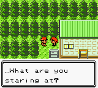 versus
  Notice the difference in a) the text size with respect to the textbox size; b) the text's distance from the edges of the textbox; and very importantly c) the ratio of how much the screen is taken up by the textbox. Notice in Pokemon Gold (the former), the textbox is HUGE compared to the screen size. Now look at Pokemon Black (the latter), and you'll notice that the textbox size is much smaller. In Gold, you could fit maybe two more of those textboxes, whereas in Black, you could fit three more.
Also, add borders to your textboxes. Borders make things look much more appealing for almost anything. It segregates the textbox from the backgrounds, the sprites, and makes it more definitive. Hakuouki has some very nice border work:
 If the borders weren't there, the textbox would feel like it's melting into the backgrounds and such. Again, notice how you can neatly fit plenty of text there. I also think adding spaces around the outside of the borders is attractive (notice how the textbox doesn't simply stick to the edge of the screen). Now, Hakuouki uses a similar brown to yours, and also reduced its opacity. The difference here is that they decided to use a nice, solid black. The font itself obviously works with the UI because it's very Japanese-ish. It's optional, but you can change your font to something else that feels a little less standardized, or whatever fits your VN. Oh yeah, I don't recommend making your lower-case letters as large as Hakuouki's font; Japanese characters are larger in comparison to ours, since ours differ in height whereas Japanese heights are all the same.
tl;dr: Here are my suggestions:
1. Shrink your text size.
2. Keep your text away from the borders of the textbox.
3. Change your font colour to a solid black.
4. Add a solid border to your textbox.
5. Shrink the textbox itself so that you can fit three of them on your screen, on top of the one you have right now (four in total). I think you're OK on this point.
6. Add spaces around the outside of the textbox so it doesn't touch the edges of the screen.
7. A veeery thin white border around the black text wouldn't hurt either.
8. Change your font style to something a little less standardized, or something that suits your VN.
9. Remove bevel.
Again, I'm not a professional, but I have been a gamer for a very long time, and reading's a hobby of mine, so these are just some of my observations. I hope that helped. Sorry for overly long post.
There used to be issues with games where the text was too large in relation to the textbox itself. Text would be too close to the edges of the textbox as a result. That's what's happening with your situation. I'd recommend making the text smaller, and keeping it away from the edges. These issues appear in fan-subbing and manga scanlations as well; for fan-subs, the subbers tend to put the text too low on the screen (which causes issues for overscan), and scanlators tend to make their text stick to edges of the speech bubbles.
For manga, compare these two pages:
VERSUS
For games:
versus Also, add borders to your textboxes. Borders make things look much more appealing for almost anything. It segregates the textbox from the backgrounds, the sprites, and makes it more definitive. Hakuouki has some very nice border work:
tl;dr: Here are my suggestions:
1. Shrink your text size.
2. Keep your text away from the borders of the textbox.
3. Change your font colour to a solid black.
4. Add a solid border to your textbox.
5. Shrink the textbox itself so that you can fit three of them on your screen, on top of the one you have right now (four in total). I think you're OK on this point.
6. Add spaces around the outside of the textbox so it doesn't touch the edges of the screen.
7. A veeery thin white border around the black text wouldn't hurt either.
8. Change your font style to something a little less standardized, or something that suits your VN.
9. Remove bevel.
Again, I'm not a professional, but I have been a gamer for a very long time, and reading's a hobby of mine, so these are just some of my observations.
Who is online
Users browsing this forum: No registered users