I know I created a thread once asking for opinion about a piece of artwork for a convention, but I'm gonna pull a personal thread so that I could improve some-some and more. Like I mentioned in the "Critique Please" discussion, I'm gonna edit the first post a lot to keep track what I do have up and what not so bear with me.
The following could be critiqued:
In need of critique:
http://i6.photobucket.com/albums/y236/d ... epose1.png
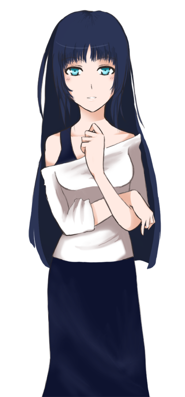
Here's my first piece. I'm working on sprites for 軽い夏: The Sun Will Shine Through but I'd like to know what I'm doing right and what I'm doing wrong. I'd also would like to hear about what size of sprites would work within a 800x600 screen, an efficient way of saving these sprites so they don't take up space, and how the process of JCC work exactly.
Another thing: I would like to know if I should stick with clean coloring or more painterly for sprites.
Cookies to those who would critique my painterly drawing of the Aces. <3
[Crit] CaesMRaenes: Art Thread
-
CaesMRaenes
- Regular
- Posts: 132
- Joined: Wed Aug 19, 2009 12:42 am
- Projects: 軽い夏, The Aces
- Contact:
[Crit] CaesMRaenes: Art Thread
a.k.a. DragonfaeryYume on dA
The Vault in the Sky (Dev Blog)
Projects:
WIP The Aces
WIP (Head Artist) 軽い夏: The Sun Will Shine Through (tentative title)
The Vault in the Sky (Dev Blog)
Projects:
WIP The Aces
WIP (Head Artist) 軽い夏: The Sun Will Shine Through (tentative title)
-
Samu-kun

- King of Moé
- Posts: 2262
- Joined: Mon Sep 03, 2007 3:49 pm
- Organization: Love in Space Inc
- Location: United States
- Contact:
Re: [Crit] CaesMRaenes: Art Thread
The biggest problem with the sei sprite is that the head is rendered pretty realistically, but is overall too big compared with the small and youthful shoulders and torso. I think she either needs a rounder head (to make the head fit the deformed body) or broader shoulders and a longer torso (to make the body fit the realistic head).
The other problems are that I don't think the white sweater would work in real life unless it was tighter around the top without falling down whenever she moved her arms and that the hard shading underneath her breasts need to be corrected to make it feel more spherical. I also think her right hand (the lower one) is a bit smaller than her left hand. The skirt kind of looks like the kind that businesswomen wear - I think those wrap around and have buttons on the front where you can detach it. I don't think many people will notice the faults in the second paragraph without specifically targeting the art for flaws though, since the render quality's pretty good enough to satisfy most readers.
The other problems are that I don't think the white sweater would work in real life unless it was tighter around the top without falling down whenever she moved her arms and that the hard shading underneath her breasts need to be corrected to make it feel more spherical. I also think her right hand (the lower one) is a bit smaller than her left hand. The skirt kind of looks like the kind that businesswomen wear - I think those wrap around and have buttons on the front where you can detach it. I don't think many people will notice the faults in the second paragraph without specifically targeting the art for flaws though, since the render quality's pretty good enough to satisfy most readers.
-
IxIoN
- Regular
- Posts: 160
- Joined: Sat Jan 16, 2010 12:51 pm
- Projects: Thinking
- Location: Venezuela
- Contact:
Re: [Crit] CaesMRaenes: Art Thread
Like Samu-kun said, the head has to be a little smaller and I think the eyes have to be a little more close to each other.
BTW, nice coloring except the breasts shading ;D
BTW, nice coloring except the breasts shading ;D
This is my World.
Look forward to my game.
Thinking
Look forward to my game.
Thinking
-
Deji

- Cheer Idol; Not Great at Secret Identities
- Posts: 1592
- Joined: Sat Oct 20, 2007 7:38 pm
- Projects: http://bit.ly/2lieZsA
- Organization: Sakevisual, Apple Cider, Mystery Parfait
- Tumblr: DejiNyucu
- Deviantart: DejiNyucu
- Location: Chile
- Contact:
Re: [Crit] CaesMRaenes: Art Thread
About the sprite, I really like the way you colored it simple, and I like the aqua eyes that stand out a lot, though the coloring on her skirt could use more work.
I agree with Samu-kun that you mainly have a proportions issue here.
I think the most notorious flaws are:
- Head is too big for the body: it'd be better if you'd shrink the head. Also the top seems to bee a tad too tall.
- hand in front is bigger than the other one: shrink it
- there is a problem with how the arms are bent. I find it hard explaining to you what's exactly what's wrong and how to fix it, so my best advice is to look at yourself in the mirror or ask somebody to pose for you in the same pose to see how arms behave. (Also, I tried the pose myself, and I found it hard to mimic the exact position, because the hand over the bent arm doesn't hang as freely as you have it there. pay attention to that)
- I agree with samu-kun about the shirt not behaving so much like a real clothing item. Try finding a picture of somebody wearing a similar top and see how it behaves, especially around the breasts.
the bottom of the hair could use more love, like the bangs have
And that's all I can think about right now.
I can show you a photoshop-tweaked version of your sprite to illustrate, but I'm not sure if you'd like something like that? (I tend to do that without people asking me for it and sometimes I make some people mad, so I better ask ^^; )
Coloring wise, while I like the simple style you used in the sprite, I feel you put more love on coloring the Aces there, so it'd be nice to see a sprite colored like that and see how it works C:
As long as it fits the backgrounds you're going to use, you should pick the coloring style you're more comfortable with or the one that's more fun to do

When drawing something, anything, USE REFERENCES!! Use your Google-fu!
Don't trust your memory, and don't blindly trust what others teach you either.
Research, observation, analysis, experimentation and practice are the key! (:
-
unknown5

- Veteran
- Posts: 311
- Joined: Tue Apr 20, 2010 1:41 pm
- Completed: (see sig)
- Projects: slit-mouth girl, purifier, etc.
- Contact:
Re: [Crit] CaesMRaenes: Art Thread
not an artist or nuthin, but pretty much as an untrained avg person, i noticed the same things. just to add something, for her slim body type, i think long, slender fingers are nice in relative proportion to the rest of the hand. dunno.
i love the face. very pretty. her personality seems to come through with a demure elegance. or sumthin.
edit: also like how her hands express her personality - although i guess those hand gestures are used in anime a lot (but prolly cuz they work, dunno???). still, all cool stuff to me. my opinions are often wrong, so take or discard as u see fit. hehehe.
information wants to be free, yo.
-
CaesMRaenes
- Regular
- Posts: 132
- Joined: Wed Aug 19, 2009 12:42 am
- Projects: 軽い夏, The Aces
- Contact:
Re: [Crit] CaesMRaenes: Art Thread
@Samu-kun, IxIoN, Deji, and unknown5:
Holy brick that smacked me in the head! @_@ I never actually realized that. I got curious and compared your explanations and critiques to some of my other artworks and actually noticed that the mistakes that I've been pulling off are there too. The only time I haven't the full pic of my avatar, Myrtle. That's kinda creepy.
@Samu-kun and Deji:
Clothing wise, I see what you mean. I tried draping myself with a towel and well that didn't work. Heheh. How's the shading for the clothes though? I've always had worst luck with cotton and silk.
@IxIoN and Deji:
Yeah, I was worried about the coloring around the breasts. It felt "okay" so I decided to wing it but I can see now that I need improvement with the coloring of that area. Thanks! (I'm kinda ashamed. I'm a woman. ;_;)
@Deji:
Oh feel free to take my stuff and tear it apart. So long as I'm aware that you are ripping my stuff apart and you're doing it right in front of me, go ahead. Have a ball with it. Haha! I'm a visual learner so it'll be a lot of help and very appreciated. Plus, I'm always up for advices, tips, and a variety of comments. I flippin' love learning. *_* It's also interesting that you chose my painterly style rather than my cleaner one. Hm... Maybe, I can incorporate both styles to see if my client likes it. So I might make a repost of this piece of work except as a comparison. I hope you'll comment on that too. <3
@unknown5:
You are not allowed to post. No. No. I'm kidding, joking and pulling your leg. XD With love. <3
Believe it or not, commenting helped me understand how a person who is untrained would see her as. I did want her to have an elegance, but with this expression, I suppose her "strong woman" style isn't showing through. Thanks a lot.
And by the way, don't ever be afraid of commenting and critiquing my stuff or anyone's so long as you have a reason to point it out. Any and all information would be taken into consideration. Listen: my ethics teacher once told me this. "The only way we can finally see the Truth is when we all have shared our opinions, have argued and understood each other. Else, we would be living a lie or a Partial Truth." This is because, in philosophy, reality is a perception of multiple viewpoints so for the Truth to reveal itself, the Truth must be exhausted and completely examined by everyone.
Never be afraid to tell me that what I'm doing is wrong or that I'm being stupid or whatever because I, myself, won't be able to see it unless someone notes my mistakes like what all of you did. Of course, I would have the inability to appeal to everyone's taste and ideas, but that's just how human I am. So speak up, unknown5. Your opinion will always be welcomed with me.
a.k.a. DragonfaeryYume on dA
The Vault in the Sky (Dev Blog)
Projects:
WIP The Aces
WIP (Head Artist) 軽い夏: The Sun Will Shine Through (tentative title)
The Vault in the Sky (Dev Blog)
Projects:
WIP The Aces
WIP (Head Artist) 軽い夏: The Sun Will Shine Through (tentative title)
-
Deji
- Cheer Idol; Not Great at Secret Identities
- Posts: 1592
- Joined: Sat Oct 20, 2007 7:38 pm
- Projects: http://bit.ly/2lieZsA
- Organization: Sakevisual, Apple Cider, Mystery Parfait
- Tumblr: DejiNyucu
- Deviantart: DejiNyucu
- Location: Chile
- Contact:
Re: [Crit] CaesMRaenes: Art Thread
Ok, I did this Photoshop edition really fast and it's very very messy! I just moved things around with lasso tool and threw some strokes here and there.
I think that's a bit more in proportion. Let me know what you think C:
An advice that may help:
Try sketching *all* your characters in one file, fullbody if possible, in line next to each other. You'll be able to keep the proportions of all the characters that way and, when you zoom back (or get further away from your piece of paper, if you're doing it by hand), it'll be easier to spot proportion mistakes that you may not see if you're focusing on a part of their bodies (main reason for misproportions is that you are paying attention to, say, the head, then you pay attention to the hand, then to the breasts, but not so much to the full picture).
Then just copy the sketch of each character to a new file and work individually on each sprite C:
When drawing something, anything, USE REFERENCES!! Use your Google-fu!
Don't trust your memory, and don't blindly trust what others teach you either.
Research, observation, analysis, experimentation and practice are the key! (:
-
FeatherThief
- Regular
- Posts: 49
- Joined: Wed Apr 07, 2010 12:54 pm
- Projects: 軽い夏: The Sun Will Shine Through
- Location: Somnium
- Contact:
Re: [Crit] CaesMRaenes: Art Thread
It's such a thrill seeing the characters that I designed come to life like this. Most of the obvious things have been said so I will comment on Deji's photoshop for now. I think maybe the shoulders should be slightly wider or something that gives her a more healthy build like that of Kyou or Tomoyo from clannad, because now she reminds me more of Ryou or Nagisa. Otherwise, the shading looks a bit off but it looks good. I can't wait to see a updated version.
Sincerely,
Feather Thief
Sincerely,
Feather Thief
I will steal your dreams and make them real.
Projects: 軽い夏: The Sun Will Shine Through (In progress)
Chief and Head Writer
Website: http://www.shirogroup.blogspot.com
Projects: 軽い夏: The Sun Will Shine Through (In progress)
Chief and Head Writer
Website: http://www.shirogroup.blogspot.com
-
Ren
Re: [Crit] CaesMRaenes: Art Thread
I'd mention another thing, which is still present in Deji's corrected version: her hips are twisted a bit weirdly. If you look at her right leg (our left), you'll see a curve, while there's none on the left one. This makes me think that she's twisting her waist a bit, and bending her right leg to be able to assume that position.
Considering how relaxed the rest of the body is, it would make more sense to accentuate the curve on her left, so that it looks like she's standing straight, without twisting her waist in a bit of a painful way.
On second thought: I'd advise you flip your drawing while sketching it, as you'll possibly find some surprises (your brain will start trying to fix the incongruences it sees, after a while, flipping the image is a good way to refresh your view.
Perhaps you're right handed? Your drawing, especially on the face, seems to be skewed a bit to the left. She doesn't seem to be titling her head, though, if you draw an axis on her face, you'll see that one side of the face is bigger than the other, even if I centred the nose and mouth, effectively dividing it in two.
Here's a flipped version of your picture, with tweaked hip.

Also, proportions-wise: see the segments I drew? The first one takes the height of the head (a bit lower than the hair, since it does seem to have some volume to it), the second goes from the chin to the sternum, and the third from there to almost the pubic bone - which is a bit of a problem. As it goes, the correct/realistic proportions would want the distance from the top of the head to the chin to equal the distance from there to where the nipples should be (unless you have saggy boobs, that is), to the one from there to the navel, to the one from the navel to the pubic bone. This varies depending on the age of the person you're drawing, obviously.
In your case, you essentially have three sections instead of four. Now, this will very well give the impression that the head is disproportionated compared to the rest of the body (especially if her head makes her look mature, while her body is proportioned for someone who's much younger than her face would make me think.
Also, assuming that pose, I wouldn't expect her shoulders to have that difference in height (especially since her breasts don't line with them, as they should).
Lastly, I agree with Deji: it's wise to make sketches of all your characters first, so that you know they fit with each other and fit well in the screen with the text box. I still remember the first time I produced a sprite I was very proud of, only to discover that when it came to drawing the male protagonist I couldn't make him fit in with the girl I already had, because he wouldn't have fir in the screen unless I cropped her body a lot... And colouring everything in a coherent style proved itself to be much harder than I'd have thought at first.
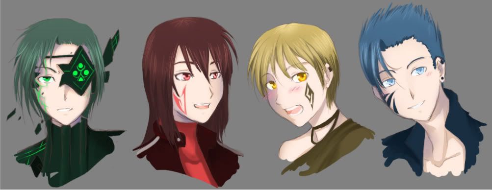
On the colouring style for the aces: I'd try to think more of the surfaces/planes, when you go for that style. It seems to me you remember where the shadow fall in drawings in a similar style, but end up rendering the light in a bit of an unrealistic way at times. On the blue haired guy, the light seems to come from more than one point: he has a shadow where his right eye is, and nothing on the rest of the face, which makes me think the light comes from upper right, but then he has a shadow on the neck on the right (our right). Also, if I'm right about the light, the shading on his nose should be on the opposite side.
I hope you don't mind, I tried to play with his shadows a bit, while going for a painterly style. I also fixed his clavicles, which seemed to be too low on his chest. I softened the shadows on the neck which seemed too defined for a painterly effect, and replaced them a bit so that they could be more coherent with just one light source.

The guy with red hair seems to have the same problem to a lesser degree: he has a shadow on his left eye, but the shadows on his neck and chest seem to be cast by a light upon him, rather than slightly to his right.
I'd balance the colours you use, too: On Hearts (I guess?), he has a very dark and saturated red on his hair, but a very light pink on his face, and blurred out and very soft shadows on his skin. I'd expect his hair to be like that if he was in a very dark place, but then, his skin would need more dramatic shading, too.
I this respect, the one with blonde hair seems to be the one with better shading: his hair have a lighter area on the top of the head, and the colour isn't so dark as the other ones. I'd choose a selection of lighter blue, red, and green for the other characters' head tops, and then shade their hair in the same way. Also, putting some highlights in darker areas would help giving an idea of the volume of their faces. Again, on the blonde boy, I'd expect part of his eyelid to be a bit lighter, since it comes out more than the concave part between his eye and eyebrow and would most likely catch some light.
For the tattoo on the green haired boy, I'd choose a less electric green: unless you were going for a neon effect, consider that it contrasts a lot with his dark clothing and hair, and makes it look as if it was lit up. I'd say most of the time, any colour you apply to the skin will be more dull than that, unless it was under direct light (which it isn't, since I see a shadow there).
I'd also say that you could try to play a bit with shadows: you seem to just choose the darker (more grey) version of the colours you have to obtain your shadows. I possibly see a hint of blue on the Hearts character, but since the rest of his skin is so light, it ends up being a bit too different to look like a shadow. I'd say you could try shading his skin with a more purple colour, and perhaps make the transition from pink to shadow a bit more gradual.
Considering how relaxed the rest of the body is, it would make more sense to accentuate the curve on her left, so that it looks like she's standing straight, without twisting her waist in a bit of a painful way.
On second thought: I'd advise you flip your drawing while sketching it, as you'll possibly find some surprises (your brain will start trying to fix the incongruences it sees, after a while, flipping the image is a good way to refresh your view.
Perhaps you're right handed? Your drawing, especially on the face, seems to be skewed a bit to the left. She doesn't seem to be titling her head, though, if you draw an axis on her face, you'll see that one side of the face is bigger than the other, even if I centred the nose and mouth, effectively dividing it in two.
Here's a flipped version of your picture, with tweaked hip.

Also, proportions-wise: see the segments I drew? The first one takes the height of the head (a bit lower than the hair, since it does seem to have some volume to it), the second goes from the chin to the sternum, and the third from there to almost the pubic bone - which is a bit of a problem. As it goes, the correct/realistic proportions would want the distance from the top of the head to the chin to equal the distance from there to where the nipples should be (unless you have saggy boobs, that is), to the one from there to the navel, to the one from the navel to the pubic bone. This varies depending on the age of the person you're drawing, obviously.
In your case, you essentially have three sections instead of four. Now, this will very well give the impression that the head is disproportionated compared to the rest of the body (especially if her head makes her look mature, while her body is proportioned for someone who's much younger than her face would make me think.
Also, assuming that pose, I wouldn't expect her shoulders to have that difference in height (especially since her breasts don't line with them, as they should).
Lastly, I agree with Deji: it's wise to make sketches of all your characters first, so that you know they fit with each other and fit well in the screen with the text box. I still remember the first time I produced a sprite I was very proud of, only to discover that when it came to drawing the male protagonist I couldn't make him fit in with the girl I already had, because he wouldn't have fir in the screen unless I cropped her body a lot... And colouring everything in a coherent style proved itself to be much harder than I'd have thought at first.
On the colouring style for the aces: I'd try to think more of the surfaces/planes, when you go for that style. It seems to me you remember where the shadow fall in drawings in a similar style, but end up rendering the light in a bit of an unrealistic way at times. On the blue haired guy, the light seems to come from more than one point: he has a shadow where his right eye is, and nothing on the rest of the face, which makes me think the light comes from upper right, but then he has a shadow on the neck on the right (our right). Also, if I'm right about the light, the shading on his nose should be on the opposite side.
I hope you don't mind, I tried to play with his shadows a bit, while going for a painterly style. I also fixed his clavicles, which seemed to be too low on his chest. I softened the shadows on the neck which seemed too defined for a painterly effect, and replaced them a bit so that they could be more coherent with just one light source.

The guy with red hair seems to have the same problem to a lesser degree: he has a shadow on his left eye, but the shadows on his neck and chest seem to be cast by a light upon him, rather than slightly to his right.
I'd balance the colours you use, too: On Hearts (I guess?), he has a very dark and saturated red on his hair, but a very light pink on his face, and blurred out and very soft shadows on his skin. I'd expect his hair to be like that if he was in a very dark place, but then, his skin would need more dramatic shading, too.
I this respect, the one with blonde hair seems to be the one with better shading: his hair have a lighter area on the top of the head, and the colour isn't so dark as the other ones. I'd choose a selection of lighter blue, red, and green for the other characters' head tops, and then shade their hair in the same way. Also, putting some highlights in darker areas would help giving an idea of the volume of their faces. Again, on the blonde boy, I'd expect part of his eyelid to be a bit lighter, since it comes out more than the concave part between his eye and eyebrow and would most likely catch some light.
For the tattoo on the green haired boy, I'd choose a less electric green: unless you were going for a neon effect, consider that it contrasts a lot with his dark clothing and hair, and makes it look as if it was lit up. I'd say most of the time, any colour you apply to the skin will be more dull than that, unless it was under direct light (which it isn't, since I see a shadow there).
I'd also say that you could try to play a bit with shadows: you seem to just choose the darker (more grey) version of the colours you have to obtain your shadows. I possibly see a hint of blue on the Hearts character, but since the rest of his skin is so light, it ends up being a bit too different to look like a shadow. I'd say you could try shading his skin with a more purple colour, and perhaps make the transition from pink to shadow a bit more gradual.
Who is online
Users browsing this forum: No registered users