Use this forum to help develop your game-making skills, and get feedback on writing, art, music, or anything else you've created that isn't attached to a game in progress.
We're in the process of a simple otome game and would like feedback from forum-goers on these character designs and drawing/coloring style! If there's anything you'd like to see improved upon, please speak up. This is our first draft of the characters. Thanks!
Looks like a 3D than 2D picture, but they have their own charm. I'm not that good with art, but here's my critique:
1st pic: Her eyes aren't balanced between left eye and right eye. Her body seems too big. Her neck looks strange since it's also getting bigger toward the head. Not much could be said about anatomy since her cloth is in the way. Better practice drawing naked girls.
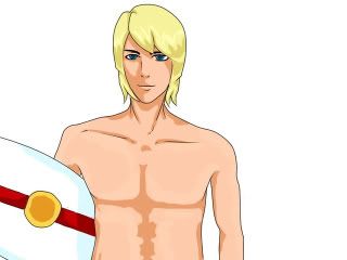
2nd pic: Same with his neck. His right shoulder looks strange. His body just like a cloth, where his muscle? And also looks very 2D... His hand also looks (sorry) terrible. Please spend more time drawing his hand and all of the muscle. And the shading for his body (chest and stomach) Looks very strange. More like emboss than a shading.
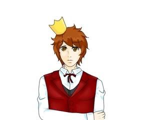
3rd: His crown looks like a piece of paper and it's impossible to hang on his head like that without a string. The cloth looks like a piece of cardboard box, too stiff. His right hand also looks weird, his elbow is too high. Draw without cloth first to make sure you get the anatomy right.
General critique: The shading still bad. Make sure the light source is consistent (is it from above? or below? or side?) Make sure that shading don't look like an emboss (which happens in your two first pics). Remember that shading is too make things looks 3D. If your character didn't look like 3D enough because of the shading, you better redo the shading (that's why it's a good idea to make the shading in separate layer).
"Double the princesses, quadruple the fun!" - Haken Browning (SRW-OG Endless Frontier)
I won't repeat what LVUER said, since she covered almost everything.
Here's my two cent:
* MC's shirt makes it look like she has only one breast. Her shirt can't hang that way one her body if she has two.
* Bachelor No. 2 - His hand, from the elbow to the wrist, is too long. Try doing it in front of a mirror to get it right.
Good: I really like the MC's hair style and eye color It somehow makes her amazingly adorable despite owning a pair of very nerdy glasses. I also love the style of drawing for all three of their faces and their clothing choices.
Most of it was covered, but coloring choice wise I have a couple of comments:
A big one is the skin color, it's fine if your point is to make the first and third incredibly pale and the surfer average colored, but if you were going for average and then tanned (since he's a surfer) then you're going to need to give them more color.
The MC and the spoiled prince would have the surfer's skin tone (maybe lightened up a bit if you still wish to have them to be palish) and the Surfer should be slightly darker and more yellow as many tans have more of a yellowish tone to them rather than a pinkish one.
Thank you to everybody who critiqued our character designs
if you can spare a few seconds...please check out the
NEW AND IMPROVED (hopefully) characters here: http://lemmasoft.renai.us/forums/viewto ... =26&t=7587
and give a second round of feedback