Improving Photo-Manipulated Backgrounds for VNs

Use this forum to help develop your game-making skills, and get feedback on writing, art, music, or anything else you've created that isn't attached to a game in progress.
Message
Author
User avatar
Lumen_Astrum
Dystopian Princess
Posts: 1662
Joined: Mon Nov 08, 2010 8:01 am
Completed: Soul and Heart, Twin Faces
Projects: Soul and Heart Replay; The Court of the Two Sides (tentative title)
Organization: Lion Box Studios
Tumblr: lumenizampel
Location: Philippines
Contact:

Improving Photo-Manipulated Backgrounds for VNs

#1 Post by Lumen_Astrum »

Hey, it's Lumen_Astrum again here. ^^

I just wanted to ask if there's any other way to improve the filtering and altering of photo-manipulation for backgrounds in VNs. I am practicing to manipulate photos using some of Samu-kun's photos from Japan.

I'm using Adobe Photoshop CS2 and a software my uncle gave me which is called PhotoMatix Pro.
For example, this is the original picture :
107_3938n.jpg
And using Photoshop, I lowered the exposure settings to this :
107_3938.jpg
And then this :
107_3938h.jpg
Then using PhotoMatix Pro, I compiled the pictures and tone-mapped them together to this :
107_3938h_n__tonemapped.jpg
Tah-daaah~!!!! :D

Now, my question is, how can I make the image a lot more better? I know that I edited the picture to make it more vibrant, but I kinda ... wanted to improve it. Sorry, I'm some sort of a perfectionist. :/

And also how to photo-manipulate pictures so that it can show different times of the day .. Because Clipping masks in Photoshop... kinda didn't work in me. :\
Thank you so much~!!! C:

Adorya
Miko-Class Veteran
Posts: 541
Joined: Fri Aug 18, 2006 4:51 pm
Contact:

Re: Improving Photo-Manipulated Backgrounds for VNs

#2 Post by Adorya »

Maybe by trying to use Gaussian Blur or some sort of blurry function, for adding contrast between the background and the characters...I like the 1st modified pic because in NVL mode it could be used as a second background alternative for heavy text.

User avatar
Auro-Cyanide
ssǝʇunoƆ ʇɹ∀
Posts: 3059
Joined: Sun Jul 25, 2010 9:02 am
Completed: http://auro-cyanide.tumblr.com/visualnovels
Projects: Athena
Organization: Cyanide Tea
Tumblr: auro-cyanide
Deviantart: Auro-Cyanide
Location: Melbourne, Australia
Contact:

Re: Improving Photo-Manipulated Backgrounds for VNs

#3 Post by Auro-Cyanide »

You probably could have just used curves for that.

As for different day settings, that is what Colour Balance and Hue/Saturation is for.

Verity
Regular
Posts: 67
Joined: Wed Jul 30, 2008 11:43 am
Projects: Wanderer
Location: USA
Contact:

Re: Improving Photo-Manipulated Backgrounds for VNs

#4 Post by Verity »

^ What Auro-Cyanide said; also, I find either surface blur or smart blur helps to even out surfaces and make it look more like an illustration and less like a photograph.

User avatar
Lumen_Astrum
Dystopian Princess
Posts: 1662
Joined: Mon Nov 08, 2010 8:01 am
Completed: Soul and Heart, Twin Faces
Projects: Soul and Heart Replay; The Court of the Two Sides (tentative title)
Organization: Lion Box Studios
Tumblr: lumenizampel
Location: Philippines
Contact:

Re: Improving Photo-Manipulated Backgrounds for VNs

#5 Post by Lumen_Astrum »

Thank you for your suggestions! C:

From this :
107_3938h_n__tonemapped.jpg
I used both Smart Blur and Surface Blur to this :
107_3938h_n__tonemappedandblurred.jpg
Then using Auro-Cyanide's suggestion of Hue / Saturation and Color Balance, I made an afternoon look :
afternoonclassroom.jpg
Any more suggestions for improvement~?? C:

Adorya
Miko-Class Veteran
Posts: 541
Joined: Fri Aug 18, 2006 4:51 pm
Contact:

Re: Improving Photo-Manipulated Backgrounds for VNs

#6 Post by Adorya »

It might be because of the original pic, but you would want to make the background as impersonal as possible in order to focus the eye on the character instead of the background (granted that you would want to do that).

There are some elements in the right that can "deviate" the eye, such as the clothes and the bags, also on the left the chairs are not well ordered.

You might want to use filter that alter edges and cover all the image details, something like that using the diagonal edge filter :

Image

User avatar
Elze
Veteran
Posts: 246
Joined: Mon Dec 06, 2010 7:30 am
Tumblr: Poepii
Contact:

Re: Improving Photo-Manipulated Backgrounds for VNs

#7 Post by Elze »

I actually like the photo you're working with, so I tried my hand at it as well. OuO;;

Still very photo-like:
temp1.jpg
Or if you prefer something slightly more cartoonish:
temp2.jpg
Textures can also add some interesting qualities:
temp 3.jpg
Personally, I tend to like brighter pictures, so I might have overdone it with the brightness. ^^;
Anyway, the stuff I tweaked with: brightness/contrast, levels, curves, hue/saturation, exposure. I also created an orange layer above the photo set to "soft light" to give the photo a warm glow.
To get the more cartoonish look, do the steps above followed by: filter > artistic > poster edges, then filter > artistic > cutout.
Textures are pretty much just layers of textures placed above the image.

I hope that gives you more things to experiment with to get what you want. C:
Image

IceD
Veteran
Posts: 433
Joined: Sun Feb 01, 2009 6:15 pm
Contact:

Re: Improving Photo-Manipulated Backgrounds for VNs

#8 Post by IceD »

Everything depends on the style and mood of the game. There are many different methods, but for those that would like to try something more advanced, with a little bit of work you can get various effects:

1. A fine pencil sketch:
sketch.jpg
2. A watercolor/poster-like effect (it's more of a poster effect)
watercolor_poster.jpg
3. And for a final look - by merging those two, we can gain something like this:
merged.jpg
The power lies within PS itself - the layers and layer properties are the most important aspects. You won't get much by just applying some premade filters from filter list, you have to create them by yourselves. It usually requires more work, but the final effect is also much more neat. I'm kinda busy right now, but if you're interested in this, just give me a shout and I'll drop a step-by-step instruction on how to get those. There's also was a far more greater process that allowed to get a really fine pen-watercolour drawing with clear colors and lines, but I'll have to recall that first ^^; Also, try looking at youtube - there are tons of step-by-step advanced tutorials available there.

Verity
Regular
Posts: 67
Joined: Wed Jul 30, 2008 11:43 am
Projects: Wanderer
Location: USA
Contact:

Re: Improving Photo-Manipulated Backgrounds for VNs

#9 Post by Verity »

Hm, I think I found some interesting effects you guys might find handy:
photomanip-test.png
I used surface blur at first, and then duplicated the layer and used Stylize > Find Edges. Then I set the second layer to multiply and toned the opacity down, so it looks like there's a little bit of linework there. (You could also erase bits of it around areas like highlights where there shouldn't be lines, probably.)

Then I added a selective color adjustment layer—really, selective color is really handy, so you should def learn to use it! It lets you adjust the CYMK levels in all of the different colors in the image—like, here, I added more yellow to the highlights and neutrals in particular to make the color scheme more afternoon-like in a natural-looking way.

User avatar
nefferinthia
Regular
Posts: 164
Joined: Sun Mar 21, 2010 10:12 am
Location: The Netherlands
Contact:

Re: Improving Photo-Manipulated Backgrounds for VNs

#10 Post by nefferinthia »

After seeing this thread I was inspired to try some editing myself and now I've found a filter I really like! If ayone cares I could tell you what I did?
Attachments
file.jpg

User avatar
Lumen_Astrum
Dystopian Princess
Posts: 1662
Joined: Mon Nov 08, 2010 8:01 am
Completed: Soul and Heart, Twin Faces
Projects: Soul and Heart Replay; The Court of the Two Sides (tentative title)
Organization: Lion Box Studios
Tumblr: lumenizampel
Location: Philippines
Contact:

Re: Improving Photo-Manipulated Backgrounds for VNs

#11 Post by Lumen_Astrum »

Wow! All of those things are cool! I like it ^o^
Elze wrote:I actually like the photo you're working with, so I tried my hand at it as well. OuO;;

Personally, I tend to like brighter pictures, so I might have overdone it with the brightness. ^^;
Anyway, the stuff I tweaked with: brightness/contrast, levels, curves, hue/saturation, exposure. I also created an orange layer above the photo set to "soft light" to give the photo a warm glow.
To get the more cartoonish look, do the steps above followed by: filter > artistic > poster edges, then filter > artistic > cutout.
Textures are pretty much just layers of textures placed above the image.

I hope that gives you more things to experiment with to get what you want. C:
I like the effect~ But yeah as you said, it's too bright... >_>
But I never tried mixing the poster edges effect to the cutout effect... Thanks for the tip! C:
I might try to use that technique to the other pictures~
IceD wrote:Everything depends on the style and mood of the game. There are many different methods, but for those that would like to try something more advanced, with a little bit of work you can get various effects.

The power lies within PS itself - the layers and layer properties are the most important aspects. You won't get much by just applying some premade filters from filter list, you have to create them by yourselves. It usually requires more work, but the final effect is also much more neat. I'm kinda busy right now, but if you're interested in this, just give me a shout and I'll drop a step-by-step instruction on how to get those. There's also was a far more greater process that allowed to get a really fine pen-watercolour drawing with clear colors and lines, but I'll have to recall that first ^^; Also, try looking at youtube - there are tons of step-by-step advanced tutorials available there.
I'm still learning about using PS... and I really sometimes get too dependent on PS's filters. Sometimes I use GIMP, PS and PhotoMatix Pro to make a nice effect~ But yeah, I got too dependent on PS's filters and premade features... >_>
I'd be grateful if you can show me how is done! :D
Verity wrote:Hm, I think I found some interesting effects you guys might find handy:
photomanip-test.png
I used surface blur at first, and then duplicated the layer and used Stylize > Find Edges. Then I set the second layer to multiply and toned the opacity down, so it looks like there's a little bit of linework there. (You could also erase bits of it around areas like highlights where there shouldn't be lines, probably.)

Then I added a selective color adjustment layer—really, selective color is really handy, so you should def learn to use it! It lets you adjust the CYMK levels in all of the different colors in the image—like, here, I added more yellow to the highlights and neutrals in particular to make the color scheme more afternoon-like in a natural-looking way.
It looks cool! :D
I was having trouble on making the perfect afternoon look... >_>
Because usually all I do is Color Balance and Hue / Saturation (just like what Auro-Cyanide said), so it's pretty hard...
Thank you~! =))))))
Harumi Fujyoshi wrote:After seeing this thread I was inspired to try some editing myself and now I've found a filter I really like! If ayone cares I could tell you what I did?
I'd love to know what you did! It looks poster-y and a bit blurred, and it looks nice overall~ ^o^

Any more suggestions?

User avatar
nefferinthia
Regular
Posts: 164
Joined: Sun Mar 21, 2010 10:12 am
Location: The Netherlands
Contact:

Re: Improving Photo-Manipulated Backgrounds for VNs

#12 Post by nefferinthia »

Alright~ Because what I usually do in PS is create icons I decided to go with basic first step; duplicating the base and setting it to screen. I then made a Brightness/Contrast adjust layer underneath the duplicated base increasing the contrast a little. Then, I duplicated the base once more, keeping this copy underneath the other and the Brightness/Contrast layer and I went to Filter>Brush Strokes>Crosshatch and set Stroke Length to around 4-6 (adjust as you see fit), Sharpness to 0 and Strength to 3. If you want to, you can also apply Smart Blur but it's not necessary.

Hope this helped a bit ^___^

EDIT: Also, for afternoon/evening settings you could try using Selective Color. It works quite well for intensifying certain colors~

IceD
Veteran
Posts: 433
Joined: Sun Feb 01, 2009 6:15 pm
Contact:

Re: Improving Photo-Manipulated Backgrounds for VNs

#13 Post by IceD »

Lumen_Astrum wrote:I'm still learning about using PS... and I really sometimes get too dependent on PS's filters. Sometimes I use GIMP, PS and PhotoMatix Pro to make a nice effect~ But yeah, I got too dependent on PS's filters and premade features... >_>
I'd be grateful if you can show me how is done! :D
Sure, here they are. Also, note I own the PS CE version (7th one), and some of the names and functions may sound different on newer versions and not exist on older ones at all (as far as I know, 6 is still ok, but 5 is too old and outdated to be of any use now).

1. A fine pencil sketch:
Image

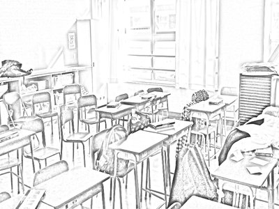
1. Open the chosen picture in photoshop, make a duplicate out of it (ctrl+j) and then remove the color from the duplicated layer (shift+ctrl+u).
2. We duplicate the layer once more, and make an inversion (ctrl+i) on that new one, then we change the blending mode of that layer into color dodge (PS CE).
3. Finally, we use a gausian blur filter on the same layer with a proper ammount (it varies, depending on the picture type), and that's basically all.

2. A watercolor/poster-like effect (it's more of a poster effect):
Image

1. Open the chosen picture and duplicate it three times (ctrl+j).
2. For now, we start to work on the first duplicate (the second after the original). Use the cutout filter on it (it's located in the 'artistic' ones), it's best to set the values to 4-4-2 for the best results. Then set the layer's blending mode into luminosity.
3. The second deuplicate... We use the 'dry brush' filter on that one, and set the values to 10-10-1. We then set the blending mode into screen.
4. The last dupllicate needs a median filter (noise > median in 'filters'). You can experiment with that one a bit, but don't set the value too high - it's best to keep it at lower values. Finally, set the blending into soft light and you're done.


Image

Final picture was done by merging examples 1 and 2 (each one on a separate layer with the sketchy one above), and setting the layer blending mode of the sketchy one to Luminosity.

That's all. Don't forget to experiment a lot - it's the only way to grasp all of the PS functions well.

VenusEclipse
Veteran
Posts: 348
Joined: Fri Mar 13, 2009 5:26 pm
Completed: Princess of Ruin, Frozen Essence, Heartstring Bugs
Organization: Unbroken Hours
Tumblr: unbrokenhours
Deviantart: venus-eclipse
Location: Canada
Contact:

Re: Improving Photo-Manipulated Backgrounds for VNs

#14 Post by VenusEclipse »

This image is tough to edit. Here's my end result.

I used a bunch of gaussian blurs, paint daubs, ink outlines, blending options (lighten, hue, etc), and a lot of layers. If you want to know, I could try to remember exactly what I did (because it took a while).

Like what Iced said above, experiment. :lol:

Sometimes it takes hours and it still won't look right. Sometimes it's easier to go find another image that is just less complicated to edit. I can't really explain it, but some images are just easier to manipulate. >>
Attachments
finalresultclass.jpg

salis
Regular
Posts: 56
Joined: Thu Aug 12, 2010 9:28 pm
Projects: Too many~!
Location: USA
Contact:

Re: Improving Photo-Manipulated Backgrounds for VNs

#15 Post by salis »

Wow, everyone is doing such an awesome job! Seeing this thread has got me excited about photo-manipulating, so I'll give it a shot too.

This photo was a bit difficult to manipulate since there are both extreme dark and extreme bright elements in this picture, but using some basic filters, blurring techniques, and different layer modes, I tried to find a balance between blurred and sharp edges to produce a softer, lighter feeling. As for different types of day, I usually use multiple layers of either light blue, orange, or dark blue set to different layer modes, (such as darken or soft light,) for morning, day and night. It's definitely not a fail-proof method, though, as you can see the night version I did has a rather strong light source. Anyway, I hope my examples give you some ideas!

Like the others said, just keep experimenting and manipulating! The best way to learn is hands-on.
morningclassroom.png
afternoonclassroom.png
nightclassroom.png
ImageImageImage
If you'd like to contact me, please email me at: sal.com@live.com

Locked

Who is online

Users browsing this forum: No registered users