Page 1 of 1
Interface (GUI) Design Opinions?
Posted: Fri Feb 21, 2014 3:48 pm
by Coyotl
I'm still debating a couple different combat systems, but for the one I'm leaning towards, I have a need for some outside perspective.
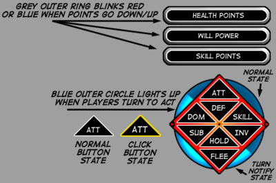
First, here's a visual reference for the question:

- I'd put the game title here if I could decide on that. (Don't say it)
The question is, if I decide to go with lettering on the buttons like that, instead of icons, will it be seen as a move for clarity, or a cheap design cop-out?
Note: We're only talking about the triangular buttons. The indicators above will have bar/dot visual representation.
(Actual numbers may be dependent on perception skill - lots of little details to work out still - main development focus has been on story, structure and artwork.)
Re: Interface (GUI) Design Opinions?
Posted: Fri Feb 21, 2014 3:50 pm
by SundownKid
There are so many buttons there that it seems you may need to put text on them so the player can know what they do. After all, in RPGs there tends to be a textual list of commands.
Alternatively you can add an option in settings to swap the buttons appearance between text and icons based on a variable, thus eliminating the issue.
Re: Interface (GUI) Design Opinions?
Posted: Fri Feb 21, 2014 3:59 pm
by Coyotl
Yeah, button clutter is what originally led to the text labels. Especially after looking at some Japanese language games and painfully wracking my brain trying to decipher what the designer was trying to indicate with that strange icon.
The other combat system I'm debating is considerably simpler, and more fluid, with only situation applicable options appearing in a button stack. And,so - interface design keeps getting pushed back while there's other things to focus on.
Re: Interface (GUI) Design Opinions?
Posted: Fri Feb 21, 2014 5:26 pm
by SundownKid
The problem I can see with these buttons is that they all look similar, with only text delineating what they do. You might as well just make them text buttons but without the fancy layout. Otherwise, I would look into modifying the size and shape of the buttons until they are a little more self explanatory. For example, attack and defend being a sword and shield on one side of the screen. Flee being a pair of boots on the other side. And so on.
Re: Interface (GUI) Design Opinions?
Posted: Sun Feb 23, 2014 1:50 pm
by Coyotl
I'd hoped for a bit more input for the decision making process. Your thinking mirrors mine quite closely in most respects. Your icon suggestions mostly match mine
(stick figure fleeing instead of boots), but still stuck for an icon for 'Dominate'.
(Attack to wound - Dominate to control)
A stick figure on its knees is easy enough for Submit/Surrender - but Dominate? Ack.
At any rate, I'll push back deciding again for a bit, let things percolate longer while I continue work on the art and story. Not like there isn't plenty there to keep me busy.

Re: Interface (GUI) Design Opinions?
Posted: Sun Feb 23, 2014 8:53 pm
by Asceai
Coyotl wrote:A stick figure on its knees is easy enough for Submit/Surrender - but Dominate? Ack.
Kneeling stick figure with a club or sword over it (at an angle, as if it would crush the stick figure if the 'swing' continued)
Re: Interface (GUI) Design Opinions?
Posted: Mon Feb 24, 2014 2:15 am
by Coyotl
That's getting to be a lot to fit into a small icon. 'though, the kneeling figure icon could be a bit smaller than what would be easily recognized, since there's a larger version on the Submit/Surrender button. So could get away with cramming more in because of that. Maybe just a hand over the kneeling figure?
Or, hell - maybe I could just put a whip.
Sword to Attack, Whip to Dominate?
Might not be intuitively clear, but easy to distinguish once the player figures them out.
Re: Interface (GUI) Design Opinions?
Posted: Mon Feb 24, 2014 3:32 am
by 2dt
You could do a dog/neck collar for submit, whip for dominate. Admittedly though the whip is kinda corny.
I don't see what's wrong with just having all text buttons, so long as the buttons are big enough and the text large enough to be easily read. Either style can be made to look good or bad. Its better to have good text buttons than halfassed icons. Thing about text buttons though is that they're much easier to adjust and change. They're also much clearer.