Marketing + Design: What makes great promotional imagery?

A place to discuss things that aren't specific to any one creator or game.
Forum rules
Ren'Py specific questions should be posted in the Ren'Py Questions and Annoucements forum, not here.
Message
Author
User avatar
Zelan
Lemma-Class Veteran
Posts: 2436
Joined: Tue Mar 01, 2016 7:23 pm
Completed: The Dark
Projects: Cosplay Couple
Tumblr: evns
itch: Zelan
Discord: ltnkitsuragi#7082
Contact:

Re: Marketing + Design: What makes great promotional imagery

#16 Post by Zelan »

RedOwl wrote:So, I think these last three are great reference if you have something where there's actually gameplay - however I am still curious about what makes great promotional material for a more classic VN (without much gameplay) - if you can't do the Ufotable/"mega awesome cinematic sequences" thing - and you can't showcase gameplay... but, somehow, you want to get the "feel" of the story across in an interesting way... Hmmm
It really IS tough when you have a VN without gameplay - you essentially have to bank on the idea that the people watching it don't immediately click away from visual novels. The best thing to do that isn't misleading seems to be showing what is essentially a character card - a sprite with an expression or two (and possible a quote) - plus a few of the best backgrounds and some non-spoilery CGs. Showcase the animation and/or voice acting if you have some (which you did in yours). Pick the music track that you think best represents the overall theme of the VN.

If there isn't gameplay... there just isn't gameplay. Insinuating that there is some is just plain misleading.

This probably isn't exactly helpful in trying to design a trailer, but it's my personal take on VN trailers. It's very difficult to target them to anyone besides people who are already established members of the VN audience.

User avatar
Kuiper
Regular
Posts: 154
Joined: Sun Jun 19, 2011 1:16 am
Completed: Cursed Lands, Trial by Fire
Projects: Necrobarista, Idol Manager
Organization: Route 59 Games
Tumblr: kuiperblog
Contact:

Re: Marketing + Design: What makes great promotional imagery

#17 Post by Kuiper »

RedOwl wrote:terra0nova and I watched all the trailers you linked, and we were actually somewhat unimpressed with the first trailers, even though they were cinematic, complex, etc. - mainly because we just don't care much about those types of games. We weren't "converted."
I think that this gets at an important point, which is that AAA and indie tend to have different marketing goals.

Going back to the Battlefield example, Battlefield is marketing to an existing (and large) mainstream audience. They're competing against games like Call of Duty and Halo and Gears of War. This really becomes apparent if you watch the 99 problems trailer for Battlefield 3, which is full of media quotes like "The most realistic shooter yet" and "shooter of the year." They even end with the slogan "above and beyond the call," which clearly calls to mind the idiom "above and beyond the call of duty," which is kind of a capstone on the commercial which is basically intended to convey the message, "This is why you should buy Battlefield instead of Call of Duty." If you're not already part of that first-person shooter audience, none of this is going to appeal to you. And that's okay, because the audience for those games is large enough that they are fine with just going after the people who already play realistic military FPS games.

AAA marketing is often about saying, "You already like these kinds of games, and we're the best one." Indie marketing often has to take the approach of, "You've never played a game like this, but here's why you're going to like it." It's not as if a game like Long Live the Queen is facing stiff competition for the "hardcore princess survival game" genre.
RedOwl wrote:I am still curious about what makes great promotional material for a more classic VN
I'm probably not the first one to make this observation, but pretty much all bishoujo games have the same opening. It becomes really obvious and recognizable when you see it; Key games like Clannad and Little Busters and Rewrite, and honestly I've disliked this style for a long time because everything about it always screamed "boring and generic" to me. But the more I think about it, the more sense it makes. The point of these openings is basically, "Here are all the pretty girls that you are going to romance," and for a lot of people, that is the point of the game. They're showing up so that they can see (and romance) a bunch of aesthetically pleasing characters), so for those people, seeing an image slideshow that shows all of the character designs over inoffensive pop music is exactly what they want. And if you're of the belief that visuals are what draw people to VNs, this might be the most effective way to present the game.

Incidentally, I think that I could be bouncing off of the Key trailers for the same reason you bounced off of the AAA trailers I linked in the previous post. It seems like the Key trailers are intended to appeal to the kind of people who are already into bishoujo games in a big way, and I don't really fall into that category. They're going after an existing market, rather than trying to draw new players in. I would assume that these kinds of trailers are effective at capturing the attention of Key's "core market," as they probably wouldn't continue releasing these same-y trailers if they weren't at least somewhat effective.

So yeah. If your game is all about romancing pretty girls (or pretty boys), make sure that those images feature prominently in the marketing, I guess.

Otome games do this, too. Amnesia: Memories at least starts with the premise, but it quickly descends into the same thing of "Look at all these pretty boys while you listen to jpop. Code: Realize does it too. That being said, I do like those two trailers a bit more for the fact that they provide a bit more of a sense of place, and I think that is a big part of their appeal as well: I think that a game like Code: Realize sells itself on the steampunk setting just as much as the bishounen that populate it. Visual novels are a visual medium, after all, so perhaps it's best just to find the most visually impressive part of your game (be it character designs or airships) and make sure that comes across in your trailer.
Necrobarista - serve coffee to the living and the dead
Idol Manager - experience the glamour and dangers of the pop idol industry
Cursed Lands - a mix of high fantasy and gothic horror

User avatar
Rossfellow
Veteran
Posts: 283
Joined: Sun Jun 22, 2014 9:35 pm
Projects: Sedatophobia
Organization: Team 3Edgy
Deviantart: l-rossfellow
Contact:

Re: Marketing + Design: What makes great promotional imagery

#18 Post by Rossfellow »

Okay, you just brought up one more thing that gets me nerded out.

Artsy, semi-animated VN OPs.

These are OPs that use only (or mostly) in-game assets but manage to give you a peek into what it's about, what its tone is, and its general aesthetic and atmosphere. And Nitro+ is a master at this.

A lot of them still follow the "Cute girls lineup" that Kuiper mentions, but each give off different motifs by the combination of images and the chosen songs. Bonus OP-only animation is nice to have, but good directorial vision and editing stands out for these. Examples of good game trailers for VNs are harder to find, in fact Long Live the Queen is such a rare little gem in this regard... And that's a raising sim.

Chaos;Head Noah
Steins;Gate (This original VN OP will always be my favorite one.)
Umineko no Naku Koro Ni PS3
Corpse Party PSP as well as Book of Shadows

Okay, I might be a bit biased towards "Darker" franchises, but that seems to be where these are most common.

Edit: Admittedly, a common flaw among these is how potentially spoileriffic they can be.
@Rossfellow, I might be mis-remembering here (or simply parroting apocrypha), but my understanding is that the initial marketing around Madoka was actually intentionally deceptive (presenting it more as a traditional, by-the-numbers magical girl show), even going as far to leave Urobuchi's name out of the credits, though most of that went out the window once the series got a few episodes into its initial broadcast.
Yeah, but honestly, the problem with that is that the product they were trying to pass it off as doesn't gather much interest. It would have just become another obscure title under SHAFT's belt like Soredemo Machi or Denpa Onna. What got people interested in Madoka was a taste of the meat it was trying to hide. Which is kind of ironic and cool.
ImageImage
Sedatophobia (latin SedatoPhobia)
___(n) 1: The averse reaction to stillness, silence and/or state of helplessness.
______2: (Psychology) A state of distress where the victim's sense of reality can no longer keep up with his or her imagination.
______Related: Madness, Paranoia, Despair

User avatar
Dreamgazer
Veteran
Posts: 239
Joined: Fri Oct 16, 2015 12:45 am
Completed: Death Room; Don't Take This Risk; War: 13th Day; War Specials
Projects: Beauty and the War (X Playing Pieces)
Organization: Poison Apple Tales
Tumblr: poisonappletales
Deviantart: PoisonAppleTales
Contact:

Re: Marketing + Design: What makes great promotional imagery

#19 Post by Dreamgazer »

I rather like this discussion, so I went ahead and made a thread to help out developers with their promotional images. It's easy to miss the mark, to say the least, so I'm hoping that we, as a community, can help each other out.

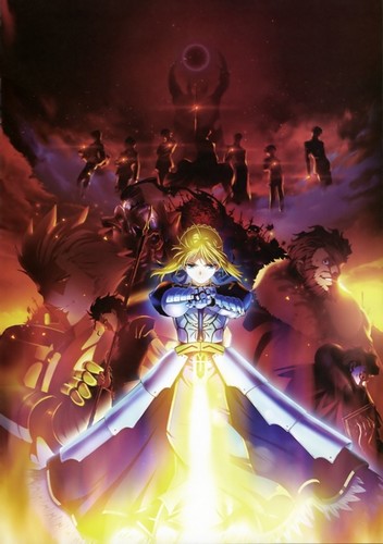
Moving on to the main subject - hmm...I find myself drawn to the use of light and the other fancy sorts of elements that can spruce up a picture, such as a scattering of feathers:
Image
And here's an oldie but goodie:
Image

I have always adored CLAMP's designs and sweeping grandeur. The feeling of motion and lovely complexity.

Oh, and here's a popular one:
Image
Someone once said he picked up this visual novel solely because he liked the use of light in this CG. But to me, while it is very pretty, I wouldn't have tried the game if I hadn't read the story's premise.

I've noticed that otomes and other media skewed towards women tend to have a softer color palette, which can personally be hit-or-miss with me. For that matter, I'm not that fond of romance sim promos that tend to shuffle the main character out of the way in favor of the men. I like a protagonist with personality and impact in the story.

However, since I'm more of a writer, I will generally read the description of whatever I'm picking up before deciding whether I should give it a go or a pass.

As for promos without any characters, it certainly can be effective.

Image

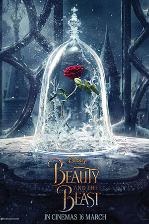
In this case, it throws attention on this one object, implying that it will have great importance in the movie. More than that, the red of the flower stands out against the white-grey background and the stem points downwards, drawing your eye to the logo at the bottom. The design in the background reinforces that.

And then, there are covers that showcase a symbol or emblem of some sort:
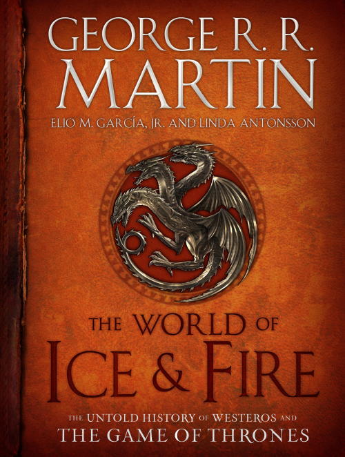
Image
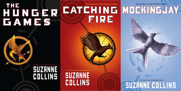
Image

Now, for the last one, if I didn't know what the Hunger Games was about and you asked me what I thought the story was, I might tell you: Everyone's starving, so people are hunting down birds to eat. Of course, I'd be only half-serious because the symbols in the background are giving me a sort of dystopian vibe, and I would actually assume the bird is a symbol for something or someone.

For that matter, the circles capture the focus point quite excellently. In the last book (Mockingjay), the bird breaking free of the circle conveys the message of freedom quite clearly, especially when put together with the other two covers. Although -and this might just be my personal taste - I ordinarily wouldn't have picked up this story based on the front alone.

User avatar
RedOwl
Regular
Posts: 82
Joined: Sun Oct 02, 2016 1:34 am
Projects: < /reality >
Tumblr: realityvn
Contact:

Re: Marketing + Design: What makes great promotional imagery

#20 Post by RedOwl »

Dreamgazer wrote:Moving on to the main subject - hmm...I find myself drawn to the use of light and the other fancy sorts of elements that can spruce up a picture, such as a scattering of feathers
I'm also drawn to these elements - often I feel they are meant to imply a sense of magic, wonder or mysticism, which is appealing to me.
Dreamgazer wrote:I have always adored CLAMP's designs and sweeping grandeur. The feeling of motion and lovely complexity.
I tend to prefer the simple over the complex - but I do agree that a sense of motion is often very, very appealing. Good point!
Dreamgazer wrote:Someone once said he picked up this visual novel solely because he liked the use of light in this CG.
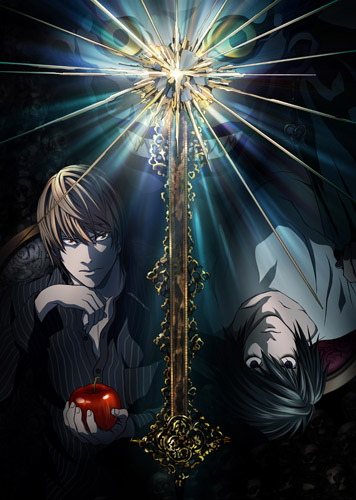
Lighting can be VERY powerful - and very eye-catching. Here are some more examples where I feel the use of light plays a big role in creating a great image:

Image

Image

Image
Dreamgazer wrote:I've noticed that otomes and other media skewed towards women tend to have a softer color palette, which can personally be hit-or-miss with me.
Interesting. I hadn't really noticed this.
Dreamgazer wrote:As for promos without any characters, it certainly can be effective.
Ok, so - the Beauty and the Best promo works for me because - as your description explained - it's a strong, eye-catching image. It looks good and it makes me wonder what this contrast between the bright, warm lively flower and the dark, cold exterior is all about. But the other character-less promos? Eh. Not working for me [even though I've read and enjoyed all those books]. Frankly, the symbolic imagery there is boring and doesn't convey much at all about the setting or story. The World of Ice and Fire is a little better because it has the old-timey leather-look with the dragon that makes you think "epic fantasy" because that aesthetic is totally a trope. But the Hunger Games covers don't convey much at all for me - like you, I would not have picked them up based on the cover art. I think they could have been much stronger.
Rossfellow wrote: Artsy, semi-animated VN OPs.
Chaos;Head Noah
Steins;Gate (This original VN OP will always be my favorite one.)
Umineko no Naku Koro Ni PS3
Corpse Party PSP as well as Book of Shadows
Yeah, these are great - they're appealing, and communicate a lot about the stories/settings/feelings you will be in for if you were to play these games. I'll definitely be giving these another look, as reference, when I'm ready to make a final trailer for my game. They're definitely effective. Sidenote: the unreadable text at the beginning of the Chaos;Head one frustrated me tho. >.<
Rossfellow wrote:Yeah, but honestly, the problem with that is that the product they were trying to pass it off as doesn't gather much interest.
Yep. And I think that's an issue - and a marketing blunder. But luckily for them, it doesn't seem to have been a big problem in the end.
Image
~Please give me Honest Critique!~

User avatar
Rossfellow
Veteran
Posts: 283
Joined: Sun Jun 22, 2014 9:35 pm
Projects: Sedatophobia
Organization: Team 3Edgy
Deviantart: l-rossfellow
Contact:

Re: Marketing + Design: What makes great promotional imagery

#21 Post by Rossfellow »

Just bought this game at full price, shortly before I realized that it was pretty lackluster. What is it with gorgeous looking games with nonsense game direction and writing? It makes me want to cry.

...Well that's deja vu.

Image

I got excited to see this gorgeous looking VN mystery come out for the PS4/Vita. I really wish it had more things going for it than its visuals. This keeps happening to me and I never learn. :(
ImageImage
Sedatophobia (latin SedatoPhobia)
___(n) 1: The averse reaction to stillness, silence and/or state of helplessness.
______2: (Psychology) A state of distress where the victim's sense of reality can no longer keep up with his or her imagination.
______Related: Madness, Paranoia, Despair

User avatar
Kuiper
Regular
Posts: 154
Joined: Sun Jun 19, 2011 1:16 am
Completed: Cursed Lands, Trial by Fire
Projects: Necrobarista, Idol Manager
Organization: Route 59 Games
Tumblr: kuiperblog
Contact:

Re: Marketing + Design: What makes great promotional imagery

#22 Post by Kuiper »

The mention of the Hunger Games cover art reminded me of something that exists in publishing, particularly in the epic fantasy market, which is that hardcover editions and paperback editions tend to have different cover art. For example, here's an image comparing the cover art for the Mistborn trilogy:

Image

The hardcover editions get much more stylized, somewhat abstract, and in my opinion much more artistically creative. However, the paperback feature very literal, very generic covers depicting the main character in various poses.

The stark difference in design choices here is likely do to the fact that the hardback and paperback editions are intended for different audiences.

The purpose of the hardcover cover art is to give fans and collectors something beautiful that they can put on their shelf; these are people who want a durable book that they can keep around. These are the kinds of people who don't need the cover to tell them what the book is about: they're the kind of people who will pick a book up off the shelf to read the inside jacket, or in some cases they're people who have already found out what the book is about by hearing about it from a friend, or reading a book catalog or the author's website.

The purpose of mass-market paperback covers is to catch attention from the largest possible number of readers, people who just want to pick up a fantasy novel without having to spend $30+ on a hardcover. The paperback covers, generic as they are, require very little "decoding:" you can look at the cover, immediately see a girl wearing a cloak and holding a knife, and assume that it's a fantasy novel with a female protagonist that involves fighting. That messaging is far more important than having a cover that looks aesthetically pleasing, because you can't be guaranteed that these people are going to pick up the book and read the back to see what it's about. One thing that's important to note when it comes to middle grade and some YA fiction is that in a lot of cases, the books aren't being bought by young readers, they're often bought by parents (or older family members). That's why is important that these books be immediately "readable" and not have a cover design that is too abstract or artistic: they're trying to appeal to the kind of person who will say, "Oh, my 14-year-old niece likes fantasy books, and she has a birthday coming up in a few weeks, maybe this will make a good gift." (In fact, in cases where the paperback release is held back until the hardcovers have been in stores for a few months, the paperback editions that are making a "first impression" will likely be hitting these kinds of "non-book" people who might buy the book mainly as a gift: the book has already been out for months, so anyone who seriously combs the "fantasy" section of their bookstore would have already seen the hardcover book and know what it was about before they picked up the paperback.)

I personally really dislike the paperback art, but Tor (the publisher) isn't dumb and their choice of cover art for the paperbacks is a deliberate one. That being said, they did also take the time to update the cover art for a later print run of the paperback to this:

Image

I think this cover art does a decent job of "splitting the difference": it's somewhat "generic" fantasy art featuring the main character in various action poses, but there's a lot less "noise" in these cover designs (more white/gray, and less orange/teal).

Book covers can also vary by region. US covers tend to lean more in the "mass-market" direction, which is to say that they tend to be more "generic" and less abstract, even when it comes to hardcover designs: it's very common for US cover art to depict the main character. On the other hand, this is much less common for UK covers; this kind of art is often seen as "tacky" and in my subjective opinion UK covers tend to have much better design. I personally love the watercolor art UK hardcover editions of Sanderson's books:

Image

That's the kind of beautiful art that you'd be proud to have sitting on your shelf. But it's not the kind of thing that allows you to look at the book when it's sitting on a store shelf and tell what it's about just at a glance.
Necrobarista - serve coffee to the living and the dead
Idol Manager - experience the glamour and dangers of the pop idol industry
Cursed Lands - a mix of high fantasy and gothic horror

Post Reply

Who is online

Users browsing this forum: No registered users