GUI Layout critique/advice?

A place to discuss things that aren't specific to any one creator or game.
Forum rules
Ren'Py specific questions should be posted in the Ren'Py Questions and Annoucements forum, not here.
Post Reply
Message
Author
User avatar
KarmaLarma
Newbie
Posts: 23
Joined: Wed May 10, 2017 11:40 pm
Projects: Deadly Vice
Tumblr: karmalarma
Deviantart: karmalarma
itch: karmalarma
Contact:

GUI Layout critique/advice?

#1 Post by KarmaLarma »

So to start off with some context, I'm rather new to UI design. I've made a couple of very small VNs before (both in TyranoBuilder) and didn't bother with customizing that aspect since both games were just to practice what a visual novel actually is. I've been working on my first larger project for a little while now. And the other day I saw the Visual;Conference video on the important of UI Design (which you can find here if you wanna hear some interesting discussion on that sort of thing). The idea of bringing interesting elements directly into the main UI rather than hiding stat bars in a separate menu like I was planning to do caught my interest so I figured I should design the UI sooner rather than later to plan around it.

I knew I wanted my protagonist to have a side image since he doesn't have a full sprite.
I knew I wanted to implement the 'personality quirk' sliders into the main view so that when the player makes a decision that affects them, they can watch and see it happen.
And I knew I wanted the buttons to look a little quirky since I have trouble doing plain text buttons without making them look totally sterile and bland.

So I sketched up my ideas (using sketches I already had of some of the characters to get a better idea of how it worked together)
Image

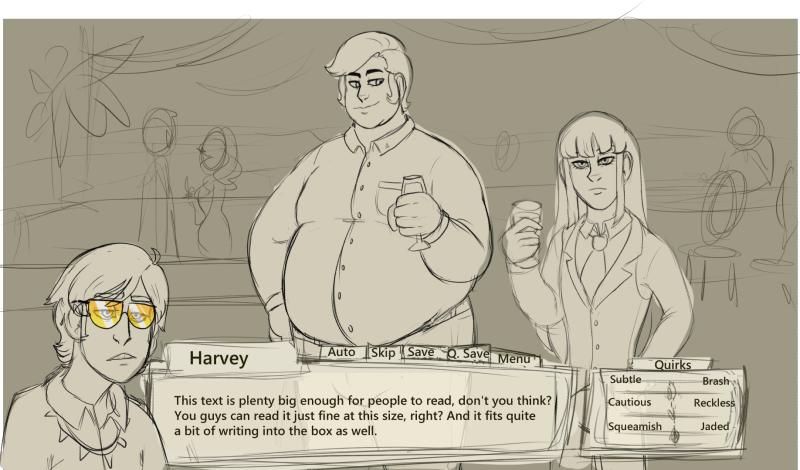
Then I designed my box and added it in
Image

But I realized there was something I totally didn't account for. Whenever Harvey isn't there, the Quirks box makes it look totally imbalanced.
Image

I find side portraits for visible characters to be very redundant so I don't want to add that. So I thought I'd ask on here.
Should I add a placeholder for Harvey's spot, scoot everything over and make Harvey overlap it more, or just try to find a way to make the Quirks stat screen collapsible?
In addition, any ideas on how to make a UI look more polished? I haven't gotten around to changing the text and name fonts and such yet other than shrinking them, but critique on anything else would be much appreciated.
Thanks for your opinions!

User avatar
parttimestorier
Veteran
Posts: 429
Joined: Thu Feb 09, 2017 10:29 pm
Completed: No Other Medicine, Well Met By Moonlight, RE:BURN, The Light at the End of the Ocean, Take A Hike!, Wizard School Woes
Projects: Seeds of Dreams
itch: janetitor
Location: Canada
Contact:

Re: GUI Layout critique/advice?

#2 Post by parttimestorier »

Looks nice! I think making that "quirks" screen collapsible is a good idea. It doesn't seem like something that you'd need to be checking constantly, and that way the screen is more symmetrical when the characters without side portraits are talking. Maybe you could put a quirks button at the top of the textbox, next to the menu button, with a little arrow to indicate that it will slide out at the side or something. (But that's just the opinion a potential player - I don't really know much about design on a technical level.)
ImageImageImage

User avatar
KarmaLarma
Newbie
Posts: 23
Joined: Wed May 10, 2017 11:40 pm
Projects: Deadly Vice
Tumblr: karmalarma
Deviantart: karmalarma
itch: karmalarma
Contact:

Re: GUI Layout critique/advice?

#3 Post by KarmaLarma »

It took a lot of fiddling since I'm new to coding, but thank god for the Ren'py cookbook part of the forum hehe. I managed to make the quirks sliders collapsible and it looks a lot nicer.

Image

Also got them to animate (this gif makes it look choppier than it is) so I'm pleased with that!

Post Reply

Who is online

Users browsing this forum: No registered users