Which Game's UIs Do You Like Most?

A place to discuss things that aren't specific to any one creator or game.
Forum rules
Ren'Py specific questions should be posted in the Ren'Py Questions and Annoucements forum, not here.
Post Reply
Message
Author
User avatar
KrunchyFriedGames
Regular
Posts: 32
Joined: Tue Oct 02, 2018 12:14 pm
Completed: Witches and Bandits and Swords (Oh My), The Bunny Hill Horror
Projects: The Bunny Hill Horror : Bunny Boiler
Organization: Krunchy Fried Games
Deviantart: redruM-110
itch: krunchyfriedgames
Location: Manchester, England
Contact:

Which Game's UIs Do You Like Most?

#1 Post by KrunchyFriedGames »

I ask, as we put out The Bunny Hill Horror as a free game just before Hallowe'en. Some people liked it, some people didn't- and one of the main criticisms people made were that the UI was a bit clunky, so this is going to be the main thing I want to improve for the next game.

Would be grateful if anyone could name any games where the UI really works well that we could take inspiration from, or could make any suggestions for what we could be doing there.

A couple of things immediately: scrolling needs to be replaced by clicking on text box, need more of a consistent theme in terms of shape/ style, object icons to be improved (although I'm not quite sure how since neither of us can draw).

Here are a couple of Pics:
Image Image
Krunchy Fried Games
Itch Homepage
Twitter

User avatar
LexBit
Newbie
Posts: 5
Joined: Tue Oct 28, 2014 11:04 am
Projects: Celestial Navigator [WIP]
Location: Pennsylvania, USA
Contact:

Re: Which Game's UIs Do You Like Most?

#2 Post by LexBit »

Hello and congratulations on your game release! I'd like to preface this post saying that I'm not a fan of the horror genre, and I'm not a professional in UI development, but hopefully some general opinion can be helpful. :D

For your first question of some game UI recommendations, unfortunately I haven't played enough horror games to suggest anything particularly similar to your style. A few keynotes from games such as Silent Hill and Amnesia though is the very clean interface. Granted I'm a little biased on minimal UI design, but I think from your screenshots it's just fine. What I would suggest is changing the overall style of how your UI is pushing your theme.

What I mean by 'theme' is the mood, feeling, or atmosphere a game conveys through its style. A notable example I can think of is the fog in Silent Hill and the gritty style that comes with the gameplay.
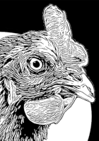
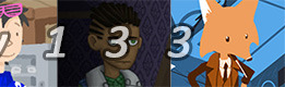
I really like the serif font you chose to use with dark backgrounds and think this is a great choice with a horror game. Silent Hill and Amnesia both use these serif fonts when examining text. (Example below)

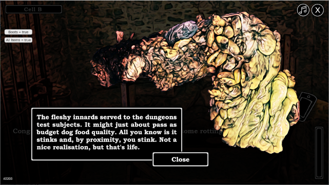
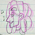
You've already mentioned some good improvements, such as removing the scroll, but for the style I would suggest avoiding boxes around your text. Below are some screenshots as examples.
SilentHill3-BelieversComplaints_1.jpg
amnesia_text.png
However, if you want to keep this border around your text, make it consistent with everything. Right now in your screenshots, I can see that the "Elf's Room", "Cell B", Music and Exit icons, and examining text on the bottom picture all have these outlines, which is okay but inconsistent with the lady's text in the first picture.

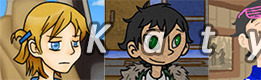
Here is another example from a game called "9 doors 9 persons 9 hours" that uses outlines on everything.
51zi1B6LhWL.jpg
My last suggestion would be changing the icons of the mail and cellphone. These icons would be good for a more graphical kind of game but seem out of place with the realistic women and background. Maybe an actual photograph of a cellphone and envelope would fit better? Note that if you choose to keep the outline style and want to keep these icons, I would suggest making them a little more straight and less hand-drawn looking. This way the straight lines of the icon could match the straight lines of the outlined boxes.

Anyway, I think what you have is awesome and congrats again on producing a finished game! If I get a chance to play, I'll leave a more thorough review. Hopefully some of this was helpful to you, and I'm sure whatever you choose to do will be great. Good luck with all your adventures!

User avatar
Katy133
Miko-Class Veteran
Posts: 704
Joined: Sat Nov 16, 2013 1:21 pm
Completed: Eight Sweets, The Heart of Tales, [redacted] Life, Must Love Jaws, A Tune at the End of the World, Three Guys That Paint, The Journey of Ignorance, Portal 2.5.
Projects: The Butler Detective
Tumblr: katy-133
Deviantart: Katy133
Soundcloud: Katy133
itch: katy133
Location: Canada
Contact:

Re: Which Game's UIs Do You Like Most?

#3 Post by Katy133 »

The Blind Griffin on Itchio has some of my favourite UI design in a visual novel. It fits in with the game's setting (using the 1920s art deco aesthetic) and is diegetic (it's implied the backgrounds are the "walls" of the speakeasy).

Sasquatchii on Twitter and Lemmasoft is also an amazing VN UI designer. You should check out her work and talk to her about UI--she also does commission work. You can check out her UI designs on this Lemmasoft page: | Sasquatchii's Designs | Logos | GUI | Kickstarter Graphics | NSFW |

I also recommend watching Design Doc's YouTube channel if you haven't already. Here's their video on UI design in video games:


And on inventory UI design:


Also, check out his ongoing series on graphic design. It covers good examples and bad design choices, explaining why things work or don't work. I recommend starting with episode 3, because it covers Neir Automata, which has one of my fav UI designs in a game. Simple, elegant, minimalist, and diegetic.


Hope this helps! :D
ImageImage

My Website, which lists my visual novels.
Become a patron on my Patreon!

User avatar
KrunchyFriedGames
Regular
Posts: 32
Joined: Tue Oct 02, 2018 12:14 pm
Completed: Witches and Bandits and Swords (Oh My), The Bunny Hill Horror
Projects: The Bunny Hill Horror : Bunny Boiler
Organization: Krunchy Fried Games
Deviantart: redruM-110
itch: krunchyfriedgames
Location: Manchester, England
Contact:

Re: Which Game's UIs Do You Like Most?

#4 Post by KrunchyFriedGames »

@LexBit
Thanks for your comments- it's good to know what we're doing right as well as what can be improved on as sometimes you can lose track of this. So, to sum up: more consistency, ensure graphics themes match throughout and ensure the style matches the theme. And also lose the boxes! That all sounds useful :)

@Katy133
Thanks for these, I've had a quick look at The Blind Griffin and Sasquatchii's stuff. I'll definitely check out the video resources too- he's got loads on his channel!
Krunchy Fried Games
Itch Homepage
Twitter

Post Reply

Who is online

Users browsing this forum: No registered users