Ren'ai Stuff

A place to discuss things that aren't specific to any one creator or game.
Forum rules
Ren'Py specific questions should be posted in the Ren'Py Questions and Annoucements forum, not here.
Post Reply
Message
Author
kara24601
Veteran
Posts: 427
Joined: Wed Oct 27, 2004 12:02 am
Projects: Numerous unfinished dreams await completion.
Location: USA
Contact:

Ren'ai Stuff

#1 Post by kara24601 »

I apoligize for the unfinished face and anything else you may find annoying , I just wanted to quickly show off some things to let people have an idea of my style and have proof that yes , I haven't given up on making games ...I'm just really slow and have the bad habit of losing track of things....:oops:

ImageImage

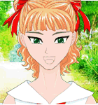
The lack of face - I'm still unsure about what kind of faces I want to go for I mean like facial features...obviously I've got the head down already but the lips and stuff...still need to work on them or keep working on them...
Also there's the worry about change of expression to show wether a character is joking or not , ect. I haven't made any expressions for them yet. ( I can't remember when I started on these by the way )

Black lines and shading - I am more comfortable working with Black lines
...I can do color / colored lines but it takes longer and I get annoyed with it.
I think I've rarely tried shading , I think shading can make characters look diseased ..it's funny how decent shaders seem to make such good characters yet at the same time / in a way the characters can look diseased if you're looking at them too closely. So , I do not use shading partly due to my opinions on it and partly due to my lack of skill / knowledge when it comes to shading.

"Flatness" : I think lack of shading may have something to do with it but I don't understand why people make such a big deal about flatness , my hope is that if / when I've got a finished Ren'ai (or any other type game or project for that matter ) , people will enjoy my work despite the "flatness" of my art.

Background : I just threw in those gradients as the BGs because the previews would've been boring without some sort of background.
I love gradients , but I know alot of people get annoyed with people using the easy way out / overusing gradients so I don't know...I'd love to use some gradients for BGs , though. I'm still planning on using photos and stuff I've drawn myself for BGs too. Maybe some adventures will have only photographic BGs , maybe some will only have drawn BGs , whatever. I haven't decided yet. As you've seen , I've been working on the characters , making sure I can make a game using Ren'Py , ect. more than anything else when I do work on Ren'ai.


I completely lost track of the males and have so much crap on my computer that I fear I may have lost them forever / will have to do them all over again and of course I hate having to go through tons of stuff just to find one thing or a few things , hence the lack of a male character preview. *cries* Actually I did do some searching but so far , I haven't found the guys and I can't remember what I named the files so it's that much harder.

I have other ren'ai related stuff such as scripts and the beginnings of things...
( ie - plot or whatever - Maria : "Let's go to the mall!" John ( choice one ) : "I don't feel like going to the mall. Let's do something else." John ( choice two ) : "Yeah , just let me get some things done real quick and then we'll go." )

More previews later , maybe. Feel free to add previews to your own work 'cause I feel like it would be a bad / sad thing if I started a thread with so few previews ...and only my previews. Besides , I love to see others work.

Oh , and ...yes , I'm planning on adding catgirls into at least one Ren'ai.
The gradients I used were chosen for the fact that the first one gives one the concept of a beach and the other of a field. Therefore making perfect BGs in my opinion rather than ...um...a peppermint gradient , for example.
The non-natural colors chosen for the catgirl - I like how they look together. Plus if I am going to add a catgirl , why not take it further and give her funky colors. Heh. I will try to have some more "natural" catgirls too but right now I'm in love with the fiery catgirl and want to put her in a game. Baggy pants and big boots thing - Don't worry they don't really have fat legs or anything...that's just what I ended up drawing when I first started working on the character art. I've got them with better / actual legs. No hands / paws thing - I chose to draw the arms like that so that I wouldn't have to draw hands / paws. *sweatdrop* I can have alot of trouble with drawing hands...paws...not so much...but it's been a while since I've tried.....and since these are just previews , who knows , maybe by the time I release something the characters will have hands / you'll see their hands ( or paws in the case of catgirls and catboys ) .
Centaurs and other character ideas have not been drawn yet ...only humans and catpeople. Apoligies to fans of other species / creatures. Heh.

Now , some examples of BGs I've drawn / made pixel by pixel and stuff :

Image

Image

These are actually sized for use in Adventure Game Studio aka AGS but , of course , I could work on bigger or smaller BGs if I had / wanted to.
As you can see , the first BG preview is lacking a cityscape or anything else that might be interesting like that but the second one is finished.
Sorry again for lack of certain features.
I just remembered a couple of other things - I've only worked on one hairstyle so far that's why both the human and the catgirl have the same hairstyle right now ...the fact that they have the same hair color is just another laziness issue ...I just wanted to show off some characters and didn't notice they had the same hair color until I already posted and then I didn't want to change it since I'd already put both up anyway. The catgirls have a base with the hair and the other is without so if you consider bald / realistic or whatever a hairstyle...then the catgirls have two hairstyles / hair choices. Heh.
I hope I didn't forget any other details that might've been worth discussing. I hope you like these previews. Thank you for checking out this post / thread. 8)

Why is the word project in Yellow? Did I mispell it earlier? *confused look , laughs*
Last edited by kara24601 on Thu Jul 14, 2005 3:51 am, edited 4 times in total.

Shii
Regular
Posts: 49
Joined: Thu Jun 02, 2005 8:00 pm
Contact:

#2 Post by Shii »

Pixel art is a fine style-- it was used through many 1980s H-games to good effect. I don't have any non-pornographic pixel art to share, but suffice to say it was all shaded, at least a little. Even modern sprites are shaded. Your characters will look very weird just as flat colors.

<-- Look, even Pikachu is shaded. :) Even this smilie is shaded. You know how smilie faces look without shading-- it's sort of inhuman.

Your technical talent is good, but you need to brush up on proportions some. The "baggy pants" look, especially to someone like me who's seen a lot of it, doesn't do much to hide a lack of knowledge about proportions. Try drawing from a human subject or a mannequin, to start.

User avatar
rioka
Royal Manga Tutor
Posts: 1255
Joined: Fri Jul 16, 2004 12:21 pm
Completed: Amgine Park, Garden Society: Kykuit, Metropolitan Blues (art)
Location: somewhere in NY
Contact:

#3 Post by rioka »

The "flat" style is a preference and personally, I like it. Line art is actually one of the things that drew me to manga. Personally, I think flat art can work. It just depends on the execution.

Anyways, looking good so far kara! =)

User avatar
mikey
Lemma-Class Veteran
Posts: 3249
Joined: Sat Jan 10, 2004 6:03 am
itch: atpprojects
Contact:

Re: Previews of Ren'ai related stuff

#4 Post by mikey »

kara24601 wrote:"Flatness" : I think lack of shading may have something to do with it but I don't understand why people make such a big deal about flatness , my hope is that if / when I've got a finished Ren'ai (or any other type game or project for that matter ) , people will enjoy my work despite the "flatness" of my art.
That's a generally good view to have. I personally see nothing wrong with your designs in a global point of view. In addition to that it's very smart to do what you did - so you wouldn't have to draw paws and all.

Especially with your first game, this "cheating" is very important in eliminating tine-consuming activities such as learning too much new stuff that detracts from the global goal. I had many sacrifices to make, I had to make decisions that pulled down gameplay and replace better art with worse at times, so that I would be able to finish the game.

In the case of your art I would say the art is good enough, so draw what you need and focus on the script and programming. Personally for the BGs I would suggest you somehow tamper with photographs, although Kasuka will prove even simple line art is fine.

This is not to say "ignore art suggestions" of course and Shii made some good points concerning shading and such. If you're going to practice more to better up your art, or if you focus on script (which IMO probably should be your priority now) is entirely up to you. Besides, if you make a game with Ren'Py, you can always replace and re-release the game with better art if you won't be able to sleep at night.

Again, I'm not downplaying the importance of graphics and shading. I kind of try to play up the overall goal - the game itself :?

bookie
Veteran
Posts: 269
Joined: Fri Mar 25, 2005 10:17 pm
Contact:

#5 Post by bookie »

I think models like those will do fine for a ren'ai game, but it's always good to want to improve every aspect of what you do. In that sense I'll give you a few suggestions/critiques.

Firstoff, Proportion is important. It's also the hardest thing ever and takes a bucketload of time to get right. However, the better you get and understanding anatomy and proportion, the better and better your art will look. Right now your arms have a 'hidebehindtheback' feeling, mostly because the lines sort of sweep behind the back with no definition of elbows or anything.

Also, the shirt looks sort of painted on to the chest. Try seperating the cloth a few pixels from the skin and it will look more natural. The problem with the pants and feet is the same as with the arm. There's just nothing defined. I can see the hips, but then the pants billow out into an odd form, which the shoes follow. If anything, seperate the pants from the shoes so they don't look like one continuous thing.

kara24601
Veteran
Posts: 427
Joined: Wed Oct 27, 2004 12:02 am
Projects: Numerous unfinished dreams await completion.
Location: USA
Contact:

#6 Post by kara24601 »

Thanks for the comments.
( imagine a serious , not whiny voice / tone )
Again , the "baggy pants" look was just what I ended up with at first ,
but I've got bitmaps of them with actual / better legs and feet too.
The last part could either be thought of as big shoes or boots.
I love boots.
For the lack of elbow lines , I think I know how to do that but I don't like doing it ...I don't know , for some reason it looks bad to me or something when those things are added.
I don't see this problem with proportion others are seeing... :?
( imagine the next part said in a curious or confused , not whiny voice / tone ....heh )
Isn't there something about Anime style / cartoon style art that can and usually does have characters that aren't a certain proportion or whatever , anyway?
( serious voice again )
And lastly ,
I know I could improve the clothes
but these were just quick previews
of what I've been working on anyway.
I'll keep these suggestions in mind
when I work on the art again sometime.
I apoligize if I seem whiny at all ,
( I know I worry too much ) ,
that's not my intention.
:wink: :lol:

bookie
Veteran
Posts: 269
Joined: Fri Mar 25, 2005 10:17 pm
Contact:

#7 Post by bookie »

Anime style is a lot more lax, but it still obeys anatomy to a certain extent. I mean, it doesn't have to be like Leonardo da Vinci, but it shouldn't look lazy either.

I can only critique on what I've seen, and it's really not that bad. It's just that everything can be improved, right? And it's healthy never to be satisfied completely with what you do. But please don't take me too seriously, I'm not that much better with art then you are, and I do think that what you have would do fine in a Ren'ai game.

kara24601
Veteran
Posts: 427
Joined: Wed Oct 27, 2004 12:02 am
Projects: Numerous unfinished dreams await completion.
Location: USA
Contact:

#8 Post by kara24601 »

I agree , everything can be improved.
Thanks again for posting. :)
===================================
Why is the word project suddenly Yellow?
Did I mispell it earlier or something?
:? :lol:
===================================
Last edited by kara24601 on Sun Jun 19, 2005 1:59 am, edited 1 time in total.

Shii
Regular
Posts: 49
Joined: Thu Jun 02, 2005 8:00 pm
Contact:

#9 Post by Shii »

kara24601 wrote:I don't see this problem with proportion others are seeing... :?
( imagine the next part said in a curious or confused , not whiny voice / tone ....heh )
Isn't there something about Anime style / cartoon style art that can and usually does have characters that aren't a certain proportion or whatever , anyway?
By "proportion" I mean the shape and curvature of the body as well. Your body sizes are just fine, but their shape is a bit off.

eclipse: Yes, line art is a great style, but when you color in pictures it helps to shade them :) (unless if you are Andy Warhol)

RedSlash
Veteran
Posts: 351
Joined: Sun Oct 31, 2004 12:48 am
Location: Canada
Contact:

#10 Post by RedSlash »

Wow, pixelart! That's some good stuff. Brings back the memories...

kara24601
Veteran
Posts: 427
Joined: Wed Oct 27, 2004 12:02 am
Projects: Numerous unfinished dreams await completion.
Location: USA
Contact:

#11 Post by kara24601 »

Just a reminder since I was making a big deal about it in here too ( lol ) - if you start seeing Yellow words , it's just a result of you having done a search.
I think it was Chronoluminaire ( hope I spelled that correctly ...sorry Chrono... ) that pointed this out to me.

:oops: :lol:

So , now , hopefully this means I'll have been the only who freaked out about it and I'm sorry.

=================================================
Three of my planned games were / are inspired by this site
( just so people know there is some nude drawings and stuff at this
site ....mmmkay? ) :

http://www.neomonsterisland.com/kgirls.htm

Kaiju Hard Doki Doki ,
Monster Island ( working title ) ,
and Kaiju Soft Doki Doki
Sorry no art done for any yet.
but I wanted to chat a little about them anyway.

Post Reply

Who is online

Users browsing this forum: No registered users