I don't usually like dating sims, but the art appeals to me so I may give this a try.
Though I hope you don't mind if I point out a few things.
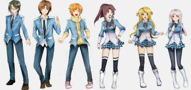
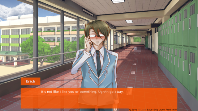
Mike's sprite looks a bit weird to me in the screenshots. It's like he was stretched horizontally. Of course, I'm not a professional artist by any means so I doubt my comments about the art mean much, but that particular pose just looks slightly odd to me.
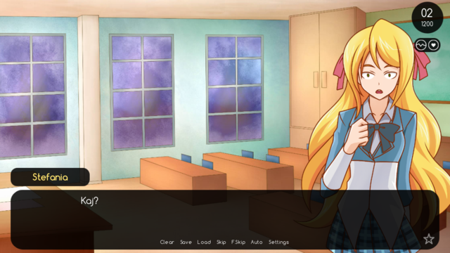
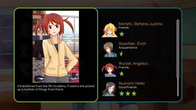
Second, I don't really like the GUI... it's very plain. Sometimes simple works well, but it has to be done well. On the second screenshot, all that text is hard to read. You might want to up the opacity of the box because it's difficult to read against the background/sprite.
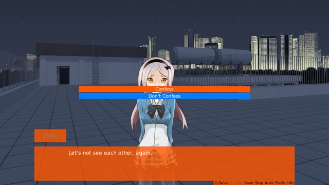
Also, it's a big pet peeve of mine when a game is in widescreen format and the textbox stretches across the entire screen. It looks a lot better when the textbox is less wide and the text is closer to the center of the screen, so that the reader's eyes don't have to go back and forth, straining them. I've heard that about 10-12 words per line is best for easy reading.
The font is also very small and hardly readable, especially the buttons on the bottom right (I hardly noticed them). And again, you should up the opacity because it's very difficult to read small text against a busy background.
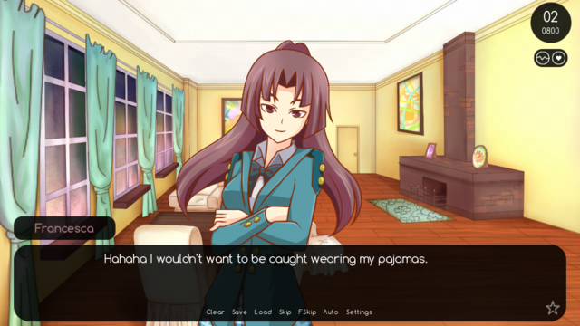
Here's an example of a visual novel, in widescreen format, with a very simple GUI that works well. Notice that the text starts closer to the center so not to strain the eyes, and even though the opacity is low, the text itself is large and has an outline to make it easier to read. I think you could do something similar to this easily if you want to keep it simple ^^
I hope I don't seem too nitpicky! I like the art overall and the fact that it's a dating sim not set in Japan. Plus, the fighting aspect seems interesting. I hope it isn't too hard, though >_< Good luck!


