Version's Art.. Please Critique It?

Questions, skill improvement, and respectful critique involving art assets.
Post Reply
Message
Author
Version
Regular
Posts: 34
Joined: Sat Jul 16, 2011 5:14 pm
Projects: On Hiatus
Contact:

Version's Art.. Please Critique It?

#1 Post by Version »

oh god, i know, i suck ;v;They're all sketches, but.. please don't hold back! Any kind of criticism is accepted. :oops:

I think I'm going through some artistic puberty. ;v;

http://ver-tan.deviantart.com/art/Howl- ... r-tan&qo=2

http://ver-tan.deviantart.com/art/Light ... r-tan&qo=6

http://ver-tan.deviantart.com/art/Mulan ... r-tan&qo=5

ver-tan.deviantart.com
Attachments
hugsfanart.jpg
aatlantic.png
sketch.png
Image
Image
Omo, omo, omo, aigoo.
Sorry for all of these: [!!!!]

Johvalo
Newbie
Posts: 15
Joined: Sun Oct 02, 2011 10:08 pm
Projects: Truth or Dare
Contact:

Re: Version's Art.. Please Critique It?

#2 Post by Johvalo »

Hmm.. I know this isn't much of a critique, but I like your art!
I can really feel the movement in the lightning bug piece. :3
The only criticism I've got is that the nose on the second attachment guy (sorry IDK what to call him XD) looks a bit funny somehow. Can't place my finger on what it is, though. Also Shang looks a bit off in the Mulan one; he just doesn't seem too... Shang-like, I guess?
That's all I've got. Sorry it wasn't very helpful ^^;

User avatar
Tag-
Miko-Class Veteran
Posts: 508
Joined: Tue Jul 05, 2011 7:50 am
Projects: Circo della Sera
Contact:

Re: Version's Art.. Please Critique It?

#3 Post by Tag- »

Alright, I'm gonna give it a shot at critiquing. First off, let me say that I really like your style~ :D I'll write about my thoughts for each individual piece.

1. Dang, I really like the way you drew the feathers :o But, you've got to be careful of relative head sizes. Either Howl's head is too big, or Sophie's is too small.

2. Haha, it's cute~ Liked how you used the lighting effects here. I don't know much about backgrounds, so I won't say anything about that :'D There are a few inconsistencies in this picture, for example, for the leg that's been raised, you have the bottom of his shorts stopping above his knee. On the other leg, however, the shorts seem to stop below his knee. Also, with his shoe, without a strap at the back, it wouldn't stick to his foot the entire way like that. Kinda like flip flops when we walk in them, they hang at the back.

3. Not much I can pick out with this one, the only thing is that Shang's head looks like it curves upwards and in too much (I hope that wasn't a confusing explanation @_@'')

4. Nothing I can pick out out here, but I'd like to point out that although she's telling him off, Bora doesn't look very annoyed :P

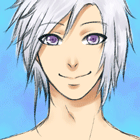
5. Again, not much, but I feel as if his eyes are just that tiniest bit too close to each other, particularly the one on our right.

6. A few inconsistencies here. It seems like the girl's arms too much too long in comparison to her legs, in fact, they're longer than the guy's arm :shock:


Well, I hope this has helped a bit xD''
PM me if needed

MonoPiero
Regular
Posts: 77
Joined: Thu Oct 27, 2011 3:08 am
Contact:

Re: Version's Art.. Please Critique It?

#4 Post by MonoPiero »

Its not bad. Not the kind of art I like though xD But I won't be bias(Maybe). *u*

For the first one, It kinda looks like the guy is holding a doll.. The girl's head should be bigger. (I think their eyes look kinda lifeless but I'm sure thats your style so no prob there :D)

The 2nd one, the fingers should be longer abit I think. You could try taking photos of your hand or draw guidelines(Though the hands I draw are not so good either >o<)

The 3rd one, I think its ok as it is (Cannot comment cos I'm gonna bias.)

The 4th one, Water color style? xD If its not then the color is too light! (Like the other ones)

5th one, no comments.

6th one, no comments.

ouo So I guess your style of coloring is the watercolor look? I really can't comment much xD Even if I think they look weird but they are your kind of drawing style.. So probably you did them on purpose. But your art is really good compared to most people xD. Just some little mistakes here and there. +u+ Fixed = perfect

Celestine
Veteran
Posts: 265
Joined: Thu Jun 23, 2011 4:06 pm
Location: USA, Michigan
Contact:

Re: Version's Art.. Please Critique It?

#5 Post by Celestine »

1.Tall person and school uniformed girl

I like that posture of someone standing and leaning far into person sitting back.
I've never seen anyone draw that. But the posture is correct. The coloring is nice.
Bending the paper gives it that realistic approach of pressure.
Irritation on her face is funny. Her fist clenched with it. Drawing of hair flexible flow. The slender fingers drawn.

2. Long red-haired winter hood

Love this one. I like this one out of the 3. But only two things.
The coloring above the top lip but beneath the nose is a bit too dark. Looks like a pimple. And the coloring inside of the hood. Unless the inside of the hood is red too then your blending the hair color with the hood that makes it unrealistic. Should be a bit of the coloring of the hood especially with someone of really long hair then some with a bit of shorter hair but still long.
Otherwise it'll seem more like a oval portrait potryaing the face of the person being your focal point.
But there's something I noticed. If you ever want him to look like he just got slapped you could slightly darken the pink area in the cheek. Which would look like an identation of part of a hand print.
I really like how you drew his hair and eyes, the way shaped and colored the eyes shows some real indepth personality. The face itself is really nice. The nose looks good. Especially the lips, very realistic. The coloring of the face and neck looks like he's been out in the cold.

3. pic of the two people
Arm seems awkward. Elbow seems bent out not inward.
Looks like she's kneeling on her knee but lifting herself from sitting down. Which I hope it suppose to look like she's trying to balance herself from falling on him. The thumb still a little bit to far from fingers placed down on the ground. The scarf looks nice. The clothes too and the way drew her hair being pulled up. The posture and angle nice too.
Iratherbeweird,thencalledstrange.
MydadtaughtmeinLifeEverything[/i]has consequences.Good and Bad actions/decision.

Post Reply

Who is online

Users browsing this forum: No registered users