Help! Lacking something!
-
Camille

- Eileen-Class Veteran
- Posts: 1227
- Joined: Sat Apr 23, 2011 2:43 pm
- Completed: Please see http://trash.moe
- Projects: the head well lost
- Organization: L3
- Tumblr: narihira
- Deviantart: crownwaltz
- itch: lore
- Contact:
Re: Help! Lacking something!
I'm not an artist so I really can't help with all that (I think LWR and the others have you covered, anyway), but I just want to say that people criticize the art in Starry Sky for the crappy anatomy ALL THE TIME. (Iku's ridiculously long neck, Homare's turtle neck, Naoshi's paper hands that bend in a way that's physically impossible…) So I really don't think that's what you should be emulating. I have some friends who flat-out refuse to play Starry Sky because they'd be too distracted by the poor art to play. People—even non-artists like me—do notice bad anatomy. Your anatomy doesn't have to be spot-on, but if your character looks really off, people will notice. D: Don't use the "anime doesn’t have to be realistic!" excuse as a crutch because it will only limit your art.
-
Deji

- Cheer Idol; Not Great at Secret Identities
- Posts: 1592
- Joined: Sat Oct 20, 2007 7:38 pm
- Projects: http://bit.ly/2lieZsA
- Organization: Sakevisual, Apple Cider, Mystery Parfait
- Tumblr: DejiNyucu
- Deviantart: DejiNyucu
- Location: Chile
- Contact:
Re: Help! Lacking something!
I think your weakest points, when it comes to make your artwork look more "professional", are linework and coloring.
You'd want to make your linework a bit more precise, so to speak, and try to use a bit of color and line width variation. I'm guilty of not using much variation in my lines myself, but I've found you can fix that by adding a bit of thickness on parts where some object overlaps another, like a shadow. it helps quite a bit to give more personality to your linework (:
About coloring, the best advice I can give you is to make color studies. Look at the artists you like, look at photographs, maybe even look at artists you don't like but that have great use of color. Tr not to draw or color by memory or from the top of your head what you think it looks right at the time, look at other drawings or photos as much as you can! (unless you've done the process so many times you can do it with your eyes closed xD; ) It's the best way to check your drawing and coloring isn't too sloppy or too odd and looks the way you want it to look. Copy, experiment, try new things, imitate, study, play around!
(sorry, I couldn't resist using your character to play around with coloring ^^; )
Keep up the good work! (:
You'd want to make your linework a bit more precise, so to speak, and try to use a bit of color and line width variation. I'm guilty of not using much variation in my lines myself, but I've found you can fix that by adding a bit of thickness on parts where some object overlaps another, like a shadow. it helps quite a bit to give more personality to your linework (:
Keep up the good work! (:

When drawing something, anything, USE REFERENCES!! Use your Google-fu!
Don't trust your memory, and don't blindly trust what others teach you either.
Research, observation, analysis, experimentation and practice are the key! (:
-
Green Skies
- Regular
- Posts: 53
- Joined: Wed Jun 16, 2010 1:47 am
- Projects: Shoot The Moon (GXB Otome)
- Organization: Green Skies
- Contact:
Re: Help! Lacking something!
LateWhiteRabbit wrote:As many teachers and professors of the world have said, you must learn the rules before you can effectively break them. If you don't know how to draw a realistic jacket, your stylized jacket will never look very good.
I completely agree! I'm pretty bad with getting what I'm trying to say across sometimes. What I was trying to say is weird things CAN happen in anime, and are even sometimes well accepted. Sorry if I made it sound like I thought I didn't need to study the basics to draw anime (which would be ridiculous).Auro-Cyanide wrote:Everything starts with reality at some point, so it is the best place to look when you get lost
I do think that part of it is coloring. (and I would love it if you elaborated a little bit!) But I also think that the before pictures of the marvel comics were just as professional and sell-able as the second, even though they may not look as contemporary and realistic, but I could be the oddball out on this point. Maybe it is the detailed/clean linart?LateWhiteRabbit wrote:Ah, that is because of the coloring.
Range Murata & Satoshi Kon! I love both of their work
The purple shadow has so much more flow! and his hair fits his head so much better O.oAuro-Cyanide wrote:
Current Project: Shoot the Moon // Devblog
-
Green Skies
- Regular
- Posts: 53
- Joined: Wed Jun 16, 2010 1:47 am
- Projects: Shoot The Moon (GXB Otome)
- Organization: Green Skies
- Contact:
Re: Help! Lacking something!
Again, I'm sorry I made it sound like I was saying I didn't think I had to study realism. I was just trying to point out that cellshading doesn't have to involve using every color. I wasn't trying to use it as an excuse! I swear! Obviously I wasn't very clearCamille wrote:...but I just want to say that people criticize the art in Starry Sky for the crappy anatomy ALL THE TIME...People—even non-artists like me—do notice bad anatomy. Your anatomy doesn't have to be spot-on, but if your character looks really off, people will notice. D: Don't use the "anime doesn’t have to be realistic!" excuse as a crutch because it will only limit your art.
In defense of Starry Sky, it is a very popular otome game. Of course popularity doesn't mean skill, but in the end we are all striving to get our work seen and talked about. Even if some people don't like it, if the majority love it and are willing to spend money for it...I think it has to have a certain charisma (This was the point I brought up in the beginning, the atmosphere some art has). Take Skip Beat (http://i14.mangareader.net/skip-beat/17 ... 016215.jpg) for instance, I couldn't read it for so long because the proportions were so awful but something about the art became beautiful in its own way after I adjusted my perspective.
But again, no crutch I promise! Thank you!
Current Project: Shoot the Moon // Devblog
-
Green Skies
- Regular
- Posts: 53
- Joined: Wed Jun 16, 2010 1:47 am
- Projects: Shoot The Moon (GXB Otome)
- Organization: Green Skies
- Contact:
Re: Help! Lacking something!
Wow! You made him look amazing. What programs do you use? Do you lineart by hand? Pen tool? Pathways?Deji wrote:I think your weakest points, when it comes to make your artwork look more "professional", are linework and coloring...sorry, I couldn't resist using your character to play around with coloring
Your style carries with it that "professional sense"! So do you think it has to do with detail as well? Sorry to bombard you with questions.
edit: Sakevisual! You are amazing.
Current Project: Shoot the Moon // Devblog
-
LateWhiteRabbit

- Eileen-Class Veteran
- Posts: 1867
- Joined: Sat Jan 19, 2008 2:47 pm
- Projects: The Space Between
- Contact:
Re: Help! Lacking something!
Well, to elaborate on coloring -Green Skies wrote: I do think that part of it is coloring. (and I would love it if you elaborated a little bit!) But I also think that the before pictures of the marvel comics were just as professional and sell-able as the second, even though they may not look as contemporary and realistic, but I could be the oddball out on this point. Maybe it is the detailed/clean linart?
A good coloring job can make art look much more professional automatically. What makes a coloring job look professional?
1. Use of color harmony. This means the colorist is using complementary colors, and mixing colors properly. It is important to have strong contrast in your colors using VALUE, but you generally don't want to use a lot of colors contrasting by HUE. Contrasting using HUE is what makes the 1990s anime look like . . . well, like a clown died and bled out on the page. Professional colorists usually choose a limited palette for their work, so all the colors have some of the other colors in them. A short of quick "cheat" that a lot of artists use to harmonize an image is to do a single color overlay on top, then fade the opacity until they like the effect. This adds that overlay color to every other color they used.
2. Using neutral colors is quite popular today, because they do most of the harmonizing work for you if you've chosen them correctly. Range Murata is using a neutral color range for this image. Neutral colors often result in a slightly desaturated look.
3. Differentiating materials. Professional coloring allows you to easily see what type of material something is - be it silk, cotton, denim, skin, or hair. This is because different materials reflect light differently, some being highly reflective like silk, some scattering light diffusely like denim, or some that absorb light and scatter it in the sub-surface like skin. Professional coloring takes all this into account. Make a jacket with no highlights and people will assume it is wool or cotton, give it a few broad and diffuse highlights and people will assume it is leather. Go too far with the highlights and make them too hot and you end up making the jacket look like it is made of latex. It isn't just highlights and color that tells us what a material is, however. A lot of responsibility lies with the artist who drew the sketch to begin with, since different materials will wrinkle and fold and unique ways.
It is really hard to "tell" someone how to color well. It is a bit like trying to describe purple to someone. A lot of being a good colorist is training your eyes to see all the colors that go into a painting or color, and really SEEING everyday colors, not just saying, "Oh, that's yellow. Or that's blue." It is why you here a lot of artists describe color very precisely, like ochre red, or vermillion, or indigo.
It IS possible to mathematically or statistically arrive at good color mixing, however. Funny aside story: When I was in art school I was painting beside a girl for several weeks. She was a better painter than I was - not by a lot, but measurably. One day she looks over and asks me if the paint on her palette is more red or orange in hue. I looked at her very funny, with a confused look on my face. "What are you looking confused for?" She asked. "Because it is a very bright orange," I told her. I couldn't see how she might even begin to mistake it for red. She shrugged apologetically and responded, "Oh, I'm color blind." I was both flabbergasted (she painted better than me!) and amazed. So getting good results from a purely academic standpoint is possible, but most artists rely on intuition (which is really academic rules internalized).
Go check out this thread on Gutterzombie. It has many different colorists trying to color the same drawing. Notice how some results look amateurish and other results make the drawing look 10x better. That board is dedicated to nothing but coloring comics, and it has a mix of total amateurs and industry professionals from Marvel, DC, and others on it. Check out the rest of that forum and you will learn a LOT. This is particularly helpful because good coloring is good coloring anywhere, not just in anime, paintings, or comics.

Re: Help! Lacking something!
Ehhh slightly off topic but in defense of Starry Sky and Kazuaki (the artist), I have to say that her 'anatomy issues' are really more of a choice of stylization. If you take a look at her art books and sketches, it's quite obvious that she has a good grasp on anatomy and how the human body works. She just chooses to elongate or change the proportions of certain parts for aesthetic purposes. However, there is a difference between looking at realistic art and then altering the proportions to make it more stylized, VS looking at art that's ALREADY stylized. Try to refer to both realism and stylized art.
When it comes to anime art, there isn't a need to use a rainbow platoon of colours or shade in every detail, depending on which style you're looking at. For more simplified styles, they usually have very clean, flowy lines that are properly weighted(varying thickness of lines), along with a very nice colour template (since they can't rely on shading skills to bring out the colours). Basically, you just have to learn to work with a "stylized style" that looks "reasonably realistic and believable". Sometimes, less is more, so don't feel pressured to have to shade in a dozen details for it to work.
When it comes to anime art, there isn't a need to use a rainbow platoon of colours or shade in every detail, depending on which style you're looking at. For more simplified styles, they usually have very clean, flowy lines that are properly weighted(varying thickness of lines), along with a very nice colour template (since they can't rely on shading skills to bring out the colours). Basically, you just have to learn to work with a "stylized style" that looks "reasonably realistic and believable". Sometimes, less is more, so don't feel pressured to have to shade in a dozen details for it to work.

-
LateWhiteRabbit
- Eileen-Class Veteran
- Posts: 1867
- Joined: Sat Jan 19, 2008 2:47 pm
- Projects: The Space Between
- Contact:
Re: Help! Lacking something!
I'd say any "stylization" that people routinely mistake for bad anatomy is bad stylization. I looked at Kazuaki's art after you mentioned her name, and she obviously has a lot of artistic talent and knowledge, but her hands always look atrocious in all her works. That is one of the only failings I can readily pick out of her art, however. She either doesn't know how to draw hands well (and every artist on the planet sympathizes with her), or she has chosen an awful form of stylization for them.Elze wrote:Ehhh slightly off topic but in defense of Starry Sky and Kazuaki (the artist), I have to say that her 'anatomy issues' are really more of a choice of stylization. If you take a look at her art books and sketches, it's quite obvious that she has a good grasp on anatomy and how the human body works. She just chooses to elongate or change the proportions of certain parts for aesthetic purposes. However, there is a difference between looking at realistic art and then altering the proportions to make it more stylized, VS looking at art that's ALREADY stylized. Try to refer to both realism and stylized art.
True, this is where a working knowledge of color theory is vital for the selection of a limited palette. Even just flat coloring can work very well if you have chosen an appropriate palette. The more simple your coloring, however, the stronger your initial drawing has to be. Also, the simpler your coloring, the more on your game you need to be about palette choices, color harmony, and complementary hues.Elze wrote: When it comes to anime art, there isn't a need to use a rainbow platoon of colours or shade in every detail, depending on which style you're looking at. For more simplified styles, they usually have very clean, flowy lines that are properly weighted(varying thickness of lines), along with a very nice colour template (since they can't rely on shading skills to bring out the colours). Basically, you just have to learn to work with a "stylized style" that looks "reasonably realistic and believable". Sometimes, less is more, so don't feel pressured to have to shade in a dozen details for it to work.
There is also something to be said for matching coloring style to art style. If you have a very stylized drawing, coloring it realistically with full rendering isn't the way to go. But good coloring remains universal, and it is all based in a deep understanding of color theory, of which entire books have been written.
-
Deji
- Cheer Idol; Not Great at Secret Identities
- Posts: 1592
- Joined: Sat Oct 20, 2007 7:38 pm
- Projects: http://bit.ly/2lieZsA
- Organization: Sakevisual, Apple Cider, Mystery Parfait
- Tumblr: DejiNyucu
- Deviantart: DejiNyucu
- Location: Chile
- Contact:
Re: Help! Lacking something!
I use Paint Tool SAI and I draw the lineart by hand with a Wacom Bamboo tablet. I'm slowly getting better at inking (I used to hate it >>; ), so it's all a lot of practice, in the end.Green Skies wrote: Wow! You made him look amazing. What programs do you use? Do you lineart by hand? Pen tool? Pathways?
Your style carries with it that "professional sense"! So do you think it has to do with detail as well? Sorry to bombard you with questions.
I do think detail has a lot to do with it, but I think it's more... hmm.... "defining" things. Like when you have a sketch where you have plenty of lines that give you an idea of how things look like/where things are versus a finished drawing where everything is clearly defined, without the "vagueness" and "insinuation" of things. Sketchy art does have its appeal, though, but most professional art (at least when it comes to anime/VN) is very "clean", so to speak, so you may want to aim for that (:
When drawing something, anything, USE REFERENCES!! Use your Google-fu!
Don't trust your memory, and don't blindly trust what others teach you either.
Research, observation, analysis, experimentation and practice are the key! (:
-
Green Skies
- Regular
- Posts: 53
- Joined: Wed Jun 16, 2010 1:47 am
- Projects: Shoot The Moon (GXB Otome)
- Organization: Green Skies
- Contact:
Re: Help! Lacking something!
DUNDUNDARUN!!! VERSION NUMBER 2!!!
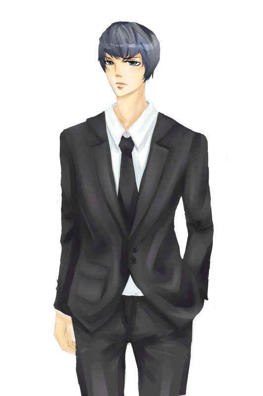
Sorry I didn't get this up yesterday, I was busy and didn't have any time to process all the wonderful critiques you gave.
I think its a little bit better?
A little messy, but I wanted to put it up before I started mopping the floor XD
Sorry if I made the same mistakes
Sorry I didn't get this up yesterday, I was busy and didn't have any time to process all the wonderful critiques you gave.
I think its a little bit better?
A little messy, but I wanted to put it up before I started mopping the floor XD
Sorry if I made the same mistakes
Last edited by Green Skies on Tue Dec 20, 2011 8:01 pm, edited 4 times in total.
Current Project: Shoot the Moon // Devblog
-
Green Skies
- Regular
- Posts: 53
- Joined: Wed Jun 16, 2010 1:47 am
- Projects: Shoot The Moon (GXB Otome)
- Organization: Green Skies
- Contact:
Re: Help! Lacking something!
Deji wrote:
I do think detail has a lot to do with it, but I think it's more... hmm.... "defining" things. Like when you have a sketch where you have plenty of lines that give you an idea of how things look like/where things are versus a finished drawing where everything is clearly defined, without the "vagueness" and "insinuation" of things. :
Sorry I didn't read this before I made the second version...I obviously was pretty sketchy OTL
just a few more questions I swear (do you have a FAQ somewhere?): What brushes do you use to color? Do you use any textures?
Thank you for much for commenting, you're such an inspiration!
You are so thorough! I understand your point about trying to explain "color", but i'll try to research the topics you brought up!LateWhiteRabbit wrote: Well, to elaborate on coloring
I know this is off topic, but you mentioned you went to art school, do you like it there? Who would you recommend art school to? Thanks
Current Project: Shoot the Moon // Devblog
-
LateWhiteRabbit
- Eileen-Class Veteran
- Posts: 1867
- Joined: Sat Jan 19, 2008 2:47 pm
- Projects: The Space Between
- Contact:
Re: Help! Lacking something!
I actually graduated from art school a while ago. It was very enjoyable - I had a previous degree, so I didn't have to take any general education courses. Instead every class I had was painting, or drawing, or art related. I had previous art experience - I started getting private art lessons when I was 5 once a week, and went to a couple of art summer camps over the years. I was also an artist for my platoon in the Marines, helping paint mascots on walls and design range flags.Green Skies wrote: You are so thorough! I understand your point about trying to explain "color", but i'll try to research the topics you brought up!
I know this is off topic, but you mentioned you went to art school, do you like it there? Who would you recommend art school to? Thanks
Art school is generally very expensive, since they tend to be private schools here in the US. (Yay! Student loan debt!) But they are tremendously helpful and motivating. There is nothing quite like having someone standing over your shoulder as you make art to point out corrections or teach you techniques. At the school I attended, I had a former Disney animator teach me 2D animation, a former Disney illustrator teach me illustration, etc. That is one of the greatest strengths of attending an art school is making networking connections. Art school also really pushes you to improve, because you are constantly being compared to your classmates, many of whom will be VERY VERY good. Your art is also being graded and critiqued constantly. It certainly isn't for the faint of heart, as unlike a lot of college courses, in art classes you either pass or fail. One of my professors had a simple rule - "If your work is professional, such that I could turn it in to a major client and it be accepted, you pass. If your work is not professional, you will fail." It is sort of a crucible for your skills. My illustration teacher required 60 drawings a week of acceptable quality. One of my 3D modeling teachers required a new 3D model everyday. You are kept constantly drawing and making art.
But it all depends on what you want to do. If you wish to make a career out of art, I would say it is very helpful. On the other hand, if you just wish to improve your skills for your own satisfaction or for hobby work, I think it is too expensive, and you can learn everything you need to know more slowly by taking some community art classes and following video tutorials online. Art school is also more of a "finishing school", I'd say. You get more out of it the more you know going in.
On to your second picture, in brief:
A very definite improvement over your first. I see you've used some color in the shadows on the suit.
As Deji pointed out, you need to work on your line work. This second image is very "sketchy" as you said. The clothes still aren't fitting your figure correctly. I get what you are going for - this is a cool guy, relaxed, he may wear a suit, but he isn't tight-laced. However, look at the shirt collar. No matter how loose the shirt, the collar will never be that loose around the back of the neck. See here, and here. The break in the lapels is also very large and deep, and the top of the lapels don't seem to follow the curve of the upper body. The head of your figure is also too small.
And one final piece of advice - don't be afraid to take your time. That picture I showed from Jo Chen took her a week. Professional artists spend a lot of time on a piece of art - we do silhouette studies, concept sketches, try out different thumbnails, work on composition, mock up color palettes, then we do a loose sketch, then we refine it, then we tighten it up. Then depending on what we are doing, we ink it, then we color it. And then, if its no good, we never show any body!
While you're learning its cool to show unfinished pieces and what not for feedback, but one of my professors at art school told me that for him, one of the defining differences between amateur and professional artists was that amateurs were too eager to show off their work. All that means is that amateurs often don't spend enough time on each piece before moving on to the next.
-
Green Skies
- Regular
- Posts: 53
- Joined: Wed Jun 16, 2010 1:47 am
- Projects: Shoot The Moon (GXB Otome)
- Organization: Green Skies
- Contact:
Re: Help! Lacking something!
Most of my paintings (traditional media work) as well as computer sketches don't make it past the first draft. I'm no professional, but I still take pride in what I put out to be critiqued. You have to understand that my start to finish ratio is absolutely pitiful. But I really really really want to finish a game.LateWhiteRabbit wrote: While you're learning its cool to show unfinished pieces and what not for feedback, but one of my professors at art school told me that for him, one of the defining differences between amateur and professional artists was that amateurs were too eager to show off their work. All that means is that amateurs often don't spend enough time on each piece before moving on to the next.
108 sprites. 10 cgs. At least 4 image maps. A few dialogue boxes. Backgrounds. = one finished piece.
I need people like you to give me feedback, because I don't have access to anyone else. Of course I would rather show only show everyone masterpieces, but you are my art teachers.
Thank you for all your comments
Current Project: Shoot the Moon // Devblog
-
Green Skies
- Regular
- Posts: 53
- Joined: Wed Jun 16, 2010 1:47 am
- Projects: Shoot The Moon (GXB Otome)
- Organization: Green Skies
- Contact:
Re: Help! Lacking something!
I know this is completely going against rabbit's advice but:
Number #3
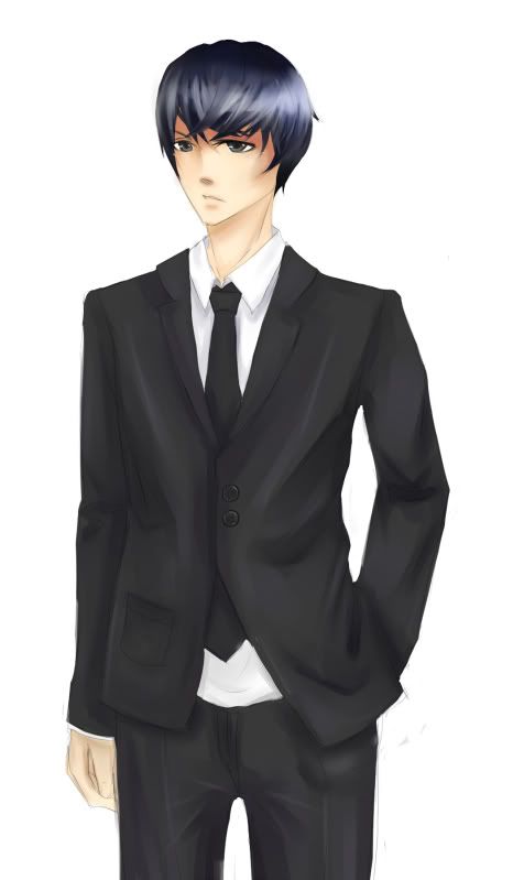
Still missing something though
Number #3
Still missing something though
Current Project: Shoot the Moon // Devblog
-
JustAnotherMe
- Veteran
- Posts: 391
- Joined: Mon Aug 15, 2011 12:35 pm
- Projects: Kuro no Chou; 0.3 Second Lunch
- Location: in the mirror
- Contact:
Re: Help! Lacking something!
I don't know if this can help at all.
Urmmm.. I'm still not good too, not good at all, but still I hope I can help you. Um, I think what you lack is how you color it. The drawing already good, except that you can improve in the proportion section. Not that I'm already good. I'm just saying what I think.
And the main part is your clothe. I don't know how to explain how to color it since I'm still no good in it, but your coloring feels like... you're using mainly water tool right? If I'm not wrong...shoot me if I'm wrong XS
Actually you can use the rather purple-ish grey for the base color. And then use the more black for the shading, maybe using airbrush and water tool. And then add a little tiny bit shine (purple too, but not THAT purple) with mainly water tool, but once in a while use the airbrush too...
ur~ But I think I've seen improvement. So, keep it up!! XD ganbatte!!
And the main part is your clothe. I don't know how to explain how to color it since I'm still no good in it, but your coloring feels like... you're using mainly water tool right? If I'm not wrong...
Actually you can use the rather purple-ish grey for the base color. And then use the more black for the shading, maybe using airbrush and water tool. And then add a little tiny bit shine (purple too, but not THAT purple) with mainly water tool, but once in a while use the airbrush too...
ur~ But I think I've seen improvement. So, keep it up!! XD ganbatte!!
Who is online
Users browsing this forum: No registered users