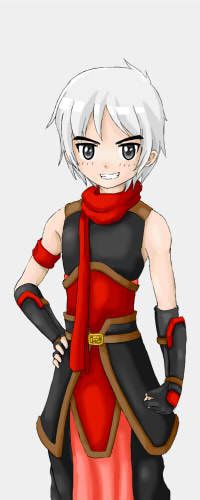
ScottySeng wrote:To start off, I think the proportions scale oddly. The shortest person (left) should have the shortest arm, while the tallest person (right) should have the longest arm. Right now it's the opposite because the tallest person (right) has the shortest arm, and that's odd.
Niki wrote:For the guy on the left, his arms could be a little shorter.
KimiYoriBaka wrote:I agree with the two posts above about the proportions and style.
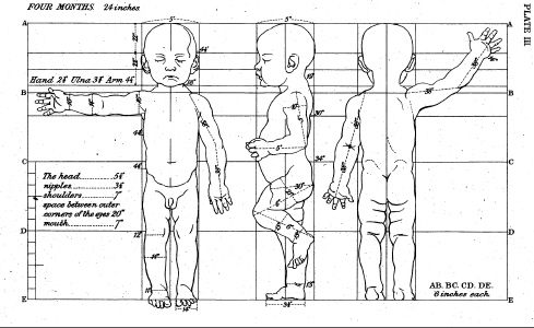
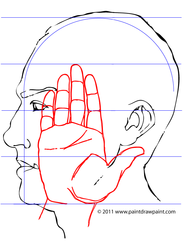
LateWhiteRabbit wrote:The arms on all of the figures except for the first are too short. As a general rule, with the arm at the side and fingers extended, the tips of the fingers should fall half-way down the thigh. To get the size of the hand right, just know that the hands are bigger than a lot of people think - from the bottom of the hand to the top of the index finger is going to be the same distance as from the bottom of the chin to almost the hairline above the forehead on the face.
Woaah! Nice Observation, thanks a lot >.<!! I didn't notice this at all even though I stared at them for hours ;_;
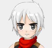
Regarding the conflicting opinion about the white haired boy's hands, maybe it happens because he is to slim? He is proportionally correct according to LateWhiteRabbit but since his body is too slim it gives the impression that his hand is too long to most people. Maybe I should fix his proportion and adjust his hand accordingly instead of only editing his hand?
ScottySeng wrote:I think the shading needs a definitive light source though. Right now the shading is opposing other shaded areas on the same character (left). The person on the left has darker shading on the left on his hand armor, but if you look at the pants, the shadows are to the right.
I see ... . orz. I'll make his pants darker right away!
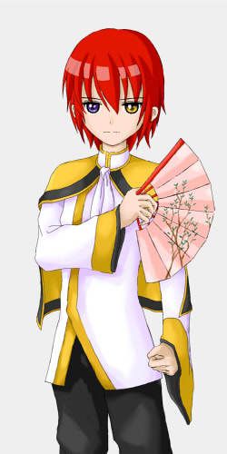
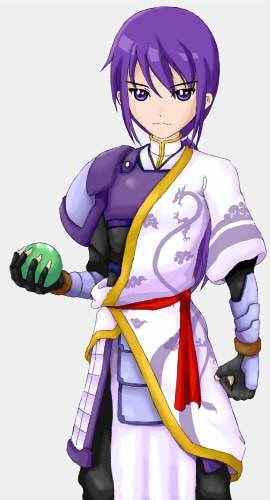
KimiYoriBaka wrote:From what I can tell, 6 for the one on the left, 6 1/2 for the other two. Pretty reasonable as long as they weren't supposed to be adults.
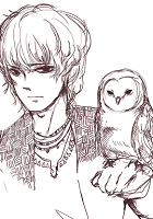
Well .. the red and blue haired guys are supposed to be in their early twenties ^^; . I have a tendency to draw the characters younger than they actually are and no matter how hard I try to draw them to match their age I always fail horribly lol. I guess unconsciously I want them look younger ^^;
Niki wrote:His torso also seems a bit long, though that could just be an optical illusion caused by the clothing.
Niki wrote:The middle guy's left hand looks a little awkward. I can see where you intended his hips to be, but because the shirt is a little long, it looks as if his torso is really long. Moving the hem of the shirt up and showing a bit of his crotch area should fix this.
KimiYoriBaka wrote:The shortest looks like it might be a masculine girl because of the hips
Those optical illusions are really a pain T__T .. I think none of these will happen if I draw them naked lol ... . I have to fix them I guess them since they create a weird impression on the characters >.<. Thanks for pointing these out

!!
ScottySeng wrote:In total though, the character designs are pretty nice and match with the clothing. I wish you luck in drawing more art

Niki wrote:Firstly, I love your art style, it's adorable >w< The clothing designs are really cute too, no complaints there. They're fantastic, and the color scheme goes nicely.
Thanks for the compliments, glad you like them <3 !
ScottySeng wrote:It is really hard to tell the gender of the characters. Right now I think the left and middle people are guys while the one on the left is a girl
Hmmm ... I guess I'll wait for more input regarding this, especially about the blue haired guy.
Pugfarts wrote:Broader chins. Make that chin less pointy, eyebrows a little heavier, and BAM, you've got +10 testosterone.
Thanks for going through the trouble to edit the character to show me this ^^. I kinda like his current look so I think I won't change it, but I think I'm going to create a new character and apply your testosterone booster on him XD!