Feedback on sprites for new game
-
akizakura
- Regular
- Posts: 93
- Joined: Tue Apr 24, 2007 11:01 pm
- Completed: Adversity Comp 2012
- Projects: Everything's Going My Way
- Organization: Mitayume
- Location: That's confidential.
- Contact:
Feedback on sprites for new game
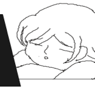
Hey Lemma Soft Forums! Gonna give this VN thing another go. I have most of my story down, but sprite creation/art's another issue. It's something I'd like to learn to do anyway, so if you guys wouldn't mind, please take a look at one of the sprites I created and let me know how I can improve her. I suspect line-thickness (I turned the pen to its lowest thickness, but pressure sensitivity on the tablet may be an issue) may be a part of it, but I'm open to all critique. Thanks in advance for your time!
- Attachments
-
-
Chushiki Maho
- Regular
- Posts: 174
- Joined: Wed Jan 04, 2012 3:28 pm
- Projects: X-Tasy, Teacher Pets, Virus
- Organization: Infinite Scribbles Productions
- Location: Check Your Closet.
- Contact:
Re: Feedback on sprites for new game
Maybe it's just me, but maybe her neck is a bit too... Thick? I dunno, it's probably just me, but it looks a teensy bit off. Is she supposed to be plump? Not as an insult, but if that's not what you were going for, I suggest you slim her down a bit. Other than that, I have no complaints. Nice job 
X-Tasy - GXB (WIP)
~ My Fanfiction
Virus [NaNoRenO 2012]
French to English (or vice-versa) VN translator ~ PM me if interested :3
~ My Fanfiction
Virus [NaNoRenO 2012]
French to English (or vice-versa) VN translator ~ PM me if interested :3
-
Desu_Cake

- Veteran
- Posts: 300
- Joined: Mon Aug 15, 2011 2:03 pm
- Projects: Secret, Secret and Secret
- Location: Ireland
- Contact:
Re: Feedback on sprites for new game
Hum. Yes, line-thickness is an issue, but probably not in the way you think. The lines are far too thin, mostly only a pixel wide, which makes them look very jagged. On a related note, the linework is very wiggly - I'd suggest you loosen up your strokes somewhat. A simple way to solve both problems is to draw much much bigger and scale down once you're finished.
Her clothes look very... undetailed in comparison to her hair and face. Remember, even the plainest T-shirts will at least have some detail around the collar and cuffs, even if it's just a hem.
May I ask what program you are using?
Her clothes look very... undetailed in comparison to her hair and face. Remember, even the plainest T-shirts will at least have some detail around the collar and cuffs, even if it's just a hem.
May I ask what program you are using?
-
Tag-

- Miko-Class Veteran
- Posts: 508
- Joined: Tue Jul 05, 2011 7:50 am
- Projects: Circo della Sera
- Contact:
Re: Feedback on sprites for new game
Actually, 1 pixel can look good if used correctly, particularly if you use one swift stroke. However, it is a better idea to vary line widths; the thinnest being 1 pixel, to about 3 or 4 pixels. At the moment, your lines are very wobbly, therefore distracting.
I agree with Desu_Cake, draw on a large canvas (around 2000 pixels at least) and scale down, it'll help your lines look a lot smoother and gets rid of small mistakes.
I'm not sure if it's just the style you were going for, but her nose is just too far up on her face, and it bothers me - a lot lot. It also looks kind of awkward in the sense that her body and eyes are facing front, but her nose is pointing to the side. Her hair looks fine as is, but you'll want to study clothing and how it sits on a person to draw realistic wrinkles on her clothes. Just google reference pictures, trust me, they come in handy a lot.
Try to keep an equal amount of contrast when shading. I thought she didn't have any shading on her skin at first because it was just so light compared to the shirt or hair shading.
Hope some of this helped
PM me if needed
-
akizakura
- Regular
- Posts: 93
- Joined: Tue Apr 24, 2007 11:01 pm
- Completed: Adversity Comp 2012
- Projects: Everything's Going My Way
- Organization: Mitayume
- Location: That's confidential.
- Contact:
Re: Feedback on sprites for new game
Thank you three very much for your suggestions, all of them are extremely helpful. I'm going to try incorporating your suggestions and redoing it on a larger canvas (I looked up what size the sprites were on the demo games that come with Ren'Py (generally 350 pixels wide and about 600 tall) and went with those originally).
The program I am using is Gimp for Mac.
The program I am using is Gimp for Mac.
Who is online
Users browsing this forum: No registered users