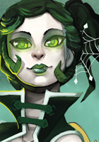
So I redid the ui based on the feedback that I received. It no longer takes up the entire width of the game, and the portrait is to the left of the text.
I'm not entirely certain how I want to handle the save/load/skip buttons yet, nor how to imagemap them.
There are two different screenshots, one with the player portrait and one without.
What are your thoughts about the UI, now?
EDIT---
How do you feel about the text/name box, player portrait and everything else?
Is the character portrait embellishment (the wood/leaves) too distracting? If so, how should I fix it?
Do I need to make the text a bit bigger?
I left the text/ui as is from its original 1280 x 720 resolution, but I have since decided to use a 1920 x 1080 resolution, and while Renpy does do downwards scaling, it also makes the text smaller.
I have the load/save/skip buttons down in the corner but I do not, as of yet, know how to edit them to change their text color or make an image map for them, so they are sort of hard to read...
Anyhow, please let me know your thoughts!
Thank you in advance.
How do you like the UI? (almost good to go I think)
-
Geckos
- Veteran
- Posts: 471
- Joined: Fri Aug 17, 2012 8:33 am
- Completed: Brilliant Shadows, Perceptions of the Dead, The Phantom Icecream Truck
- Projects: Embers of Magic, Pale Spectrum, Perceptions of the Dead
- Organization: Ithaqua Labs
- Tumblr: geckosart
- Deviantart: sitaart
- Contact:
How do you like the UI? (almost good to go I think)
- Attachments
-
-
Last edited by Geckos on Thu Mar 14, 2013 9:34 pm, edited 4 times in total.

Re: How do you like the UI?
I like the character embellishment and the portrait, they're both creative and easy on the eyes. What I don't like is the colour of the text and the size of the textbox in general. It looks like it's just been tacked on at the bottom, it took a long time for my eyes to be able to focus on it in comparison to the rest of the screenshot. The rest of the screenshot is waaaay taller than the speech. I think you'd benefit from making the textbox a bit taller, maybe reaching the top of the speaker's eyes? Also, you can move it up, don't be afraid to have a space between your textbox and the bottom of the screen. (Though if you move it I recommend moving the portrait/embellishments as well.)
The maroon of the text detracts from the airy, nature aesthetic that you have going on. Experiment with different colours and text outlines. I'd advise against drop shadow just to keep the aesthetic fresh.
The text size itself is fine for me right now. That might change if you take my advice and heighten the textbox, but for now I think it's an okay size. That's just me, though.
-
teacup
- Holder of Tasty Drinks
- Posts: 911
- Joined: Thu Oct 15, 2009 12:25 pm
- Completed: (P)lanets - the life of normalcy has ended
- Projects: Circum[N]avigate
- Contact:
Re: How do you like the UI?
I like everything about the UI except the textbox itself.
Like Cadenza said, it just looks like it's been tacked on there.
One thing is that the textbox doesn't have to stretch all the way across the screen. There are a lot of widescreen games that have a less wide, centered textbox, and I think that's a lot easier on the eyes. (Here's an example of what I mean) Personally, my eyes get strained when I have to look from one side of the screen all the way to the other to read the text. I feel like the the text buttons and character portrait are too far away from the dialogue. It's more convenient when everything is closer together so the player doesn't have to glance back and forth constantly, straining their eyes. I hope that makes sense >_<
And I agree that you should position the textbox higher up, instead of being at the very bottom of the screen.
I also don't like the color of the textbox or that feathered effect it has (how it fades out at the edges). It isn't cohesive with the darker colors and bolder lines of the leaves/wood part
This is all just my opinion, of course.

-
TrickWithAKnife
- Eileen-Class Veteran
- Posts: 1261
- Joined: Fri Mar 16, 2012 11:38 am
- Projects: Rika
- Organization: Solo (for now)
- IRC Nick: Trick
- Location: Tokyo, Japan
- Contact:
Re: How do you like the UI?
I think I'd find it a little strange having the portrait on the far right, because most of the reading will take place on the left, and that's where my eyes are generally going to be the majority of the time. If I read at a normal speed, I may miss any expression or even character changes.
I agree with the previous replies about the location and style of the text box, but not super strongly.
I'm not a big fan of the font though. You have a beautiful art style, and a generic font.
Also, if you're planning to have a long textbox, you might as well make the font larger to make good use of the extra real estate.
The tree on the left will have the character's name? If so, it seems a bit odd being so far from the portrait.
The menu text at the bottom right is pretty much unreadable.

"We must teach them through the tools with which they are comfortable."
The #renpy IRC channel is a great place to chat with other devs. Due to the nature of IRC and timezone differences, people probably won't reply right away.
If you'd like to view or use any code from my VN PM me. All code is freely available without restriction, but also without warranty or (much) support.
If you'd like to view or use any code from my VN PM me. All code is freely available without restriction, but also without warranty or (much) support.
-
nyaatrap

- Crawling Chaos
- Posts: 1824
- Joined: Mon Feb 13, 2012 5:37 am
- Location: Kimashi Tower, Japan
- Contact:
Re: How do you like the UI?
In my opinion, user Interface should be user friendly. Which means:
Keep user's eye movement minimum.
Keep user's mouse movement minimum.
So I always make interface elements simple, large and close (I think the importance of closeness is tend to be undervalued by artistic designers).
Keep user's eye movement minimum.
Keep user's mouse movement minimum.
So I always make interface elements simple, large and close (I think the importance of closeness is tend to be undervalued by artistic designers).
-
azureXtwilight
- Megane Procrastinator
- Posts: 4118
- Joined: Fri Mar 28, 2008 4:54 am
- Completed: Fantasia series (ROT and ROTA), Doppleganger: Dawn of The Inverted Soul, a2 (a due), Time Labyrinth
- Projects: At Regime's End
- Organization: Memento-Mori VNs, Team Sleepyhead
- Location: Yogyakarta, Indonesia.
- Contact:
Re: How do you like the UI?
It's nice... But the font is too small for my preferences. I like looking at character's expression, so having myself looking back and forth towards the small text is a bit too stressful for me.
Re: How do you like the UI?
personally, i find the display text to be awfully small and hard to read. if you dont have alot of text to go though then it wont be much of a problem but the text size seems a bit too small. just personal preference though.
Re: How do you like the UI?
The fonts are too small; the rest of the picture is okay.
Some of my visual novels are at http://www.the-new-lagoon.com. They are NSFW
Poorly done hand-drawn art is still poorly done art. Be a Poser (or better yet, use DAZ Studio 3D) - dare to be different.
Poorly done hand-drawn art is still poorly done art. Be a Poser (or better yet, use DAZ Studio 3D) - dare to be different.
-
xavimat
- Eileen-Class Veteran
- Posts: 1461
- Joined: Sat Feb 25, 2012 8:45 pm
- Completed: Yeshua, Jesus Life, Cops&Robbers
- Projects: Fear&Love
- Organization: Pilgrim Creations
- Github: xavi-mat
- itch: pilgrimcreations
- Location: Spain
- Discord: xavimat
- Contact:
Re: How do you like the UI?
As other have said, the text is too small for the large screen. Some issues:
- Do you really need a 1920x1080 resolution? How many people have that? I mean, all images will be bigger and heavier to download, but a few people will use that. (I thought my 1680x1050 resolution was big )
)
- The default RenPy game is 800x600 (that's a 4:3) and the text takes all screen, form left to right, because the proportion is OK. But for a widescreen, I think the text window can't be so long. When I use a 1024 x 640 resolution, the text window of 800 width is OK (as an example of proportion).
- The Character name on the tree seems also a bit odd. It's not even centered in the green part of the branch. Maybe a white cloud, like the text one, for the character's name would be better.
(Hope it helps).
- Do you really need a 1920x1080 resolution? How many people have that? I mean, all images will be bigger and heavier to download, but a few people will use that. (I thought my 1680x1050 resolution was big
- The default RenPy game is 800x600 (that's a 4:3) and the text takes all screen, form left to right, because the proportion is OK. But for a widescreen, I think the text window can't be so long. When I use a 1024 x 640 resolution, the text window of 800 width is OK (as an example of proportion).
- The Character name on the tree seems also a bit odd. It's not even centered in the green part of the branch. Maybe a white cloud, like the text one, for the character's name would be better.
(Hope it helps).
Comunidad Ren'Py en español: ¡Únete a nuestro Discord!
Rhaier Kingdom A Ren'Py Multiplayer Adventure Visual Novel.
Cops&Robbers A two-player experiment | Fear&Love Why can't we say I love you?
Honest Critique (Avatar made with Chibi Maker by ~gen8)
Rhaier Kingdom A Ren'Py Multiplayer Adventure Visual Novel.
Cops&Robbers A two-player experiment | Fear&Love Why can't we say I love you?
Honest Critique (Avatar made with Chibi Maker by ~gen8)
-
Hijiri
- Eileen-Class Veteran
- Posts: 1519
- Joined: Sun Mar 25, 2012 6:35 pm
- Completed: Death Rule:lost code Overdrive Edition, Where the White Doves Rest-Tsumihanseishi
- Projects: Death Rule: Killing System
- Organization: MESI Games
- IRC Nick: Hizi
- Tumblr: mesigames
- Skype: kurotezuka
- itch: hijiri
- Location: Los Angeles
- Contact:
Re: How do you like the UI?
When working with wide screens and large resolutions, you have to make the UI work for it. As teacup pointed out and nyaatrap noted, its best to keep the textbox and text near the center of the screen so as to keep people from having to rake the whole screen. (Also, its not like you'll be writing pages and pages of prose that require such huge spaces.)
Secondly, the textbox itself is very small. It needs to be large enough to be viewed comfortably in its resolution. How it currently is, it looks small in my 1366x768 monitor. I'd say the best ratio is to have around 15-20% of the screen be the textbox.
Secondly, the textbox itself is very small. It needs to be large enough to be viewed comfortably in its resolution. How it currently is, it looks small in my 1366x768 monitor. I'd say the best ratio is to have around 15-20% of the screen be the textbox.
Resolution is really up to the person making it. A lot of games nowadays are releasing in widescreen (with a lot of them being no less than 720p), and its becoming a rare sight to see a game support anything less than 1024x768 (And even then, I have a game that doesn't support even that)xavimat wrote: - Do you really need a 1920x1080 resolution? How many people have that? I mean, all images will be bigger and heavier to download, but a few people will use that. (I thought my 1680x1050 resolution was big
- The default RenPy game is 800x600 (that's a 4:3) and the text takes all screen, form left to right, because the proportion is OK. But for a widescreen, I think the text window can't be so long. When I use a 1024 x 640 resolution, the text window of 800 width is OK (as an example of proportion).
(Hope it helps).


-
Geckos
- Veteran
- Posts: 471
- Joined: Fri Aug 17, 2012 8:33 am
- Completed: Brilliant Shadows, Perceptions of the Dead, The Phantom Icecream Truck
- Projects: Embers of Magic, Pale Spectrum, Perceptions of the Dead
- Organization: Ithaqua Labs
- Tumblr: geckosart
- Deviantart: sitaart
- Contact:
Re: How do you like the UI?
Thank you all very much for the input. I have a good idea of what I need to do to fix the ui. I will update the image with the new ui once I draw it up.
-
Geckos
- Veteran
- Posts: 471
- Joined: Fri Aug 17, 2012 8:33 am
- Completed: Brilliant Shadows, Perceptions of the Dead, The Phantom Icecream Truck
- Projects: Embers of Magic, Pale Spectrum, Perceptions of the Dead
- Organization: Ithaqua Labs
- Tumblr: geckosart
- Deviantart: sitaart
- Contact:
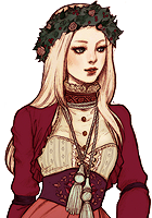
Re: How do you like the UI? (New UI images up!)
I went ahead and redid the ui based on the feedback.
What are your thoughts?
What are your thoughts?
-
Hijiri
- Eileen-Class Veteran
- Posts: 1519
- Joined: Sun Mar 25, 2012 6:35 pm
- Completed: Death Rule:lost code Overdrive Edition, Where the White Doves Rest-Tsumihanseishi
- Projects: Death Rule: Killing System
- Organization: MESI Games
- IRC Nick: Hizi
- Tumblr: mesigames
- Skype: kurotezuka
- itch: hijiri
- Location: Los Angeles
- Contact:
Re: How do you like the UI? (New UI images up!)
Better, but still a bit on the small side.
-
Geckos
- Veteran
- Posts: 471
- Joined: Fri Aug 17, 2012 8:33 am
- Completed: Brilliant Shadows, Perceptions of the Dead, The Phantom Icecream Truck
- Projects: Embers of Magic, Pale Spectrum, Perceptions of the Dead
- Organization: Ithaqua Labs
- Tumblr: geckosart
- Deviantart: sitaart
- Contact:
Re: How do you like the UI? (New UI images up!)
I had it larger but ended up scaling it to be less tall. I don't like that it covers up so much of the sprites. If everoyne agrees that it still feels small I may make it taller again, but towards the bottom of the screen as opposed to the top.Hijiri wrote:Better, but still a bit on the small side.
-
MaiMai
- Yandere
- Posts: 1757
- Joined: Sat Mar 21, 2009 6:04 pm
- Completed: [Phase Shift]
- Projects: [ None ]
- Organization: Paper Stars
- Tumblr: maiscribbles
- Deviantart: maiscribble
- Location: USA, Southern California
- Contact:
Re: How do you like the UI? (New UI images up!)
I think the text box is tall enough, but you chopped off a lot of the width. It doesn't look as centered as it should be.
 COMMISSIONS AVAILABLE (check Tumblr sidebar)
Who is online
Users browsing this forum: No registered users