Page 5 of 526
Posted: Mon Nov 29, 2004 2:13 pm
by Erik
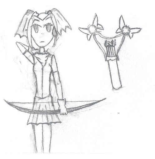
Nice drawing, BlackSpider, I think the eyes are very nicely drawn. The only critique I can cough up is about the hair. In the forehead, it looks like the hair would bend forward when seen from the side, that is, the opposite of 'sticking to' the forehead (unless you meant to draw that, of course, but I rarely see that haircut so I thought I'd mention it). I hope I'm making myself clear, if not I'll post a pic.
Posted: Mon Nov 29, 2004 5:12 pm
by BlackSpider
Thanks for your opinion Erik. I think I know what you mean. Actually I wanted the hair to stick to her forehead

. Probably the problem is that there is not too much depth in that sketch and at times it may look weird depending on what things (problems) you notice first.
Posted: Tue Dec 21, 2004 3:59 pm
by tsg1zzn
Well what do you think of this? The hair looks a little "flat" any tips? Also, she looks too much like a boy (or he looks too much like a girl

)
Done in Deneba Canvas 6, some nice old program. Older programs seem much easier to learn.


Posted: Tue Dec 21, 2004 5:46 pm
by rioka
The fastest and easiest ways to make a girl less like a boy is to:
1. Add eyelashes to the eyes
2. Add earrings
3. Add ribbon, headband, or clip on the hair
As for making her hair less flat, add shadow and highlight. Just use a color darker than the main color and a color lighter than the main color (even white).
And dont' forget to make her eye's white instead of skin color. =)
Posted: Tue Dec 21, 2004 7:57 pm
by RedSlash
Dont forget to add ears too!
Posted: Wed Mar 23, 2005 5:37 pm
by Iaman
Hey, I'm finally back!!!
Not that anybody would miss me...
I come bearing gifts of... some random crappy artwork of mine!!! Yea!!!!!!! RAAAAAAAASSSSSK!!!!
But anyway, I kinda got grounded from the internet for a while, so I'm finally back on! Huzzah!!!!
But I digress, here is the artwork... I think I improved a little bit, maybe?
http://www.deviantart.com/deviation/10773974/
http://www.deviantart.com/deviation/10909560/
http://www.deviantart.com/deviation/16039388/
Note that there is a considerable amount of time between the first two and the last one(about four months or so)
I took Sai's advice to work on views other than the side view and I have a pic I'm working on tonight that I'll have up tomorrow hopefully... It's concept art for the webcomic my friend wants to start with me...
So... do you like?
Posted: Wed Mar 23, 2005 7:11 pm
by Kikered
To say the least, all of the artwork posted so far is really good! Much better than anything I can come up with... My doodles can hardly be considered "art" at all. Well... you'll see what I mean.
 Don't
Go
Blind
Looking
At
These
Don't
Go
Blind
Looking
At
These
Posted: Wed Mar 23, 2005 7:36 pm
by BlackSpider
Claudia3 i actually quite good Kikered
. That's the one uder the 'Go' link.
Posted: Thu Mar 24, 2005 11:32 am
by papillon
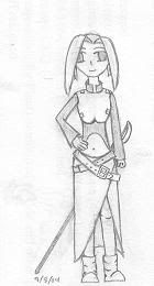
Because I can never have too many projects underway... another game whose plot I have very little idea about, but for which I have designed a handful of characters... Here's one of them, and this game may get a little bit naughty.
http://irc.wgp.org/users/papillon/freya1.png
Posted: Thu Mar 24, 2005 3:52 pm
by BlackSpider
Wow, nice colors Papillon
. Problem is that perhaps because of her nose she looks rather old.
Posted: Sat Mar 26, 2005 3:48 pm
by bookie
Kikered, your stuff isn't bad for being sketches. *nod* all of your characters have real personality, and they pose well. Lots of people have cleaner pictures but their much more dull in the personality department.
papillon, she's kinda nekkie! The biggest critique I could give is that she's kind of asymetrical around the waist and where the ribs are. Maybe if she was stepping foward it would make more sense in the hips, but the lines at her crotch indicate otherwise.
These are some characters that I may use in the future, maybe, if I have time. >.<
http://www.enus.net/testor/Matts.jpg
http://www.enus.net/testor/Lances.jpg
http://www.enus.net/testor/Zach.jpg
I need to learn how to color. *sigh*
Posted: Sat Mar 26, 2005 6:04 pm
by Jerails
Very good critiques, Bookie. Your art in particular also has a very a striking appearance. The way you coloured isn't a weak point for you. It's presence in your art gives the character their own personality. For physical features, the only gripe I have is that some of their clothes...Look like clothes...But don't feel like clothes.
Matts, for example. I love her facial expression. Can't really describe, but I've got this empathy going with that expression that I can't shake off. Her clothes give her that really sad look, but those areas where the cloth is bunched up, those make her look like she's going triple decker in the body fat department. Either that or she's wearing one hell of a belt!
Lance got it goin on! *Fangirl* Lookit that arm! Muscles!! His clothes really give him that firey star thing going, but it isn't so bright that you think he's conceited. The brick red colour makes him look like he's in control.
Zach, the Iron Chef! Chef hat looks like it's about ready to tilt his entire head one way. All he needs to do is look in the wrong direction and he's going over! Heh, his chefy attire looks very chef-ish, and those buttons are HUGE (Are they that huge in those Iron Chef shows?!) The way he wears that uniform loosely makes him appear kind of like on of those humble bakery type chef doods. You know, they own their own little store in town, and chillax, make a few friends of customers, and otherwise enjoy baking.
Definitely got something going with your art style Bookie, keep going that way to see where it goes.
Posted: Sat Mar 26, 2005 8:55 pm
by Iaman
http://www.deviantart.com/deviation/16451030/
http://www.deviantart.com/deviation/16451087/
anyway, this is some concept art for something, the second image is with colored pencils, and I'm working on coloring it with photoshop as well, so wish me luck!
Posted: Sun Mar 27, 2005 11:17 am
by bookie
Jerails, thanks for the kind words. You're right, folds are my nemisis. I'll be drawing and suddenly think the clothes are too flat and then just bunch a lot of folds at the bottom. Another guy I didn't post has so many folds his shirt probably comes down to his knees. >.<;
Posted: Sat May 07, 2005 6:46 pm
by Iaman
Hey, i'm back! I just got a Wacom Graphire3 4x5, so I've been playing around with it for a little bit. Anyways, I made my first semi-decent thing with it, and I want to show you guys/gals/fellow ren'ai lovers.
Mind you, it's my wildcard entry for the gamingw.net art tournament, so that's why the sign is there... just to let you know.
Without further ado, here's the pic:
