I noticed that we have a couple of great sticky threads with resources for sprites, CGs, etc. but I wasn't able to find a whole lot for making GUI for games. I'm trying to learn how to make GUI, so I don't know much yet but here are some resources that I found. If anyone else has any resources they want to share that would be great!
DESIGN:
GUI Designs thread on lemmasoft forums
Design 101: Basic Design Theory by Auro-Cyanide
GUI Design Principles on wikibooks
The Squint Test: How quick exposure to design can reveal its flaws
COLORS:
Color Scheme Designer
Color Design Using Turtle Theory by AquaSixio
Color Map by AquaSixio
Colour Pod
Color Hexa
Color Theory Simplified
Forbidden Forest Color Palette Masterpost on Color Pod
TUTORIALS:
How Green Glasses Girl does GUI Part 1
How Green Glasses Girl does GUI Part 2
Crash Course in Screen Language/GUI Design
Customizing Menus
Custom Backgrounds: Save/Load/Pref/Yes-No/MainMenu
Imagebutton GUI Framework
More newbie-friendly guide to customizing load/save screen?
How to Make A Fancy Button
Guide to Making A Circular Avatar Portal Part 1
Guide to Making A Circular Avatar Portal Part 2
TEXTURES:
CG Textures
The Hudson River Painters Vs. The Texture Monster :: Digital Painting Tutorial
Photoshop Tutorial on Gold Plated Effect
FONT RESOURCES:
Da Font
1001 Fonts
Google Fonts
THEME RESOURCES:
Technology Brush Set
Fractal Art Reference
OTHER:
Free Silhouettes and Icons
GUI Guides/Tutorials
-
silverpikachu99

- Veteran
- Posts: 439
- Joined: Sat Jan 26, 2013 8:35 pm
- Completed: #Yolo v.s #Swerve (part of worst vn ever)
- IRC Nick: silverpikachu99
- Tumblr: angelgod2.tumblr.com
- Location: Canada
- Contact:

-
noeinan
- Eileen-Class Veteran
- Posts: 1153
- Joined: Sun Apr 04, 2010 10:10 pm
- Projects: Ren'Py QuickStart, Crimson Rue
- Organization: Statistically Unlikely Games
- Deviantart: noeinan
- Github: noeinan
- Location: Washington State, USA
- Contact:
Re: GUI Guides/Tutorials
Glad I could help! Hopefully we can get some tips from more experienced graphic artists, too! 


-
Green Glasses Girl

- Veteran
- Posts: 367
- Joined: Thu Jul 11, 2013 7:16 pm
- Projects: Cavaliers & Carnivals
- Tumblr: green-glasses
- Contact:
Re: GUI Guides/Tutorials
I'm still pretty new to the EVN scene, but would it be of interest to anyone if I posted my process (with pictures) in how I've gone about making my UI? Maybe like a semi-tutorial/step-by-step process, although the links you provided are amazingly helpful!

-
Hazel-Bun

- Eileen-Class Veteran
- Posts: 1010
- Joined: Sun Oct 28, 2012 6:03 pm
- Completed: Sunrise: A Dieselpunk Fantasy & Ultramarine: A Seapunk Adventure
- Projects: Thrall: A Dark Otome Visual Novel
- Organization: AURELIA LEO, LLC
- Tumblr: authorzknight
- itch: authorzknight
- Contact:
Re: GUI Guides/Tutorials
God yes. Whenever I attempt to make GUI, I'm either overwhelmed or confused by the often pointed to tutorials. Even more, with steps for dummies, would be awesome!Green Glasses Girl wrote:I'm still pretty new to the EVN scene, but would it be of interest to anyone if I posted my process (with pictures) in how I've gone about making my UI? Maybe like a semi-tutorial/step-by-step process, although the links you provided are amazingly helpful!
Last edited by Hazel-Bun on Wed Feb 12, 2014 10:51 pm, edited 2 times in total.
Black bookstore owner. Diverse fiction reviewer. Bestselling romance author. Award-winning fiction editor. Quite possibly a werewolf, ask me during the next full moon.
-
Green Glasses Girl
- Veteran
- Posts: 367
- Joined: Thu Jul 11, 2013 7:16 pm
- Projects: Cavaliers & Carnivals
- Tumblr: green-glasses
- Contact:
Re: GUI Guides/Tutorials
Okay! I should correct myself though - this is by no means a tutorial, but a process guide of how I design. I don't know the technical elements of UI, such as resolution, formatting, or programming. I am not an expert, and admittedly very new at this! I say this because there is no "correct" way to design, nor do I know the best solution or ideal UI. However, I hope that maybe this will help someone out there in designing the UI to their game. 
Prior Reading:
- Auro-Cyanide's Design 101: Basic Design Theory <---Seriously, read this.
- Auro-Cyanide's Design Process
So without further ado...
PART ONE - Super Basics
1.) Inspiration
2.) RESEARCH!
3.) Form
4.) User Usage
5.) Colors
PART TWO - Getting Into Action
6.) Drawing + Mockup
7.) Coloring + Texture
8.) Font/Typeface
9.) Polishing
10.) Imagemap or Imagebutton?
To start with, here is my WIP GUI: (note: these are not the final ones)


Kind of rusty for my first time, but I'm satisfied with it (for now...)!
1.) Inspiration
Yes, you have heard this probably a billion times, but this is where you have to start? What inspires you? Daikiraikimi posted a thread above about people's UI inspirations. Heck, people have tumblr blogs devoted to it. I broke my list down as:
a) What visually inspires you?
b) What is the mood/theme/setting of the game?
c) What VNs or other games feature UI that appeal to you? And why?
Write those things down. I'm serious. Before I even started anything, I wrote a list of random things about my visual novel to get me pumped up for making UI. It contained everything from gold jewelry to the animated version of Little Nemo: Adventures in Slumberland to theme park rides to A Little Princess to magic carpets to Duck Tales. Okay, you have that list. Now put stars next to the ones that have the biggest impact to you and what you like about them. I minimized mine down to six. Mine were:
1) Baten Kaitos (videogame) - character designs, color schemes
[attachment=3]baten_kaitos_conceptart_a5KiU.jpg[/attachment][attachment=4]mainmap.png[/attachment]
2) Art/architecture of the Middle East and Italian Renaissance - ornamentation, attention to detail
[attachment=5]Image13_TEASER.jpg[/attachment]
3) Little Witch Academia (anime) - art, attention to detail
[attachment=2]Little Witch Academia - OVA - Large 07.jpg[/attachment]
4) Carousels - variation of type, flippin' carousel animals why are these things so magical
[attachment=1]carousel horse.jpg[/attachment]
5) Assassin's Creed II + Brotherhood (videogame) - artwork, mood
[attachment=0]assassin's creed 2 concept art.jpg[/attachment]
6) Persona 3 + Persona 4 (videogame) - colors schemes, UI sleekness/smoothness, those character images in the menus (as seen later in step #5)
aaaaaand a bunch of GUI screens of some Lemma Soft members~
Wow. That's still going to be a hodgepodge. You can either take bits of the whole list or condense it more and take the core elements you like.
2.) RESEARCH!
It's time to open up Google Search and hit the books, because it's research time! You made a list, so what can you learn from it? For me, a library at an art school was a gold mine. Seriously, there were actually books on carousel animal design. Crazy, right?
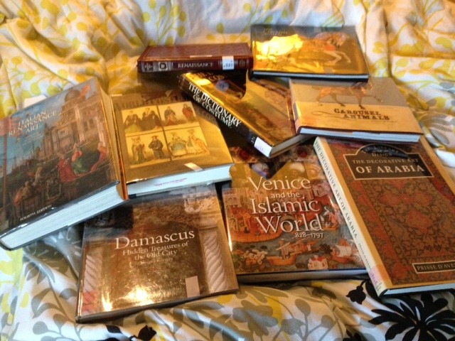
This was my collection I checked out from my school's library last January. I kept checking new books in and out over the year. I have a ton of bookmarks on my web browser devoted to research as well. A big part of the research process isn't just looking at things because they're pretty - but getting right down to comprehending on how they work in harmony. If you don't know how to do something, look at references! Practice and understand them.
3.) Form
All right. You know vaguely what your UI screens should look like now, right? No? Well, it's time to make some thumbnails! The screens to remember are:
Screen Checklist
-Main Menu
-Save Menu
-Load Menu
-Preferences: After Choices, Auto-Forward, Display, Music, Sound, Skip, Text Speed, Transitions, (Voice)
-Do you want to quit? Y/N
-Do you want to override your game? Y/N
-Do you want to return to the main menu w/o saving? Y/N
-Extras (things to unlock, gallery, music box, etc.)
Taking into account my inspiration and research, I started thumbnailing ideas. Some people go through pages of thumbnails, while some only go through a few. It's important to get critique in either case. I knew I wanted A) Islamic art and Italian Renaissance ornamentation, B) a side image like in the Persona menus, C) the colors I would use, but I'll get to that next.


I drew borders, screens, and patterns based from my research. What I learned from all of this: keep it simple. I have a tendency of...not making things simple, haha.
4.) User Usage
How smoothly can a user get from one screen to the next? What makes a navigation item easy to find? When I considered this, I 86'd some of my thumbnails and initial mock-up sketches, such as this one:

It was a fun idea to have a spinning options wheel for a preference screen, but I decided that it would have been too complicated in the end (having to click left and right over and over just to get to music, sound, display, etc.).
5.) Colors
Helpful Links:
- Color Pod: a site completed devoted to color palettes/swatches.
- ColorHexa: Similar to a link daikiraikimi posted above. Simple to use and made my life easier. Even lists color blindness!
- ImagineFX's Color Theory Simplified. Scroll down to the .PDF; it's only 6 pages, but helped me.
- A very good related tumblr post of color palette sites
While this isn't necessary for all things, but one of the things that makes UI memorable to me is the "Power Color(s)!" Otherwise known as the dominant colors that fit the mood of the game.
I'll use Persona 3 and Persona 4 as examples.
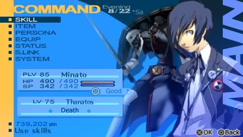
Persona 3's power color is blue. The game has a lot of dark and somber moments, so it's fitting.

Persona 4’s color scheme is dominantly yellow (and mood wise, I would say the antithesis of Persona 3). However! It also takes in account the rainbow color scheme of its protagonists’ clothing/eyewear. I think this screen spells it out pretty well:

Usually, using too many colors can get pretty overwhelming, but here they make it work as the yellow hues are still the prevailing color scheme.
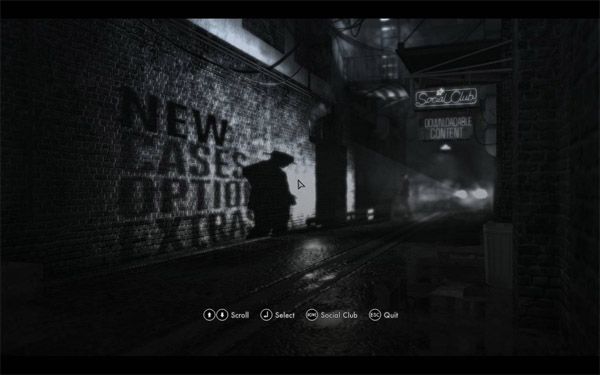
And who says that you even have to use color? L.A. Noire has a gorgeous main menu interface, but it's mainly in black and white:
The question is - how far do you take your Power Color(s)? Do you just add hints/accents of it to tell users what is important/indicate users where to go? Or do you go all-out to establish a theme/mood? It's up to you, but definitely try different versions.
I knew I wanted my color scheme would be purple and gold: Majestic and mystical. I thought this would work well since purple and yellow are complimentary colors.
If you have any questions, please ask! I still have a lot of learn, but questions can benefit anyone who is scrolling through this thread. I will post Part Two later that will cover drawing, mock-up, coloring, and texture components.
Prior Reading:
- Auro-Cyanide's Design 101: Basic Design Theory <---Seriously, read this.
- Auro-Cyanide's Design Process
So without further ado...
PART ONE - Super Basics
1.) Inspiration
2.) RESEARCH!
3.) Form
4.) User Usage
5.) Colors
PART TWO - Getting Into Action
6.) Drawing + Mockup
7.) Coloring + Texture
8.) Font/Typeface
9.) Polishing
10.) Imagemap or Imagebutton?
To start with, here is my WIP GUI: (note: these are not the final ones)
Kind of rusty for my first time, but I'm satisfied with it (for now...)!
1.) Inspiration
Yes, you have heard this probably a billion times, but this is where you have to start? What inspires you? Daikiraikimi posted a thread above about people's UI inspirations. Heck, people have tumblr blogs devoted to it. I broke my list down as:
a) What visually inspires you?
b) What is the mood/theme/setting of the game?
c) What VNs or other games feature UI that appeal to you? And why?
Write those things down. I'm serious. Before I even started anything, I wrote a list of random things about my visual novel to get me pumped up for making UI. It contained everything from gold jewelry to the animated version of Little Nemo: Adventures in Slumberland to theme park rides to A Little Princess to magic carpets to Duck Tales. Okay, you have that list. Now put stars next to the ones that have the biggest impact to you and what you like about them. I minimized mine down to six. Mine were:
1) Baten Kaitos (videogame) - character designs, color schemes
[attachment=3]baten_kaitos_conceptart_a5KiU.jpg[/attachment][attachment=4]mainmap.png[/attachment]
2) Art/architecture of the Middle East and Italian Renaissance - ornamentation, attention to detail
[attachment=5]Image13_TEASER.jpg[/attachment]
3) Little Witch Academia (anime) - art, attention to detail
[attachment=2]Little Witch Academia - OVA - Large 07.jpg[/attachment]
4) Carousels - variation of type, flippin' carousel animals why are these things so magical
[attachment=1]carousel horse.jpg[/attachment]
5) Assassin's Creed II + Brotherhood (videogame) - artwork, mood
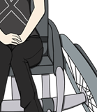
[attachment=0]assassin's creed 2 concept art.jpg[/attachment]
6) Persona 3 + Persona 4 (videogame) - colors schemes, UI sleekness/smoothness, those character images in the menus (as seen later in step #5)
aaaaaand a bunch of GUI screens of some Lemma Soft members~
Wow. That's still going to be a hodgepodge. You can either take bits of the whole list or condense it more and take the core elements you like.
2.) RESEARCH!
It's time to open up Google Search and hit the books, because it's research time! You made a list, so what can you learn from it? For me, a library at an art school was a gold mine. Seriously, there were actually books on carousel animal design. Crazy, right?
This was my collection I checked out from my school's library last January. I kept checking new books in and out over the year. I have a ton of bookmarks on my web browser devoted to research as well. A big part of the research process isn't just looking at things because they're pretty - but getting right down to comprehending on how they work in harmony. If you don't know how to do something, look at references! Practice and understand them.
3.) Form
All right. You know vaguely what your UI screens should look like now, right? No? Well, it's time to make some thumbnails! The screens to remember are:
Screen Checklist
-Main Menu
-Save Menu
-Load Menu
-Preferences: After Choices, Auto-Forward, Display, Music, Sound, Skip, Text Speed, Transitions, (Voice)
-Do you want to quit? Y/N
-Do you want to override your game? Y/N
-Do you want to return to the main menu w/o saving? Y/N
-Extras (things to unlock, gallery, music box, etc.)
Taking into account my inspiration and research, I started thumbnailing ideas. Some people go through pages of thumbnails, while some only go through a few. It's important to get critique in either case. I knew I wanted A) Islamic art and Italian Renaissance ornamentation, B) a side image like in the Persona menus, C) the colors I would use, but I'll get to that next.
I drew borders, screens, and patterns based from my research. What I learned from all of this: keep it simple. I have a tendency of...not making things simple, haha.
4.) User Usage
How smoothly can a user get from one screen to the next? What makes a navigation item easy to find? When I considered this, I 86'd some of my thumbnails and initial mock-up sketches, such as this one:
It was a fun idea to have a spinning options wheel for a preference screen, but I decided that it would have been too complicated in the end (having to click left and right over and over just to get to music, sound, display, etc.).
5.) Colors
Helpful Links:
- Color Pod: a site completed devoted to color palettes/swatches.
- ColorHexa: Similar to a link daikiraikimi posted above. Simple to use and made my life easier. Even lists color blindness!
- ImagineFX's Color Theory Simplified. Scroll down to the .PDF; it's only 6 pages, but helped me.
- A very good related tumblr post of color palette sites
While this isn't necessary for all things, but one of the things that makes UI memorable to me is the "Power Color(s)!" Otherwise known as the dominant colors that fit the mood of the game.
I'll use Persona 3 and Persona 4 as examples.
Persona 3's power color is blue. The game has a lot of dark and somber moments, so it's fitting.
Persona 4’s color scheme is dominantly yellow (and mood wise, I would say the antithesis of Persona 3). However! It also takes in account the rainbow color scheme of its protagonists’ clothing/eyewear. I think this screen spells it out pretty well:
Usually, using too many colors can get pretty overwhelming, but here they make it work as the yellow hues are still the prevailing color scheme.
And who says that you even have to use color? L.A. Noire has a gorgeous main menu interface, but it's mainly in black and white:
The question is - how far do you take your Power Color(s)? Do you just add hints/accents of it to tell users what is important/indicate users where to go? Or do you go all-out to establish a theme/mood? It's up to you, but definitely try different versions.
I knew I wanted my color scheme would be purple and gold: Majestic and mystical. I thought this would work well since purple and yellow are complimentary colors.
If you have any questions, please ask! I still have a lot of learn, but questions can benefit anyone who is scrolling through this thread. I will post Part Two later that will cover drawing, mock-up, coloring, and texture components.
- Attachments
-
-
-
-
-
-
Last edited by Green Glasses Girl on Thu Feb 27, 2014 6:54 pm, edited 4 times in total.
-
Green Glasses Girl
- Veteran
- Posts: 367
- Joined: Thu Jul 11, 2013 7:16 pm
- Projects: Cavaliers & Carnivals
- Tumblr: green-glasses
- Contact:
Re: GUI Guides/Tutorials
PART TWO - Getting Into Action
6.) Drawing + Mockup
7.) Coloring + Texture
8.) Font/Typeface
9.) Polishing
10.) Imagemap or Imagebutton?
Okay! So now we roughly know the basics of starting up GUI. Now for getting to the particulars.
6.) Drawing + Mockup
This is where we get to go look back at our earlier thumbnails and refine them.
For this process, I used Adobe Photoshop CS3 (yes, don't laugh at me for using old versions). I also have Paint Tool Sai, but I use that for sprite lineart. Any program will do. Heck, I want to make an entire pixel art-UI using Microsoft Paint, but that's a journey for another day.
Here is the thumbnail for the main menu (for some reason, I imagined the game in 800x600 originally).

The resolution I decided on was 1280 x 720. Anyway, the first thing I do is start blocking shapes out.

oh lord this is so ugly ahhhh i can't look (that's how to old logo used to look like. I think I've come a long way)
Remember, blocking out things isn't going to be pretty. You're trying to decide on composition here, not colors. The dome pattern is courtesy of All-Silhouettes.com.
Next is drawing detail. The basic shapes are a guideline, so now it's up to you to decide what you want to add to it. This is a sketch portion. Be sure to look at your references and research if you have trouble sketching out your ideas! Below is the final sketch of what I had in mind:

Same goes for the process of other screens:
Thumbnail...

Blocking...

Detail sketch!

You won't always decide what you want to first few times (I'm indecisive as heck) and not everyone works in this process. This is just a method I have to continually work on!
Clean-up your sketches, put down the linework you are accustom to, and then ask for critique if you are still unsure.
7.) Coloring + Texture
Ooooooh, man. My favorite and most time consuming part. We'll look at the character/event image slider-tab-thing that I have for the save slot.
Coloring
I put a base color underneath my lineart layer. I lock the lineart layer if I want to color part of it (notice how the inside line is colored white as opposed to black).

I color a bit more using my Power Colors! Next, I use a light yellow soft brush on the left end of the slider so it looks shiny.

Do you like gold? I like gold. How do I make gold? I'm not an alchemist. Google, luckily, is your friend. I found a very nice tutorial on getting the gold plated effect in Photoshop.

Fwiiiiing!
I continue doing this for the rest. I use blending options like Drop Shadow and Outer Glow as well...I just have to be careful not to overdo it!
Textures
The textures I find are from the amazing CGTextures.com. I have a nice palette of texture brushes in Photoshop as well. But note: You do not have to use textures. If anything, textures can distract and detract if they aren't used properly or even the right kind (brush scale, edges, resolution/pixelation, etc). It takes critique and practice to get it right.
Make sure you can get the highest res/largest texture you can find. It's easier to scale down and have things look clean than to scale up and have things looks blurry and pixelated. I use textures to accent. Nothing too crazy. I wanted a slightly aged-paper look. So I used this one:

I put that on the top of my layers for my file, and brought the opacity down to 25%:

Whoa. So intense. A little too much for me. So I changed the layer to multiply tweaked the opacity more.

Better!
Usually I get bored and just run the gamut of Photoshop layer properties (Multiply, Lighten, Overlay, and so on) until find something neat. I like to experiment!
There is a pretty cool tool in Photoshop called Variations too:

I can add a bit of blue or red, and change the intensity and mood. It can be applied to the shadows, midtones, or highlights of your work! Just kind of handy. I like using the Dark/Light options here as opposed to Brightness/Contrast because your image doesn't get as washed out. Same goes with Hue/Saturation.

8.) Font/Typeface
Sources:
- Dafont.com - My favorite. Categorizes font by genre (techno, cartoon, retro).
- 1001Fonts - Categorizes font by type (narrow, wide, sans serif, serif)
- Google Fonts Warehouse - a great selection of fonts.
Some examples (name of font is written beneath title):
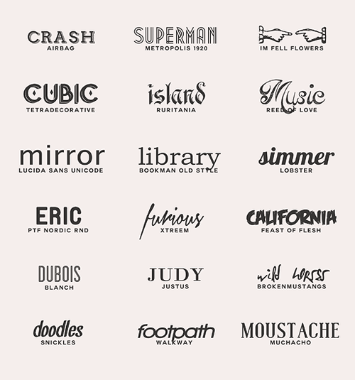
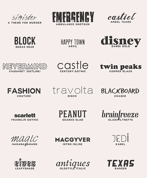
Fonts say a lot about your VN. Not only that, but an illegible font can cause much frustration to your reader. You can find a ton for free, but others are for commercial-license purchases only. Make sure you check first! For my VN, I'm using Montserrat and Carrosserie.
Someone asked what fonts I used for my logo. Usually you shouldn't use more than 2 fonts. For any given situation. Like, ever. WELP TIME TO BE TOPH AND BREAK SOME RULES

The fonts are Ruritania (the 'C'), Onyx ('-avaliers'; similar to the "Final Fantasy" logo font), Angelic Peace (the '&'), Matura MT Script Capitals ('Carnivals'). Not sure what I was thinking, but what the hey. Generally, try to avoid using too many fonts. Remember, keep it simple.
9.) Polishing
Not really a step? Maybe because I haven't reached this point in my own VN, ha ha. Just remember to zoom into your work! Put it against different background colors. I found I had a few stray pixels in one image, and a slightly cropped Outer Glow in another. You want your VN to look perfect! Double-check your file types too (.jpeg vs. .png for size and transparency).
10.) Imagemap or Imagebutton?
Related threads:
A) [Tutorial] Crash Course in Screen Language/GUI Design
B) [Tutorial] Customizing Menus
C) [Tutorial] Custom Backgrounds: Save/Load/Pref/Yes-No/MainMenu
D) Imagebutton GUI Framework
E) More newbie-friendly guide to customizing load/save screen?
I guess this isn't really a step either, but it's certainly something to keep in mind. Remember, you can apply Animation and Transformation Language to imagebuttons!
I made note of a few things that I wanted to move. For example, I knew that I wanted the save/load slots to slide out when you hovered over them, so I made those imagebuttons (the save slot saved as its own file):

I made three different slots - one for "ground", one "idle", and one "hover". (I removed the drop shadow temporarily since I'm still on the fence whether to use it)
Coding for that is pretty simple too:
A negative position number will put your save slot off-screen on idle (xpos -150 in this case). Hovering over it will bring it back to (xpos 0 in this case). The result:
Idle:

Hovered:

There is probably an easier way to do it, but this worked for me.
That's all I have! I really hope this helps someone a little in making their GUI. I'm still learning, so let's improve on our UI together! *shounen fist pump* Yeah!
6.) Drawing + Mockup
7.) Coloring + Texture
8.) Font/Typeface
9.) Polishing
10.) Imagemap or Imagebutton?
Okay! So now we roughly know the basics of starting up GUI. Now for getting to the particulars.
6.) Drawing + Mockup
This is where we get to go look back at our earlier thumbnails and refine them.
For this process, I used Adobe Photoshop CS3 (yes, don't laugh at me for using old versions). I also have Paint Tool Sai, but I use that for sprite lineart. Any program will do. Heck, I want to make an entire pixel art-UI using Microsoft Paint, but that's a journey for another day.
Here is the thumbnail for the main menu (for some reason, I imagined the game in 800x600 originally).
The resolution I decided on was 1280 x 720. Anyway, the first thing I do is start blocking shapes out.
oh lord this is so ugly ahhhh i can't look (that's how to old logo used to look like. I think I've come a long way)
Remember, blocking out things isn't going to be pretty. You're trying to decide on composition here, not colors. The dome pattern is courtesy of All-Silhouettes.com.
Next is drawing detail. The basic shapes are a guideline, so now it's up to you to decide what you want to add to it. This is a sketch portion. Be sure to look at your references and research if you have trouble sketching out your ideas! Below is the final sketch of what I had in mind:
Same goes for the process of other screens:
Thumbnail...
Blocking...
Detail sketch!
You won't always decide what you want to first few times (I'm indecisive as heck) and not everyone works in this process. This is just a method I have to continually work on!
Clean-up your sketches, put down the linework you are accustom to, and then ask for critique if you are still unsure.
7.) Coloring + Texture
Ooooooh, man. My favorite and most time consuming part. We'll look at the character/event image slider-tab-thing that I have for the save slot.
Coloring
I put a base color underneath my lineart layer. I lock the lineart layer if I want to color part of it (notice how the inside line is colored white as opposed to black).
I color a bit more using my Power Colors! Next, I use a light yellow soft brush on the left end of the slider so it looks shiny.
Do you like gold? I like gold. How do I make gold? I'm not an alchemist. Google, luckily, is your friend. I found a very nice tutorial on getting the gold plated effect in Photoshop.
Fwiiiiing!
I continue doing this for the rest. I use blending options like Drop Shadow and Outer Glow as well...I just have to be careful not to overdo it!
Textures
The textures I find are from the amazing CGTextures.com. I have a nice palette of texture brushes in Photoshop as well. But note: You do not have to use textures. If anything, textures can distract and detract if they aren't used properly or even the right kind (brush scale, edges, resolution/pixelation, etc). It takes critique and practice to get it right.
Make sure you can get the highest res/largest texture you can find. It's easier to scale down and have things look clean than to scale up and have things looks blurry and pixelated. I use textures to accent. Nothing too crazy. I wanted a slightly aged-paper look. So I used this one:
I put that on the top of my layers for my file, and brought the opacity down to 25%:
Whoa. So intense. A little too much for me. So I changed the layer to multiply tweaked the opacity more.
Better!
Usually I get bored and just run the gamut of Photoshop layer properties (Multiply, Lighten, Overlay, and so on) until find something neat. I like to experiment!
There is a pretty cool tool in Photoshop called Variations too:
I can add a bit of blue or red, and change the intensity and mood. It can be applied to the shadows, midtones, or highlights of your work! Just kind of handy. I like using the Dark/Light options here as opposed to Brightness/Contrast because your image doesn't get as washed out. Same goes with Hue/Saturation.
8.) Font/Typeface
Sources:
- Dafont.com - My favorite. Categorizes font by genre (techno, cartoon, retro).
- 1001Fonts - Categorizes font by type (narrow, wide, sans serif, serif)
- Google Fonts Warehouse - a great selection of fonts.
Some examples (name of font is written beneath title):
Fonts say a lot about your VN. Not only that, but an illegible font can cause much frustration to your reader. You can find a ton for free, but others are for commercial-license purchases only. Make sure you check first! For my VN, I'm using Montserrat and Carrosserie.
Someone asked what fonts I used for my logo. Usually you shouldn't use more than 2 fonts. For any given situation. Like, ever. WELP TIME TO BE TOPH AND BREAK SOME RULES
The fonts are Ruritania (the 'C'), Onyx ('-avaliers'; similar to the "Final Fantasy" logo font), Angelic Peace (the '&'), Matura MT Script Capitals ('Carnivals'). Not sure what I was thinking, but what the hey. Generally, try to avoid using too many fonts. Remember, keep it simple.
9.) Polishing
Not really a step? Maybe because I haven't reached this point in my own VN, ha ha. Just remember to zoom into your work! Put it against different background colors. I found I had a few stray pixels in one image, and a slightly cropped Outer Glow in another. You want your VN to look perfect! Double-check your file types too (.jpeg vs. .png for size and transparency).
10.) Imagemap or Imagebutton?
Related threads:
A) [Tutorial] Crash Course in Screen Language/GUI Design
B) [Tutorial] Customizing Menus
C) [Tutorial] Custom Backgrounds: Save/Load/Pref/Yes-No/MainMenu
D) Imagebutton GUI Framework
E) More newbie-friendly guide to customizing load/save screen?
I guess this isn't really a step either, but it's certainly something to keep in mind. Remember, you can apply Animation and Transformation Language to imagebuttons!
I made note of a few things that I wanted to move. For example, I knew that I wanted the save/load slots to slide out when you hovered over them, so I made those imagebuttons (the save slot saved as its own file):
I made three different slots - one for "ground", one "idle", and one "hover". (I removed the drop shadow temporarily since I'm still on the fence whether to use it)
Coding for that is pretty simple too:
Code: Select all
screen file_picker:
    #use navigation # We include the navigation/game menu screen
    # Buttons for selecting the save/load page:

    imagebutton auto "ui/savebar1_%s.png" xpos 30 ypos 65 focus_mask True action FileAction(1) at file_slide
    use load_save_slot(number=1)
Code: Select all
# below is for menu animation effects
init -2:
    transform file_slide:
        on hover:
            easein 0.3 xpos 0 #0.3 is the speed in which it moves
        on selected_hover:
            easein 0.3 xpos 0
        on idle:
            easein 0.5 xpos -150
        on selected_idle:
            easein 0.5 xpos -150
Idle:
Hovered:
There is probably an easier way to do it, but this worked for me.
That's all I have! I really hope this helps someone a little in making their GUI. I'm still learning, so let's improve on our UI together! *shounen fist pump* Yeah!
Last edited by Green Glasses Girl on Thu Feb 20, 2014 6:10 pm, edited 5 times in total.
-
Hijiri
- Eileen-Class Veteran
- Posts: 1519
- Joined: Sun Mar 25, 2012 6:35 pm
- Completed: Death Rule:lost code Overdrive Edition, Where the White Doves Rest-Tsumihanseishi
- Projects: Death Rule: Killing System
- Organization: MESI Games
- IRC Nick: Hizi
- Tumblr: mesigames
- Skype: kurotezuka
- itch: hijiri
- Location: Los Angeles
- Contact:
Re: GUI Guides/Tutorials
Just a short comment: The UI is the first impression people get of your game. It also can set a 'tone' for the work itself. Just as example, look at some of your favorite games. Even before you start the game proper, don't you have an idea of what to expect just from looking at the menus?
Try and communicate something with your UI as well. It is as much a storytelling device as it is an interface with your work.
Try and communicate something with your UI as well. It is as much a storytelling device as it is an interface with your work.


-
noeinan
- Eileen-Class Veteran
- Posts: 1153
- Joined: Sun Apr 04, 2010 10:10 pm
- Projects: Ren'Py QuickStart, Crimson Rue
- Organization: Statistically Unlikely Games
- Deviantart: noeinan
- Github: noeinan
- Location: Washington State, USA
- Contact:
Re: GUI Guides/Tutorials
Wow, thanks for that GUI process Green Glasses Girl! It's super helpful.
And thanks to everyone for contributing resources and ideas. I'll keep looking for more as well!
And thanks to everyone for contributing resources and ideas. I'll keep looking for more as well!
-
Green Glasses Girl
- Veteran
- Posts: 367
- Joined: Thu Jul 11, 2013 7:16 pm
- Projects: Cavaliers & Carnivals
- Tumblr: green-glasses
- Contact:
Re: GUI Guides/Tutorials
An excellent summation.Hijiri wrote:Just a short comment: The UI is the first impression people get of your game. It also can set a 'tone' for the work itself. Just as example, look at some of your favorite games. Even before you start the game proper, don't you have an idea of what to expect just from looking at the menus?
Try and communicate something with your UI as well. It is as much a storytelling device as it is an interface with your work.
No problem! If anyone has any questions, I'd be happy to answer them too. I'm actually interested in seeing other people's GUI making process! There are many ways to go about it.daikiraikimi wrote:Wow, thanks for that GUI process Green Glasses Girl! It's super helpful.
And thanks to everyone for contributing resources and ideas. I'll keep looking for more as well!
-
noeinan
- Eileen-Class Veteran
- Posts: 1153
- Joined: Sun Apr 04, 2010 10:10 pm
- Projects: Ren'Py QuickStart, Crimson Rue
- Organization: Statistically Unlikely Games
- Deviantart: noeinan
- Github: noeinan
- Location: Washington State, USA
- Contact:
Re: GUI Guides/Tutorials
I cleaned up the first post a little to make it easier for people to immediately get resources.
-
Green Glasses Girl
- Veteran
- Posts: 367
- Joined: Thu Jul 11, 2013 7:16 pm
- Projects: Cavaliers & Carnivals
- Tumblr: green-glasses
- Contact:
Re: GUI Guides/Tutorials
Wow, that helps a lot too! Also, you should include http://all-silhouettes.com/ (where I got the dome pattern shape). They have a large variety of silhouettes, icons, and patterns.
Who is online
Users browsing this forum: No registered users