Haha, Yeah. That's always been my biggest problem drawing. Thank you again for doing this!MelodyKnighton wrote: be careful not to focus too much on small areas to the point you don't see the big picture. Seeing the forest through the trees and all that jazz.
Melody's Art Tutoring/Critiques [Open]
-
ThisIsNoName
- Veteran
- Posts: 311
- Joined: Fri Feb 10, 2012 10:15 pm
- Contact:
Re: Melody's Art Tutoring/Critiques [Open]
-
MelodyKnighton

- Regular
- Posts: 72
- Joined: Sun May 04, 2014 4:53 pm
- Projects: too many
- Organization: Los Muertos Studios
- Tumblr: MelodyKnighton
- Contact:
Re: Melody's Art Tutoring/Critiques [Open]
No problem, I hope it helps! : )
I'll get your response up tomorrow Pox.
I'll get your response up tomorrow Pox.
-
MelodyKnighton
- Regular
- Posts: 72
- Joined: Sun May 04, 2014 4:53 pm
- Projects: too many
- Organization: Los Muertos Studios
- Tumblr: MelodyKnighton
- Contact:
Re: Melody's Art Tutoring/Critiques [Open]
Pox:
What you're doing great:
-You have a nice sense of facial proportions as well as the head. This is a tricky thing so getting that down early has you off to a great start.
-Character personality. Adding unique hairstyles helps distinguish your character from others.
What you can do to improve even more:
-Work on adding variety to your hair, aka thickness of the lines, fullness of the pieces, and layering. This will make the hair flow better.
-Work on shading to give your character more depth and leave it less muddy.
Since you seemed to want help with coloring, I'm going to do a method that starts with a gray scale painting like what you provided. This isn't my usual style since it's a bit more time consuming, but it's good if you struggle with color theory or your illustrations look too flat. It's good even as an exercise and I recommend it to everyone checking out the thread. : )
Here's a gif of what we'll end up with:

Let's start with your sketch and the line art I did based off of it:

 I kept your style but added variety to the hair. notice how changing the thickness of the lines, creating some larger pieces and overlapping gives the hair more fullness and brings it to life?
Next we'll add in the base gray scale coloring, then some general shading on a multiply layer above it. After that repeat the process with another multiply layer, this time shade in more specific areas like shadows under the chin, eyebrows, hair, ect.

 Then add some highlights.
 Now we can start the coloring process. Merge everything into one layer and on a new layer above it, (set to Overlay) add in some red's, blues, yellows and whatever shade you generally want the eyes to be. I like keeping the area around the eyes/nose/lips/ears warm, then keep the shadow areas cool, and add yellow to where the light hits the most (the top of the head in this case). Don't cover everything, and don't go overboard with opacity and saturation, you just want hints of color.
 On a new layer (set to Multiply) add in a shadow color. I like purple but any dark, medium saturation color can work. Then on that same layer, start painting in the skin tone/hair/eyes/ect. Don't paint in everything, leave some of the purple peeking through.

 On a new layer (set to Multiply) paint in the skin/hair/eyes/ect again to start bringing out the color even more. I keep this stage loose and at an opacity around 60-80% depending on how heavy handed you are. Then merge everything again and play with your adjustment levels until you're satisfied. Viola, from grayscale to color with a bit of color theory along the way.


Hope this helps! : )
What you're doing great:
-You have a nice sense of facial proportions as well as the head. This is a tricky thing so getting that down early has you off to a great start.
-Character personality. Adding unique hairstyles helps distinguish your character from others.
What you can do to improve even more:
-Work on adding variety to your hair, aka thickness of the lines, fullness of the pieces, and layering. This will make the hair flow better.
-Work on shading to give your character more depth and leave it less muddy.
Since you seemed to want help with coloring, I'm going to do a method that starts with a gray scale painting like what you provided. This isn't my usual style since it's a bit more time consuming, but it's good if you struggle with color theory or your illustrations look too flat. It's good even as an exercise and I recommend it to everyone checking out the thread. : )
Here's a gif of what we'll end up with:
Let's start with your sketch and the line art I did based off of it:
Next we'll add in the base gray scale coloring, then some general shading on a multiply layer above it. After that repeat the process with another multiply layer, this time shade in more specific areas like shadows under the chin, eyebrows, hair, ect.
Hope this helps! : )
-
Didules

- Veteran
- Posts: 417
- Joined: Thu May 09, 2013 6:34 am
- Completed: Sophie, Midnight's Café, The Phantom of the Hospital
- Projects: SchizoValentine
- Organization: Hidden Masquerade
- Tumblr: hidden-masquerade
- Location: Somewhere on the map
- Contact:
Re: Melody's Art Tutoring/Critiques [Open]
Until I've only been reading but this seems really interesting, may I ask some critiques/tutoring too? ^^
(Let's be honest, I can't draw backgrounds at all  )
)
Thanks in advance ^^
Thanks in advance ^^

-
kisa

- Veteran
- Posts: 384
- Joined: Sat Aug 27, 2011 7:08 pm
- Completed: Brother Rose, Dogs Alone
- Projects: So many projects, I can't name them.
- Deviantart: tsubasafan135
- Skype: Discord: Kisaofbishies#6680
- itch: kisa
- Contact:
Re: Melody's Art Tutoring/Critiques [Open]
I would appreciate your input on some concept art I have...
My art always looks off to me and your input seems to be more helpful than my friends' "wow that's amazing"s.
My art always looks off to me and your input seems to be more helpful than my friends' "wow that's amazing"s.
- Attachments
-
- I know about the hand, I'm working on those...
I'm offering commissions!
viewtopic.php?f=62&t=41656
viewtopic.php?f=62&t=41656
-
MelodyKnighton
- Regular
- Posts: 72
- Joined: Sun May 04, 2014 4:53 pm
- Projects: too many
- Organization: Los Muertos Studios
- Tumblr: MelodyKnighton
- Contact:
Re: Melody's Art Tutoring/Critiques [Open]
Didules:
What you're doing great: You've nailed down the basics of perspective which is harder than it looks. Once you've done that, the rest will slowly come to you with practice.
What you can do to improve even more: Spice things up with more details. The fastest way to make a background more lively and believable is in the attention to detail. Also be mindful of your color pallet. Stay away from primary colors like the saturated standard green you have in your trees, it gives off a child like psychology and that's probably not what you're going for.
 A: I know it's tempting when using 2 point perspective to have everything fade off into the distance but unless you're in the desert, the chances of your seeing the horizon in a town or slim to none.
 see here instead of the street going on forever, it's cut across with a perpendicular road and a house marks the end of the road. This makes the space more believable.
B: Details, details, details. You've got the basics down but if you want to take it further, then you need to spend the extra time adding more life into the scene. Zoom in on those windows and add panes of glass, add inlays to the door, add siding to the house, windows on the side, lines and cracks in the sidewalk, stone work in the walls, ect. It might be time consuming in the beginning but you'll get faster and it'll improve your backgrounds ten fold.
C: Color pallet. Look at photos or even other illustrated backgrounds. You rarely see primary colors in their purest form. Using the trees for example, using a more yellow green makes them look much more natural. Play around with your colors before you paint, and edit them again afterwards. Here's a quick little touch up to give you an idea of what can be done after-the-fact.
 In summary, you're off to a great start, keep pushing yourself and I bet you'll have something really lovely to show for it. : )
Nonsense! You're off to a really great start. Backgrounds are tricky beasts but you can do it.(Let's be honest, I can't draw backgrounds at all
What you're doing great: You've nailed down the basics of perspective which is harder than it looks. Once you've done that, the rest will slowly come to you with practice.
What you can do to improve even more: Spice things up with more details. The fastest way to make a background more lively and believable is in the attention to detail. Also be mindful of your color pallet. Stay away from primary colors like the saturated standard green you have in your trees, it gives off a child like psychology and that's probably not what you're going for.
B: Details, details, details. You've got the basics down but if you want to take it further, then you need to spend the extra time adding more life into the scene. Zoom in on those windows and add panes of glass, add inlays to the door, add siding to the house, windows on the side, lines and cracks in the sidewalk, stone work in the walls, ect. It might be time consuming in the beginning but you'll get faster and it'll improve your backgrounds ten fold.
C: Color pallet. Look at photos or even other illustrated backgrounds. You rarely see primary colors in their purest form. Using the trees for example, using a more yellow green makes them look much more natural. Play around with your colors before you paint, and edit them again afterwards. Here's a quick little touch up to give you an idea of what can be done after-the-fact.
-
MelodyKnighton
- Regular
- Posts: 72
- Joined: Sun May 04, 2014 4:53 pm
- Projects: too many
- Organization: Los Muertos Studios
- Tumblr: MelodyKnighton
- Contact:
Re: Melody's Art Tutoring/Critiques [Open]
Kisa:
Friends and Family definitely don't make for good critics haha, so it's good of you to look elsewhere. It may fun to get compliments but it won't help you improve, so kudos on making the effort to better yourself.
What you're doing great: You've got a definite style, very reminiscent of manga with sharp elongated angles and your faces are well drawn.
What you can do to improve even more: You seem to have a knack for faces (I'm guessing you doodle them a lot but don't do as many full body shots, simply because that's how I was as well haha), but you shouldn't let the rest of the picture pale in comparison. Your well drawn face won't be noticed as much if there are anatomy issues stealing the show.
I understand the style you're going for with the long-limbed bishounen vibe, and that's fine, I can appreciate the aesthetic, but still keep anatomy in mind. All the professionals I know recommend learning figure and life drawing before developing something more stylized and I'm going to repeat that here. It's something I still have problems with so don't get frustrated if it doesn't happen over night. Keep practicing and you'll get there, because you obviously have natural talent. : )
Here's a gif of a quick draw over to give you an idea of what I'm talking about. The figure is still lean and long (though you can push that a bit further than I did), but the dimensions are a bit more natural. You don't want necks and arms and waists that look like they'll snap off.

So in summary, I think you've got a really amazing start and you know what you want, just study the basics more and it will reflect in your future work, guaranteed!
Friends and Family definitely don't make for good critics haha, so it's good of you to look elsewhere. It may fun to get compliments but it won't help you improve, so kudos on making the effort to better yourself.
What you're doing great: You've got a definite style, very reminiscent of manga with sharp elongated angles and your faces are well drawn.
What you can do to improve even more: You seem to have a knack for faces (I'm guessing you doodle them a lot but don't do as many full body shots, simply because that's how I was as well haha), but you shouldn't let the rest of the picture pale in comparison. Your well drawn face won't be noticed as much if there are anatomy issues stealing the show.
I understand the style you're going for with the long-limbed bishounen vibe, and that's fine, I can appreciate the aesthetic, but still keep anatomy in mind. All the professionals I know recommend learning figure and life drawing before developing something more stylized and I'm going to repeat that here. It's something I still have problems with so don't get frustrated if it doesn't happen over night. Keep practicing and you'll get there, because you obviously have natural talent. : )
Here's a gif of a quick draw over to give you an idea of what I'm talking about. The figure is still lean and long (though you can push that a bit further than I did), but the dimensions are a bit more natural. You don't want necks and arms and waists that look like they'll snap off.
So in summary, I think you've got a really amazing start and you know what you want, just study the basics more and it will reflect in your future work, guaranteed!
-
Didules
- Veteran
- Posts: 417
- Joined: Thu May 09, 2013 6:34 am
- Completed: Sophie, Midnight's Café, The Phantom of the Hospital
- Projects: SchizoValentine
- Organization: Hidden Masquerade
- Tumblr: hidden-masquerade
- Location: Somewhere on the map
- Contact:
Re: Melody's Art Tutoring/Critiques [Open]
Thanks a lot for the helpful advices!! I'll keep them in mind while re-doing the background and making other ones! 
-
MelodyKnighton
- Regular
- Posts: 72
- Joined: Sun May 04, 2014 4:53 pm
- Projects: too many
- Organization: Los Muertos Studios
- Tumblr: MelodyKnighton
- Contact:
Re: Melody's Art Tutoring/Critiques [Open]
Aw i'm glad I could help Didules! Be sure to show me your future work, I'd love to see how you (and everyone else here) progress. : )
-
kisa
- Veteran
- Posts: 384
- Joined: Sat Aug 27, 2011 7:08 pm
- Completed: Brother Rose, Dogs Alone
- Projects: So many projects, I can't name them.
- Deviantart: tsubasafan135
- Skype: Discord: Kisaofbishies#6680
- itch: kisa
- Contact:
Re: Melody's Art Tutoring/Critiques [Open]
Thank you for your tips.
The character in that is actually supposed to be a little bit rail-thin as he's a vampire and all... But, I do realize that could be taken as an excuse. Hopefully these tips will help me improve to something you can be happier to see!
And thank you very much for the compliments. ^u^
The character in that is actually supposed to be a little bit rail-thin as he's a vampire and all... But, I do realize that could be taken as an excuse. Hopefully these tips will help me improve to something you can be happier to see!
And thank you very much for the compliments. ^u^
I'm offering commissions!
viewtopic.php?f=62&t=41656
viewtopic.php?f=62&t=41656
-
kitsubasa

- Regular
- Posts: 148
- Joined: Thu Nov 28, 2013 7:29 pm
- Projects: Inverness Nights
- Tumblr: kitsubasa
- Location: New Zealand
- Contact:
Re: Melody's Art Tutoring/Critiques [Open]
Hi there! The game I'm working on right now has a whole ton of backgrounds, and since I couldn't afford to commission them all, and photos wouldn't work (both stylistically and because it's a fantasy setting which needs some unusual and specific locations) I decided to try taking care of them myself. I haven't had any experience drawing backgrounds before now, and while I'm fairly happy with how the lineart is turning out (though I'm sure there's lots of room for improvement there too), my colouring for them seems kind of off. I was hoping I could get some critique on this background here: http://gyazo.com/0425ee3b8c5720a248f87b0de0575cee and how I can improve it in general, but particularly the colouring/my colouring technique.
If it helps for giving more specific suggestions; here's the BG with one of the sprites it needs to match to style-wise http://gyazo.com/95c08f222f3a8ad3296a8ec59be4df33
Also, I'm currently doing colouring in four layers; flats, then textures, then shadows, then coloured highlights. Thank you!
If it helps for giving more specific suggestions; here's the BG with one of the sprites it needs to match to style-wise http://gyazo.com/95c08f222f3a8ad3296a8ec59be4df33
Also, I'm currently doing colouring in four layers; flats, then textures, then shadows, then coloured highlights. Thank you!


Re: Melody's Art Tutoring/Critiques [Open]
Uhm, I'm learning how to do background but I can't get the right colour and I don't know what's wrong with the shading. And there's something in this picture that really annoys me but I'm not quite sure what it is. Please help me T^T
-
MelodyKnighton
- Regular
- Posts: 72
- Joined: Sun May 04, 2014 4:53 pm
- Projects: too many
- Organization: Los Muertos Studios
- Tumblr: MelodyKnighton
- Contact:
Re: Melody's Art Tutoring/Critiques [Open]
Kistsubasa:
What you're doing great: Your room has a lot of attention to detail and personality. It looks lived in and that's really important and often neglected when it comes to backgrounds!
What you can do to improve even more: Be careful of your perspective and scale, as well as work on matching the background to your sprites.
 -Some of the scaling is a bit off. The bed is too short and the doorway isn't tall enough. Sometimes I'll draw a quick stick figure and move it around the room to make sure everything is scaled properly because this is an easy mistake to make.
-Does this room belong to the sprite you included? If not, ignore this, but if it does, it doesn't quite match, or rather it's not the type of room I would imagine him to be in. Other than the swords and trinkets, the rest of the room seems rather warm and welcoming. This guy has a very theatrical and dark sense of style and his room would probably be similar. Dark painted walls, posters of his favorite bands, more blues and purples and blacks.
-As for the coloring itself, your sprite is very saturated and focuses on primary colors while the background is washed out and almost sepia in it's warm color scheme. It allows your sprite to stand out, but that's not quite what you want in a visual novel. A character should look like they could be in the room, not just standing in front of a backdrop set. So I changed the colors in the background to be cooler, and increased the saturation a bit. Then I reduced the saturation a bit on the sprite and made the colors slightly less primary in his blue coat. This allows the two to meet in the middle and seem much more natural.
Before: After:
 Hope this helps! You're off to a great start. : )
What you're doing great: Your room has a lot of attention to detail and personality. It looks lived in and that's really important and often neglected when it comes to backgrounds!
What you can do to improve even more: Be careful of your perspective and scale, as well as work on matching the background to your sprites.
-Does this room belong to the sprite you included? If not, ignore this, but if it does, it doesn't quite match, or rather it's not the type of room I would imagine him to be in. Other than the swords and trinkets, the rest of the room seems rather warm and welcoming. This guy has a very theatrical and dark sense of style and his room would probably be similar. Dark painted walls, posters of his favorite bands, more blues and purples and blacks.
-As for the coloring itself, your sprite is very saturated and focuses on primary colors while the background is washed out and almost sepia in it's warm color scheme. It allows your sprite to stand out, but that's not quite what you want in a visual novel. A character should look like they could be in the room, not just standing in front of a backdrop set. So I changed the colors in the background to be cooler, and increased the saturation a bit. Then I reduced the saturation a bit on the sprite and made the colors slightly less primary in his blue coat. This allows the two to meet in the middle and seem much more natural.
Before:
-
MelodyKnighton
- Regular
- Posts: 72
- Joined: Sun May 04, 2014 4:53 pm
- Projects: too many
- Organization: Los Muertos Studios
- Tumblr: MelodyKnighton
- Contact:
Re: Melody's Art Tutoring/Critiques [Open]
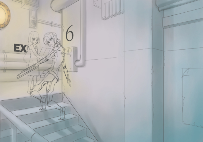
Disciple:
What you're doing great: Your BG has a great sense of depth and is very believable with the right amount of details added into the mix.
What you can do to improve even more: You've got a great start, but everything seems washed out due to a lack of variation in the gray and a lack of contrast. Luckily these are all easily fixed in post production!
 1. There are several shades of warm and cool and neutral grays. It's tempting just to you use shade for everything in a scene like this, but you never see that in real life. A pipe won't be the same tone and shade as a wall or railing and neither should your picture. Here on a new layer I added a variety of different grays to the image.
 2. Then I set that layer to color burn and lowered the opacity until I was happy and merged it down.
 3. Then I increased the contrast.
 4. And finally I adjusted the color balance (increased yellow and blues to made the lighting stronger)

Before:
 After:
In summary you've got a great base to work with, the rest is learning how to properly edit your illustrations afterwards. This is the fastest part of the processes but requires a lot of trial and error to get right. You can do it! : )
What you're doing great: Your BG has a great sense of depth and is very believable with the right amount of details added into the mix.
What you can do to improve even more: You've got a great start, but everything seems washed out due to a lack of variation in the gray and a lack of contrast. Luckily these are all easily fixed in post production!
Before:
-
kitsubasa
- Regular
- Posts: 148
- Joined: Thu Nov 28, 2013 7:29 pm
- Projects: Inverness Nights
- Tumblr: kitsubasa
- Location: New Zealand
- Contact:
Re: Melody's Art Tutoring/Critiques [Open]
Thank you very much for the feedback! As you guessed, the sprite I had in the room doesn't actually belong with it-- I would have put in the sprite that does, but I don't have a transparent version of her at the moment, I keep forgetting to ask my sprite artist for one, and her harpoons make her hard to cut out for testing her on backgrounds. As you can see though, she matches a bit better. The room's part-ancient weaponry collection, part-trash pile, since she kills monsters for a living, gets pizza for a quick and easy dinner, eats it, then passes out for the night and gets up in the morning to do it all again... without bothering to clean from the previous day. I picked the colour scheme to go with her, but the dustiness of both the room and her design makes her fade into it too much. I know she's not meant to pop out from it, but actually being visible against it would be good too. Though, part of that might be my hasty work cutting her out from the checkered background her sprite is stuck on, since she normally has lineart around her which I tend to lose when I cut her out by hand. Hm. : I
(The guy there, when I get around to his actual house, has a beat-up early 1900s place with books everywhere and piles of old antiques he doesn't have a place for; he's a kind of old-fashioned academic who let himself go after being cursed with lycanthropy, so it's a juxtaposition of very high-class intellectual foundations against the chaos his mind lives in now)
(The guy there, when I get around to his actual house, has a beat-up early 1900s place with books everywhere and piles of old antiques he doesn't have a place for; he's a kind of old-fashioned academic who let himself go after being cursed with lycanthropy, so it's a juxtaposition of very high-class intellectual foundations against the chaos his mind lives in now)
Who is online
Users browsing this forum: No registered users