As some of you may remember, I used to do weekly livestream tutorials. Unfortunately I don't have the time for those, but I still want to give back to the community in some way. Thus leads me to this tutoring/critique thread.
The process is simple:
-Post or link to a Sprite/CG/BG/Illustration/UI/Logo/Ect. you're having trouble with or want feedback on.
-I'll go through the list first come/first serve
-I'll then do draw overs and create mini tutorials as well as link to some useful ones I found, all focused on things I think could help you improve.
Art and teaching are two of my passions so there's no limit to the number of people who can submit or the number of times you can send in an image(s) but try to post one at a time and wait until the first is reviewed before submitting again or a new image so everyone gets feedback.
I'll try to be as in-depth, personalized and helpful as possible. Keep in mind this is a professional art critique so I'll also let you know what I think your strengths are, not just what you need to work on! : )
This will stay open as long as I have the time. If I need to close it temporarily, i'll post in the thread as well as change the status in the subject bar, and of course, this is completely free.
(on a side note, would you be interested in a similar thread but for writing? My husband is a professional editor and I think I could convince him to look at and do free critiques of some short writing samples.)
Melody's Art Tutoring/Critiques [Open]
-
MelodyKnighton

- Regular
- Posts: 72
- Joined: Sun May 04, 2014 4:53 pm
- Projects: too many
- Organization: Los Muertos Studios
- Tumblr: MelodyKnighton
- Contact:
-
Rozume
- Veteran
- Posts: 351
- Joined: Wed Oct 31, 2012 11:10 pm
- Completed: Munster Academy, boy
- Projects: Coming of Age VN
- Organization: Cosmic Visual
- IRC Nick: Rozume
- Contact:
Re: Melody's Art Tutoring/Critiques [Open]
Oh, this is a good idea!
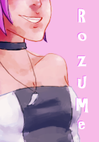
Would you mind critiquing this sprite I did a month ago? This was supposed to be a sprite for someone's game, but I asked to redo it because I didn't like the results very much. ^^;
I'm sure plenty would be interested in a similar thread for writing! I know I would. xD
Would you mind critiquing this sprite I did a month ago? This was supposed to be a sprite for someone's game, but I asked to redo it because I didn't like the results very much. ^^;
I'm sure plenty would be interested in a similar thread for writing! I know I would. xD
- Attachments
-
-
MelodyKnighton
- Regular
- Posts: 72
- Joined: Sun May 04, 2014 4:53 pm
- Projects: too many
- Organization: Los Muertos Studios
- Tumblr: MelodyKnighton
- Contact:
Re: Melody's Art Tutoring/Critiques [Open]
Pheonix:
What you're doing great:
-Body Anatomy and Positions
How you can improve it even more:

A= Maybe make the ponytail hair length a little shorter or longer to differentiate it from the rest of the hair. This will make the character even more visually appealing and readable.
B= The arms are a little too long for the bottom half. You're not far off, but a small difference can improve how natural it looks.
C= You already have a lot of beautiful detail in the coat and I think you can go even further. It's just a small amount of extra work but the difference makes it look even more professional.
D= I like the leaning in the position, it's more dynamic than if she were standing straight up, but keep in mind her center line of gravity. The weight should balance itself out. Once again you're really close, but the small tweak helps.
What you're doing great:
-Shading
How you can improve even more:
-The colors can get a bit muddy if you don't start off with the right pallet, so here's my trick to creating the right base colors. From there you can continue with your normal painting method.
-Find an image with a person with similar hair and skin tone and clothes (though you can get three separate images if you can't find one).

-In photoshop or an online program, create a pallet (in this case I use crystalize filter and adjust it to where I want)

-Here's your pallet!

-Using the eyedropper I selected different colors directly from the pallet and used them to create a base color for the skin and hair. It will look a little weird until you shade and highlight it properly, but the end result will be more vibrant and clear.

In summary: You're doing really well! You have a distinct style you're cultivating and with a bit of refining you'll have some beautiful sprites to show for it. Keep it up! I hope this helps. : )
What you're doing great:
-Body Anatomy and Positions
How you can improve it even more:
A= Maybe make the ponytail hair length a little shorter or longer to differentiate it from the rest of the hair. This will make the character even more visually appealing and readable.
B= The arms are a little too long for the bottom half. You're not far off, but a small difference can improve how natural it looks.
C= You already have a lot of beautiful detail in the coat and I think you can go even further. It's just a small amount of extra work but the difference makes it look even more professional.
D= I like the leaning in the position, it's more dynamic than if she were standing straight up, but keep in mind her center line of gravity. The weight should balance itself out. Once again you're really close, but the small tweak helps.
What you're doing great:
-Shading
How you can improve even more:
-The colors can get a bit muddy if you don't start off with the right pallet, so here's my trick to creating the right base colors. From there you can continue with your normal painting method.
-Find an image with a person with similar hair and skin tone and clothes (though you can get three separate images if you can't find one).
-In photoshop or an online program, create a pallet (in this case I use crystalize filter and adjust it to where I want)
-Here's your pallet!
-Using the eyedropper I selected different colors directly from the pallet and used them to create a base color for the skin and hair. It will look a little weird until you shade and highlight it properly, but the end result will be more vibrant and clear.
In summary: You're doing really well! You have a distinct style you're cultivating and with a bit of refining you'll have some beautiful sprites to show for it. Keep it up! I hope this helps. : )
-
trooper6
- Lemma-Class Veteran
- Posts: 3712
- Joined: Sat Jul 09, 2011 10:33 pm
- Projects: A Close Shave
- Location: Medford, MA
- Contact:
Re: Melody's Art Tutoring/Critiques [Open]
Wow! Melody your feedback is totally awesome!
I think it is great you are doing it and when I get back to drawing I hope you still are!
I think it is great you are doing it and when I get back to drawing I hope you still are!
A Close Shave:
*Last Thing Done (Aug 17): Finished coding emotions and camera for 4/10 main labels.
*Currently Doing: Coding of emotions and camera for the labels--On 5/10
*First Next thing to do: Code in all CG and special animation stuff
*Next Next thing to do: Set up film animation
*Other Thing to Do: Do SFX and Score (maybe think about eye blinks?) Check out My Clock Cookbook Recipe: http://lemmasoft.renai.us/forums/viewto ... 51&t=21978
*Last Thing Done (Aug 17): Finished coding emotions and camera for 4/10 main labels.
*Currently Doing: Coding of emotions and camera for the labels--On 5/10
*First Next thing to do: Code in all CG and special animation stuff
*Next Next thing to do: Set up film animation
*Other Thing to Do: Do SFX and Score (maybe think about eye blinks?)
-
Rozume
- Veteran
- Posts: 351
- Joined: Wed Oct 31, 2012 11:10 pm
- Completed: Munster Academy, boy
- Projects: Coming of Age VN
- Organization: Cosmic Visual
- IRC Nick: Rozume
- Contact:
Re: Melody's Art Tutoring/Critiques [Open]
Thanks Melody! You're so helpful. 
The color palette tip is great, I'll try it next time I paint. ^^
The color palette tip is great, I'll try it next time I paint. ^^
-
MelodyKnighton
- Regular
- Posts: 72
- Joined: Sun May 04, 2014 4:53 pm
- Projects: too many
- Organization: Los Muertos Studios
- Tumblr: MelodyKnighton
- Contact:
Re: Melody's Art Tutoring/Critiques [Open]
Everyone: I'm always open to specific questions as well as general critiques. Things like "I need help with color schemes" or "I need help with perspective", ect, ect are all fine.
trooper: Everyone's been so friendly and helpful with my game, it's the least I can do to return the favor. I'm sure I'll have this open for quite a while, so no rush.
Pheonix: Thanks for sharing it with me. You've got a lot of talent. : )
trooper: Everyone's been so friendly and helpful with my game, it's the least I can do to return the favor. I'm sure I'll have this open for quite a while, so no rush.
Pheonix: Thanks for sharing it with me. You've got a lot of talent. : )
-
Lady-Cynic

- Regular
- Posts: 104
- Joined: Sun May 04, 2014 3:17 pm
- Completed: Bobette: A KN that's horrible but at least complete
- Projects: To Hell With Love: A G/G action game; Wendigo: A B/B horror game; Hannah's Humanity: A G/B KN about a girl making a choice; Counting Sheep: A mini RPG about a girl traveling with her sheep
- Organization: Cynical Ghost Productions
- IRC Nick: Lady-Cynic
- Location: Chicago, IL
- Contact:
Re: Melody's Art Tutoring/Critiques [Open]
Uh, hi, I was hoping I can get some feedback/help with my logo. I dabble a little in typography, but is definitely not my strong suit. I'm afraid it's too simple (and too big, I really need to resize it), but I have no clue what to add to it that will make it look better/improve it.
Thanks for any help you can give me!
Architect in training!
Cynical Ghost Productions
My commission thread.
BB's commission thread
My art thread~!
BButt's art thread
Help me go to college!
I prefer the pronouns xe, xem, xirself, etc., but what ever you use is cool with me.
Cynical Ghost Productions
My commission thread.
BB's commission thread
My art thread~!
BButt's art thread
Help me go to college!
I prefer the pronouns xe, xem, xirself, etc., but what ever you use is cool with me.
-
MelodyKnighton
- Regular
- Posts: 72
- Joined: Sun May 04, 2014 4:53 pm
- Projects: too many
- Organization: Los Muertos Studios
- Tumblr: MelodyKnighton
- Contact:
Re: Melody's Art Tutoring/Critiques [Open]
Lady-Cynic:
What you're doing great:
-Making your logo/font match your theme and genre
-Varying size of font and giving it personality
What you can do to improve even more:
-Push it even further! Go big or go home when it comes to logo's. You only have one shot to hook your audience and tell them what your game is about in the few seconds it takes them to look at your logo.
Things to keep in mind:
-Readability: If you can't read the logo clearly, then it's not working. 'To' 'Hell' and 'Love' are all very clear but 'With' gets a little lost.
-Theme: This is super important for VN's. You do a great job of it by adding the 'devil' motifs that I have shown below as figure 'A'. Once again we want to push this even further.
-Variation: There are lots of ways to give your logo variety. For yours I recommend creating the first part in a much smaller font than the 'Love!'. Other ways include serifs/sans serifs, bold/thin fonts, or even different font types.
-Cohesion: I know I just said to make things different, but it's important the two different parts have something in common. Maybe they're both curvy or pointy or really anything that can tie them together. It takes a while to get the perfect balance of variety and cohesion.

A: These little devil motifs are great. I used them and then some for my revised version. Be careful with the devil horns above the 'T' on yours, it starts to look like parentheses instead of horns.
B: Your natural instinct to make this first section smaller than the 'Love!" part is spot on, but once again, push it further.
C: I love the tail idea on the L, let's make this word the focus of the logo since it's so eye catching.

-I'm not very good with hand lettering, so here's my sneaky tip. Start off with a very basic font similar to what you would like, and similar in size/layout. This will help you keep your letters consistent. Though, make sure your font and the base font are very different in the end, this is to help guide you, not to straight up trace. If yours is different, there's no copyright issues.

-I put the original font on a layer at a low opacity, and then on a new layer above it I began creating my own font. Notice I changed it enough to avoid copyright issues, as well as adding in the devil motifs from your logo.

-And here is the end result. I added an outline and gradient to the Love! to make it pop, and the rest has a white background and a drop shadow to make sure it stands out on any background, since the rest is transparent.
In summary:
Your natural instincts are great, it's just a matter of trusting them and pushing them even further out of your comfort zone. I hope this helps! : )
What you're doing great:
-Making your logo/font match your theme and genre
-Varying size of font and giving it personality
What you can do to improve even more:
-Push it even further! Go big or go home when it comes to logo's. You only have one shot to hook your audience and tell them what your game is about in the few seconds it takes them to look at your logo.
Things to keep in mind:
-Readability: If you can't read the logo clearly, then it's not working. 'To' 'Hell' and 'Love' are all very clear but 'With' gets a little lost.
-Theme: This is super important for VN's. You do a great job of it by adding the 'devil' motifs that I have shown below as figure 'A'. Once again we want to push this even further.
-Variation: There are lots of ways to give your logo variety. For yours I recommend creating the first part in a much smaller font than the 'Love!'. Other ways include serifs/sans serifs, bold/thin fonts, or even different font types.
-Cohesion: I know I just said to make things different, but it's important the two different parts have something in common. Maybe they're both curvy or pointy or really anything that can tie them together. It takes a while to get the perfect balance of variety and cohesion.
A: These little devil motifs are great. I used them and then some for my revised version. Be careful with the devil horns above the 'T' on yours, it starts to look like parentheses instead of horns.
B: Your natural instinct to make this first section smaller than the 'Love!" part is spot on, but once again, push it further.
C: I love the tail idea on the L, let's make this word the focus of the logo since it's so eye catching.
-I'm not very good with hand lettering, so here's my sneaky tip. Start off with a very basic font similar to what you would like, and similar in size/layout. This will help you keep your letters consistent. Though, make sure your font and the base font are very different in the end, this is to help guide you, not to straight up trace. If yours is different, there's no copyright issues.
-I put the original font on a layer at a low opacity, and then on a new layer above it I began creating my own font. Notice I changed it enough to avoid copyright issues, as well as adding in the devil motifs from your logo.
-And here is the end result. I added an outline and gradient to the Love! to make it pop, and the rest has a white background and a drop shadow to make sure it stands out on any background, since the rest is transparent.
In summary:
Your natural instincts are great, it's just a matter of trusting them and pushing them even further out of your comfort zone. I hope this helps! : )
-
madocallie

- Regular
- Posts: 45
- Joined: Tue May 14, 2013 1:57 am
- Completed: Bad Faith (DEMO), When We First Met, Party Favors
- Projects: Bad Faith (Full Release)
- itch: madocallie
- Location: UK
- Discord: madocallie#2937
- Contact:
Re: Melody's Art Tutoring/Critiques [Open]
This thread sounded interesting, and so I wanted to take the opportunity to get some feedback on some GUI I made for a project I am currently working on! ovo
Any advice is appreciated!
Main Menu (Still a WIP at the moment in terms of Main Menu artwork.)

Save/Load Menu

Prefs Menu

Any advice is appreciated!
Main Menu (Still a WIP at the moment in terms of Main Menu artwork.)
Save/Load Menu
Prefs Menu

-
MelodyKnighton
- Regular
- Posts: 72
- Joined: Sun May 04, 2014 4:53 pm
- Projects: too many
- Organization: Los Muertos Studios
- Tumblr: MelodyKnighton
- Contact:
Re: Melody's Art Tutoring/Critiques [Open]
Mado: First of all, your GUI is really lovely and off to a great start.
What you're doing great:
-I can tell the genre of the game just by looking at the UI, which is important
-You have a good eye for pattern and color scheme
-You mix and match patterns and textures for visual variety
What you can do to make it even better:
-Be careful of the patterns you use behind text, if they are too busy they can make it hard to read
-Use a good balance of texture and patterns, don't let one over power the other
-It's okay to use solid colors here and there as accents

A: This is a fun pattern but it's far too busy. The text is lost in it, which is the last thing you want. It also has a very different line thickness than every other pattern you've chosen so it looks out of place. I'd suggest either replacing it with a solid color or a texture, not another pattern.
Solid=

Texture=

B: This is the only texture you have in your GUI. I really like it, but it's overpowered by all the patterns. Try to find another place to incorporate texture to help balance things out.
C: I like the way these characters are placed out. It makes the whole UI look like a scrap book. I'd suggest pushing it even more towards that direction by 'adhering' the images to the board in some way. Here are a few examples. Obviously just use one type, not all of them like I did below.
Tape ---> Staple ---> Paperclip ---> Pushpin

Summary: You've got a really lovely start. With a few changes this UI should be at a beautiful professional level. best of luck with your project! : )
What you're doing great:
-I can tell the genre of the game just by looking at the UI, which is important
-You have a good eye for pattern and color scheme
-You mix and match patterns and textures for visual variety
What you can do to make it even better:
-Be careful of the patterns you use behind text, if they are too busy they can make it hard to read
-Use a good balance of texture and patterns, don't let one over power the other
-It's okay to use solid colors here and there as accents
A: This is a fun pattern but it's far too busy. The text is lost in it, which is the last thing you want. It also has a very different line thickness than every other pattern you've chosen so it looks out of place. I'd suggest either replacing it with a solid color or a texture, not another pattern.
Solid=
Texture=
B: This is the only texture you have in your GUI. I really like it, but it's overpowered by all the patterns. Try to find another place to incorporate texture to help balance things out.
C: I like the way these characters are placed out. It makes the whole UI look like a scrap book. I'd suggest pushing it even more towards that direction by 'adhering' the images to the board in some way. Here are a few examples. Obviously just use one type, not all of them like I did below.
Tape ---> Staple ---> Paperclip ---> Pushpin
Summary: You've got a really lovely start. With a few changes this UI should be at a beautiful professional level. best of luck with your project! : )
-
ThisIsNoName
- Veteran
- Posts: 311
- Joined: Fri Feb 10, 2012 10:15 pm
- Contact:
Re: Melody's Art Tutoring/Critiques [Open]
Right now this is more of a concept than an actual sprite, but I was hoping to get some feedback on this:
One specific question I have is whether I should be practicing on my shading, lineart, etc. on concept pieces, or is it better to keep ideas and practice seperate?
Thank you for doing this!
Thank you for doing this!
-
Hazel-Bun

- Eileen-Class Veteran
- Posts: 1010
- Joined: Sun Oct 28, 2012 6:03 pm
- Completed: Sunrise: A Dieselpunk Fantasy & Ultramarine: A Seapunk Adventure
- Projects: Thrall: A Dark Otome Visual Novel
- Organization: AURELIA LEO, LLC
- Tumblr: authorzknight
- itch: authorzknight
- Contact:
Re: Melody's Art Tutoring/Critiques [Open]
If you could critique any of these, that would be helpful. I can't fix Corrine right now, nor the bg, but would love some feedback for future projects! Also a sprite from my old NaNo. Thank you very much for setting up this thread  I think a writing thread similar to this would be great as well.
- Attachments
-
-
-
Black bookstore owner. Diverse fiction reviewer. Bestselling romance author. Award-winning fiction editor. Quite possibly a werewolf, ask me during the next full moon.
-
MelodyKnighton
- Regular
- Posts: 72
- Joined: Sun May 04, 2014 4:53 pm
- Projects: too many
- Organization: Los Muertos Studios
- Tumblr: MelodyKnighton
- Contact:
Re: Melody's Art Tutoring/Critiques [Open]
ThisIsNoName:
What you're doing great:
-Details! The attention to detail in the clothes, weapons and chains is really impressive, but be careful not to focus too much on small areas to the point you don't see the big picture. Seeing the forest through the trees and all that jazz. It's something I'm guilty of as well. But you're off to a great start.
-General Proportions. Some areas are off but you have the general idea of head to height ratio which is a very important base to start with.
What you can do to improve even more:
A-Work on the proportions of the head. This will bring your character to life and make the hair look more in place.
B-Work on the shading to give your character more depth while not going overboard.

A: Here's my general method for getting the proportions for a head.

The main circle will be most helpful to you to keep the back of the head from looking too squished.


Here we see the difference the layout made. I tried to still keep it in your style so you can see the change more easily.

Using that red circle as a base, draw the hair so it 'floats' above it to give your hair natural depth. Human hair doesn't lay perfectly flat against our skulls unless it's pulled back very tightly.


And here we see the difference. Remember, all I did was use a few circles and lines to get the proportions right from the start, the rest is all things that you already know how to do. The base work isn't particularly fun or excited but it's very important. You couldn't want to build a house without a foundation.


Now that we adjusted the proportions of the head, we need to adjust the body accordingly. The limbs need to be a little longer, the torso a little straighter and the shoulders wider.
B: Cell shading can be a little tricky. It's easy to go overboard with the folds and wrinkles and shade them accordingly but it will just result in your clothing looking crumpled.


First you need your base color, I used the same one as you. Then you need a color for the highlights and the shadows. Doing a shade directly lighter or darker than your base will wash out your image. Instead choose a highlight that is slightly warmer and lighter, and a shadow that's slightly cooler and darker.
As for the folds, look at your clothes. most folds happen where the fabric bends and creases like the elbows, wrists, shoulders and waist. keep your folds restricted to these areas unless you want your fabric to be intentionally ruffled or wrinkled or pleated.
Once you have your wrinkles in place and colors picked out, do a gradient from the highlight to base to shadow colors over the whole thing (in the direction of your light source). This will help blend the colors and give the fabric depth.
Then you can go in and add the cell shaded shadows and highlights. As a general rule use highlight sparingly.
I think that's it! You've got a lot of talent, you just need to focus more on the basics before you worry too much about the details. If you can do that you'll have some wonderful sprites. Best of luck! : )
What you're doing great:
-Details! The attention to detail in the clothes, weapons and chains is really impressive, but be careful not to focus too much on small areas to the point you don't see the big picture. Seeing the forest through the trees and all that jazz. It's something I'm guilty of as well. But you're off to a great start.
-General Proportions. Some areas are off but you have the general idea of head to height ratio which is a very important base to start with.
What you can do to improve even more:
A-Work on the proportions of the head. This will bring your character to life and make the hair look more in place.
B-Work on the shading to give your character more depth while not going overboard.
A: Here's my general method for getting the proportions for a head.
The main circle will be most helpful to you to keep the back of the head from looking too squished.
Here we see the difference the layout made. I tried to still keep it in your style so you can see the change more easily.
Using that red circle as a base, draw the hair so it 'floats' above it to give your hair natural depth. Human hair doesn't lay perfectly flat against our skulls unless it's pulled back very tightly.
And here we see the difference. Remember, all I did was use a few circles and lines to get the proportions right from the start, the rest is all things that you already know how to do. The base work isn't particularly fun or excited but it's very important. You couldn't want to build a house without a foundation.
Now that we adjusted the proportions of the head, we need to adjust the body accordingly. The limbs need to be a little longer, the torso a little straighter and the shoulders wider.
B: Cell shading can be a little tricky. It's easy to go overboard with the folds and wrinkles and shade them accordingly but it will just result in your clothing looking crumpled.
First you need your base color, I used the same one as you. Then you need a color for the highlights and the shadows. Doing a shade directly lighter or darker than your base will wash out your image. Instead choose a highlight that is slightly warmer and lighter, and a shadow that's slightly cooler and darker.
As for the folds, look at your clothes. most folds happen where the fabric bends and creases like the elbows, wrists, shoulders and waist. keep your folds restricted to these areas unless you want your fabric to be intentionally ruffled or wrinkled or pleated.
Once you have your wrinkles in place and colors picked out, do a gradient from the highlight to base to shadow colors over the whole thing (in the direction of your light source). This will help blend the colors and give the fabric depth.
Then you can go in and add the cell shaded shadows and highlights. As a general rule use highlight sparingly.
I think that's it! You've got a lot of talent, you just need to focus more on the basics before you worry too much about the details. If you can do that you'll have some wonderful sprites. Best of luck! : )
-
MelodyKnighton
- Regular
- Posts: 72
- Joined: Sun May 04, 2014 4:53 pm
- Projects: too many
- Organization: Los Muertos Studios
- Tumblr: MelodyKnighton
- Contact:
Re: Melody's Art Tutoring/Critiques [Open]
Hazel:
What you're doing great:
-Style! Your style is really fantastic and unique. It's like finding your voice when writing. Once you have something unique, stick with it and use it to create your brand.
-Expressive. Your characters have a lot of personality in their designs.
-Background depth. You know how to layout a scene to give it dimension.
What you can do to improve even more:
A-Your style is pretty cartoony and I'd love to see you push that even further. Add thicker, smoother lineart to emphasis the style. Look at Japanese popart for inspiration.
B-Push the depth of your backgrounds even more and frame your scenes with the interior elements.
A:


Here we have your original and a version I redid with thicker smoother lines. It gives it a look reminiscent of animation which I think works well with your style.


Add in lots of solid black. high contrast like you would see in a comicbook will help push the pop art feeling. Then add the highlights sharply like you do with your cell shading. Soft airbrushed hair highlights clash with your normal coloring method.

Then add color like you normally would.
B:


You've got a good sense of depth already, but push it with another layer that frames the picture.
Your original (minus a couple crooked trees) has good perspective already so I just added in a layer closer to the foreground that frames the outer edges. This adds depth and balances out the BG as a stand alone illustration. You want the eye to follow the path and framing the picture with the trees/bushes helps block out distractions and force the audience to focus on what you want them to.
What you're doing great:
-Style! Your style is really fantastic and unique. It's like finding your voice when writing. Once you have something unique, stick with it and use it to create your brand.
-Expressive. Your characters have a lot of personality in their designs.
-Background depth. You know how to layout a scene to give it dimension.
What you can do to improve even more:
A-Your style is pretty cartoony and I'd love to see you push that even further. Add thicker, smoother lineart to emphasis the style. Look at Japanese popart for inspiration.
B-Push the depth of your backgrounds even more and frame your scenes with the interior elements.
A:
Here we have your original and a version I redid with thicker smoother lines. It gives it a look reminiscent of animation which I think works well with your style.
Add in lots of solid black. high contrast like you would see in a comicbook will help push the pop art feeling. Then add the highlights sharply like you do with your cell shading. Soft airbrushed hair highlights clash with your normal coloring method.
Then add color like you normally would.
B:
You've got a good sense of depth already, but push it with another layer that frames the picture.
Your original (minus a couple crooked trees) has good perspective already so I just added in a layer closer to the foreground that frames the outer edges. This adds depth and balances out the BG as a stand alone illustration. You want the eye to follow the path and framing the picture with the trees/bushes helps block out distractions and force the audience to focus on what you want them to.

Re: Melody's Art Tutoring/Critiques [Open]
Oh wow. I'm so happy I found this thread right after joining up ^^
I know I have quite a bit to learn with coloring but my anatomy is rather rocky too, so I would greatly appreciate any feedback you give me.
I know I have quite a bit to learn with coloring but my anatomy is rather rocky too, so I would greatly appreciate any feedback you give me.
Who is online
Users browsing this forum: No registered users