Hey Everyone! Lately, I've been feeling like my art is a little stuck in a rut, and it's been really discouraging. I don't know how to take it to that "next level" of polished, eye-catching professionalism I see in the works of others.
I don't know what's missing, but I feel like something is. Take a look:
I would appreciate any advice or suggestions you have; how can I make my portfolio better, my art more professional, or even just work towards creating my own unique style?
TLDR: I'm hoping to get some pracitcal advice/tips on how to paint in a way that will create a more polished, professional look. Or even stories/advice on how you developed your style. I'm open to constructive criticism, but please be gentle with me!
Last edited by Beckers on Tue Jul 28, 2015 4:00 am, edited 3 times in total.
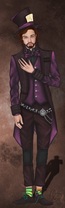
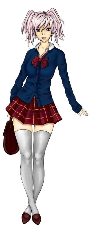
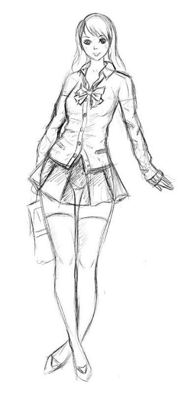
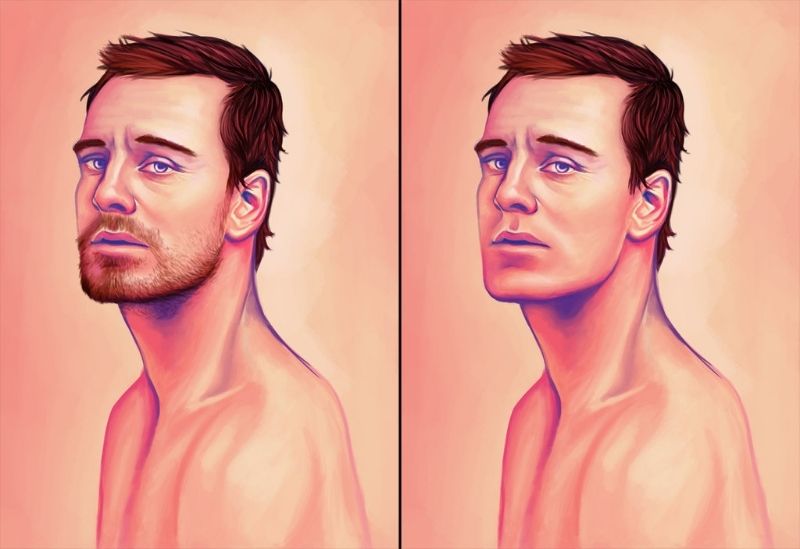
wow your art is great...mmm...something to recommend ....perhaps working on the clothes wrinkles ....on the second drawing (the one with the girl and her legs crossed) I feel like the anatomy of it is a bit off specifically knee down (the position of the feet/ankle) 6th drawing with the guy with and without beard is gorgeous (and you pretty proud of it yourself so you know what I mean ;D )
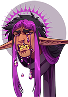
I do see a few weird things here and there, but the base is pretty strong. With that said, I'll try to be as picky and hard on your art as possible, but please, take no offense even if my critique may contain some harsh comments:
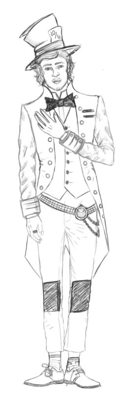
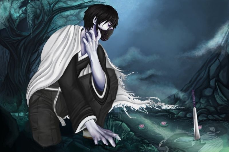
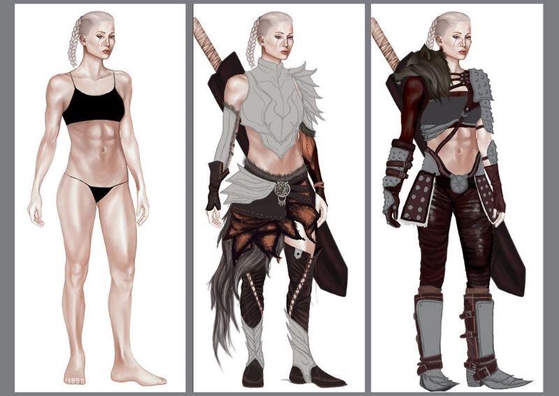
- As sei.chan stated, take care with those wrinkles. Some of them are fairly good, but most of the time I can't really understand what's going on with those clothes. In some cases (like the first drawing) they just make no sense to me, the cloth doesn't have tension where it should show, and the opposite, or even times (like the last picture) where I feel like I only see wrinkles put there for the heck of it. I also see a lack of bigger wrinkles on the torso, even when the character is inclined or in some kind of motion (in the second drawing you get it better, though). This feels weird to me, since the sketches provided show more coherent wrinkles, which get lost on the painting.
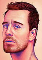
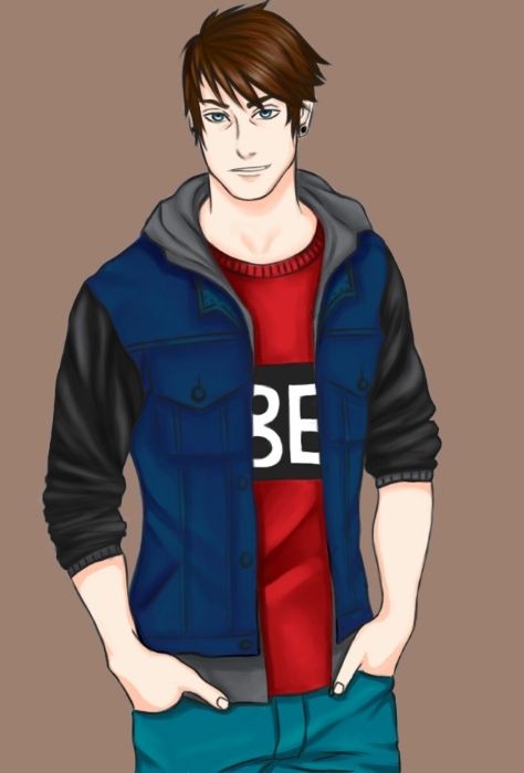
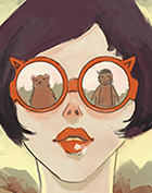
- Once again sei.chan mentioned, but you need to work on anatomy. Weigh distribution is impossible in the second picture (unless she's resting her hand on something, she'll fall in a second. And even if she is, she'd probably sprain her ankle), the face in the first picture, while it's awesomely detailed and gains a more intense expression [kudos for that], the mad hatter just lost his chin. It goes straight from the lip to the beard (compare it to your Fassbender portrait: the beard looks thicker on the hatter, yet Fassbender still has a bigger chin). In the third drawing (the more anime-ish), the girl has no trapezium muscle at the left side, her eyebrows have different length... It's even more obvious with the fourth picture, where one side of the body is too thin (or wide) compared to the other, even if the pose is inclined (which also donesn't make sense, since it looks like the collarbone starts in the middle of the... drawing. Not the body). Even when you detail more the anatomy and work on the muscles I find strange things (in the last character, what is that protuberance on her shoulder??)
-Everything lacks volume. There are no strong shadows, no lightsources at all, everything I see are neutral shadows from wrinkles and such (the only exception are a few hints of cast shadow on the mad hatter, like that little shadow from his arm over his torso, but it's pretty undefined and doesn't make too much sense: the hat should cast a shadow on the face, the hair too, even his nose, his chin... and I see none. Looking at the huge shadow the figure is forming on the ground, the lightshource is supposed to cause way more shadows than that). All of the pictures, with no exception, lack in any kind of directional shadow (once again, even when being neutral, body parts and accesories affect each other. For example, in the fourth picture, it looks like it has a frontal light (higher than the character) but the arms have no effect on the body, the lower part of the hips have no volume whatsoever, etc). Where it looks worse is in the seventh picture, where any chance of creating an atmosphere is completely impossible because every element lives in a different world where light affects things in their own way. To put it bluntly, it makes no sense. Where it looks better (apart from the mad hatter stuff I mentioned) is in the second and third pictures, but even there you commit a beginner mistake: very little contrast. Don't be afraid of heavy contrasts, they don't look too dark or light, they're fine. Even in the Fassbender portrait, there are parts which will have darker shades than that purple you used,specially when the shadows on the hair are way, waaay darker. Which takes me to the final point...
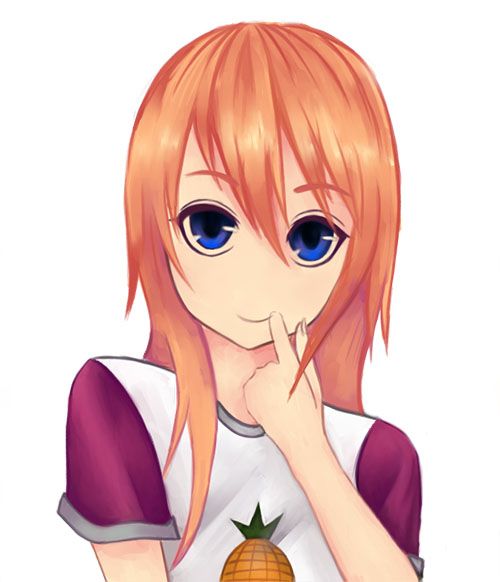
- There's a big lack of consistency on your art. I'm not talking about having a single and unique style (I like the fact that you are practising different styles, that's a good way to go). I'm seeing inconsistencies in the same drawing. The shading thing I mentioned in the Fassbender portrait is an example, but it also happens with the drawing: In the mad hatter, the face is pretty realistic, but everything else is way more stylised, and there are measuring mistakes (the sleeves have different lenght, and the hands are completely different), in the sixth drawing (which also have shading issues from my earlier comment) the overall style is really simple and manga-ish, but then the hair is more on the realistic-soft shaded style? In the last picture I'm guessing it's a WIP, because most accesories look unfinished, but even then there are certain textures that doesn't make sense (the wolf head looks like it's growing tentacles, and it's fur doesn't match up at all with the woman's hair. Well, it just doesn't feel like hair). In the seventh picture is worse: every element, from the background to the skin and the clothes, seem to be made by different artists. The arms are fairly realistic, the face a little more stylized, but the clothes are way more cartoony. The background is even worse, with completely different perspectives for every element. And well... that reflection... it's lazy. Which should be fine, but also makes no sense (reflections distort, even if it's a little, and I can't find a way the light falls over the character in a way that creates a reflection like that in that exact place). Even in a single part I can see different stuff: the character's cape has clear lineart on a side, but then loses it on the other, in favor of a textured look. The only drawing where I see everything being coherent is the anime styled one.
So... you still have a lot of work:
-Work on a more consistent anatomy, and make sure to keep proportions.
-Learn about lightsources and how shadows are cast.
-More contrast. MOAR.
-Stick to a way of work, or a single style, for a drawing.
-Work more on perspective.
As I said, even if I wrote a huuuge walltext going nuts, I DO think you have a strong base, and you have some very promising stuff here and there (I took a look at your DeviantArt gallery, too). Everyone is constantly changing and evolving (hell, some of the critiques I've told you are the ones I'm recently started to apply on myself!) and it's a matter of working hard.
I hope this has been useful!
Artist and voice actor, trying to actually write stuff.
Thank you, both of you! I appreciate you taking the time to offer help. Not going to lie, some of that stuff was pretty hard and demoralizing to read, so I guess I didn't really know what I was getting into here haha. Never-the-less, I appreciate it, and I'm going to take the time to try and fix the issues discussed, even it seems a little impossible/daunting from the long list XD
I knew my anatomy was probably wonky in some places, as I'm self-taught and have no art/anatomy classes under my belt, but what really helped me was the advice regarding creating more contrast and volume through lighting. Thanks again!
Leaving aside the fundamentals already mentioned, one of the ways you could level up is to have a really strong direction or artist you want to model yourself after.
Right now your stuff is good, but it's also stylistically hovering between realism and semi-realism (leaving aside the anime/flat styles, which I presume were experiments) without taking advantage of either art styles. Loosely explained: there isn't enough texture, pores, and subtle color changes etc. to push your work into realism, but at the same time semi-realism also demands more idealized or exaggerated features.
If you have a goal in mind, perhaps I'd suggest sitting down and making thought-out copies of it to see what the 'genre' of art you're going for consists of, and if you don't have one in mind yet - to push your art into two or three distinct styles and see what they can do for you.
Beckers wrote:Thank you, both of you! I appreciate you taking the time to offer help. Not going to lie, some of that stuff was pretty hard and demoralizing to read, so I guess I didn't really know what I was getting into here haha. Never-the-less, I appreciate it, and I'm going to take the time to try and fix the issues discussed, even it seems a little impossible/daunting from the long list XD
I knew my anatomy was probably wonky in some places, as I'm self-taught and have no art/anatomy classes under my belt, but what really helped me was the advice regarding creating more contrast and volume through lighting. Thanks again!
ah I didn't mean to come out as rude ;.; only the legs were wrong but I don't think its a consistent mistake since the last drawing has a pretty good pose. I'm also self taught I was taking the wrong course I accidentally signed up for botany but I graduated high school this summer so my only hope was to take anatomy in college (which I wont since I'm not pursuing art anymore)so I get where your coming from. TT.TT your renders are awesome though...I mean even the way you drew the beard..I think realism is your fort`e.
You didn't come off as rude at all! When I said some of it was demoralizing I was referencing the long list of faults truefaiterman made. I felt pretty crudy after reading it, but in hindsight, I know it all came from a place of trying to help me grow as an artist, so I'm just going to take the opportunity to do just that—grow! I made the thread, after all
I really appreciate every bit of advice everyone contributed. Sorry if I sounded ungrateful Again, you didn't sound rude at all!