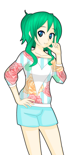
Critique please?
-
LoveIsInTheAir

- Newbie
- Posts: 16
- Joined: Wed Apr 24, 2019 12:47 pm
- Contact:
Critique please?
Critique will be appreciated
-
ScentOfSilver
- Newbie
- Posts: 1
- Joined: Sat Apr 27, 2019 7:47 pm
- Contact:
Re: Critique please?
The only two things that stand out to me to be improved on are mostly the skin's shading, and the crotch-line indent.
The skin looks a bit monotonous because of a similar hue being used to shade it, I recommend adding some hints of pink, orange, blue, or purple to the areas of the skin to mimic human skin tones.
The crotch-line only looks a bit out of place. As a general guide for anatomical stuff, Proko's videos are really nice.
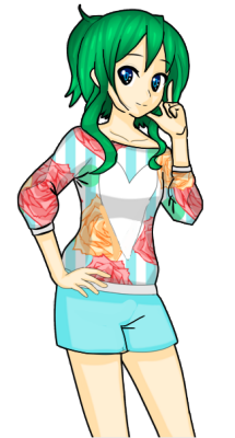
Here is a minor paint over to show you the critique in action:
https://imgur.com/k9M2mqW
The skin looks a bit monotonous because of a similar hue being used to shade it, I recommend adding some hints of pink, orange, blue, or purple to the areas of the skin to mimic human skin tones.
The crotch-line only looks a bit out of place. As a general guide for anatomical stuff, Proko's videos are really nice.
Here is a minor paint over to show you the critique in action:
https://imgur.com/k9M2mqW
-
Fisseha

- Newbie
- Posts: 20
- Joined: Thu May 24, 2018 8:11 am
- Projects: Fly Fly Fly, Grey Area, SICK, Raindrops, My Girlfriend Akane
- Organization: Lonely Fish
- Tumblr: PoissonMorts
- Deviantart: MiyukiKudo(INACTIVE)
- itch: FishPrincess
- Location: Philippines
- Contact:
Re: Critique please?
Line art: Avoid using the color black as your line art color. I think this is subjective, however, as black line art can have different effects. But there's something about colored line art that makes it aesthetically pleasing to the eyes, depending on how you use it.
Also the thickness of the line art is rather thick, unless you did that on purpose to pop up the character.
Coloring: ScentofSilver already mentioned important points. For coloring, try to use color theories (adjacent, complementary, etc.) Don't be afraid to experiment!
I'm also bothered of the eyes, but I guess it's artistic creativity? Anyway, I think that the eyes feel flat.
Anatomy: Again, someone mentioned the crotch area being OOP, I feel like the other arm is 'forced', clothing wise.
I'm an artist, and probably a weaboo.
-
Per K Grok

- Miko-Class Veteran
- Posts: 882
- Joined: Fri May 18, 2018 1:02 am
- Completed: the Ghost Pilot, Sea of Lost Ships, Bubbles and the Pterodactyls, Defenders of Adacan Part 1-3, the Phantom Flyer
- itch: per-k-grok
- Location: Sverige
- Contact:
Re: Critique please?
Basically the image is pretty good.
The biggest thing is that the center line of the body seems to be off. Leading to the crotch being to much to the side (as previously pointed out).
I would expect the point of the heart to be on the center line. It is not. Now that is not necessarily wrong if the pattern have the heart at an angle. But having the point at the center line will help the eye to see the form of the body.
Having a strong outline and no inked lines inside the outline gives me the impression of a cutout cardboard figure. I would certainly add some internal inking, including some folds in the clothing. This could be a case of personal taste.
Finally the coloring is a bit weak for my taste. I would make the colors deeper (stronger).
Below a link to a quick paint over making use of the points above. (I would have included the image directly, but that didn't work out, so it will have to be a link instead).
Again. Basically your image is good. Some of the stuff I've said is just from my preference.
https://images-wixmp-ed30a86b8c4ca88777 ... vWbVwIPFHo
Who is online
Users browsing this forum: No registered users