I do not know why my characters are not beautiful. They are tedious, that's from his picture
I've done shading and other things, but I can not find my problem.
If anyone knows, please help. Thankyou!!
What do you mean by beautiful? Are you trying to improve the quality of the art, or make the character look more physically attractive? Both?
A few things I noticed:
The placement of the features on his face is a little wonky. His mouth in particular is very far to the left compared to the nose position. I would suggest drawing some guidelines onto the head and dragging the features around to fit.
It would be a good idea to get some reference photos for the pose, as it’s looking a bit stiff, especially the arms. Try putting your hand on your hip in a way that feels natural, and you’ll find the arm pushes the hand against the body to keep it in place. In your sprite, the hand is just floating there with no suggestion of any pressure on it.
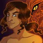
His hair is maybe a bit too big, even for someone with really thick hair. There’s a really large gap between where I would estimate the head to stop and the top of his hair. Pick a point on the top of the head for the hair to radiate out from, and it will be easier to control the volume of the hair and keep it looking plausible.
When you’re shading the clothes, trying shifting the hue a little as well as making it darker/lighter - the colours will look more interesting.
The way to fix it is figure drawing, figure drawing and more figure drawing. The pose is too stiff, the fundamentals have to be down before proceeding onwards to the detail and shading.
Not sure if you've already fixed your drawing, but I have some tips for you!
The biggest problems with the head are the placement of the nose and mouth and the size of the hair. As you can see in the picture below, the best way to fix the face is to draw a circle from the top of the head to the bottom of the nose, and draw a curved line down the middle of it. The bridge of the nose should start on this line, and the mouth should be in the middle of the line. I also shrunk the hair a little, as you can see it makes him look quite a bit different.
In regards to his pose, his shoulders and hips are both a straight horizontal line. Making these lines diagonal will help make the pose a bit more dynamic. I made another quick sketch to demonstrate - it's very rough, but hopefully you can see what I was going for.
I'm a bit late to the party, but one more thing in addition to the tips on anatomy and already given that may help your character look more pleasing to the eye is to use darker and thicker lines.
Right now, the lines between the forms on his body, clothes, and hair are barely visible and this makes it hard to distinguish between features, so adding dark lines will create contrast and give the eye some more direction!
I added some lines over top of what you already had, and you can see the result here:
With the added definition, it's easier to read the character's face and pose.
Hope that helps!
Currently working on Of Sense and Soul, a M/M slice of life romance VN set in Late-Victorian England. https://www.ofsenseandsoul.com/