Hello! I'm Chaos and i'm making a Visual Novel based on an Vocaloid MMD series I did 3 years ago called "Vocal Chorus". Since it's a free project, my options on finding help is quite limited. For this post, I'll be just talking about the art.
We don't have much artists in our team. We only have 2 line artist and 1 color artist, which both don't know how to make background art or GUI art. Although, I made my own custom version of GUI art, it does not look visually appealing nor does it match the actual art style. (I have some examples below)
Here's the choice box. The background also looks bad as well. It doesn't quite match well. ><
Here's another one-- the textbox looks like when placed with one of the locations. There's no portrait art of the character yet so it looks like no one is talking. But as you can see, it looks off.
This is how the textbox and the namebox currently looks. It's meant to look like a case file.
Same goes for the background art. Our only option is to use MMD for the background art with a wetpaint effect but it ends up just looking lazy. But because I don't have any money to spare, i'm limited in help.
Here's how one of the completed portrait arts look. It was made by one of my artist. In my opinion it looks great but with the current background art and GUI art that I can offer ruins that appeal.
I'm hoping to get some advice or help from anyone here.
Textbox:
I like the idea of making the dialog boxes look like case files! I think making the tab for the name longer (like manila folders) and removing the rounded corners at the bottom can help with that. One thing I strongly suggest is to add a drop shadow. The textbox looks like it's getting a bit lost in the second image.
If you want a bit more decoration, you can add some papers poking out or maybe play around with labels :3
Decision Menu:
Decrease the width and add more padding around the text. Keep the text black, since the white is a bit too close in value to the yellow.
Backgrounds:
Look at photos of interiors (https://www.houzz.com is a good site) and take note of the layout of the rooms. Decor, colors, lighting, and flooring greatly determines a room's atmosphere.
It strikes me that on the dialogue boxes, the text looks uncomfortably close to the top of the box. Spacing it out a little more and increasing the padding would give it some more room to breath and help it look a little less unbalanced.
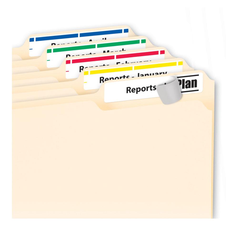
I agree that the decision to make it look like a folder is really neat, but right now the name-text doesn't really fit I think. Once again adding a little more space may help (it took me a bit to realize the white background was like a sticker, since usually the stickers have more white space on the sides). If you're not sure about something art wise, it's always wise to look at references! I googled around and this picture looks like a good place to start with adjusting the proportions and stuff.
edit: I ended up playing around with it a little bit in paint, just kind of showing what I talked about above. I think keeping your textbox padding even will also help (as in, you can bring it to the left a little if you want). Some VNs stylistically leave a wide side margin, but I think with how narrow your textbox is I wouldn't recommend it here.
A game about loneliness, chess, and fighting monsters with magic
