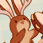
I'm not sure I should add marker-like lines to the main character's colour layer.
Please critique this mock up of a game
-
verysunshine
- Veteran
- Posts: 339
- Joined: Wed Sep 24, 2014 5:03 pm
- Organization: Wild Rose Interactive
- Contact:
Please critique this mock up of a game
It's going to be made in Unity, and is more of a movement-based interactive fiction. I'm trying to do the art myself, so I'm aiming for a child-like style.
Please critique the art. I'm trying to get a style down so I don't do too much before finding out it won't work.
I'm not sure I should add marker-like lines to the main character's colour layer.
Please critique the art. I'm trying to get a style down so I don't do too much before finding out it won't work.
I'm not sure I should add marker-like lines to the main character's colour layer.

-
puppetbomb
- Regular
- Posts: 123
- Joined: Fri May 19, 2017 4:04 pm
- Tumblr: puppetbomb
- itch: puppetbomb
- Location: USA
- Contact:
Re: Please critique this mock up of a game
I think you have a good start!
I suggest avoiding using textures (like on the floor) and work with flat colors. Since you have a purple outline on what I assume is the avatar the user controls, I suggest using that same color and line width for anything that is interactive. It will serve as shorthand for users in identifying interactive elements and create a cohesive look.
I suggest avoiding using textures (like on the floor) and work with flat colors. Since you have a purple outline on what I assume is the avatar the user controls, I suggest using that same color and line width for anything that is interactive. It will serve as shorthand for users in identifying interactive elements and create a cohesive look.
-
LexBit
- Newbie
- Posts: 5
- Joined: Tue Oct 28, 2014 11:04 am
- Projects: Celestial Navigator [WIP]
- Location: Pennsylvania, USA
- Contact:
Re: Please critique this mock up of a game
Hello, I like the child-like approach you're going for and I can easily see this animated in a simple way.
Some things I can recommend are if you maybe put a white outline around your character too. This could give a sort of cut-out kind of look, like the game Paper Mario. Here is an example using your screenshot:
Another thing I would highly recommend for a child-like style is to make the outlines or even the fill color look like it was drawn with a crayon or pencil. This can be done by changing the brush in whatever drawing program you're using. If you happen to be using Photoshop, I recommend using Kyle T. Webster Megapack (https://www.adobe.com/products/photoshop/brushes.html You will need to log in with an Adobe account to see this). If you don't have Photoshop, other drawing programs can usually replicate this feature.
Here is an example of some brushes, with the first one being a straight brush for comparison:
Even Microsoft Paint (if you're on a Windows machine) has a crayon brush available:
This is just a suggestion, however, I do recommend you try these different kinds of brushes because they are very fun to draw with!
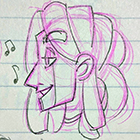
Lastly, here is an example of something drawn with a crayon-like brush AND colored with it. I know this example isn't exactly what you're looking for, but the style might be helpful in getting a direction to aim for, plus you can see how the line variation helps push the idea of a more loose, pencil-like drawing:
Good luck with your game, and I hope you enjoy trying new types of brushes!
Some things I can recommend are if you maybe put a white outline around your character too. This could give a sort of cut-out kind of look, like the game Paper Mario. Here is an example using your screenshot:
- mis-mockup_white around character.jpg (53.1 KiB) Viewed 7904 times
Here is an example of some brushes, with the first one being a straight brush for comparison:
- gLmigUg.png (47.43 KiB) Viewed 7904 times
Lastly, here is an example of something drawn with a crayon-like brush AND colored with it. I know this example isn't exactly what you're looking for, but the style might be helpful in getting a direction to aim for, plus you can see how the line variation helps push the idea of a more loose, pencil-like drawing:
-
briarbun
- Regular
- Posts: 49
- Joined: Wed Feb 20, 2019 4:23 pm
- Projects: Helix Felix
- Location: PNW
- Contact:
Re: Please critique this mock up of a game
I really like the tamagatchi-esque feel of the art. I think LexBit's suggestion of a crayon like brush is a good idea. Also consider when you add new elements to keep your color palette limited- it will make it feel more childish but also more cohesive, like if you were stuck with a box of only 25 crayons or something.
Who is online
Users browsing this forum: No registered users