Hi! If this isn't the right place to ask this, let me know; I don't think it fit the writing subforum despite being text-based.
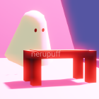
This is a turn-based battle system I'm working with for my current IF project; this screenshot shows just about every element that'll be on the screen (Enemy's names/HP, the battle text itself)...though it's, for lack of a better word, ugly. Basic? Unpolished? Either way, I'd like to smarten it up before presenting it to other people for the demo. I'm not much of a designer! Work on this has been very slow going and a lot of 'well this still looks bad but it looked worse the old way'...and I'd like some feedback on how to tweak this to look better. Font change? Change in the color scheme? Alignments, etc? Should I fiddle with textures?
I look forward to hearing from you!
Critique/help with a battle UI in Twine
- namastaii
- Eileen-Class Veteran
- Posts: 1350
- Joined: Mon Feb 02, 2015 8:35 pm
- Projects: Template Maker for Ren'Py, What Life
- Github: lunalucid
- Skype: Discord: lunalucid#1991
- Soundcloud: LunaLucidMusic
- itch: lunalucid
- Location: USA
- Contact:
Re: Critique/help with a battle UI in Twine
You could create something in photoshop. With frames/boxes and maybe even icons
- puppetbomb
- Regular
- Posts: 123
- Joined: Fri May 19, 2017 4:04 pm
- Tumblr: puppetbomb
- itch: puppetbomb
- Location: USA
- Contact:
Re: Critique/help with a battle UI in Twine
I feel that you need a set of tables to help visually categorize who the characters are and their status (http://twinery.org/questions/41450/how- ... ng-borders).
Basically, keep information on subjects together visually, then add size and font effects (size, bold, italicize) based on importance/function.
(It's a janky Photoshop job, nothing is exact)
I only did a few changes here by separating the enemies and shrinking text. It's now easier to see at a glance the sequence of actions (I would recommend bolding or isolating damage counters and status effects, as that information is important to the player)
As for font choices, use sans serif fonts. What you have is a serif font, which was traditionally created for large chunks of text. Sans serif fonts are faster to read and are more easily recognizable from a distance. Take a look at other game UI fonts and see what feels best for your game.
Re: Critique/help with a battle UI in Twine
Thank you so much! The moment I saw your quick mockup it was like a lightbulb went off in my head. "Ah! Yes, of course, they're so right! Of course this should be aligned like this, and this..."
Anyway. I've spent a day working off and on with it (encountered like three bugs in the middle of testing all these changes, lmao) and this is what I have now!
This is the current version! I think this is about as nice as it'll look short of coding in things like background images and overlays, or messing around with the border. Any further commentary is of course greatly appreciated
Re: Critique/help with a battle UI in Twine
Hi! I feel that perhaps if you have status effects like "bleeding" or "poisoned", maybe change the font color into something that represents it! Red for bleed and either purple or green for poison, if it helps. Since there aren't any images, I'd say that having color contrasts to the events that happen in your turn based battles can improve the UI by a bit and make it more palatable while your audience plays it. It's also best to stick to a nice mix of your color palette. I know some websites offer premade palettes for you to use and copy the hex codes off from, which might help make it visually appealing too.
Best of luck!
Best of luck!
Who is online
Users browsing this forum: No registered users