LONG REPLIES AHEAD! By the way, I've been working on a third revision, but since there's not much change, I'll just
leave the link here and work on the next revision! Notes on some of responses below x"DDD Thanks for your precious inputs, guys!
.usa wrote:[...] one of the boys was a childhood friend? Like, they already know each other so they can skip the meeting part, but would feel a little awkward because from friend to couple... Welp, it could lead to some real good fluff! Ah, but from the characters' descriptions, I didn't see anything pointing that anyone is already a friend of Shigure, so this wouldn't work at all... Still, just an idea!
❋ What kind of random meetings you'd expect to see?
I want to see Nao with his siblings! Let's see this tsun's soft side!!! (I think it's already obvious that tsun tsun boys are my top type.....haha......ha....)
[...]
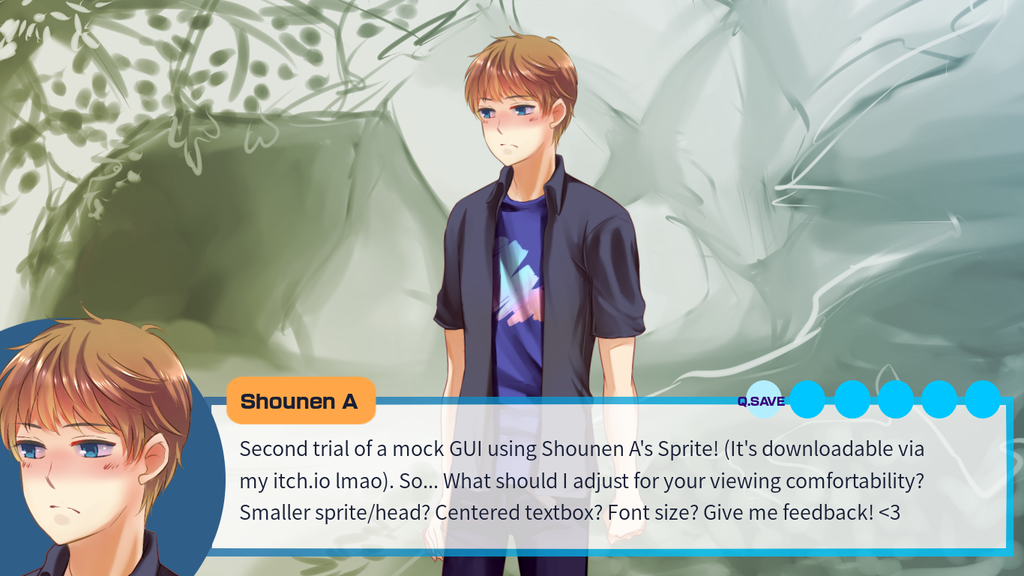
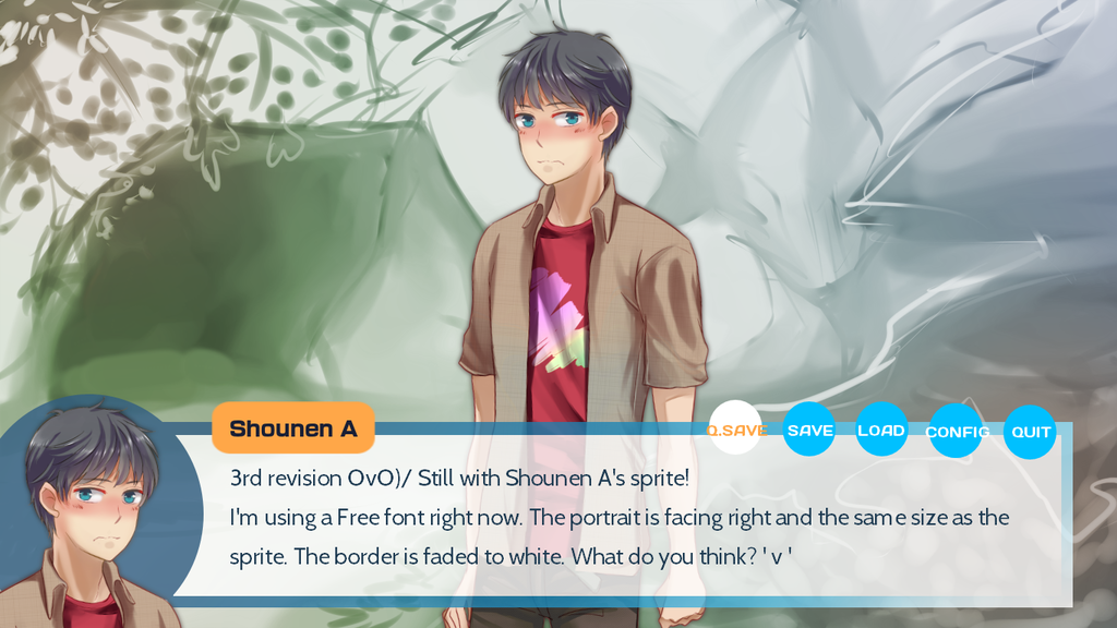
And now about the GUI! I think it's looking pretty good, just needing a few changes? One is, MC's portrait being smaller, and facing the other side! I think it looks a little weird he's facing left, for some reason I just can't imagine it that way! Other than that, I really like it <3
I should probably start counting who's winning, because I feel like Nao is winning on a landslide XDDD
We all like tsuns Your inputs on the GUI side has been noted and implemented in the 3rd revision but I'll tinker with it more before I update the first post!
And childhood friend is one of my fave trope as well please please don't tempt meeeee //runs
Ahem. Let's see what I could add post NaNo! I definitely love this trope too ehehe.
Weenily wrote: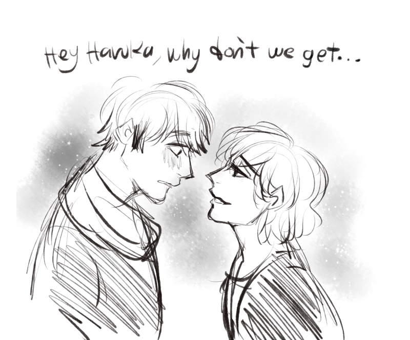
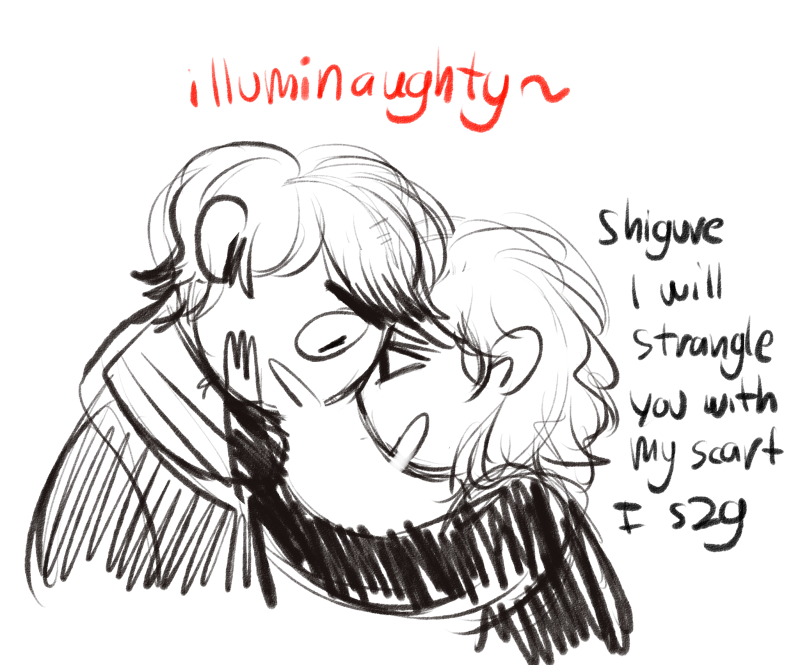
LMAO i wouldnt mind getting illuminaughty^ with haruka ;B)
im s o sorry for my illuminati jokes thi s is the last one i swe ar
ANNND NOTES ON THAT GUI. The fonts are easy to read and the GUI looks very sleek! I think the side sprite should be smaller (i typically prefer when the side sprite and the normal sprites are the same size) and face the right hand side of the screen though. I like how the textbox has a gradient in color but maybe make the brighter blue side fade to white? Also how would the quick buttons work because it kind of looks cramped on those circles? That sprite looks really good btw! :'>
KASJKLASFLKJAJFASF?????
????
I DON'T----
I DON'T THINK THIS WAS WORTHY OF FANARTS KSLAKJFLKAJF so awesome I'm jelly of your humors klasjklajf yes that's the proper way of using Haruka's scarf totally HAMG
no please illuminaughty is brilliant! If only I could put it somewhere inside the VN I'd be happy lmfaoooo
You're throwing your awesome artsus left and right and bless people's post I feel so happy you can't even--- //crai
My favorite character this NaNo is Shrich by the way. And Zena, but it's GxG, not BxB.
I was focusing on readability and probably ignored the touch-ups hahaha. Noted and fixed at the 3rd revision but I'll post the update when there's a significant exponent xD And thank you for commenting on the sprite hahahaha >////< //
Nekobako wrote:UI's looking pretty good, though I agree that the side sprite is too big. Also I can slightly see the corner of the box connecting with the side sprite and that's eh. Should just run the lines all the way into the circle. Seconding the quick buttons looking cramped; maybe use symbols instead? Of course, you'll have to be careful to make sure they're easily recognizable...
Not sure about the color either, but more than anything it needs to be unified with the rest of the system, so it's kind of dependent upon the menu/title screens and whatnot. Hard to judge it without context, haha.
Also I love the sprite, and now I'm excited to see finished sprites of the main boys *___*
Noted about the sprite, and yeah, I just realized the bump after I posted the mock up X"""D It's fixed. Thank you about the symbols, I'm looking for it right now!
About the colors, yeah, I haven't made the other stuffs, but I'll make sure the show the same message. X"D Please comment again later on if I've posted the main menu/gallery/other places~
LadyOfGatsby wrote:Hello there! I'm Really loving the sprites and the teaser art I really can't wait to see the fully colored sprites

As for the gui, I do feel it is a little bland. Maybe it can have more of its own set of colors matching? More personality whereas it fits the theme and overall gameplay/story vibe. Overall the gui needs some work but great job on what you have so far! I'm looking forward to this.
OAO Thank you very much for coming here + those precious inputs. Because I'm lowkey blown away by your logo + GUI (esp. the gallery! So sparkly and pretty */////*)
Yup, not too shabby for the first GUI I made hahaha. xD //shot
I need to do some self appreciation lmaooo
I was aiming for morning sky + that golden reflection on the cloud when the sun broke the dawn. Unf somehow it's embarrassing to say here hahahah xD
I noticed there were patterns in your GUI + elaborate design, whereas I was aiming for simple/sleek/readable... But right now I agree that it's too bland. TTATT
If you were me, how'd you touch up the GUI? //calls an audience XD
I need at least photoshop to work on this more... Mere illustration software just don't have the instant layer effects, so I'll continue tomorrow after I get back home :'D


