Requesting critique of girl sprites

Art threads specific to a single artist.
Message
Author
User avatar
CeruleanMermaid
Regular
Posts: 30
Joined: Mon Jul 23, 2012 9:21 am
Projects: Modus Operandi
Organization: Oceanic Eden
Contact:

Requesting critique of girl sprites

#1 Post by CeruleanMermaid »

Hey everyone!

I'm hoping to look for some critique of my girl sprites. It's well known to anyone who knows me that I dislike drawing girls. I prefer to draw males, and because of that I rarely find myself sitting down to draw a girl. As a result, my drawings of girls... leave a lot to be desired. It seems I just can't get their proportions right, and several people have told me that sometimes they come out looking kinda manly.

So in the thread for the game I'm working on, I've had several people kindly give me their critique on my female sprite. But even when using their critique I still can't seem to get it right. Here's my first attempt at redrawing the sprite:
Sayurisketch2.jpg
Using their feedback I redrew it to this:
newSayurisketch.jpg
It looks better, but there still seems to be something off....

I would appreciate any critique you could give me. It feels kinda sad not being to draw my own gender right >_>; I really do want to improve in girls; I've put it off long enough.

Thanks in advance!
Image

User avatar
FatUnicornGames
Miko-Class Veteran
Posts: 576
Joined: Sun Mar 25, 2012 7:54 pm
Projects: Club Shuffle
Contact:

Re: Requesting critique of girl sprites

#2 Post by FatUnicornGames »

The sprite has a few minor problems, the folds on the outfit could be better defined, the shoulders look a bit narrow when compared to the rest of the body, the head is a bit small. The one BIG problem I see (like that needs to be fixed) is the right arm, it is entirely awkward, the inside of the elbow area should be pointed out toward the viewer, though I suggest just finding a different position for it.

Edit: In the colored version on your wip thread the hair and her outfit are the same color making it hard to see any of the shapes in the torso/stomach region.

Other than that, the coloring is really nice though. :D

Edit edit: ALSO I was reading on your other thread that some people thought she looked manly. One instant way to make her less masculine would be to draw in her waist a bit more. An hourglass shape is always a feminine trait.

Image

Doing bow shaped lips like these might help too.
Image
Developer Blog for Club Shuffle - Follow and Share?
-Also! You can call me Crystal if you want.-

Explosions&NickCage
Regular
Posts: 36
Joined: Tue Jul 03, 2012 10:31 pm
Location: UWF Pensacola, Florida
Contact:

Re: Requesting critique of girl sprites

#3 Post by Explosions&NickCage »

That right elbow is way too sharp and the eyelashes are too big. I suggest just having the upper eyelashes remain the same, and make the lower ones less noticeable. Otherwise, her eyes paired with her blank smile makes her look absolutely blazed.
The hair could work, but it depends on how you color it. The triangles make it look choppy like it's made of felt.
I love the little details you put on the clothes, however, like the lace-ish trim and the little dots on the sleeves, but uncolored I can't tell how they relate to the smock/front. It could just be because the top trim is gray lines and not black.
Definitely not bad, but the hair is very 80's choppy and big. And because there's so much of it it's very apparent. It could look different colored, though.

User avatar
Daistarir
Veteran
Posts: 314
Joined: Thu Aug 09, 2012 2:47 am
Projects: History [GxB], Alice Revo
Organization: Kingdom Crown Production
Location: Tokyo,Japan
Contact:

Re: Requesting critique of girl sprites

#4 Post by Daistarir »

When my friend saw it , she said : " Is that a man or a woman ?'
Lol Now , critique time. I see the eyes too long , and a bit small . So bigger eyes please . Woman usually have bigger eyes than man. (Same size in the real life)
The hair look a bit shaky . And the shoulder is a big problem . Her shoulder shouldn't be that large.
I'm very amatuer so I can't say much . Good luck in drawing girls.

User avatar
CeruleanMermaid
Regular
Posts: 30
Joined: Mon Jul 23, 2012 9:21 am
Projects: Modus Operandi
Organization: Oceanic Eden
Contact:

Re: Requesting critique of girl sprites

#5 Post by CeruleanMermaid »

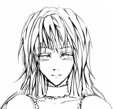
FatUnicornGames wrote:The sprite has a few minor problems, the folds on the outfit could be better defined, the shoulders look a bit narrow when compared to the rest of the body, the head is a bit small. The one BIG problem I see (like that needs to be fixed) is the right arm, it is entirely awkward, the inside of the elbow area should be pointed out toward the viewer, though I suggest just finding a different position for it.

Edit: In the colored version on your wip thread the hair and her outfit are the same color making it hard to see any of the shapes in the torso/stomach region.

Other than that, the coloring is really nice though. :D

Edit edit: ALSO I was reading on your other thread that some people thought she looked manly. One instant way to make her less masculine would be to draw in her waist a bit more. An hourglass shape is always a feminine trait.

Image

Doing bow shaped lips like these might help too.
Thank you for the critique! I'll try fixing her head and shoulders. I was thinking her right arm looked odd, so maybe I'll redraw it in a different position like you suggest.

Yeah the colors do blend together, but I'm a little unsure of how to fix it :/ Since both her outfit and her hair are supposed to be dark... I'll try changing the color of her outfit and see if that works. And thanks for the compliment! :D

Thanks for your help, I'll try applying everything you said!
Explosions&NickCage wrote:That right elbow is way too sharp and the eyelashes are too big. I suggest just having the upper eyelashes remain the same, and make the lower ones less noticeable. Otherwise, her eyes paired with her blank smile makes her look absolutely blazed.
The hair could work, but it depends on how you color it. The triangles make it look choppy like it's made of felt.
I love the little details you put on the clothes, however, like the lace-ish trim and the little dots on the sleeves, but uncolored I can't tell how they relate to the smock/front. It could just be because the top trim is gray lines and not black.
Definitely not bad, but the hair is very 80's choppy and big. And because there's so much of it it's very apparent. It could look different colored, though.
Thanks! I'll try making the bottom eyelashes thinner. I like the look of thick eyelashes, but I guess I got a little carried away |D And I'll redraw her arm in a different position.

If you'd like to see a colored version, you can see the colored version of the original sprite in the first post of my wip thread here: http://lemmasoft.renai.us/forums/viewto ... 43&t=17194 I'd appreciate it if you could take a look at it and see if it still looks bad.

Thank you!
Daistarir wrote:When my friend saw it , she said : " Is that a man or a woman ?'
Lol Now , critique time. I see the eyes too long , and a bit small . So bigger eyes please . Woman usually have bigger eyes than man. (Same size in the real life)
The hair look a bit shaky . And the shoulder is a big problem . Her shoulder shouldn't be that large.
I'm very amatuer so I can't say much . Good luck in drawing girls.
Aha ouch... ^^;

The woman having bigger eyes thing is sort of a shoujo trend, but I'll play around with it and see if it looks better a little bigger.

And her shoulder looks large? She's wearing puffed sleeves, is that why maybe? Or is it something else?

Thanks for the feedback!


I'm thinking that maybe it'll be better/easier for me to just redraw her body again? So I can resize her head and change the position of her arms... I'll see. Thank you guys for all the critique, I'll be back with an updated version soon! :D
Image

User avatar
Daistarir
Veteran
Posts: 314
Joined: Thu Aug 09, 2012 2:47 am
Projects: History [GxB], Alice Revo
Organization: Kingdom Crown Production
Location: Tokyo,Japan
Contact:

Re: Requesting critique of girl sprites

#6 Post by Daistarir »

Lolololol !! I'm remember the time when I draw a actual boy and my friend said :" She looks so cute xD"
I was like :*poker face*"

User avatar
bunbun
Regular
Posts: 140
Joined: Mon Jun 11, 2012 10:54 pm
Contact:

Re: Requesting critique of girl sprites

#7 Post by bunbun »

hmmmm She pass as a girl to me ^^
Face wise maybe because her cheeks is long and sharp?
Since I have an impression of guys having longer face and smaller eyes.

For body, perhaps make her body smaller and more curve on her waist? <:
WIPS
Image

User avatar
CeruleanMermaid
Regular
Posts: 30
Joined: Mon Jul 23, 2012 9:21 am
Projects: Modus Operandi
Organization: Oceanic Eden
Contact:

Re: Requesting critique of girl sprites

#8 Post by CeruleanMermaid »

bunbun wrote:hmmmm She pass as a girl to me ^^
Face wise maybe because her cheeks is long and sharp?
Since I have an impression of guys having longer face and smaller eyes.

For body, perhaps make her body smaller and more curve on her waist? <:
Thank you! Hmm I'll try doing that :)

....................

So I ended up redrawing her body, clothes, and hair. I wanted to show the sketch here before I do the lineart, so could you guys please see if it's better or still totally off?
Sayurisketch3.jpg
I feel like her arms are off...
Image

User avatar
Tag-
Miko-Class Veteran
Posts: 508
Joined: Tue Jul 05, 2011 7:50 am
Projects: Circo della Sera
Contact:

Re: Requesting critique of girl sprites

#9 Post by Tag- »

I think that definitely looks a lot better, very feminine now :D

And personally, I don't think her eyes make her look like a guy, since you've added quite thick lashes. It's so rare to see a female character without massive shoujo eyes, and I really like it.~ Cough I am a hypocrite cough
PM me if needed

User avatar
Daistarir
Veteran
Posts: 314
Joined: Thu Aug 09, 2012 2:47 am
Projects: History [GxB], Alice Revo
Organization: Kingdom Crown Production
Location: Tokyo,Japan
Contact:

Re: Requesting critique of girl sprites

#10 Post by Daistarir »

Ummmmm.. .
The result is better than the first one.
She need to be more female-ish and softer.
Basically , those eyes are not quite good and her hair is not that smooth for a girl.
And the creepy smile . XD
If she is a boy-ish girl then Christina from The Second Reproduction is a good example .
Like more round eyes . Less empire waist.
Last edited by Daistarir on Tue Oct 09, 2012 10:54 am, edited 1 time in total.

User avatar
Merula O
Regular
Posts: 78
Joined: Sat Apr 21, 2012 12:47 pm
Projects: Era of Monsters
Contact:

Re: Requesting critique of girl sprites

#11 Post by Merula O »

Wow, she looks so nice now! Anatomy is much much better.
But I think her hands a little too thin in contrast with the whole body. And the face could be bigger.
Sorry, I photoshoped her head a little :oops: .

Image

Eyes were too wide, and because of this located too close. But I like her eyes! Round sparkle ones don`t fit here, I think. Also changed her mouth. If you satisfied with her face, you can just ignore me haha…

User avatar
Daistarir
Veteran
Posts: 314
Joined: Thu Aug 09, 2012 2:47 am
Projects: History [GxB], Alice Revo
Organization: Kingdom Crown Production
Location: Tokyo,Japan
Contact:

Re: Requesting critique of girl sprites

#12 Post by Daistarir »

@Merula : xD You are understand what I meant . Thanks god. I think her hair need to fix ,too.

User avatar
CeruleanMermaid
Regular
Posts: 30
Joined: Mon Jul 23, 2012 9:21 am
Projects: Modus Operandi
Organization: Oceanic Eden
Contact:

Re: Requesting critique of girl sprites

#13 Post by CeruleanMermaid »

Tag- wrote:I think that definitely looks a lot better, very feminine now :D

And personally, I don't think her eyes make her look like a guy, since you've added quite thick lashes. It's so rare to see a female character without massive shoujo eyes, and I really like it.~ Cough I am a hypocrite cough

Thank you! :D I don't mind large shoujo eyes, but that's not really the style I'm looking to draw in. Besides, I'm really bad at drawing them cough Thank you~
Daistarir wrote:Ummmmm.. .
The result is better than the first one.
She need to be more female-ish and softer.
Basically , those eyes are not quite good and her hair is not that smooth for a girl.
And the creepy smile . XD
If she is a boy-ish girl then Christina from The Second Reproduction is a good example .
Like more round eyes . Less empire waist.
Making them look soft is something I struggle with... comes from drawing guys too often |D
Her hair is not smooth? What do you mean by that?
I guess her smile does look weird... I don't know why I'm so bad at drawing mouths on the computer orz

I get the feeling you'd like to see me redraw her eyes to big round shoujo style ones, but that's really not my style. So, sorry :/
Merula O wrote:Wow, she looks so nice now! Anatomy is much much better.
But I think her hands a little too thin in contrast with the whole body. And the face could be bigger.
Sorry, I photoshoped her head a little :oops: .

Image

Eyes were too wide, and because of this located too close. But I like her eyes! Round sparkle ones don`t fit here, I think. Also changed her mouth. If you satisfied with her face, you can just ignore me haha…
Thank you for doing that! I see what you mean... I tend to make my eyes too wide for some reason oops. Okay I'll try fixing it. Thanks! :D

........................

Ok guys I'll try fixing it again. I'll be back soon!
Image

User avatar
bunbun
Regular
Posts: 140
Joined: Mon Jun 11, 2012 10:54 pm
Contact:

Re: Requesting critique of girl sprites

#14 Post by bunbun »

I think she looks so much girlier now!
gratz! :D
WIPS
Image

User avatar
15385bic
Miko-Class Veteran
Posts: 771
Joined: Tue Jun 28, 2011 7:39 am
Location: Australia
Contact:

Re: Requesting critique of girl sprites

#15 Post by 15385bic »

definitely looking much girlier ;)

Post Reply

Who is online

Users browsing this forum: No registered users