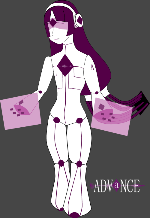
I'm working on a new game and I wanted some input on the main menu and the backgrounds I have made so far.
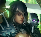
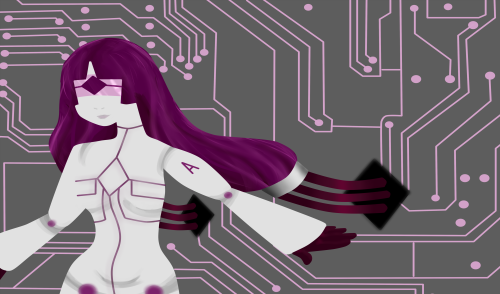
Here's the main menu:

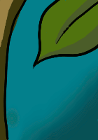
Here's the first background:

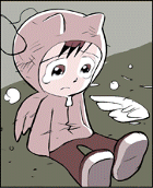
And, just for the heck of it, the dialogue box:

Now, my sprites are going to be drawings. Will the photos on the main menu clash with this? The people in the photos are not necessarily my characters. The theme of the main menu is like a psych ward report (the text in the background) with pictures of the patients, and then the game logo. Does it flow?
The background image of the train station is something I'm pretty darn satisfied with. I think it will match a general "visual novel" background style. Your thoughts?