Yelling at someone for doing something wrong is rude. I don't think anyone here would do that to you. Here we all want people to get better and be able to produce the best work they can.
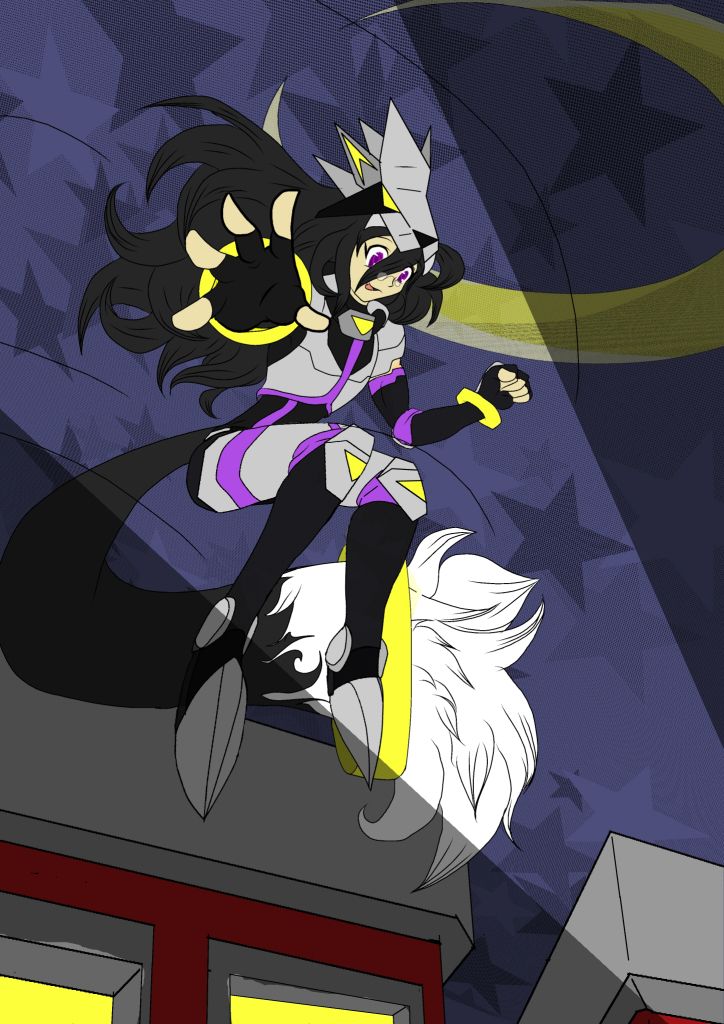
The biggest thing that pops out at me, besides the things that have already been mentioned, is that four of the five fingers on the characters hand are creating some sort of tangent. You might want to move the hand a teeny bit or edit the hair lines a bit to get rid of those.
This is what a tangent is if you don't know what I'm talking about
Two other big things that pop out are that the perspective of the helmet is off and the top of the gray part of the shoes is completely different on both feet. With the helmet you can draw a box before you start to help you imagine it as a three dimensional object.
Also I don't think you need the action lines. You could remove them and the character's movement would be just as powerful as before. The hair you've drawn shows the motion well and captures a nice moment of right before everything starts to be affected by the force of the wind rushing past you as you fall. I guess you could call it an in media res pose?

Otherwise I really like this piece. The patterned background is very cute, and if you do decide to add shading I think using the color of the sky would be a great color choice. I highly recommend that you shade the figure because your linework is busy and with that spotlight it would introduce some lovely depth. Also it might be good to put some sort of pattern overlay on the character and the buildings to have them fit better with the background.
And one last thing- the color scheme of the character is nice but you might want to add a tiny bit of color to that gray. Neutral gray is best in black and white pictures, but it will 'dull' the picture out when you're working with color. Everything has a bit of color in it, even if it's white, black or gray.
Sorry for the wall of text, but I hope this helps you out a bit. Good luck on finishing that piece!