Critique needed

Art threads specific to a single artist.
Post Reply
Message
Author
User avatar
Bellalea
Newbie
Posts: 22
Joined: Sun Jun 17, 2012 6:06 pm
Location: Finland
Contact:

Critique needed

#1 Post by Bellalea »

I am doing art myself for my VN, and I'm getting really stressed out. I feel like I'm not good enough, that I'm going to get a lot of criticism for my art. My VN won't be commercial, but I wan't the quality to be decent anyways.

So here are some of my sprites, tell me what you think about them, are they "good enough" for a VN and what you would change :)

Image
Small hand, I know... I just hope it doesn't bother anyone.

Image
This is still a bit under construction (everything is not colored).

Image
Again with the small hands.

Image
This one only has lineart, but I would like to get some extra help with it because of that. I feel like there's something wrong with his anatomy, I just can't tell what.

Thank you for answering :)

User avatar
Itwasneveradream
Veteran
Posts: 248
Joined: Wed Jan 02, 2013 10:48 am
Projects: Color Me Cliche (semi-hiatus) | Rose Colored Days | College Jam | One secret Project
Contact:

Re: Critique needed

#2 Post by Itwasneveradream »

Uh okay, where do I begin...

For starters, I think the heads might be too big. Perhaps that's merely a stylistic choice. And about the hands, I do believe that one of the anatomy rules is to make sure that the hand is able to cover your face.

Also, make realistic choices when it comes to anatomy such as "oh, I should make sure that the neck looks big and strong enough to support the weight of her head" and I'm not saying that it has to be the size of a tree trunk either.

I'm not too sure what to comment on the other features since it might be a stylistic choice so I guess you should try to pick a certain style (i.e. realistic, western, cartoonish, anime, etc.) and practice it.

tl;dr study and follow anatomy rules, be realistic, choose a style and PRACTICE PRACTICE PRACTICE

User avatar
9-of-Hearts
Regular
Posts: 115
Joined: Sun Nov 11, 2012 9:07 pm
Contact:

Re: Critique needed

#3 Post by 9-of-Hearts »

I like your style, it reminds me of ball-jointed dolls! I feel like the girls are pretty good, I only have minor complaints about coloring (which in this case I'm pretty sure "it's not you, it's me"), the jawline of the red-headed girl, and you could stand to make hands a tiny bit bigger if you want to stick with the BJD kind of aesthetic.

The guy's anatomy definitely needs to be worked on, though. His cheek and ear are a bit oddly shaped, his near arm and hand have an awkward look, and his chest is rounded in an unnatural way. Did you mean for him to have such a long forehead? Also, did you draw him without clothes first? Getting references for the body and drawing it to add the clothes on later is a good way to improve that.

All in all, I feel like your art has potential--I feel like I'd enjoy your style in a VN, to say the least.

dramspringfeald
Miko-Class Veteran
Posts: 825
Joined: Tue May 03, 2011 2:45 pm
Projects: The Echo, CBlue, Safety_Dance
Location: ABQ-USA
Contact:

Re: Critique needed

#4 Post by dramspringfeald »

Hmm... well then
Try going here for starters then How to draw people

Remember Comic and Anime drawings are Simplified Human drawings. So I suggest you start learning the basics before moving on to the harder stuff.

Once you are comfortable with drawing people and objects then try emulating an artist you enjoy. Just remember If they are abstract artists or have the eyes in the brain or something post a reference so we can adjust to it.
Don't be a Poser! Learn to Draw
Learn to Draw with Stan Lee
Learn to Draw with Mark Crilley
If you want you can brows my art. My art can be found at...FA // IB // DA Neglected for a few years so I'm just now updating it

Learn to break a bone to break a bone,
Learn to build a house to build a house,
Learn to make a Game to make a Game.

User avatar
arachni42
Veteran
Posts: 341
Joined: Mon Feb 25, 2013 6:33 pm
Organization: no, I'm pretty messy
Location: New York
Contact:

Re: Critique needed

#5 Post by arachni42 »

Yes, I think they are pretty good (enough for a free VN -- but that is IMO), but they could still use a lot of work. There is plenty to critique about them... however, I do really like the direction they're going!

I like the style; the faces are very doll-like in a cute and unique way. I like the big heads; I don't think the size of the heads is the problem. I think it's the shape of the head and placement of the neck.

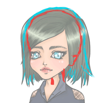
Get ready for a really REALLY terrible redline! (I literally dusted off my tablet today; I haven't used it in a long time, so it's more like a redscribble, BUT it's still way easier than trying to describe things with words! :)

Image

OK, there's a cyan line in there, too. I choose to do the first one since she struck me as the most developed. Remember that the hair will follow the shape of the head, so it's important to know where the shape of the head actually *is* under the hair. I made a rough guess with red. With the cyan, I attempted to adjust the shape of the hair so that on those sides, it "falls" from her head. This prevents the shape of the hair from suggesting a misshapen head underneath -- especially since this girl's hair has very little volume. Even anime hair with gravity-defying characteristics is drawn with the head underneath in mind.

The placement of the neck can be guided by the shape of the head; the neck should look like it's in the "center" underneath. You can use chibi-style art for reference. (...if you can find any where the necks are shown -- I actually used a Nendoroid for reference!) It seems that the relative placement of tiny necks like those vary a lot even with small changes in angle.

I didn't reline this, but the cheek looks like it juts out too much... but I think *true* culprit is the center of the chin. I believe it should be moved a tiny bit to the right. Keep in mind again the shape of her head and where the center line will be. The cheek jutting out is part of what gives them their lovely doll-like appearance, so see how it looks with the chin adjusted.

I focused on the head, but as far as the body, I will mention that it is a problem that her hand (and her forearm) is *that* small. In this case, it's not going to be as big as her face, but the body suggests certain proportions. The elbows may need to be higher. Experiment a bit.

I've just been focusing on the one because the others have the same type of head shape problem -- definitely fixable, though. And they've got the same adorable eyes. ;)
Edit: The placement of their necks might be ok, but I can't really tell without adjustment of the head shape first.

I think I have to study the guy a little longer, but I have similar thoughts about the head.

Hope this helps!
I, Miku (NaNoRenO 2014)
Vignettes (NaNoRenO 2013)
_________________

User avatar
greyinthedark
Newbie
Posts: 21
Joined: Sat Aug 04, 2012 1:29 pm
Contact:

Re: Critique needed

#6 Post by greyinthedark »

I like your style - it looks much more stylised than you usually see in VNs, which isn't necessarially a bad thing. You seem quite consistent with your deviations from realistic anatomy, which does make it seem much more like an artistic choice. The only thing that does strike me as obviously off is the neck problem that's already been mentioned; even if the neck is thin, it should probably be a little closer to reality. Ditto with the hands, if you intend to have them show.

They're all quite ridiculously cute, though, thanks to your tweaked proportions, in a way that could make them suitable for either a very cutesy game or a very dark one. Funny how that works!

Short version: As a player of VNs, I would definitely play a game with this art. :D

User avatar
Bellalea
Newbie
Posts: 22
Joined: Sun Jun 17, 2012 6:06 pm
Location: Finland
Contact:

Re: Critique needed

#7 Post by Bellalea »

Thank you all for your answers, they're very helpful :) I'm happy that these are not horrible, and I only have to do a couple of changes on some (making bigger hands, adjusting the jaw/chin and neck). But I really need to work on the guys, I guess I'll have to draw only them for a couple of weeks to study their anatomy. And by the way, I always draw my characters without hair and clothes first, I guess I just manage to mess them up at some point..

I can't really choose a style, because I just draw what feels the best. But I guess it's something between cartoonish and anime, and I'll try to stick with that. I like the BJD-reference, they really do look like them :D I don't purposely make them cute, maybe it just comes naturally. I can't really imagine myself making tinier heads or smaller cheeks, it would feel abnormal :D

And now that I look closer, their hands can barely cover their eyes... Poor guys, I need to get you bigger hands!

User avatar
Starwulfen
Regular
Posts: 55
Joined: Thu Jan 03, 2013 11:37 am
Projects: Project PeGASuS, Destiny's Spire, The Dragon Call
Organization: Mist Fables
Location: Northampton, UK
Contact:

Re: Critique needed

#8 Post by Starwulfen »

Personally I really like them, though I agree the necks need moving.
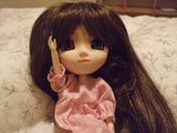
They really look so much like Pullip dolls in terms of proportions ^_^
My Pullip Lucinda says hi (and she can't cover her eyes with her hands either XD)
Image
Work in Progress - Destiny's Spire
NaNoRenO 2013 - The Dragon Call

User avatar
100puro
Regular
Posts: 88
Joined: Sun Feb 12, 2012 11:43 am
Projects: Driftwood, FatexHeart
Contact:

Re: Critique needed

#9 Post by 100puro »

Like everyone's said your art is really like bjd's or blythe dolls (i'm guessing you get inspiration from them)?

I'm a fan too and sometimes i draw people that look sort of like them because I'm just in love with their perfect delicate faces <333 However in general you could work on the anatomy a bit like for the girl with the orange hair, the left side of her face shouldn't have the "dimpling" effect near her chin because from this angle we should be seeing her jaw bone and not her flesh (not sure if that made sense). There are other things like clothing wrinkles and head shapes that could be worked on. But I can definitely tell that you've practices a lot with faces since the facial proportion are quite good and they're quite pretty. I hope to see more of your work in the future!

Oh and I think there's no "standard" for art quality for visual novels since I've seen pretty amateur work to professional quality work even for free games. However, if you'd like to know where yo u stand I would say you're above average for the faces and maybe around average for body/clothes.
::Currently looking for work! <3::
Doing sprites, cg's, and chibis. PM me if interested!

User avatar
Bellalea
Newbie
Posts: 22
Joined: Sun Jun 17, 2012 6:06 pm
Location: Finland
Contact:

Re: Critique needed

#10 Post by Bellalea »

Thank you for answering :) and Starwulfen, she's really cute, I lover her heterochromic eyes!

User avatar
Bellalea
Newbie
Posts: 22
Joined: Sun Jun 17, 2012 6:06 pm
Location: Finland
Contact:

Re: Critique needed

#11 Post by Bellalea »

Image

Can I get some critique on this? I think he looks much better than the first guy, but there's something wrong in his body. I just don't know what.

User avatar
arachni42
Veteran
Posts: 341
Joined: Mon Feb 25, 2013 6:33 pm
Organization: no, I'm pretty messy
Location: New York
Contact:

Re: Critique needed

#12 Post by arachni42 »

Bellalea wrote:Can I get some critique on this? I think he looks much better than the first guy, but there's something wrong in his body. I just don't know what.
Very nice! His head and hair look great!

You're right about the body, but I think I can help. The way his arms are drawn (and the way his face is facing) visually indicates that we're viewing his body at an angle, too. However, the shoulders are at odds with that, because they are fairly symmetrical as if we are looking at them from the front. The one on the right (his left) need not change, but I think the one on the left should be brought inward a bit. Another conflicting visual cue is the placement of the buttons. The upper buttons don't seem quite far enough over to the left for the angle his body is at.

You've definitely improved -- good luck!
I, Miku (NaNoRenO 2014)
Vignettes (NaNoRenO 2013)
_________________

User avatar
noeinan
Eileen-Class Veteran
Posts: 1153
Joined: Sun Apr 04, 2010 10:10 pm
Projects: Ren'Py QuickStart, Crimson Rue
Organization: Statistically Unlikely Games
Deviantart: noeinan
Github: noeinan
Location: Washington State, USA
Contact:

Re: Critique needed

#13 Post by noeinan »

I agree with arachni42 that it is the angle. You could also make the angle not so severe by thickening his torso so it looks like it's facing toward the front. Right now you can see a gap between his foremost arm and his waist. If you look at the first girl you posted at the top of the thread you can see that she doesn't have this gap and she's facing pretty much the same direction that he is. The position of the shoulders is different with her as well, which arachni42 pointed out in hir post. Also, his sleeve is pretty narrow, so unless the shirt is especially tight you may want to widen it. The way it is now, the sleeve follows his arm exactly but still has wrinkles as if it was loose.

Other than that, looking great! I can definitely see improvement from the first guy.
Image

Image
Image

User avatar
Bellalea
Newbie
Posts: 22
Joined: Sun Jun 17, 2012 6:06 pm
Location: Finland
Contact:

Re: Critique needed

#14 Post by Bellalea »

Thank you both very much, I'm glad if I've improved :)

Post Reply

Who is online

Users browsing this forum: No registered users