Yes, I think they are pretty good (enough for a free VN -- but that is IMO), but they could still use a lot of work. There is plenty to critique about them... however, I do really like the direction they're going!
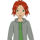
I like the style; the faces are very doll-like in a cute and unique way. I like the big heads; I don't think the size of the heads is the problem. I think it's the shape of the head and placement of the neck.
Get ready for a really REALLY terrible redline! (I literally dusted off my tablet today; I haven't used it in a long time, so it's more like a redscribble, BUT it's still way easier than trying to describe things with words!

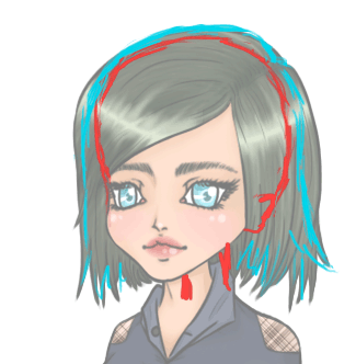
OK, there's a cyan line in there, too. I choose to do the first one since she struck me as the most developed. Remember that the hair will follow the shape of the head, so it's important to know where the shape of the head actually *is* under the hair. I made a rough guess with red. With the cyan, I attempted to adjust the shape of the hair so that on those sides, it "falls" from her head. This prevents the shape of the hair from suggesting a misshapen head underneath -- especially since this girl's hair has very little volume. Even anime hair with gravity-defying characteristics is drawn with the head underneath in mind.
The placement of the neck can be guided by the shape of the head; the neck should look like it's in the "center" underneath. You can use chibi-style art for reference. (...if you can find any where the necks are shown -- I actually used a Nendoroid for reference!) It seems that the relative placement of tiny necks like those vary a
lot even with small changes in angle.
I didn't reline this, but the cheek looks like it juts out too much... but I think *true* culprit is the center of the chin. I believe it should be moved a tiny bit to the right. Keep in mind again the shape of her head and where the center line will be. The cheek jutting out is part of what gives them their lovely doll-like appearance, so see how it looks with the chin adjusted.
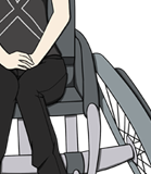
I focused on the head, but as far as the body, I will mention that it is a problem that her hand (and her forearm) is *that* small. In this case, it's not going to be as big as her face, but the body suggests certain proportions. The elbows may need to be higher. Experiment a bit.
I've just been focusing on the one because the others have the same type of head shape problem -- definitely fixable, though. And they've got the same adorable eyes.

Edit: The placement of their necks might be ok, but I can't really tell without adjustment of the head shape first.
I think I have to study the guy a little longer, but I have similar thoughts about the head.
Hope this helps!