Which logo looks best?
- Ant-san
- Regular
- Posts: 102
- Joined: Sun Apr 28, 2013 10:22 pm
- Completed: Snowdrop, The Demon Lord is Mine, PrinHero, PreOdyssey
- Projects: The Three Princes and Adarna
- Location: Yongen-Jaya
- Contact:
Which logo looks best?
I've made variations with our logos, and we can't decide which one to use XD
So... that's why I'm hoping you guys could vote which look best to you (or suggest something maybe?)
Help will be greatly appreciated
1.) http://sta.sh/0dupx0hiyg6
2.) http://sta.sh/028nwrcvozps
3.) http://sta.sh/0yo0yuvisyx
4.)
http://sta.sh/0280jwxi7abg
So... that's why I'm hoping you guys could vote which look best to you (or suggest something maybe?)
Help will be greatly appreciated
1.) http://sta.sh/0dupx0hiyg6
2.) http://sta.sh/028nwrcvozps
3.) http://sta.sh/0yo0yuvisyx
4.)
http://sta.sh/0280jwxi7abg
Last edited by Ant-san on Thu Jun 06, 2013 10:02 am, edited 2 times in total.
Otome game currently in progress~;)
Feel free to check it out ^_^
Interested in commissioning me?
Finished Project/s:
The Philosopher's War
- merdeamour
- Veteran
- Posts: 307
- Joined: Sun Apr 21, 2013 10:23 pm
- Projects: Taleweaver's Curse
- Location: Philippines
- Contact:
Re: Which logo looks best?
Is the topmost one new? ((: I love it xD (Although I don't know if my vote's counted because I'm part of the team )
What would life be if we had no courage to attempt anything?
-Vincent van Gogh
I manage a blog, Another Otome Diary where I give my two cents on otomes I've played. Check it out, or let me know if you want a game of yours reviewed!- Ant-san
- Regular
- Posts: 102
- Joined: Sun Apr 28, 2013 10:22 pm
- Completed: Snowdrop, The Demon Lord is Mine, PrinHero, PreOdyssey
- Projects: The Three Princes and Adarna
- Location: Yongen-Jaya
- Contact:
Re: Which logo looks best?
That one's actually the oldest, but I forgot to show it XDmerdeamour wrote:Is the topmost one new? ((: I love it xD (Although I don't know if my vote's counted because I'm part of the team )
Otome game currently in progress~;)
Feel free to check it out ^_^
Interested in commissioning me?
Finished Project/s:
The Philosopher's War
Re: Which logo looks best?
My favourite one would be no. 2
The reason being because I like the colour scheme.
No.1 appears to be covered in a lot of brown making the writing appear less legible and I believe legibility of a logo of all things to be very important ^^.
No.3 is a nice colour scheme as well but it gives me the impression of a garden or the story being heavily romance based which as I understand is a part of the game but not the main aspect of it so that rules out this one for me.
No.4 gives me the impression of a dark story so understandably fits the theme ^^; but I think my eyes are more drawn to No.2 due to the lighter contrasting colours.
Avatar made by xSugar-ZooZoo
Re: Which logo looks best?
I personally prefer the second one! It looks a bit ... cleaner? idk how to word it haha~ but yeah, #2!
- azureXtwilight
- Megane Procrastinator
- Posts: 4118
- Joined: Fri Mar 28, 2008 4:54 am
- Completed: Fantasia series (ROT and ROTA), Doppleganger: Dawn of The Inverted Soul, a2 (a due), Time Labyrinth
- Projects: At Regime's End
- Organization: Memento-Mori VNs, Team Sleepyhead
- Location: Yogyakarta, Indonesia.
- Contact:
Re: Which logo looks best?
I prefer number 2, but if I have to say all the fonts used is hard to read for me. But maybe it's just me, ;_;
- PyTom
- Ren'Py Creator
- Posts: 16093
- Joined: Mon Feb 02, 2004 10:58 am
- Completed: Moonlight Walks
- Projects: Ren'Py
- IRC Nick: renpytom
- Github: renpytom
- itch: renpytom
- Location: Kings Park, NY
- Contact:
Re: Which logo looks best?
At this size, I don't like any of them.
The combination of the blackletter (?) font, the gradient, and the small lettering makes them hard to read. The decoration up top also looks like it might be text, which means I attempt to read it, but can't - I don't think it's meaningful at all, but the shapes make one want to look at it - causing a sort of dissonance.
Supporting creators since 2004
(When was the last time you backed up your game?)
"Do good work." - Virgil Ivan "Gus" Grissom(When was the last time you backed up your game?)
Software > Drama • https://www.patreon.com/renpytom
- Fairy Godfeather
- Regular
- Posts: 81
- Joined: Mon Mar 04, 2013 1:20 am
- Contact:
Re: Which logo looks best?
I'm voting for none of them as well. I can't read the text, it's the wrong font choice.
- Tempus
- Miko-Class Veteran
- Posts: 519
- Joined: Sat Feb 16, 2013 3:37 am
- Completed: Ladykiller in a Bind
- Projects: StoryDevs
- Tumblr: jakebowkett
- Deviantart: jakebowkett
- Github: jakebowkett
- Location: Australia
- Contact:
Re: Which logo looks best?
Pretty much what azure and PyTom said and I also really thought they'd link to bigger images. I'd suggest uploading something at least two times bigger than those... preferably three times.
The most important thing for a logo (if it involves text anyway) is legibility, then the pretty stuff. Right now I'd choose #4, purely because it's the most distinctive. However, the black outline around the text on top of the dark graphic makes it harder to read. I find it distinctive because of its simple (presumably related) graphic with the title. One reason I'm not a fan of the first three is that they look more like a banner to me than a logo. Most effective logos I can think of don't have backgrounds or, if they do, they don't go right to the edge of the image and are of irregular shape -- e.g. Firefox, Final Fantasy, Chrome, Skype, X-Box, McDonalds, AC/DC, etc. A lot of them have simple graphics which reinforce the name too; AC/DC has a voltage sign, McDonald's has an M, X-Box an X, Firefox a fox, etc. This is another reason I favour #4.
Somehow I wrote a lot... I hope that helps.
Edit: in a way it's actually a good thing you posted them this small, because a good logo should read at a small size as well as large. Though by "read" I don't necessarily mean include text with the graphic when it's small because then you'll make people squint -- usually text is omitted or simplified (or abbreviated, e.g., "TTC") for smaller versions. Disclaimer: not a logo expert.
- Ant-san
- Regular
- Posts: 102
- Joined: Sun Apr 28, 2013 10:22 pm
- Completed: Snowdrop, The Demon Lord is Mine, PrinHero, PreOdyssey
- Projects: The Three Princes and Adarna
- Location: Yongen-Jaya
- Contact:
Re: Which logo looks best?
Sorry bout' the size, due to size limits in linking images, I had to settle with those ^^" (and my original files are in my other laptop, so I can't upload them either)
Anyway, I added links to their original sizes... or is the font still hard to read?
Otome game currently in progress~;)
Feel free to check it out ^_^
Interested in commissioning me?
Finished Project/s:
The Philosopher's War
- Googaboga
- Eileen-Class Veteran
- Posts: 1395
- Joined: Wed Dec 12, 2012 1:37 pm
- Completed: https://gbpatch.itch.io/
- Projects: Floret Bond, XOXO Blood Droplets, Our Life
- Organization: GB Patch Games
- Tumblr: gb-patch
- itch: gbpatch
- Contact:
Re: Which logo looks best?
It is much easier to read in it's full size :>. The font is sort of fancy and I'm not sure I would instantly know that the "T" in "Taleweaver" was actually a "T" if I didn't already know the name of the game. But other than that I don't have any troubles reading it.
As for which logo, I like the darker background on the first one most. But that one has a lot of brown and bronzey colors. So if you did go with that one maybe make the font or the silhouette a color that stands out a bit more.
In-Progress:
Floret Bond, XOXO Blood Droplets, Our Life
Released:
A Foretold Affair, My Magical Divorce Bureau, XOXO Droplets, Lake of Voices
Floret Bond, XOXO Blood Droplets, Our Life
Released:
A Foretold Affair, My Magical Divorce Bureau, XOXO Droplets, Lake of Voices
- arachni42
- Veteran
- Posts: 341
- Joined: Mon Feb 25, 2013 6:33 pm
- Organization: no, I'm pretty messy
- Location: New York
- Contact:
Re: Which logo looks best?
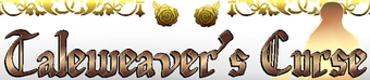
Hmm. I can read all of them (the full size ones) but the font definitely needs some anti-aliasing! In terms of readability, I'd rank them in this order: 2, 3, 1, 4.
Thematically, the choice of font does have connotations of literature and of past time periods, which (reading your WIP thread) seems to be fitting. It's on the harder-to-read side for a logo but I think it will be okay with good graphic design. Keep in mind that you can have multiple versions of the logo -- you can try having the smaller one be solid-colored with a stroke around it to make it easier to read at small size, and have the stuff like the drop shadow on the bigger, more ornate version of the logo.
The choice of gold color... well, it made me think it was going to be a pirate story. One the small versions of the logos, the roses look like gold pieces. I wasn't expecting them to be roses when I opened up the big versions. The last one with the book seems to work better for the theme of the story, but, as mentioned, it's very hard to read with the dark gold over the black. Design-wise, for a logo I'd suggest making the book a little smaller in comparison to the text. On the other logos, I think the silhouette looks nice.
#3 is a little odd with the color choices. It does make me think more "otome," but kind of feels like it conflicts (theme-wise) with the font.
I like the palette of 1, 2, and 3. If I had to pick a favorite right now, it would be #2 due to the legibility, even though I kind of like the warmth of the background in #1. Maybe I'd go with #1 if the background was a light shade of gold. So, my current ranking would be 2, 1, 3, 4.
Hope that helps
- Semienigma
- Regular
- Posts: 102
- Joined: Sun Apr 14, 2013 11:25 pm
- Projects: Cerebral Hinderance: Inner Iniquity
- Location: South Carolina USA
- Contact:
Re: Which logo looks best?
Personally I like number 1 the best. The color is nice and I can read it.
Working On:
Improving my art and my first Kinetic Novel Cerebral Hindrance: Inner Iniquity(more info coming soon)
Visit my Tumblr! to see my art
Improving my art and my first Kinetic Novel Cerebral Hindrance: Inner Iniquity(more info coming soon)
Visit my Tumblr! to see my art
Re: Which logo looks best?
I think the 3) is the most attractive with the green and the red. But the red need to be changed in a darker ton, I guess.
- Victoria Jennings
- Miko-Class Veteran
- Posts: 715
- Joined: Mon Jul 02, 2012 9:40 am
- Contact:
Re: Which logo looks best?
I like #2. #3's kind of Christmas-y and #4's hard to read.
Who is online
Users browsing this forum: No registered users