Critique background art

Art threads specific to a single artist.
Post Reply
Message
Author
User avatar
Kinmoku
Miko-Class Veteran
Posts: 591
Joined: Mon Aug 11, 2014 9:39 am
Completed: One Night Stand
Projects: VIDEOVERSE
Tumblr: gamesbykinmoku
itch: kinmoku
Location: Germany
Contact:

Critique background art

#1 Post by Kinmoku »

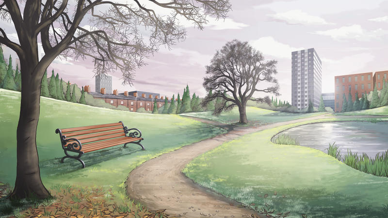
Hi guys! I've posted a couple of pictures below that I'm working on for my visual novel game. I don't usually ask for critique, but I feel like I'm missing something here, like flair, life or cool aesthetics. I'm really happy with the character art so far, but the backgrounds seem kinda behind... I can't put my finger on it! I used to do backgrounds and landscapes a lot when I was younger (non digital stuff) but now I'm trying to do it digitally, I'm really struggling.

My process: Perspective grid ---> Rough composition ---> Line Art ---> Block colour ---> Shading ---> Highlights and Fine details ---> Finishing Light Effects

Thanks in advance :)

Image

(NB: The posters are currently blank as I am looking for illustrations to add. If you're interested, please let me know!)

Image

User avatar
Steamgirl
Veteran
Posts: 322
Joined: Sat Jul 28, 2012 4:39 am
Completed: My Cup of Coffee, Queen at Arms (co-wrote a battle scene)
Projects: Stranded Hearts, Emma: A Lady's Maid
Deviantart: steamgirlgame
Contact:

Re: Critique background art

#2 Post by Steamgirl »

I'm not very good at backgrounds either! So I can't give any like, really good pointers, but here's a couple...

Picture A - if the wall was a gradient it might help make the room feel like it has more depth, I think?
Picture B - lovely scene - early winter late autumn? It's got lovely detail and perspective, but it could probably do with more light/dark contrast to make it "pop" more. General rule of thumb is that dark is closer to the front and light further away. I did a quick rough thingie to show what I mean. :)

Image

Obviously you'd ideally not use just black and white to create the contrast but various colours, but it's only a rough thingie. :)

Hope this helps somewhat!

SundownKid
Lemma-Class Veteran
Posts: 2299
Joined: Mon Feb 06, 2012 9:50 pm
Completed: Icebound, Selenon Rising Ep. 1-2
Projects: Selenon Rising Ep. 3-4
Organization: Fastermind Games
Deviantart: sundownkid
Location: NYC
Contact:

Re: Critique background art

#3 Post by SundownKid »

They seem pretty good to me. I am sure that an experienced artist might be able to give some pointers, but I think they are already professional quality.

User avatar
King-sama
Veteran
Posts: 344
Joined: Thu Oct 03, 2013 9:38 am
Deviantart: Treepastry
Contact:

Re: Critique background art

#4 Post by King-sama »

Hmm....looks great! Really appealing to the eyes!
Maybe you could give your lineart other colors other than black?

User avatar
Tempus
Miko-Class Veteran
Posts: 519
Joined: Sat Feb 16, 2013 3:37 am
Completed: Ladykiller in a Bind
Projects: StoryDevs
Tumblr: jakebowkett
Deviantart: jakebowkett
Github: jakebowkett
Location: Australia
Contact:

Re: Critique background art

#5 Post by Tempus »

Thoughts on the first BG in no particular order:
  • The line art being black makes it contrast too much with the rest of the environment IMO
  • The line weight is too heavy in places (e.g., the wicker basket handle, the bottles on the drawers). Generally, if something is smaller err toward thinner lines.
  • The line weight should vary. As things recede into the distance the line weight should also taper off to compliment this.
  • Light rays are too strong. Also, ask yourself why are they visible? It's usually because of the light reacting with particles in the air. Dusty rooms are more likely to have light rays than clean ones. The strength of the rays also doesn't match the intensity of the light hitting the floor.
  • Your primary light source is the sun coming through the window. Therefore the wall the window is set in should be shaded darker than the wall on the right. The wall on the right should have a gradient going from dark in the corner to light on the right edge of the image. Other light sources like the Christmas(?) lights will have considerably less effect in bright sunlight.
  • Sunlight is both direct and indirect. Direct sunlight is ever so slightly warm. Indirect light comes from the sky and clouds, as well as anything else direct sunlight hits and bounces off in your scene. It's hard to say without doing it myself [at this point I realise I have Photoshop open]
  • The cushions on the far right are very saturated and draw the viewer's eyes to the edge of the image.

Here's a quick example of some of the changes I'd make FWIW. Not the best, but it should illustrate a few of my points:
Image
StoryDevs — easy-to-search profiles for VN devs (under construction!)

User avatar
Taleweaver
Writing Maniac
Posts: 3428
Joined: Tue Nov 11, 2003 8:51 am
Completed: Metropolitan Blues, The Loyal Kinsman, Daemonophilia, The Dreaming, The Thirteenth Year, Adrift, Bionic Heart 2, Secrets of the Wolf, The Photographer
Projects: The Pilgrim's Path, Elspeth's Garden, Secret Adventure Game!
Organization: Tall Tales Productions
Location: Germany
Contact:

Re: Critique background art

#6 Post by Taleweaver »

Personal art threads go into our Personal Art forum.

Moved.
Scriptwriter and producer of Metropolitan Blues
Creator of The Loyal Kinsman
Scriptwriter and director of Daemonophilia
Scriptwriter and director of The Dreaming
Scriptwriter of Zenith Chronicles
Scriptwriter and director of The Thirteenth Year
Scriptwriter and director of Romance is Dead
Scriptwriter and producer of Adrift
More about me in my blog
"Adrift - Like Ever17, but without the Deus Ex Machina" - HigurashiKira

User avatar
kisa
Veteran
Posts: 384
Joined: Sat Aug 27, 2011 7:08 pm
Completed: Brother Rose, Dogs Alone
Projects: So many projects, I can't name them.
Deviantart: tsubasafan135
Skype: Discord: Kisaofbishies#6680
itch: kisa
Contact:

Re: Critique background art

#7 Post by kisa »

Image
As others have mentioned, adding some extra color to this image could help a lot to give the feeling of realism and depth. Personally, I wouldn't make the extra colors as prevalent as what Tempus did. But, that's an artistic choice.
Generally, using cooler colors for shadows indoors (Sometimes outdoors) is a good idea. just using a darker color to shade an item may seem like a good idea. But, then... that leaves out the light bouncing off of everything else.
Adding a faint hint of certain bright colors on the walls (E.G. A faint bit of orange near that rad bedsheet) could help give the impression of the sunlight hitting it. Not too strong though, otherwise it'll just look like the sheet is radioactive. OHO
(Speaking of which, since it is sunlight and there is such a rad bedsheet, you could try using warmer colors for the shadows... Whichever looks best to you)
Image[/quote]
Since it looks to be an overcast autumn day, I can't really fault anything in this picture.
(Unless it's afternoon. In which case... More saturation and orange if possible... also, deeper shadows.)
I'm offering commissions!
viewtopic.php?f=62&t=41656

User avatar
Kinmoku
Miko-Class Veteran
Posts: 591
Joined: Mon Aug 11, 2014 9:39 am
Completed: One Night Stand
Projects: VIDEOVERSE
Tumblr: gamesbykinmoku
itch: kinmoku
Location: Germany
Contact:

Re: Critique background art

#8 Post by Kinmoku »

Thankyou all so much for the time and effort in your feedback! This is really great stuff :) I tried to vary the line widths in the foreground/ background but it came out looking very samey. Changing the majority of them to different colours will really help too.
Tempus wrote:Light rays are too strong. Also, ask yourself why are they visible? It's usually because of the light reacting with particles in the air. Dusty rooms are more likely to have light rays than clean ones. The strength of the rays also doesn't match the intensity of the light hitting the floor.

Your primary light source is the sun coming through the window. Therefore the wall the window is set in should be shaded darker than the wall on the right. The wall on the right should have a gradient going from dark in the corner to light on the right edge of the image. Other light sources like the Christmas(?) lights will have considerably less effect in bright sunlight.

Sunlight is both direct and indirect. Direct sunlight is ever so slightly warm. Indirect light comes from the sky and clouds, as well as anything else direct sunlight hits and bounces off in your scene. It's hard to say without doing it myself [at this point I realise I have Photoshop open]
Tempus, this is amazing feedback too, and the mock up you did looks great! I'll try again with the lighting and see how it turns out. Do you have any tips/ books/ advice to give on lighting in general? It's usually something of an after thought with me I think.

Kohaku
Regular
Posts: 67
Joined: Mon Nov 26, 2012 5:21 pm
Contact:

Re: Critique background art

#9 Post by Kohaku »

Hope you don't mind but I thought I would give the first image a try.

Your image I think is 90% of the way there but you need to push your light and darker values. Tempus is right, for instance you have really bright light rays coming from the window and yet your room is already quite light, if you lighten the room around the light source then it should become weaker and almost blend in, The brightness as you have it would only really happen in a much darker room so I basically darkened the back wall and everything that wouldn't be hit directly with the light, looking at my own take on this I think I may have gone a tad too dark on the sides :P. Because the walls are darker you can now see some nice dust particles.

I should point out that you wouldn't get the nice glow effect that I have on the chair but I did most of the paintover with a soft brush and missed a few things when tidying up.

Another thing that you need to think about is materials, I noticed that you have coke cans on the floor but they have no reflective light on them, this is something i'm only just getting to grips with and doing this has taught me a few things as well that I forget to do sometimes.

Oh! another thing is I changed your light source from pure white to a softer less pure colour as I have learned that you only use pure white or black sparingly and only to put emphasis on whatever it is that you want the viewer to focus on, I think the glass bottles in the first image are a good case for this as I have put too much reflective light on them and almost used a pure white too.

Sorry things aren't in order much but i'm quite scatty and just thought of it :)

I should just add the fairy lights on my redo's are too bright and probably wouldn't put out that much light, at least I don't think they would looking at them.

Ummm... I think that's it and I haven't forgot anything :)

This is my finished paintover looking at it now I may have gone a tad too dark in the corners.

Image

On this image I wanted to draw focus to the laptop area so I made a duplicate of the whole image and added gaussian blur, added a layer mask to the layer and used a soft brush to erase the centre area to give a nice blurring effect on the outside only, could have pushed it more but I was just trying things out.

Image


Final image, I figured I would desaturate the image as when I compared it to your original I found I had made mine too bold ( I'm not great with colours yet ) for want of a better word.

Image


Hope this helps you and what you where looking for.

Here is some bigger version...hehe i'm so nooby :D
Attachments
redo.jpg
blur.jpg
Desat.jpg

User avatar
Steamgirl
Veteran
Posts: 322
Joined: Sat Jul 28, 2012 4:39 am
Completed: My Cup of Coffee, Queen at Arms (co-wrote a battle scene)
Projects: Stranded Hearts, Emma: A Lady's Maid
Deviantart: steamgirlgame
Contact:

Re: Critique background art

#10 Post by Steamgirl »

Ohh Kohaku! A painting really does speak a thousand words - what you've done is exactly what I was trying to say - badly. :)
Looks great!

By the way, one trick I use to check contrast in my images is to desaturate it (using Photoshop it's Ctrl + Shift + U I think). This gives a really different perspective on it and you can see if you have enough dark/light in or whether it's more or less the same.

User avatar
Kinmoku
Miko-Class Veteran
Posts: 591
Joined: Mon Aug 11, 2014 9:39 am
Completed: One Night Stand
Projects: VIDEOVERSE
Tumblr: gamesbykinmoku
itch: kinmoku
Location: Germany
Contact:

Re: Critique background art

#11 Post by Kinmoku »

Kohaku wrote:Hope you don't mind but I thought I would give the first image a try.

Your image I think is 90% of the way there but you need to push your light and darker values. Tempus is right, for instance you have really bright light rays coming from the window and yet your room is already quite light, if you lighten the room around the light source then it should become weaker and almost blend in, The brightness as you have it would only really happen in a much darker room so I basically darkened the back wall and everything that wouldn't be hit directly with the light, looking at my own take on this I think I may have gone a tad too dark on the sides :P. Because the walls are darker you can now see some nice dust particles.

I should point out that you wouldn't get the nice glow effect that I have on the chair but I did most of the paintover with a soft brush and missed a few things when tidying up.

Another thing that you need to think about is materials, I noticed that you have coke cans on the floor but they have no reflective light on them, this is something i'm only just getting to grips with and doing this has taught me a few things as well that I forget to do sometimes.

Oh! another thing is I changed your light source from pure white to a softer less pure colour as I have learned that you only use pure white or black sparingly and only to put emphasis on whatever it is that you want the viewer to focus on, I think the glass bottles in the first image are a good case for this as I have put too much reflective light on them and almost used a pure white too.

Sorry things aren't in order much but i'm quite scatty and just thought of it :)

I should just add the fairy lights on my redo's are too bright and probably wouldn't put out that much light, at least I don't think they would looking at them.

Ummm... I think that's it and I haven't forgot anything :)

This is my finished paintover looking at it now I may have gone a tad too dark in the corners.

Image

On this image I wanted to draw focus to the laptop area so I made a duplicate of the whole image and added gaussian blur, added a layer mask to the layer and used a soft brush to erase the centre area to give a nice blurring effect on the outside only, could have pushed it more but I was just trying things out.

Image


Final image, I figured I would desaturate the image as when I compared it to your original I found I had made mine too bold ( I'm not great with colours yet ) for want of a better word.

Image


Hope this helps you and what you where looking for.

Here is some bigger version...hehe i'm so nooby :D
Oohhh woww! You've made my art look amazing! Now I just need to figure out how to do it myself, haha! Seriously though, it looks great. I'm going to try and attempt this!

Kohaku
Regular
Posts: 67
Joined: Mon Nov 26, 2012 5:21 pm
Contact:

Re: Critique background art

#12 Post by Kohaku »

@Steamgirl: Thanks for the tip as this will certainly save me some time :) and your right using gradients works wonders.

@Kinmoku: Glad it helped, I worry I don't explain things very well.

Post Reply

Who is online

Users browsing this forum: No registered users