Page 1 of 1
Feedback on my sprite? *UPDATED!*
Posted: Fri May 29, 2015 6:44 pm
by Alexzandria
So, below is a post I made about my sprite, and thank you all for your feedback! I took your advice and made a new one. So if you could please give me some feedback on my newest sprite? (aka Eddy).
EDDY

-------------------------------------------------------------------------------------------------------
Hiya!, I have always wanted to make sprites for visual novel games. I tried the anime style, but it's just not me thing. So here is my first ever sprite. 100% made by me :D
(questions below pics)


So if i can get some feedback on them? Like, does she look weird? Would anyone want my characters in a VN if they looked like that? What are some good things, and some bad things? ETC.
Thank you :)
-----------------------------------------------------------------------------------------------
Re: Feedback on my sprite, please? :3
Posted: Fri May 29, 2015 7:27 pm
by zozolovesyou
hi, i think it looks great!! :3 it really has its own unique style and the backgrounds pretty good too!! c:
Re: Feedback on my sprite, please? :3
Posted: Fri May 29, 2015 7:45 pm
by TheKiwi
I like the style you're going for!
I tried to redline it a bit just to show how I think it could be improved. The body is really stiff and a bit unnatural, so I think turning it and relaxing the arms would help a lot.
The face looks nice, because it has soft shading. I think you could soften the outlines and use harder shading in the hair (just like you did with the clothes!) and it would all blend together nicer.
Keep it up! I would definitely play a game with this style!!

Re: Feedback on my sprite, please? :3
Posted: Fri May 29, 2015 8:20 pm
by Alexzandria
TheKiwi wrote:I like the style you're going for!
I tried to redline it a bit just to show how I think it could be improved. The body is really stiff and a bit unnatural, so I think turning it and relaxing the arms would help a lot.
The face looks nice, because it has soft shading. I think you could soften the outlines and use harder shading in the hair (just like you did with the clothes!) and it would all blend together nicer.
Keep it up! I would definitely play a game with this style!!
Thank you for your feedback! I'll try and do more comfortable poses.
Re: Feedback on my sprite, please? :3
Posted: Fri May 29, 2015 9:10 pm
by trooper6
Your proportions seemed off to me. So I went back to Andrew Loomis's book on proportions and overlaid this ideal proportions next to your drawing. Your drawing is a head and a half too short...mostly your legs are really too short. I'll post the overlay so maybe it will be useful to you. Also, I'd work on your hands and feet.
Re: Feedback on my sprite, please? :3
Posted: Fri May 29, 2015 10:31 pm
by LateWhiteRabbit
trooper6 wrote:Your proportions seemed off to me. So I went back to Andrew Loomis's book on proportions and overlaid this ideal proportions next to your drawing. Your drawing is a head and a half too short...mostly your legs are really too short. I'll post the overlay so maybe it will be useful to you. Also, I'd work on your hands and feet.
Proportions.png
I wouldn't necessarily say the proportions are that off. They are fairly realistic. You have to be careful when using head-to-height charts like you have, because they don't often reflect real proportions, but instead, idealistic ones. Almost no one in the real world is 8 heads tall. Really, you just need to make the relationship between body parts play nice with each other, and you can get away with all kinds of head-to-height ratios - as
demonstrated by Loomis himself. Most real humans are rather shorter and dumpier than the idealized the human form we like to draw or sculpt. The human figure proportions in many drawing books are just rounded up to 8 for artist convenience, since a truly realistic human body can't really neatly be broken down into even head heights. It depends on age, gender, and the person, but a more realistic average height ratio for an adult is 7.33 heads tall.
Alexzandria's figure height to head ratio is fairly on par if she is wishing to depict a young teen, or just a younger looking adult (depending on the style she is pursuing). Children and young teens often are only 6 heads (round-about) tall. The fewer heads to height, the younger the character will look, and the more heads to height, the more idealistic, heroic, or other-worldly the character starts to look if you push it.
The main issues with the figure is the stiff and uncomfortable pose, and, related, the leg positions and feet that don't appear grounded and balancing the character's weight. It makes it look as if her legs are dangling in the air as she floats.
Re: Feedback on my sprite, please? :3
Posted: Fri May 29, 2015 11:00 pm
by Alexzandria
LateWhiteRabbit wrote:trooper6 wrote:Your proportions seemed off to me. So I went back to Andrew Loomis's book on proportions and overlaid this ideal proportions next to your drawing. Your drawing is a head and a half too short...mostly your legs are really too short. I'll post the overlay so maybe it will be useful to you. Also, I'd work on your hands and feet.
Proportions.png
I wouldn't necessarily say the proportions are that off. They are fairly realistic. You have to be careful when using head-to-height charts like you have, because they don't often reflect real proportions, but instead, idealistic ones. Almost no one in the real world is 8 heads tall. Really, you just need to make the relationship between body parts play nice with each other, and you can get away with all kinds of head-to-height ratios - as
demonstrated by Loomis himself. Most real humans are rather shorter and dumpier than the idealized the human form we like to draw or sculpt. The human figure proportions in many drawing books are just rounded up to 8 for artist convenience, since a truly realistic human body can't really neatly be broken down into even head heights. It depends on age, gender, and the person, but a more realistic average height ratio for an adult is 7.33 heads tall.
Alexzandria's figure height to head ratio is fairly on par if she is wishing to depict a young teen, or just a younger looking adult (depending on the style she is pursuing). Children and young teens often are only 6 heads (round-about) tall. The fewer heads to height, the younger the character will look, and the more heads to height, the more idealistic, heroic, or other-worldly the character starts to look if you push it.
The main issues with the figure is the stiff and uncomfortable pose, and, related, the leg positions and feet that don't appear grounded and balancing the character's weight. It makes it look as if her legs are dangling in the air as she floats.
Thank you for your feedback. So if she was just from the thigh up, does she still look proportionate? I guess the knee down really throws off the drawing?
Re: Feedback on my sprite, please? :3
Posted: Fri May 29, 2015 11:27 pm
by LateWhiteRabbit
Alexzandria wrote:LateWhiteRabbit wrote:snip
Thank you for your feedback. So if she was just from the thigh up, does she still look proportionate? I guess the knee down really throws off the drawing?
She looks pretty proportionate to me. The legs are throwing off the drawing because of the way they are posed, and the fact it doesn't look like she is planting her feet on anything, not necessarily due to proportions. She looks knock-kneed, and not in a cute way.
Re: Feedback on my sprite, please? :3
Posted: Sat May 30, 2015 5:35 am
by noctos
I really like the colors you chose for her!
I'd like to add something though - it's about her hands. Her right hand is supposed to be holding the bow, but the grip looks loose and unnatural, like the bow is just about to slip! I'd change it so her grip is a little tighter around the bow, and also define the fingers some more.
Re: Feedback on my sprite, please? :3
Posted: Mon Jun 01, 2015 9:03 pm
by AshenhartKrie
With her feet I'd suggest looking at a lot of martial arts stances (does that sound weird? let me explain).
Since she has a bow, I'm guessing she's something of a hunter, and maybe a fighter. At the moment, she looks a little pin-uppy (to me, at least. I think it's the way her feet are directed inward)
Now, the trick with fighting and hunting, is to center your gravity, and it doesn't look like she's doing that to me (apologies, I'm at school or I'd add a few basic sketches to demonstrate).
The easiest way to achieve that is to stand with your legs shoulder distance apart, and the knees slightly bent. That's a little hard to draw for me, but I think you've got a fairly good grasp of anatomy so that shouldn't be too hard for you. SenshiStock on deviantart has GREAT resources for pose references, that's where I get a lot of mine from.
I love the shading as well, it's very soft and sweet.
Mostly just hoard resources. Save as many pose stock images as possible.
Anyway, hope that helped a little bit.
Re: Feedback on my sprite? *UPDATED!*
Posted: Sun Jun 21, 2015 10:06 pm
by Alexzandria
Just updated this post with a new character! feedback?
*ignore that brown spot on her face. lmao*
Re: Feedback on my sprite? *UPDATED!*
Posted: Mon Jun 22, 2015 2:26 am
by Llunet1
Hello!
I agree with the comments listed above about the first sprite you put up.
As for the second one, the hair has improved and looks good! The pose is a bit stiff, though better than the previous one. It still doesn't look like she's actually standing (feet are hard haha) though. Her right hand looks great but her left hand's fingers look like they've been... well, chopped off. Either extend them fully, or show a bit of the rest of the fingers to make it look like they're actually there. Then, clothing. I think, to really make it look like she's actually wearing the clothing is to add folds. If you can tell that the piece of clothing is tight or loose, then it looks like it's being worn.
Also, her left arm... You're trying to show the inner elbow portion with those extended lines (I don't know what to call that) but it would look better if each line on the arm was a single stroke.
Here. I'll redline your drawing (keeping the pose). Of course it would look more natural in 3/4 view, but here's from the front.
 Viewed 1845 times")
- Redline. Please read notes I wrote on the side.
Re: Feedback on my sprite? *UPDATED!*
Posted: Mon Jun 22, 2015 9:41 pm
by Alexzandria

Ok, so i fixed Eddy. I made her clothes look more realistic and did a few other things. Thanks ^
Re: Feedback on my sprite? *UPDATED!*
Posted: Tue Jun 23, 2015 2:32 am
by ffocal
Took a break and thought I'd do a quick resketch for you.
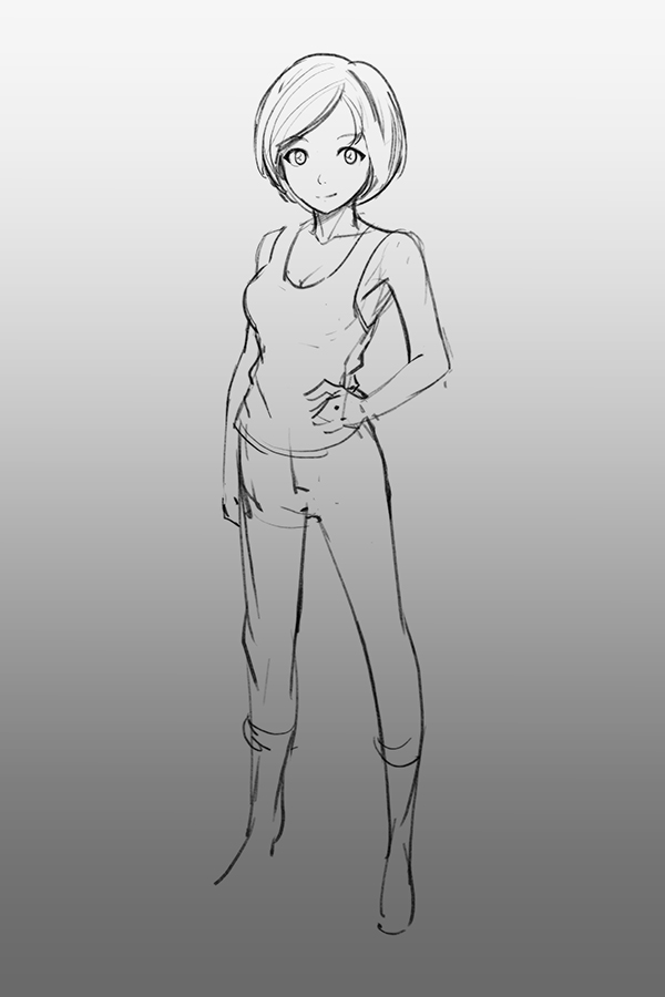
Aside from the original pose being a little stiff, can't really tell any personality through the character design..
Re: Feedback on my sprite? *UPDATED!*
Posted: Tue Jun 23, 2015 2:31 pm
by noctos
Alexzandria wrote:
Ok, so i fixed Eddy. I made her clothes look more realistic and did a few other things. Thanks ^
It's better than the first one! But the legs are still a little weird. Legs don't bend outward like that, and it looks like she's floating.