trooper6 wrote:Your proportions seemed off to me. So I went back to Andrew Loomis's book on proportions and overlaid this ideal proportions next to your drawing. Your drawing is a head and a half too short...mostly your legs are really too short. I'll post the overlay so maybe it will be useful to you. Also, I'd work on your hands and feet.
Proportions.png
I wouldn't necessarily say the proportions are that off. They are fairly realistic. You have to be careful when using head-to-height charts like you have, because they don't often reflect real proportions, but instead, idealistic ones. Almost no one in the real world is 8 heads tall. Really, you just need to make the relationship between body parts play nice with each other, and you can get away with all kinds of head-to-height ratios - as
demonstrated by Loomis himself. Most real humans are rather shorter and dumpier than the idealized the human form we like to draw or sculpt. The human figure proportions in many drawing books are just rounded up to 8 for artist convenience, since a truly realistic human body can't really neatly be broken down into even head heights. It depends on age, gender, and the person, but a more realistic average height ratio for an adult is 7.33 heads tall.
Alexzandria's figure height to head ratio is fairly on par if she is wishing to depict a young teen, or just a younger looking adult (depending on the style she is pursuing). Children and young teens often are only 6 heads (round-about) tall. The fewer heads to height, the younger the character will look, and the more heads to height, the more idealistic, heroic, or other-worldly the character starts to look if you push it.
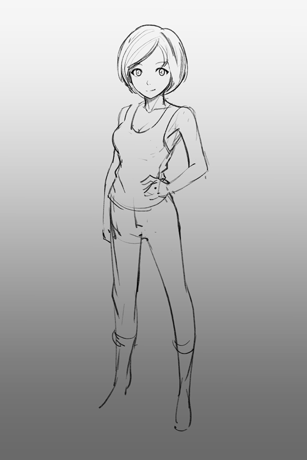
The main issues with the figure is the stiff and uncomfortable pose, and, related, the leg positions and feet that don't appear grounded and balancing the character's weight. It makes it look as if her legs are dangling in the air as she floats.


