Which Logo is Better?

Art threads specific to a single artist.
Post Reply
Message
Author
User avatar
Lunarmirage
Newbie
Posts: 19
Joined: Mon Aug 31, 2015 11:44 am
Contact:

Which Logo is Better?

#1 Post by Lunarmirage »

So I've been working on a visual novel and was creating some logos. These are the first logos I've ever made, so they're not very good. >.< I was having trouble choosing between two of them.

Which one do you prefer? And do you have any suggestions on improving them?
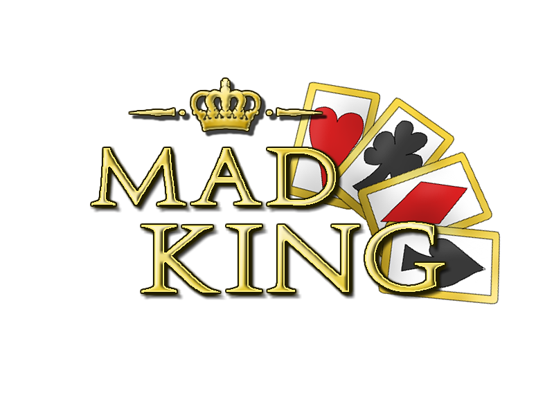
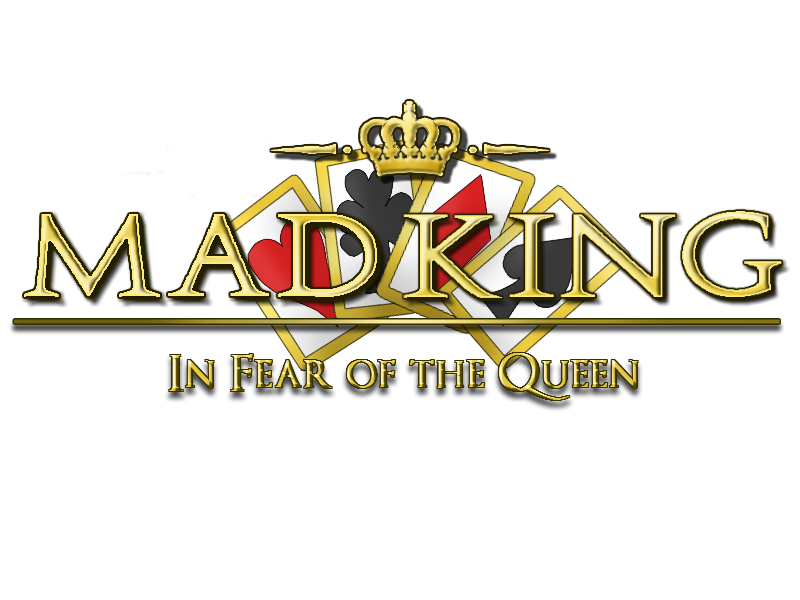
Image
Image

User avatar
Fox Lee
Veteran
Posts: 213
Joined: Sat Oct 18, 2008 1:46 am
Completed: Where Ages Go [NaNo2015]
Projects: Swan x Swan [YuriJam/NaNo16], ♥ON, Guilded Age
Organization: Invincible Ink
Deviantart: foxlee
itch: foxlee
Location: Australia
Contact:

Re: Which Logo is Better?

#2 Post by Fox Lee »

The second one definitely has a nicer layout, to my eyes. Though, if it's all right for me to say, I think they could both use some smoothing around the font edges. They're good designs, but those edges are very jagged ^^;
Fox Lee: The Girl Your Mother Warned You About
CleanDirtyFurryPro

User avatar
Lunarmirage
Newbie
Posts: 19
Joined: Mon Aug 31, 2015 11:44 am
Contact:

Re: Which Logo is Better?

#3 Post by Lunarmirage »

Yeah, I was planning on smoothing out the edges after choosing one. >.< Thanks for your advice!

User avatar
DarkSin
Regular
Posts: 110
Joined: Mon Apr 01, 2013 1:57 pm
Completed: Rituals in the Dark (GxG), Sweetest Monster (BxG), My Magical Divorce Bureau!!
Projects: Innate Imperfections (GxG)
Organization: SinSystem
itch: darksin
Contact:

Re: Which Logo is Better?

#4 Post by DarkSin »

I also like the second one better. Everything is centred and overall more pleasing to look at. Although, other than the jaggedness, I don't think the text bevelling is working here (especially in the lower text). In my opinion, it'll look much better without it. Cheers!
Image

User avatar
Laluune
Regular
Posts: 39
Joined: Sun May 17, 2015 12:27 am
Contact:

Re: Which Logo is Better?

#5 Post by Laluune »

Did you make this in Photoshop? If so play around with your blending options some more, increase the stroke outline and maybe make the bevelling/embossing sharper as it's very soft at the moment and doesn't feel like metal if that is what you were going for. As for the logo layout I think it's pretty darn good for your first try :) I'm jealous because logos are not my strong point at all.

I'll vote for the second logo but the cards in the background are fighting with the text, you could remove them entirely and I think the logo would read stronger, or you could dial down the cards in the background, maybe remove their outlines? Or don't make the border the same colour as the font?

I look forward to seeing the next iteration :)

User avatar
Lunarmirage
Newbie
Posts: 19
Joined: Mon Aug 31, 2015 11:44 am
Contact:

Re: Which Logo is Better?

#6 Post by Lunarmirage »

Thank you all for the advice! :D I was using pixlr, a free online editor, since I don't have photoshop. I might remove the beveling entirely since pixlr doesn't have the beveling options I want. And I'll definitely try removing the cards or making them lighter!

User avatar
Yangyang Mobile
Regular
Posts: 46
Joined: Wed Sep 02, 2015 2:41 am
Completed: The Letter, The Diary
Projects: Love Esquire
Organization: Yangyang Mobile
Tumblr: yangyangmobile
Deviantart: yangyangmobile
itch: yangyangmobile
Contact:

Re: Which Logo is Better?

#7 Post by Yangyang Mobile »

Lunarmirage wrote:Thank you all for the advice! :D I was using pixlr, a free online editor, since I don't have photoshop. I might remove the beveling entirely since pixlr doesn't have the beveling options I want. And I'll definitely try removing the cards or making them lighter!
Photoshop CS2 is made free, in case you're interested :) Definitely packs more features than Pixlr.

User avatar
Lunarmirage
Newbie
Posts: 19
Joined: Mon Aug 31, 2015 11:44 am
Contact:

Re: Which Logo is Better?

#8 Post by Lunarmirage »

Oh wow, I had no idea! :O I'll have to check it out, thanks! :D

User avatar
Atomic-Invasion
Regular
Posts: 111
Joined: Tue Aug 04, 2015 10:55 am
Projects: Short Story, Project BEAT
Tumblr: atomicinvasion
Deviantart: atomic-invasion
Skype: atomic.invasion
Contact:

Re: Which Logo is Better?

#9 Post by Atomic-Invasion »

Usually a VN is made for a horizontal screen so my choice is the second one, though first one is also good and promising and you can use it in square space content haha...

Other stuff that I notice for the second one...
• Smoothen the edges (I think this is more software related problems haha > < )
• Shadow is nice but I think it would be better if you lessen it. The Shadow effects must have followed the MAD KING font which is why it didn't match the smaller font "In Fear... " due to well, size haha. The bevel as well. If you could match the smaller font and its bevel/shadow intensity that will be awesome. Also you could try changing the color of the bevel/depth font to like dark yellow or anything dark except black / gray. Blending also helps.
• Try to move the cards a bit to the left to make it more centered to everything. I think someone noted about the card element fighting the text, that is true as it also fighting another element which is the crown but I think if you could try experiment the card placement a bit that will hinder the foreground of the logo it may improve. Smaller cards? Move it up? or seperate them? Revisions are a good way to see other options :D

Ahh hope this helps > <

User avatar
King-sama
Veteran
Posts: 344
Joined: Thu Oct 03, 2013 9:38 am
Deviantart: Treepastry
Contact:

Re: Which Logo is Better?

#10 Post by King-sama »

Yangyang Mobile wrote:
Lunarmirage wrote:Thank you all for the advice! :D I was using pixlr, a free online editor, since I don't have photoshop. I might remove the beveling entirely since pixlr doesn't have the beveling options I want. And I'll definitely try removing the cards or making them lighter!
Photoshop CS2 is made free, in case you're interested :) Definitely packs more features than Pixlr.
Can you give a link? o3o I wanna download

User avatar
Miyuu
Regular
Posts: 49
Joined: Tue Oct 13, 2015 11:01 pm
Completed: Iris Dream
Contact:

Re: Which Logo is Better?

#11 Post by Miyuu »

I opt for the second logo. Very neatly centred. Good design for a first try, by the way.

Another Photoshop alternative would be GIMP, it's free. The functions are almost the same as PS. You can even open .psd files from GIMP.

User avatar
Kkoro
Regular
Posts: 95
Joined: Tue Aug 25, 2015 10:13 am
Projects: False Elegy, Incompatible Species
Deviantart: 6kkoro
Location: Amsterdam, The Netherlands
Contact:

Re: Which Logo is Better?

#12 Post by Kkoro »

Second one is more pleasing.

The first logo makes my eyes switch between the cards and the capital letters MK.
Character Designer and Illustrator
Follow me on social media!

Post Reply

Who is online

Users browsing this forum: No registered users