Failed Sprite, critique welcome

Art threads specific to a single artist.
Post Reply
Message
Author
User avatar
RunereianLilli
Newbie
Posts: 13
Joined: Mon Jul 27, 2015 8:15 am
Projects: Flow of Phantasmagoria
Deviantart: RunereiaNoRirii
Contact:

Failed Sprite, critique welcome

#1 Post by RunereianLilli »

I feel so down right now. Because I spent quite some amount of work on this, and now I realize it's just wrong.

Image

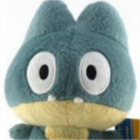
These 4 sprites and a lot more variations were supposed to be used in my project, but they don't fit the overall style of the game. And much more.

I've done many mistakes which resulted in this final product. the Sai file is hard to edit, hard to make more adjustments, because the sprite lineart is done wrong and the coloring is done odd.

Here's what I did:
  • I drew the lineart by hand first, on a paper. (I don't have a tablet)
  • Then I also did some variations (the poses) each on a different paper sheet. Some things such as the tilted head were drawn alone, leaving the rest of the body.
  • I scanned them all (four in total)
  • Then I proceeded to turn the grey hand-drawn lineart to black, plus adding transparency in GIMP.
  • Then I put all the separate body posing together and made each a different lineart png image. Which resulted in four different poses.
  • I put them into Sai, each having their own layer.
  • Then I started adding layers for coloring. There is a layer for the head, dress and retouching for each pose
  • I colored happily, had a lot of fun coloring the plant on her head and such.
  • After I 'finished' the coloring, I started with the face expressions. I've done several, even their variations for the 'tilted head' pose.
  • I printed it and showed it to others Irrelevant.
  • I took a little break from it, thinking I would just make more face expressions later and call it done.
  • I procrastinated, because I knew it won't be that enjoyable to finish it and felt something was not right.
  • Once I finally returned to it, I was looking at it from a slightly different view. I cringed.
  • I tried doing modifications, but it was too difficult to work with the sprite again, I was thinking redoing the lineart with Sai's linework layer might save it, because the lineart is untidy and has a few pencil marks left which I didn't manage to clean from the beginning.
  • I gave up with the sprite. It wouldn't even fit the game even if I managed to do some little corrections to it. I will make a different sprite from scratch, with a slightly different style and coloring.
Mistakes I know of

I will present this in a bulleted list again, hope anyone doesn't mind.
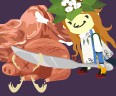
  • First of all: The lineart is just done wrong. I shouldn't have just turned a grey pencil lineart into black, hoping it would be clean and smooth by itself. There were also a lot of artifacts on the lineart layer, which were present on ALL four variations, so I had to clean the lineart four separate times, always when I found a new spot.
  • The anatomy... is... I guess... acceptable. Though in the pose where she reaches for the sheathed rapier, the left arm and the shoulder and the head just seem not in place. I am not an anatomy expert so please tell me about more mistakes
  • Ugh, the shading of the dress... If you look closely, the pose variatons have a slightly different shading of the cloth on the dress bottom. In which, when used in the game, while switching from one pose to another, the player would notice it doesn't quite transition well. Why I failed on making it the same? Because.... the different poses have different placements of the arms, and since there were 4 different linearts for poses, it was difficult for me to color and shade it the exact same, as I had to fill some space on one pose that wasn't on the other. I think I should do it differently once I start my new sprite.
  • One notable mistake, as I mentioned above, is that the sprite's colors don't fit the art of the game. One wouldn't really tell without seeing the backgrounds first, but I still count it as a mistake. It's just a thing to point out. No responses needed in regard to this.
  • The decorations on her upper arms look like I didn't even try...
  • I have a hunch (didn't confirm) that the lineart is also partly transparent because of wrong alpha settings while using GIMP, because when I overlayed layers in Sai, the linearts on top each other became darker and thicker.
  • And more I can't quite remember.
I am definitely not returning back to this. It's very clunky to modify and I would only suffer from trying to save this sprite. Note that this was my first attempt at a VN sprite ever. So I hope I am excused that this didn't work very well.

Any comments, feedback, critique (however harsh, because it's an abandoned work, so it would only help me for future works), suggestions for new sprites are welcome. Don't go easy on me with this because I seriously need to improve. What would be better? What else did I do wrong? And what could I improve for my next work? I explained my amateurish workflow above, so you can see what I've done, and perhaps tell me what is not a good thing to do.

Please don't ask me why she has heterochromia.

With honest regards,
Lilli.

SundownKid
Lemma-Class Veteran
Posts: 2299
Joined: Mon Feb 06, 2012 9:50 pm
Completed: Icebound, Selenon Rising Ep. 1-2
Projects: Selenon Rising Ep. 3-4
Organization: Fastermind Games
Deviantart: sundownkid
Location: NYC
Contact:

Re: Failed Sprite, critique welcome

#2 Post by SundownKid »

Well the anatomy is somewhat off, but it's not as if that is not fixable without practice. It's mainly that you need to practice drawing the human body in different poses. The key to that is, you have to make a framework for the body instead of just a rough approximation of where the body parts/facial features are. I would look for online figure drawing tutorials first and try to follow them to improve your figure drawing skills. https://www.youtube.com/watch?v=BvrocH4noms

User avatar
Fox Lee
Veteran
Posts: 213
Joined: Sat Oct 18, 2008 1:46 am
Completed: Where Ages Go [NaNo2015]
Projects: Swan x Swan [YuriJam/NaNo16], ♥ON, Guilded Age
Organization: Invincible Ink
Deviantart: foxlee
itch: foxlee
Location: Australia
Contact:

Re: Failed Sprite, critique welcome

#3 Post by Fox Lee »

I think your shading is pretty good actually. Most of the time, I see less experienced artists shade a character like it's a disc, with just one shadow spread equally towards every edge. Yours is a LOT less generic, especially where you've followed the folds in the skirt. Okay, you need a little practice, but who doesn't? ^_^;

The line is, okay, a bit more shaky. Anatomy IS your main problem, so yeah, look at a bunch of references and draw a simple skeleton first if you're not confident just going from scratch. Since you're drawing by hand, it may help to scan the skeleton first and reduce the darkness of the lines, then print it out to try drawing over it multiple times (as long as you have a decent scanner, you can get rid of such faint lines easily in GIMP by adjusting the Levels).

The biggest issue with the anatomy is, I think, the arms. They are a bit... noodle-y, like Adventure Time arms ^_^; If you remind yourself that the curvy bits of arms are built on two pretty straight sticks, with a hinge at the elbow, they should look a bit less like bendy tubes (drawing a skeleton will almost certainly help with that!). Likewise with the wrist joints, which look very rounded in these pics.

Her dress looks quite nice at the skirt, but otherwise neither the lines nor the shading suggest much in the way of fabric. To make it look more like clothing, you could add creases where her body would cause them (like at the elbows and near the hips/belt) and reconsider the area over her breasts - right now the dress looks like it's clinging to them super tightly, like but the skirt suggests that it's a pretty light fabric, so it's unlikely to form such a clear outline of her boobs.

As for the lines - rough lineart can look just fine over colours, but turning it black is probably the wrong tactic. It will never look like smooth brushed lines, so who says it needs to? Here are a couple of ways to work with pencil or pen (I sketch in ball-point pen, like a weirdo <XD):
  1. Leave the lines as they are, and set the coloured layer to "Multiply" mode on top of them, so the coloured areas tint the lines a little. This is a really quick simple way, but doesn't always work well if your colour palette is dark.
  2. Isolate the lines by turning the white BG transparent (Colour to Alpha and choose white) place colours underneath. Then you can change the layer mode of the lines to whatever looks good to you (and maybe colourise the lines to suit, if you want). I really like this method - you can get some really nice effects. You can even apply a little shading to the lines themselves if you're feeling fancy.
I don't have any great ideas for how to make cleaning up your lines any easier, except that it's a good idea to identify one pose as the "base" and only redraw the parts that change. That way you can clean only one base drawing, and cut/paste the changed areas, rather than cleaning the whole thing for each pose.

Finally, this is a bit more personal, but I think her eyes would benefit from a bit more detail/definition. The lines along the tops and bottoms of here eyes are very straight, and pretty much parallel to one another, which looks a bit "mechanical" to me. I would curve the lines a little, to make that area they describe a little rounder (actually I'd curve the top line quite a bit). Similarly, she lacks any kind of eyelashes or eyelids, and her eyes don't seem to have any whites (unless I just can't see them because they're lost in the shading around her face), all of which I think she would definitely benefit from having. Of course, those are all pretty much stylistic suggestions, but I certainly think they would help bring her to life.
Fox Lee: The Girl Your Mother Warned You About
CleanDirtyFurryPro

User avatar
Kia
Eileen-Class Veteran
Posts: 1050
Joined: Fri Aug 01, 2014 7:49 am
Deviantart: KiaAzad
Discord: Kia#6810
Contact:

Re: Failed Sprite, critique welcome

#4 Post by Kia »

Since you have SAI without a pen tablet, I suggest using vector layers (linework) with curve tool to re-draw your lineart really clean and flexible. and don't forget to create your document really big. it helps you achieve awesomeness in quality.

Post Reply

Who is online

Users browsing this forum: No registered users