Post What the Promos Above Make You Think...

Art threads specific to a single artist.
Post Reply
Message
Author
User avatar
Dreamgazer
Veteran
Posts: 239
Joined: Fri Oct 16, 2015 12:45 am
Completed: Death Room; Don't Take This Risk; War: 13th Day; War Specials
Projects: Beauty and the War (X Playing Pieces)
Organization: Poison Apple Tales
Tumblr: poisonappletales
Deviantart: PoisonAppleTales
Contact:

Post What the Promos Above Make You Think...

#1 Post by Dreamgazer »

Hello, everyone!

After looking at RedOwl's thread about promotional imagery and what message you're seeking to convey, I came up with this small exercise. (Since it pertains to art and a very specific kind, I figured it belonged in this forum and in its own thread rather than the Art Dumpage one, which is also cool.)

(optional) Post a promotional picture you or a friend of yours has made. Include, in a spoiler tag, what sort of themes you were hoping to share, the audience you were hoping to reach, or whatever your objective was.
Now, take a look at the promotional picture above you. Without sneaking a look at the spoiler tag, post what you thought of that promotional image. Guess what kind of game it is, what you would expect from it, and who you think would enjoy it. Talk about what drew your attention or why it wasn't your cup of tea. What are 3 words you would use to describe it? What feeling does it inspire in you, if any?
Read the spoiler tag OR play the game to find out if you were right.

Note that you don't have to post what you think of the promotional picture immediately above you, though you certainly can. It could be that one and all the others above that image. You could even take it a step further and message the poster your feedback (assuming they're open to that - I certainly would be). You don't even need to post a promotional picture if you don't want to - just your opinion. The choice is yours.

The purpose of this thread is to help developers know whether they've nailed the message they were trying to establish. Now, depending on the poster, they may or may not be looking for suggestions on precisely how to fix it. But I believe that your honest first impression can help. From there, the game maker can take steps to correct anything they feel is in need of a change.

So, when you come here, let's all play nice and remember that every opinion given is made out of a sincere desire to help. (Otherwise, get out. But come back after you've had a Snickers or something. You know you're not you when you're hungry. ;))

Anyway, I'll get the ball rolling with the promotional image for my own project. Feel free to follow my format:
Image
What Am I Doing?
I'm trying to convey the title - beauty and war. There should also be a feel of fantasy, darkness, and desire.
Genre:
Fantasy simulation, legends & fairytales, intrigue, GxB romance
Further detail: This is a fantasy simulation that draws on legends and fairytales. This can be a tale of intrigue, but you decide how much you want to get embroiled in interclan politics. There's passion and romance, but again, only if you want it. There's slice-of-island-life, too, but it's impossible to stay away from all drama. Like I said, this is a fantasy simulation. This is what it's like to live on Virgo Island as a beautiful healer. There are mature themes and a few dark ones.
Audience:
This should have appeal for both a female audience and a male one (unless men have a problem with a female-fronted fantasy, but I don't think that's necessarily true - what do you think?). If you're an avid reader of fantasy (such as Conan the Barbarian, Game of Thrones, or Lord of the Rings) and classics (i.e. Pride & Prejudice or Shakespeare's works), I would like to think you would find interest in exploring this visual novel's world and its society.

But I may be self-reflecting, so feel free to tell me if you fall into this category and think otherwise.
When you're ready to see if your guess is right, just highlight the spoilers above or play the game. If you want to go the extra mile, go ahead and tell me what the game's page makes you think, too.

Now, no one's above me other than the Lemmasoft's header, so I'll talk about that.

When I first saw it, I don't know why, but I was reminded of Chidori from Full Metal Panic. She looks real breezy, and it gives me the feeling that she's at the beach or about to go on an airship. That said, if she were to be in a visual novel, I would assume that it's in a modern or steampunk setting. I expect adventure, a big pinch of comedy, and some slice-of-life. I can see her being a romance option in a bishoujo VN, too. So, I imagine it would have an audience with whoever likes all those characteristics. (If I'm not mistaken, a good amount of people do!)

The 3 words I would use to describe it: Airy, lighthearted, happy.
I'm not struck with any particular feeling. Hmm...maybe a bit of nostalgia on account of being reminded of Full Metal Panic?

All right, it's your turn now. Let's have fun with it!

User avatar
Taleweaver
Writing Maniac
Posts: 3428
Joined: Tue Nov 11, 2003 8:51 am
Completed: Metropolitan Blues, The Loyal Kinsman, Daemonophilia, The Dreaming, The Thirteenth Year, Adrift, Bionic Heart 2, Secrets of the Wolf, The Photographer
Projects: The Pilgrim's Path, Elspeth's Garden, Secret Adventure Game!
Organization: Tall Tales Productions
Location: Germany
Contact:

Re: Post What the Promos Above Make You Think...

#2 Post by Taleweaver »

Personal art goes into the Personal Art subforum.

Moved.
Scriptwriter and producer of Metropolitan Blues
Creator of The Loyal Kinsman
Scriptwriter and director of Daemonophilia
Scriptwriter and director of The Dreaming
Scriptwriter of Zenith Chronicles
Scriptwriter and director of The Thirteenth Year
Scriptwriter and director of Romance is Dead
Scriptwriter and producer of Adrift
More about me in my blog
"Adrift - Like Ever17, but without the Deus Ex Machina" - HigurashiKira

User avatar
Katta
Veteran
Posts: 499
Joined: Sat May 04, 2013 11:18 am
Tumblr: gamesbykatta
Deviantart: katjama
Contact:

Re: Post What the Promos Above Make You Think...

#3 Post by Katta »

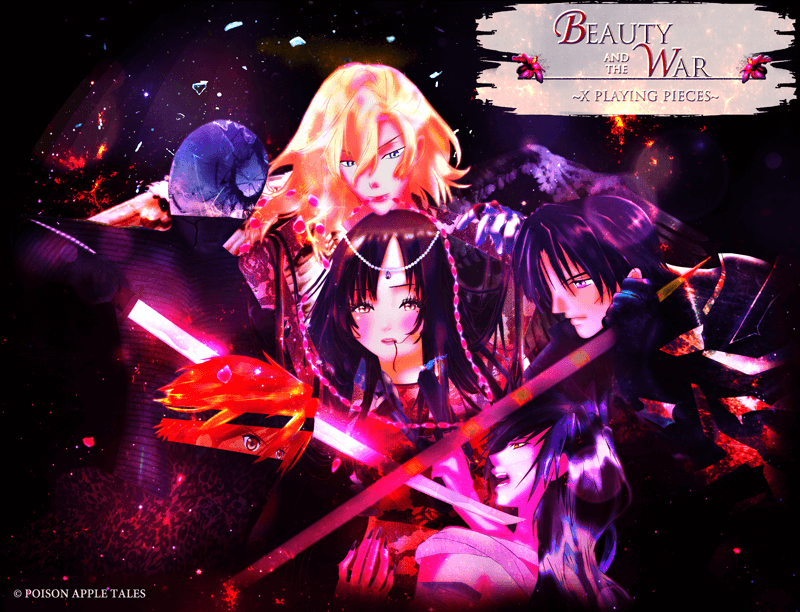
I'm not sure if that's what you meant by desire, but Ambrosia's face definitely reminds me of hentai images and to be honest not in a very good way (especially the worm out of her mouth...) The guys look nice though, I like the ones in the bottom more because they look fiercer, more war-like and make the image more intense.

User avatar
Mammon
Miko-Class Veteran
Posts: 712
Joined: Sat Nov 07, 2015 3:09 pm
Completed: Pervert&Yandere, Stalker&Yandere
Projects: Roses Of The Thorn Prince
Contact:

Re: Post What the Promos Above Make You Think...

#4 Post by Mammon »

Depending on how much knowing 'Ready, Set, Parody!' spoils the idea of predicting the story, I'm not actually sure whether I can give judgement without prior knowledge. At the very least I already knew that there were ninja's and samurai.

I would say that this promo does convey the following: Action or strive. Some element of romance and strive over said romance. The girl in the middle is the protagonist. Oriental medieval combat.

Things this promo doesn't really suggest: the intrigue. This is off course very difficult to display in a promo unless you get really on the nose about it, it's better to put that aspect in the description. However, I did expect something like a girl-fantasy story like Twilight from what I saw (not meant as an insult) rather than political intrigue, and your censored description doesn't dismiss that it might be such a Twilight-esk story (Still not meant as an insult).

About the other questions: I'm a man but I do prefer female-fronted fantasy as long as the protagonist is a strong character. I've said it before, the Protaggirl is the best trope if done well. (The moment I compare her to Bella from Twilight though, then it's meant as an insult ;) )


Unfortunately I don't have a promo from my game to show, so I can't contribute to this thread with another addition to Judge.
ImageImageImage

Want some CC sprites?

User avatar
RedOwl
Regular
Posts: 82
Joined: Sun Oct 02, 2016 1:34 am
Projects: < /reality >
Tumblr: realityvn
Contact:

Re: Post What the Promos Above Make You Think...

#5 Post by RedOwl »

Good idea, Dreamgazer! This could be very informative.

For the promo image you posted: [being completely honest here, sorry in advance if I'm too harsh] my first impression is that it's fairly dark/overly contrasty, and a bit confusing. I had to look at it for quite a while to understand that the dark area on the left is actually a character who's holding one of the swords, and that the figure on the bottom left is partially hidden by his clothing. All the characters are a bit jumbled together, and I have trouble telling where one ends and the other begins...I'm also mystified by the hair in the mouth of the main character - maybe it's just me, but that gives me a visceral negative reaction. EDIT: after staring at it for even longer... I just noticed that blonde guy has a necklace in his mouth?! Is he somehow trying to trap the main character? And where is his left shoulder/arm? It just doesn't seem to be there?

Criticism out of the way (again - sorry for the negative first impression - but what use is it to not be honest?) - the theme I'm seeing here is definitely "young innocent person [of high standing?] (MC) getting caught up in a mess of war and hatred between the people around her." And - maybe suspicious looking blonde-haired guy is attempting to manipulate/control either her, or the situation in general? The black haired guy next to the main character definitely gives off the vibe of "good loyal bodyguard who will protect the MC at all costs" (although what is he holding? Looks almost like a spear, but he's holding it by the pointy end? Also confusing). The two at the bottom have really good expressions - and it seems like they are the aggressors - the ones stirring up whatever trouble is happening. The orange haired guy has a great look in his eyes - it's too bad most of his face is covered, haha.

The 3 words I would use to describe your promo: "dark power struggle." It gives me a feeling of drama, and maybe tragedy.

Ok... I don't *actually* have a final promo image (I'm still mulling over ideas from the promotional imagery thread) - but I do have a "placeholder" promotional image that I'm using for the moment:

Image

Alternate layout:
Image

You can check out my Lemmasoft thread (click the image in my signature) to find out what the game is actually about. ;)
Image
~Please give me Honest Critique!~

User avatar
Dreamgazer
Veteran
Posts: 239
Joined: Fri Oct 16, 2015 12:45 am
Completed: Death Room; Don't Take This Risk; War: 13th Day; War Specials
Projects: Beauty and the War (X Playing Pieces)
Organization: Poison Apple Tales
Tumblr: poisonappletales
Deviantart: PoisonAppleTales
Contact:

Re: Post What the Promos Above Make You Think...

#6 Post by Dreamgazer »

Katta wrote:I'm not sure if that's what you meant by desire, but Ambrosia's face definitely reminds me of hentai images and to be honest not in a very good way (especially the worm out of her mouth...) The guys look nice though, I like the ones in the bottom more because they look fiercer, more war-like and make the image more intense.
Ahaha! Oh my goodness, does it give off that impression? What I meant was men's desire for her, the way that Helen of Troy was fought over or how Snow White was considered the fairest of them all. And does it look like a worm? It was meant to be a strand of hair. There's a lot of movement in war, so if you have long hair, it's bound to get caught in your mouth.

But I'm glad the guys are doing their job right! Thanks for letting me know what you think, Katta.
Mammon wrote:Things this promo doesn't really suggest: the intrigue. This is off course very difficult to display in a promo unless you get really on the nose about it, it's better to put that aspect in the description. However, I did expect something like a girl-fantasy story like Twilight from what I saw (not meant as an insult) rather than political intrigue, and your censored description doesn't dismiss that it might be such a Twilight-esk story (Still not meant as an insult).

About the other questions: I'm a man but I do prefer female-fronted fantasy as long as the protagonist is a strong character. I've said it before, the Protaggirl is the best trope if done well. (The moment I compare her to Bella from Twilight though, then it's meant as an insult ;) )
Oh, dear. If she makes anyone think of Bella, I have to say that I would feel rather ashamed as a writer! (No offense to anyone that likes her as a character. But let me just say that I'm not looking to create a protagonist like that.)

I would actually say this is far more Dragon Age meets Harvest Moon (as weird as a hybrid as that sounds), so if it's giving off Twilight vibes (and apparently hentai ones?), I have got to change something.
Mammon wrote:Unfortunately I don't have a promo from my game to show, so I can't contribute to this thread with another addition to Judge.
Aww, that's too bad. I was looking forward to offering feedback on someone else's promo! But I see you have a game released in your sig - Pervert&Yandere? I'm going to ahead and download it. I'm planning on joining a game jam soon, but after that, I'm playing your game and telling you what I think, if you'd care for feedback. :)
RedOwl wrote:Criticism out of the way (again - sorry for the negative first impression - but what use is it to not be honest?) - the theme I'm seeing here is definitely "young innocent person [of high standing?] (MC) getting caught up in a mess of war and hatred between the people around her." And - maybe suspicious looking blonde-haired guy is attempting to manipulate/control either her, or the situation in general? The black haired guy next to the main character definitely gives off the vibe of "good loyal bodyguard who will protect the MC at all costs" (although what is he holding? Looks almost like a spear, but he's holding it by the pointy end? Also confusing). The two at the bottom have really good expressions - and it seems like they are the aggressors - the ones stirring up whatever trouble is happening. The orange haired guy has a great look in his eyes - it's too bad most of his face is covered, haha.

The 3 words I would use to describe your promo: "dark power struggle." It gives me a feeling of drama, and maybe tragedy.
Hello, RedOwl! Don't worry about it - I need the honesty. Like I said in the opening post, it's your intentions that matter. :)

I was a little concerned that it was confusing. I was hoping that the blonde hair would draw people's eye first, and the direction of his gaze would pull the viewer's eyes to the guy in the lower right. And then, the direction of his gaze would make people look at the armored guy, whose glowing sword would pull you along to the orange-haired boy. And by following the spear, it would lead you to the dark-haired guy in the upper right, whose gaze would pull you to the protagonist in the center.

But I suppose that didn't work out so well! Though, it'd be nice if it serves as art full of symbolism that makes you ponder.

That said, I like the themes you've managed to pick up from it - dark power struggle is quite a nice description for it. (And I clearly didn't make this obvious enough, but the orange-haired guy is throwing the spear at the dark-haired guy, who grabs it at the end to keep it from striking him fatally. Oh, and the blonde might seem like he doesn't have a left shoulder if you're seeing the white wing as being...well, a wing rather than something that's covering him. ;))

However, I can see I have my work cut out for me. It's time to take it back to the drawing board. Thanks, RedOwl!

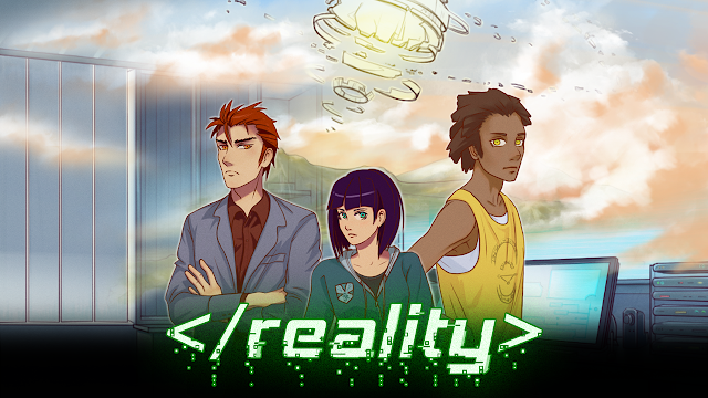
Now, my first impressions of your first image is that it's sci-fi, and for whatever reason, it's giving me the feeling of an American animated series. The title and the computer in the background make think that virtual reality of some sort is involved. The use of the glowing device above is nice - it draws your attention down towards the cast. Since the purple-haired lady is in the center, I assume she's the main character, while the other two are people who will work together with her for whatever reason. I would also think they're potential love interests for her.

Based off her expression, she looks someone with a strong personality, sarcastic wit, and she may be a bit of a tomboy. The guy on the left makes me think of someone blunt, easily erring on the side of a jerk. He's wearing a suit, so he's probably as hard on others as he is on himself. The one on the right strikes me as being more aloof, and based off his clothes, he's probably casual and laid-back.

The 3 words I would use to describe it: Calm, cyberspace, and sci-fi.
And it's giving me a serene feeling because of the clouds.

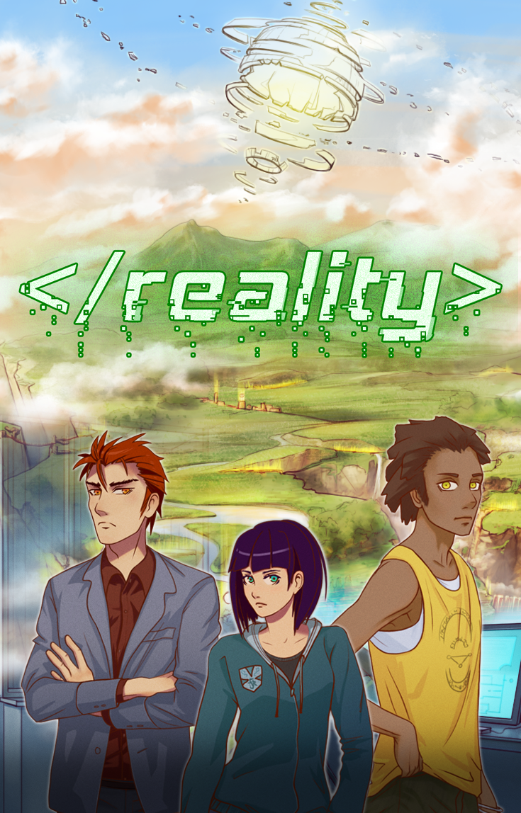
I actually prefer the second image because there's more to see. Now, I'm thinking that the characters are entering a virtual world that, for whatever reason, gives me The Land Before Time vibes. I'm also getting the feeling of exploration.

The 3 words I would use here are: Adventure, cyberspace, sci-fi.
Following along that train of thought, it gives me an adventurous feeling.

Now, let me see if I'm right. All right, I don't think I was too far off! Good job.

Also, feel free to share your placeholder promos or those that are a work in progress! This way, we can all help each other fix things before getting to the final version.
User avatar
Mammon
Miko-Class Veteran
Posts: 712
Joined: Sat Nov 07, 2015 3:09 pm
Completed: Pervert&Yandere, Stalker&Yandere
Projects: Roses Of The Thorn Prince
Contact:

Re: Post What the Promos Above Make You Think...

#7 Post by Mammon »

Oh, dear. If she makes anyone think of Bella, I have to say that I would feel rather ashamed as a writer!
Ah, I see you're not a Twilight fan either. I was tiptoe-ing around that oppinion a lot just in case it was a source of inspiration for your game. And I mean it reminded me about stories like that because there is one normal-ish girl suddenly involved in action and intrigue and such, surrounded by men fighting over her. I just mentioned Twilight for a girl-fantasy because it's an example everyone knows. And I've heard this description given to it word for word once:
a feel of fantasy, darkness, and desire.
(That's a quote from the OP by the way.)
I was a little concerned that it was confusing. I was hoping that the blonde hair would draw people's eye first, and the direction of his gaze would pull the viewer's eyes to the guy in the lower right. And then, the direction of his gaze would make people look at the armored guy, whose glowing sword would pull you along to the orange-haired boy. And by following the spear, it would lead you to the dark-haired guy in the upper right, whose gaze would pull you to the protagonist in the center.
Now there you succeeded. The blond guy was the first to draw my attention, my gaze did follow his' but went to the girl before continuing to the guy below, I then followed that man's gaze to the orange haired chap, went up to see what's up with the Moon-headed dude, and finally I looked at the guard that's also in your signiature. Then I looked at the whole thing and saw that the girl was trapped behind the two crossing weapons and that the blond man seemed like the puppeteer behind the scenes.

After a closer look at the promo and dusting up the old knowledge from art-appreciation lessons I had years ago, I think the chaotic part of this promo lies in the purple. The promo primarily relies on black (background), purple (less important), pink (highlighting the important parts) and red+white+skin-pink (important) to define the importance of all parts. Unfortunately a lot of the characters are also purple, and the red and white also seems to highlight less relevant parts. Not to mention the specks of them in places where you wouldn't expect them (like the pink in the blond hair) create a visually chaotic sight.

The use of different colours instead of brighter and duller shades of the same colour suggest a deeper theoretical and possibly practical experience with art than most people here have, but it doesn't really work as well as it should because it confuses the 'first impression' viewer. I assume this isn't as obvious for you, who saw it for hours before it was complete, because you couldn't have a first impression of your own work.


On to RedOwl's promo. My first first first impression was 'That's a neat-looking space-beam...'

After reading the title though, the MMO aspect did become a bit more clear. It actually reminded me of my own favorite MMO back when I still played those; AION, as the planet looked a little similar. I got the virtual reality part, but despite my first impression I didn't think MMO though. Not sure why. Guess the characters distracted me before I could get to that part.

For the main girl, my impression was already a few days old due to your profile picture. Serious, calm and a bit alternative, but with intelligent green eyes that seem to study you intently. The rest of her body did well to add a bit of a casual tone. The suit worked well too. With the basketballer (?) though the eye thing worked to your disadvantage. Where the blue-green colour prevented this with main girl and the eyelids overlapping the iris saved the suit, the perfectly round yellow eyes made the right guy seem... emotionless. In fact, I clicked the link to your project with the though 'I wonder if he's an android'. So when I saw he was supposed to be more of a happy character...

Moving on to the promo video. Start it, let's see what this project really is. First thing I see is an MMO boss dying by a lightning bolt to the groin :o all previous impressions under scrutiny. It was not until now that I understood that MMO's were part of the story (although in my defence, only about four seconds have passed since the 'space beam' thought, thinking goes much faster than reading my overly long posts...)

This made me a bit hesitant, but the moment she looked down I liked the girl again. She was a gamer-girl, her attire suited her perfectly now, and that looking down was a perfect display of being sad and yet having that teenage stubborness to it. And when I saw her name I immediately thought it was supposed to be some mixed up version of 'Lilith false', suggesting a deceitful and manipulating hidden personality. All of that on top of the character traits that you did advertise in the promo.... Once we got past the magic&technology bit, a few seconds made me imagine her as a very detailed and complex character.
I'm playing your game and telling you what I think, if you'd care for feedback.
If you have a review, feedback or even a rant about my game, I'd be happy to hear it. But I think that you'll notice that my greatest flaw is advertisement the moment you go to my game's thread and see the unappealing mess there. I'd wish I made a promo, because even I'm not inspired to play my own game when I see my own OP... Things for the future, I guess.
And I'll try your game as well at some point, but my game-playing time is unfortunately much less than my posting time so it may take a while still. Makes me reminise those days when I still had the time to go through ren'ai alphabetically to play games.
ImageImageImage

Want some CC sprites?

User avatar
RedOwl
Regular
Posts: 82
Joined: Sun Oct 02, 2016 1:34 am
Projects: < /reality >
Tumblr: realityvn
Contact:

Re: Post What the Promos Above Make You Think...

#8 Post by RedOwl »

Thanks for the feedback, Dreamgazer and Mammon!! It was really interesting to hear your first impressions! Mammon, you're the second person to mention that Ben appears too emotionless and android-esque. So, we will definitely be doing some revisions to mitigate that.
Dreamgazer wrote:Also, feel free to share your placeholder promos or those that are a work in progress! This way, we can all help each other fix things before getting to the final version.
Good idea, that could be very helpful!!

Anyone else have a promo image to share??

P.S. not to be argumentative but... does this thread really belong in the "personal art" subforum? This is a thread for more than one person's art... and it's really more of a marketing discussion.
Image
~Please give me Honest Critique!~

User avatar
chickandnugget
Regular
Posts: 38
Joined: Wed Oct 05, 2016 8:45 pm
Projects: circuit/break
Tumblr: chickandnugget
itch: Edelblu
Contact:

Re: Post What the Promos Above Make You Think...

#9 Post by chickandnugget »

@RedOwl I really like your promo image! I definitely get the impression that it has a futuristic/sci-fi kind of feel, and I guessed by the title that it had something to do with virtual reality. I have no idea what the thing in the sky is, but it looks very sci-fi and I'm guessing that I'll find out if I play the game. Maybe it's just me, but when a girl is standing in between two guys like that, I always assume it's a love triangle. Not sure if that's actually true for this game, though. Just from the image, I assume instantly that the girl is like some super cool techy (maybe because she kinda reminds me of the main character of Ghost in the Shell) the guy on the left is a cold scientific/CEO-type man, and the guy on the right is a laid-back, friendly guy with secrets or something.

I don't really have a promo image for my current game, so I'll put up this one for my next one that I haven't posted anything about. This is just a very WIP promo image (the logo isn't final, either), so any comments will be taken into great consideration ^^
Image

User avatar
Mammon
Miko-Class Veteran
Posts: 712
Joined: Sat Nov 07, 2015 3:09 pm
Completed: Pervert&Yandere, Stalker&Yandere
Projects: Roses Of The Thorn Prince
Contact:

Re: Post What the Promos Above Make You Think...

#10 Post by Mammon »

Oh, that looks good Chickenandnugget. First I saw the red lines which drew my eyes to her neck, and the green eyes immediately drew mine from there. She looks insecure, hopeless and asking you (the player) for help. She seems not to be suffering from those threads directly but she must know they're there and what problem they must pose. And the limbo logo, along with the background, suggests some kind of maze or unescapable problem where you go around in circles.

I personally like the eyes the most, they're really asking me to play the game and save her, and the reversed color-balance where there's a lot of red and a hint of green does work in a way.
ImageImageImage

Want some CC sprites?

User avatar
morinoir
Regular
Posts: 170
Joined: Wed Sep 28, 2016 5:55 am
itch: blackpepper
Contact:

Re: Post What the Promos Above Make You Think...

#11 Post by morinoir »

@chickandnugget
woooooaaaww that's a really good character drawing! <3 May I know the artist who draw it? I'd love to see more of their artwork!
The red threads around her neck turn my eyes into those beautiful green eyes. And those details on her hair just soo pleasant to look at! ^^

I really hope the in-game artworks are as good as this promotional picture. If that happens, I'm soo gonna play the game /crossed fingers

User avatar
chickandnugget
Regular
Posts: 38
Joined: Wed Oct 05, 2016 8:45 pm
Projects: circuit/break
Tumblr: chickandnugget
itch: Edelblu
Contact:

Re: Post What the Promos Above Make You Think...

#12 Post by chickandnugget »

@Mammon Thanks for your detailed feedback! I'm glad because those are basically the themes that I was trying to portray, so it must have been somewhat effective ^^

I was concerned that there was too much going on, but you seem to have gotten the gist of it easily enough!

@morinoir I'm happy you like it! The artist is Kamochiruu on Instagram. She's pretty amazing. Imho, the sprite artist for the game is also great haha

User avatar
RedOwl
Regular
Posts: 82
Joined: Sun Oct 02, 2016 1:34 am
Projects: < /reality >
Tumblr: realityvn
Contact:

Re: Post What the Promos Above Make You Think...

#13 Post by RedOwl »

chickandnugget wrote:@RedOwl I really like your promo image! I definitely get the impression that it has a futuristic/sci-fi kind of feel, and I guessed by the title that it had something to do with virtual reality. I have no idea what the thing in the sky is, but it looks very sci-fi and I'm guessing that I'll find out if I play the game. Maybe it's just me, but when a girl is standing in between two guys like that, I always assume it's a love triangle. Not sure if that's actually true for this game, though. Just from the image, I assume instantly that the girl is like some super cool techy (maybe because she kinda reminds me of the main character of Ghost in the Shell) the guy on the left is a cold scientific/CEO-type man, and the guy on the right is a laid-back, friendly guy with secrets or something.[/center]
@chickandnugget Aaah, sorry for the late reply! Thank you for the feedback! It's great to hear that the image is communicating what it should - and you're eerily on-target for the character types! Nice. I'm a little surprised, actually - most people don't get that Ben is actually a friendly type - there are some issues with his character sprite that I'm working on fixing.

As for your image chickandnugget - wow! Very striking! You're definitely on a good track with it. The red threads converging on her neck make her seem very, very vulnerable and fragile - and her expression solidifies that impression. I feel as though she is in great danger. I also feel that there may be tragic or death-related elements to your story - and perhaps some supernatural aspect? I may also be getting this feeling from the title of the game, "limbo" makes me think of the limbo between life and death. Especially since I've played the indie game of the same name (http://store.steampowered.com/app/48000/). You said this is just an early draft - I assume you are planning on adding some atmosphere with a setting/background? That will help to communicate more of your story. But you've definitely got a great start with this. :)

Anyone else have a promo image they're working on or would like to share?
Image
~Please give me Honest Critique!~

User avatar
RedOwl
Regular
Posts: 82
Joined: Sun Oct 02, 2016 1:34 am
Projects: < /reality >
Tumblr: realityvn
Contact:

Re: Post What the Promos Above Make You Think...

#14 Post by RedOwl »

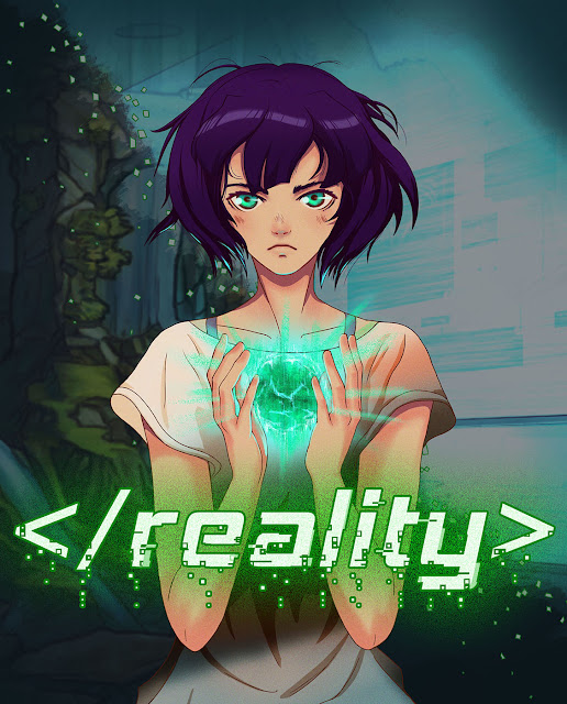
New promo image! How would you interpret this? What would you expect?

Image

Anyone else have promo art for us to attempt to make sense of? Perhaps some NaNoRenO folks?
Image
~Please give me Honest Critique!~

User avatar
morinoir
Regular
Posts: 170
Joined: Wed Sep 28, 2016 5:55 am
itch: blackpepper
Contact:

Re: Post What the Promos Above Make You Think...

#15 Post by morinoir »

RedOwl wrote:New promo image! How would you interpret this? What would you expect?

Image

Anyone else have promo art for us to attempt to make sense of? Perhaps some NaNoRenO folks?
Looking at the picture, it seems she holds the key to something important and that she's also an important character, or even the MC of the game. I hope you don't if I give you some friendly suggestion for your promo art? As an artist, I can't help to feel that the promo art still lack the 'impact' that can wow-ed people who see it. I had some free time so I edited your promo art. I hope you don't mind ^^;
reality promo art - edit.png
I increased the contrast and defined the light source (to make people's eyes focus to her face and the glowing orb), also added glow to her eyes and added blue tone to overall picture. I think the sci-fi theme will emphasized more if you add more of those glowing square particles around her =)

Post Reply

Who is online

Users browsing this forum: Ahrefs [Bot]