Do my lines and coloring look better (update)
Do my lines and coloring look better (update)
Thanks for help, according to my information my work looked similar to a game and I ended up being called a tracer. This was somewhat of a misunderstanding but I was still in the wrong. Now knowing this, if you happen to see another art thread where I state I need help the critique will be welcomed!
Last edited by NaSetsu on Sun Jun 11, 2017 3:23 pm, edited 7 times in total.
-
LateWhiteRabbit

- Eileen-Class Veteran
- Posts: 1867
- Joined: Sat Jan 19, 2008 2:47 pm
- Projects: The Space Between
- Contact:
Re: How much is my art worth?
I saw your commission thread and looked at your art, but decided not to say anything at the time. But since you asked for some tips here, I thought I could point out some things for you.
First, as to how much your art is worth - it's worth however much you can get people to pay for it! Serious answer. You have to experiment to find a balance between what compensates you for your time involved in the creation of the art, and what amount gets people to pay you.
As to the tips on your art, to do with as you will:
1. Your construction and line art look good, but is hurt by your coloring.
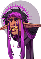
2. Your coloring is too dark. It hides all detail in your characters' hair and clothing. For instance, the all the wonderful interior folds on the kimono and skirt in the characters above as just hidden. You've essentially turned the characters into silhouettes. (You might want to check your monitor calibration in case you have it set too brightly to accurately judge your color choices.)
3. It appears you are using the Dodge and Burn tools to shade (or simply using darkened and lightened versions of the same color with a soft airbrush). This results in desaturated colors and "pillowy" or "muddy" shading. The forms aren't well defined (which is the purpose of shadows and highlights) and instead look like a fluffed pillow - i.e. pillowy. This fights against the good forms you defined with your intial drawing and linework. Good shading also involves a mix of hard and soft edges, and the Dodge and Burn tools don't give you anything but soft edges.
I think your art could really shine with brighter colors and better shading. The foundation is already there, it's just getting covered up.
Just my two cents to do with as you like.
First, as to how much your art is worth - it's worth however much you can get people to pay for it! Serious answer. You have to experiment to find a balance between what compensates you for your time involved in the creation of the art, and what amount gets people to pay you.
As to the tips on your art, to do with as you will:
1. Your construction and line art look good, but is hurt by your coloring.
2. Your coloring is too dark. It hides all detail in your characters' hair and clothing. For instance, the all the wonderful interior folds on the kimono and skirt in the characters above as just hidden. You've essentially turned the characters into silhouettes. (You might want to check your monitor calibration in case you have it set too brightly to accurately judge your color choices.)
3. It appears you are using the Dodge and Burn tools to shade (or simply using darkened and lightened versions of the same color with a soft airbrush). This results in desaturated colors and "pillowy" or "muddy" shading. The forms aren't well defined (which is the purpose of shadows and highlights) and instead look like a fluffed pillow - i.e. pillowy. This fights against the good forms you defined with your intial drawing and linework. Good shading also involves a mix of hard and soft edges, and the Dodge and Burn tools don't give you anything but soft edges.
I think your art could really shine with brighter colors and better shading. The foundation is already there, it's just getting covered up.
Just my two cents to do with as you like.
-
MaiMai

- Yandere
- Posts: 1757
- Joined: Sat Mar 21, 2009 6:04 pm
- Completed: [Phase Shift]
- Projects: [ None ]
- Organization: Paper Stars
- Tumblr: maiscribbles
- Deviantart: maiscribble
- Location: USA, Southern California
- Contact:
Re: How much is my art worth?
I actually think that your line art could use some work. When resized, it looks decent, like the girl you used in your icon. But up close, the lines look very jagged and unsteady. A lot of people have high resolution screens, so these are flaws that aren't overlooked easily. And as for coloring, LWR already mentioned what could be fixed, but I think it's also good for you to ask yourself if you have some sort of art style you have as a point of reference. And I don't mean copying someone's style, but I think you could improve your art by looking at other sprites from published games and seeing what bits and pieces you can make your own.
What digital art software are you using and are you using a tablet?
What digital art software are you using and are you using a tablet?
 COMMISSIONS AVAILABLE (check Tumblr sidebar)
-
YonYonYon
- Veteran
- Posts: 371
- Joined: Sun Jul 11, 2010 9:25 am
- Projects: Nightflower(Frozen), Reach the Starlight(WIP)
- Contact:
Re: How much is my art worth?
Every time I see art with good structure but terrible coloring and shaky lineart I suspect tracing. Tracing other people's work and selling it as your own is a bad idea, I hope you're not doing that. Nobody will nor should commission a thief.
1) Taking your lineart, I think you're doing these with your mouse. Don't line with your mouse, your lines are shaky and, uh, "hairy", I'm not sure how to explain better. Use Pen Tool or something similar instead.
2) Learn how to define form with your shadows, don't put it there just because.
3) Using only soft brush with no attention to fine details makes your coloring look cheap.
4) also, yeah, you should shade on your own, not with Dodge and Burn tools.


-
Taleweaver
- Writing Maniac
- Posts: 3428
- Joined: Tue Nov 11, 2003 8:51 am
- Completed: Metropolitan Blues, The Loyal Kinsman, Daemonophilia, The Dreaming, The Thirteenth Year, Adrift, Bionic Heart 2, Secrets of the Wolf, The Photographer
- Projects: The Pilgrim's Path, Elspeth's Garden, Secret Adventure Game!
- Organization: Tall Tales Productions
- Location: Germany
- Contact:
Re: How much is my art worth?
Moved to Personal Art threads, where it belongs.
Scriptwriter and producer of Metropolitan Blues
Creator of The Loyal Kinsman
Scriptwriter and director of DaemonophiliaScriptwriter and director of The Dreaming
Scriptwriter of Zenith ChroniclesScriptwriter and director of The Thirteenth Year
Scriptwriter and director of Romance is DeadScriptwriter and producer of Adrift
More about me in my blog"Adrift - Like Ever17, but without the Deus Ex Machina" - HigurashiKira
Re: How much is my art worth?
Thank you I'll recolor them again to see if I can make them look more happier looking, instead of zombie dead dark looking. And thank you or giving your two cents it actually halped a lot and made me understand I think.LateWhiteRabbit wrote:I saw your commission thread and looked at your art, but decided not to say anything at the time. But since you asked for some tips here, I thought I could point out some things for you.
First, as to how much your art is worth - it's worth however much you can get people to pay for it! Serious answer. You have to experiment to find a balance between what compensates you for your time involved in the creation of the art, and what amount gets people to pay you.
As to the tips on your art, to do with as you will:
1. Your construction and line art look good, but is hurt by your coloring.
2. Your coloring is too dark. It hides all detail in your characters' hair and clothing. For instance, the all the wonderful interior folds on the kimono and skirt in the characters above as just hidden. You've essentially turned the characters into silhouettes. (You might want to check your monitor calibration in case you have it set too brightly to accurately judge your color choices.)
3. It appears you are using the Dodge and Burn tools to shade (or simply using darkened and lightened versions of the same color with a soft airbrush). This results in desaturated colors and "pillowy" or "muddy" shading. The forms aren't well defined (which is the purpose of shadows and highlights) and instead look like a fluffed pillow - i.e. pillowy. This fights against the good forms you defined with your intial drawing and linework. Good shading also involves a mix of hard and soft edges, and the Dodge and Burn tools don't give you anything but soft edges.
I think your art could really shine with brighter colors and better shading. The foundation is already there, it's just getting covered up.
Just my two cents to do with as you like.
Re: How much is my art worth?
I'm using paint tool sai and sadly I dont have enough to pay for a tablet atm. So I guess the lines are coming out like that because of my mouse...MaiMai wrote:I actually think that your line art could use some work. When resized, it looks decent, like the girl you used in your icon. But up close, the lines look very jagged and unsteady. A lot of people have high resolution screens, so these are flaws that aren't overlooked easily. And as for coloring, LWR already mentioned what could be fixed, but I think it's also good for you to ask yourself if you have some sort of art style you have as a point of reference. And I don't mean copying someone's style, but I think you could improve your art by looking at other sprites from published games and seeing what bits and pieces you can make your own.
What digital art software are you using and are you using a tablet?
Re: How much is my art worth?
YonYonYon wrote:Every time I see art with good structure but terrible coloring and shaky lineart I suspect tracing. Tracing other people's work and selling it as your own is a bad idea, I hope you're not doing that. Nobody will nor should commission a thief.
1) Taking your lineart, I think you're doing these with your mouse. Don't line with your mouse, your lines are shaky and, uh, "hairy", I'm not sure how to explain better. Use Pen Tool or something similar instead.
2) Learn how to define form with your shadows, don't put it there just because.
3) Using only soft brush with no attention to fine details makes your coloring look cheap.
4) also, yeah, you should shade on your own, not with Dodge and Burn tools.
So I see, I defenetly can confirm I am not tracing because if I was tracing I could assure you this would turn out ten times worse. Like Omg my tracing is so scary that it's funny, but aside from that I'm looking at all of the people saying stuff about things wrong with different aspects of my art. First I want to try the line art again.
-
TheUsernameIsTaken

- Newbie
- Posts: 16
- Joined: Sun Mar 12, 2017 3:59 am
- Contact:
Re: How much is my art worth?
Oh are you drawing in the lines manually?NaSetsu wrote:MaiMai wrote:I'm using paint tool sai and sadly I dont have enough to pay for a tablet atm. So I guess the lines are coming out like that because of my mouse...
If so lineart layer > pen tool, click for a dot then hold ctrl>click and drag/click to add more pressure points for some line fun. Of course they wont look natural compared to tablet pen users but it is certainly useful for mouse users on sai
-
mitoky

- Veteran
- Posts: 316
- Joined: Sat Feb 07, 2015 9:12 pm
- Projects: The Purring Demon's Love, circus eterie
- Contact:
Re: Do my lines look better
Yes, the lines definitely look better now!
Re: Do my lines look better
Thank God! Now I just need to try and color again, for starter's I'll try coloring the skin first. I think that may come off as the easiest and then after that I'll move on to hair. Thank you for your opinion it makes my day!mitoky wrote:Yes, the lines definitely look better now!
Re: Do my lines and coloring look better (update)
Thread bump, posted new content for critique!
-
LateWhiteRabbit
- Eileen-Class Veteran
- Posts: 1867
- Joined: Sat Jan 19, 2008 2:47 pm
- Projects: The Space Between
- Contact:
Re: Do my lines and coloring look better (update)
Your line quality does look a lot better now. And using the pen tool if you don't have a tablet will save you wrist damage in the long term.
A tip for your coloring is to make sure you aren't picking colors that have too much K (Black) in their color mix. Now, I know Paint Tool SAI does not have a CMYK mode where you can check percentages, but the basic rule of thumb is not to pick anything outside the area I've shown in this picture on the color picker square.

Anything to the very far left is going to be too washed out with too much white in it (unless you are going for pure white). But remember that pure white should not be used that often, even eye 'whites' are usually tinted with blue or yellow. And anything below that area is going to have more than 20% black mixed into the color. This results in that 'burnt' look.
You can still make things LOOK dark, by using color contrast.
All this is especially important if you ever intend to print your pictures, because anything below that area will also have too much ink saturation and look awful on paper.
I've got additional coloring tips in the "Sketch Process" link in my signature if you'd like to see how I approach coloring myself.
A tip for your coloring is to make sure you aren't picking colors that have too much K (Black) in their color mix. Now, I know Paint Tool SAI does not have a CMYK mode where you can check percentages, but the basic rule of thumb is not to pick anything outside the area I've shown in this picture on the color picker square.
Anything to the very far left is going to be too washed out with too much white in it (unless you are going for pure white). But remember that pure white should not be used that often, even eye 'whites' are usually tinted with blue or yellow. And anything below that area is going to have more than 20% black mixed into the color. This results in that 'burnt' look.
You can still make things LOOK dark, by using color contrast.
All this is especially important if you ever intend to print your pictures, because anything below that area will also have too much ink saturation and look awful on paper.
I've got additional coloring tips in the "Sketch Process" link in my signature if you'd like to see how I approach coloring myself.
-
MaiMai
- Yandere
- Posts: 1757
- Joined: Sat Mar 21, 2009 6:04 pm
- Completed: [Phase Shift]
- Projects: [ None ]
- Organization: Paper Stars
- Tumblr: maiscribbles
- Deviantart: maiscribble
- Location: USA, Southern California
- Contact:
Re: Do my lines and coloring look better (update)
Yeah, the lines look better. Since you're without a mouse, you'll have to rely on the vector tools for nice line art until you can get a tablet and save your wrist.
COMMISSIONS AVAILABLE (check Tumblr sidebar)Re: Do my lines and coloring look better (update)
Hm does this look better thank the first one I did?LateWhiteRabbit wrote:Your line quality does look a lot better now. And using the pen tool if you don't have a tablet will save you wrist damage in the long term.
A tip for your coloring is to make sure you aren't picking colors that have too much K (Black) in their color mix. Now, I know Paint Tool SAI does not have a CMYK mode where you can check percentages, but the basic rule of thumb is not to pick anything outside the area I've shown in this picture on the color picker square.
Anything to the very far left is going to be too washed out with too much white in it (unless you are going for pure white). But remember that pure white should not be used that often, even eye 'whites' are usually tinted with blue or yellow. And anything below that area is going to have more than 20% black mixed into the color. This results in that 'burnt' look.
You can still make things LOOK dark, by using color contrast.
All this is especially important if you ever intend to print your pictures, because anything below that area will also have too much ink saturation and look awful on paper.
I've got additional coloring tips in the "Sketch Process" link in my signature if you'd like to see how I approach coloring myself.

Who is online
Users browsing this forum: No registered users