Hi,
You say critique is appreciated and as someone who's also learning art myself and appreciate critique myself I am going to give you my opinion, just keep in mind that I am no professional artist so this is an opinion from someone who is learning things himself.
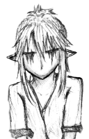
In your color images, especially in first two I think there are too much of those smaller/thiner lines witch makes hair look messy (Not in as a messy hair, but as in drawn messy). Your last image before coloring looks way better regarding this so I am not sure if you noticed and fixed that yourself or if it is in process of coloring that you add those lines. It is a same case for hands on a second and 3rd image, and some smaller lines on dress on second image seem to also be off.
All of those problems seem to fixed on your last uncolored image. In fact every next image seems to be a lot better the previous.
The only negative thing I would have to say regarding last image is about feet. Feet on right leg seems a bit to thin and then wide around part where fingers connect to feet and it looks a bit too long. Feet on left leg, thumb seems a bit off and a line going to thumb seems a bit too big and sharp. Sorry I can't really really describe it well, I am not sure if you will get what I mean.
Generally speaking true I think it looks very good, better then my own art.
PS: Feel free to to let me know what you think of my own art if you feel like it.
viewtopic.php?f=54&t=46410
viewtopic.php?f=54&t=44863