Ren'Py's Public Image
Forum rules
This is the right place for Ren'Py help. Please ask one question per thread, use a descriptive subject like 'NotFound error in option.rpy' , and include all the relevant information - especially any relevant code and traceback messages. Use the code tag to format scripts.
This is the right place for Ren'Py help. Please ask one question per thread, use a descriptive subject like 'NotFound error in option.rpy' , and include all the relevant information - especially any relevant code and traceback messages. Use the code tag to format scripts.
-
PyTom

- Ren'Py Creator
- Posts: 16093
- Joined: Mon Feb 02, 2004 10:58 am
- Completed: Moonlight Walks
- Projects: Ren'Py
- IRC Nick: renpytom
- Github: renpytom
- itch: renpytom
- Location: Kings Park, NY
- Contact:
While more quotes would be nice, I think the elevator statement is very important. It needs to be much longer, both explaining what Ren'Py is (and by extension, what visual novels are), and how it helps make a game. It needs to be relatively prose-ish.
Supporting creators since 2004
(When was the last time you backed up your game?)
"Do good work." - Virgil Ivan "Gus" Grissom(When was the last time you backed up your game?)
Software > Drama • https://www.patreon.com/renpytom
Jumpy buttons make me dizzy  ..... *thud*. Other than this, the look is pretty good ^^. I like the logo with the new Eileen except hm... she seems faded... maybe have a *slight* border to make her stand out from the blue background ?
About serif/sans : I've heard that serif is for paper because it helps the eyes imagine lines under the letters, while sans is better for screen because it doesn't. I personally prefer this use so it made sense to me ^^;
About serif/sans : I've heard that serif is for paper because it helps the eyes imagine lines under the letters, while sans is better for screen because it doesn't. I personally prefer this use so it made sense to me ^^;

Jake >> I like it, really. Maybe the Download & Run section's first item shouldn't be Download, but "latest Ren'Py version", so that it's clear, but I love the Discover section, even the fact that Games is in first place.
Statement...
Maybe something more on the catchy side would be better? Like something to draw in the people for whom it's for...
"Would you like to make your own VN, but can't program? Ren'Py is a simple [blah, blah] designed to take away the programming. Check out easy-to modift scripts and sample VN where you can learn [blah, blah] ... We have a very active and supporting community, visit us, etc. "
That kind of thing
-
PyTom
- Ren'Py Creator
- Posts: 16093
- Joined: Mon Feb 02, 2004 10:58 am
- Completed: Moonlight Walks
- Projects: Ren'Py
- IRC Nick: renpytom
- Github: renpytom
- itch: renpytom
- Location: Kings Park, NY
- Contact:
Yeah, I'd say the buttons should illuminate, like they do now, but otherwise stay put. Also, could you make them flush against the left side of the window? I think that little assymetry looks better then centering them.Jake wrote:(I'm not sure I like the jumping around of the buttons too much, myself; I modified the original behaviour a little just to try and make it more pleasing to the eye, but I still don't like it, if it were up to me I'd leave them the same size and position and just graphically highlight them... all the same, it's fiddlable easily enough.)
That's an idea. I'll look into making a variant of frame that does that.[EDIT: Now we just need a kind of Frame that tiles, instead of stretching, the inner section of the frame and I can do a theme that looks the same...]
Right. I forgot that IE sucked. (But GIF sucks as well... it's limited to 256 colors! Perhaps PNG, but without transparency or gamma correction.)On similar grounds, though, it would also be worth converting all graphics with an implicit background colour (which in this case is all of them) into GIFs, since IE is terrible at PNG palettes.
I like the logo with the drop-shadow, although the final logo will probably use the new art Piroshki is doing for this purpose. (And it should also be a little wider, I think.)
Supporting creators since 2004
(When was the last time you backed up your game?)
"Do good work." - Virgil Ivan "Gus" Grissom(When was the last time you backed up your game?)
Software > Drama • https://www.patreon.com/renpytom
Actually, there's already a slight border around her to make her stand out from the background - just obviously not quite enough of one.monele wrote:I like the logo with the new Eileen except hm... she seems faded... maybe have a *slight* border to make her stand out from the blue background ?
I didn't [want to] put too much effort into it, though, it was more just a quick knock-together to clean up that part of the look.
Mmm... I'd heard the same thing. I think the point was more that serifed fonts are always easier to read in theory, but on a computer screen the resolution is too low and the serifs end up confusing the eye more than they guide it, so sans is preferrable.monele wrote:About serif/sans : I've heard that serif is for paper because it helps the eyes imagine lines under the letters, while sans is better for screen because it doesn't. I personally prefer this use so it made sense to me ^^;
Hell, if nothing else, take a look at Apple; like 'em or not that company puts a lot of effort into presentation, and I can't remember the last time I saw a serifed typeface used as a display font. In fact, offhand the only serifed text I remember seeing from Apple at all is the big 'X' logo for OSX.
EDIT:
Like this?PyTom wrote:Yeah, I'd say the buttons should illuminate, like they do now, but otherwise stay put. Also, could you make them flush against the left side of the window? I think that little assymetry looks better then centering them.
(That's using the same button graphics, so it's a little odd padding/margin-wise if you look at the CSS, but obviously that could be fixed with only a little more work re-jigging the graphics.)
Server error: user 'Jake' not found
-
Piroshiki
- Regular
- Posts: 62
- Joined: Mon Oct 25, 2004 2:26 pm
- Location: The city of snow (Qc, CA)
- Contact:
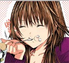
Sure. Is this one better? I think it looks a little weird, but maybe it's just because I'm not used to it.PyTom wrote:I like it, I think... but I wonder what it would look like with the full arc of the mouth, rather then just the corners. It might look silly,,, but if it isn't too hard, would you be willing to try it?
- Attachments
-
- 9a_happy.png (162.49 KiB) Viewed 2336 times
I'm not a meat bun ~nya
-
Piroshiki
- Regular
- Posts: 62
- Joined: Mon Oct 25, 2004 2:26 pm
- Location: The city of snow (Qc, CA)
- Contact:
I did a first version of safari Eileen today, after being somewhat delayed in working on it. It's... rather on the cartoon-y side though, maybe too much? I felt it worked best with the snake, but it's always possible to do it differently if this one doesn't work.
DaFool: I usually work at whatever size is the output from my scanner at 300 dpi... In Eileen's case, it was 790x1685.
DaFool: I usually work at whatever size is the output from my scanner at 300 dpi... In Eileen's case, it was 790x1685.
- Attachments
-
- eileen-snake.png (121.28 KiB) Viewed 3321 times
I'm not a meat bun ~nya
-
PyTom
- Ren'Py Creator
- Posts: 16093
- Joined: Mon Feb 02, 2004 10:58 am
- Completed: Moonlight Walks
- Projects: Ren'Py
- IRC Nick: renpytom
- Github: renpytom
- itch: renpytom
- Location: Kings Park, NY
- Contact:
I think the look of this logo is perfect. It's exactly what I was looking for... even though I was unable to express precisely what I was looking for.
There's two changes I think might help integrate the logo with the website:
- Flip the logo horizontally, so she's facing out over the web page, looking over the same content as the reader.
- Have the tail go down, rather then to the side. The idea behind this is that we want to minimize the horizontal width, so we don't have to scale the image down as much. (I'm just thinking that it should go straight down, off the image, once it clears her arm.)
I'm thinking this is an excellent stand-alone logo, and we can use a slightly altered version for the website.
---
Current Ren'Py plans:
I'm now fairly set on releasing 5.5.5 soon, which would roll in some feature enhancements. It would also feature the new character art in the old game, and the new website look with the old content.
We'd then have 5.6, which would feature more enhancements, the new demo game, and the new website content. That would take a while, and may be released in phases, as it gets completed.
Supporting creators since 2004
(When was the last time you backed up your game?)
"Do good work." - Virgil Ivan "Gus" Grissom(When was the last time you backed up your game?)
Software > Drama • https://www.patreon.com/renpytom
I find Eileen face on the test page a bit bland. Wouldnt it be better to have an interested expression? Mascot like thoses in DLsite(website not safe, mascot are) are a good exemple.
-
Watercolorheart
- Eileen-Class Veteran
- Posts: 1314
- Joined: Mon Sep 19, 2005 2:15 am
- Completed: Controlled Chaos / Sum of the Parts / "that" Midna game with ZONEsama
- Projects: Sparse Series/Oddments Shop original cartoon in Pevrea; Cybernetic Duels (fighting game); Good Vibin'
- Organization: Watercolorheart Studios
- IRC Nick: BCS
- Tumblr: adminwatercolor
- Deviantart: itsmywatercolorheart
- Github: Watercolordevdev
- Skype: heartnotes
- Soundcloud: Watercollider
- itch: watercolorheart
- Location: Florida
- Contact:
Mm!
I have only two criticisms, and they're both relatively minor.
Firstly, the lack of whites in the eyes bugs me a little bit, but it took me a minute to notice, even.
Secondly, the scaling looks a little rough, especially down Eileen's left and the side of the snake on the left of the picture.
Other than that... well, awesome!
Server error: user 'Jake' not found
Who is online
Users browsing this forum: Bing [Bot]